The content of this article is about the implementation of absolute positioning of the fixed positioning of the head of the mobile page. It has certain reference value. Friends in need can refer to it. I hope it will be helpful to you.
When developing on the mobile side, usually the header of the entire page will have a fixed area, such as the header in Taobao in the picture below. This area is visible no matter how you swipe the screen. On the PC side, we can use position:fixed to achieve this. However, due to certain compatibility issues with position:fixed, and there are many viewports on the mobile terminal, it is easy to make mistakes as to which viewport this fixation is relative to. Therefore, absolute positioning is usually used instead of fixed positioning. The following specific code examples:

HTML code is as follows:
        <header>
            <div>

            </div>
            <div>

            </div>
        </header>
CSS code is as follows:
            .header-box{
                /*position:fixed;*/
                position:absolute;
                left:0;
                top:0;
                width:100%;
                height:179px;
                background:#ef3229;
            }


            ul>li{
                height:350px;
                border-bottom: 1px solid black;
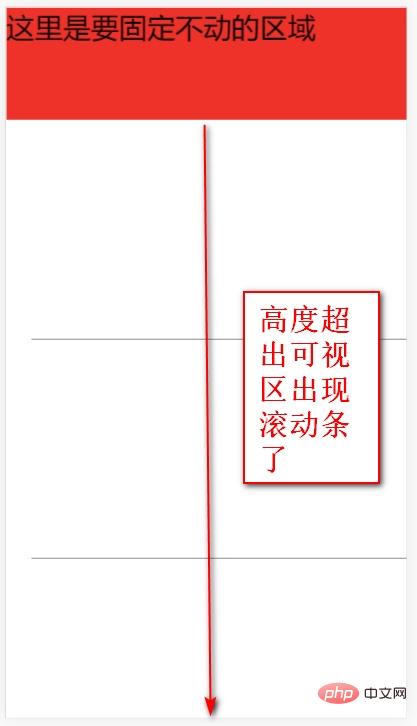
}The above html defines the top fixed area and the lower content area. The top is absolutely positioned using position, setting left to 0 and top to 0. The height of the content area exceeds the viewable area.
The final effect is as shown below:

At this time, you will find that scrolling occurs. After sliding, the area that was supposed to be fixed on the top is gone again. In other words, we did not achieve what we wanted by using absolute positioning instead of fixed positioning. Why is this? Here, we need to understand two important knowledge points:
Who is the absolute positioning here relative to?
#Who is the scroll bar here added to?
First analyze the first question: We know that position:absolute is positioned relative to the nearest positioned ancestor element whose position value is not static. If If there is no positioned ancestor element, it is positioned relative to the root node document. Then, the ancestor elements of our header element are body, html, and document. Among them, the default positioning of body and html is static. In other words, it is ultimately positioned relative to the document.
Let’s analyze the second question: when the content exceeds the height of the browser, who is the scroll bar added to? In fact, this should be added to the html element.
After understanding the above two knowledge points, we can analyze it. We know that it is precisely because of the scroll bar on the html element that the document will exceed the browser window. So what we need to do first is to disable the scroll bar of html.
html{
  overflow:hidden;
}Although disabling the scroll bar of html solves the problem of using absolute positioning instead of fixed positioning, it brings new problems. That is, the entire page no longer has scroll bars. But in fact we need scroll bars, so we can add scroll bars to the body.
html{
    height:100%;
}
body{
    height:100%;
    overflow:auto;
}Since the height of the body needs to be set to the height of the browser, and the height of html depends on the height of the browser, first set the height of html to the height of the browser, and then the body can inherit from html.
So the final code form is:
            html{
                height:100%;
                overflow:hidden;  //禁用滚动条,实现相对于document的绝对定位代替固定定位。
            }
            body{

                height:100%;
                overflow:auto;   //添加滚动条
            }
            ul{
                margin-top:179px;
                list-style: none;
            }
            .header-box{
                /*position:fixed;*/
                position:absolute;
                left:0;
                top:0;
                width:100%;
                height:179px;
                background:#ef3229;
            }


            ul>li{
                height:350px;
                border-bottom: 1px solid black;
}Summary: Some related knowledge used:
Absolute positioning of html elements and body elements The default values are all static. Therefore, if an element cannot find a non-static ancestor element, it will be positioned relative to the document.
The html element and the body element are both block-level elements. By default, it occupies one line and its width is equal to the browser width. The height is equal to the height of the content area, if height:100% is set to the height. Then its height is the browser height.
html elements have overflow:auto set by default. Scroll bars appear when the content exceeds the height of the browser.
The above is the detailed content of Absolute positioning implementation of fixed positioning of the head of the mobile page (code example). For more information, please follow other related articles on the PHP Chinese website!