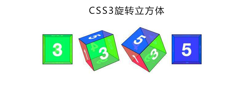
Mainly achieved through the transform attribute in CSS3, first set the element as a 3D element, then define the styles of the six faces and then rotate them through the transform attribute to achieve the rotating cube effect
Now with CSS3 With the continuous maturity and development, we can use CSS3 transformation style, translateZ, rotateX, rotateY, rotateZ, radial gradient, linear gradient, perspective and other attributes to create a 3D cube that can be rotated. Next, in the article, we will introduce in detail how to achieve this rotating cube effect through CSS3. It has certain reference value and I hope it will be helpful to everyone

[Recommended course: CSS3 Tutorial 】
Inside the cube are six sides, which are defined as separate graphic elements, each with separate "back", "top", "bottom", "left" ”, “right” and “front”. So first we have to create the html code. Contains these six elements. As shown in the following code
<div class="box">
		<div class="one"></div>
		<div class="two"></div>
		<div class="three"></div>
		<div class="four"></div>
		<div class="five"></div>
		<div class="six"></div>
	</div>
Then set the CSS properties of the box and set it as a 3D element. Here you need to pay attention to setting the positioning, so that the six elements can be superimposed together
.box{
        position: relative;
        width:200px;
         height:200px;
         transform-style: preserve-3d;/*创造3D空间*/
       -webkit-transform-style: preserve-3d;
        transition: all 5s linear;
}The next step is to set the six faces of the cube
.box div{
	width:200px;
	height: 200px;
	position: absolute;
	left: 0;
       top: 0;
       transform-style: preserve-3d;
       -webkit-transform-style: preserve-3d;
       border: 1px solid #46B8DA;
       opacity: 0.5;
}Six After setting the public parts of the faces, we need to set the 3D effects of these six faces. We can set the 3D changes through the transform attribute, which allows us to rotate, move, tilt, etc.
           .one{
                transform: rotateY(0deg) translateZ(100px);
                background-color:rgb(255,118,19);
            }
            .two{
                transform: rotateY(180deg) translateZ(100px);
                 background-color:rgb(231,78,72);
            }
            .three{
                transform: rotateX(90deg) translateZ(100px);
                 background-color: rgb(75,165,165);
            }
            .four{
                transform: rotateX(-90deg) translateZ(100px);
                 background-color:rgb(129,182,62);
            }
            .five{
                transform: rotateY(90deg) translateZ(100px);
                background-color: rgb(255,118,19);
            }
            .six{
                transform: rotateY(-90deg) translateZ(100px);
                 background-color:rgb(244,208,114);
}In this way, our cube is ready, and it will rotate when the mouse moves up.
.box:hover{
                transform: rotateX(360deg) rotateY(360deg);
                -webkit-transform: rotateX(360deg) rotateY(360deg);
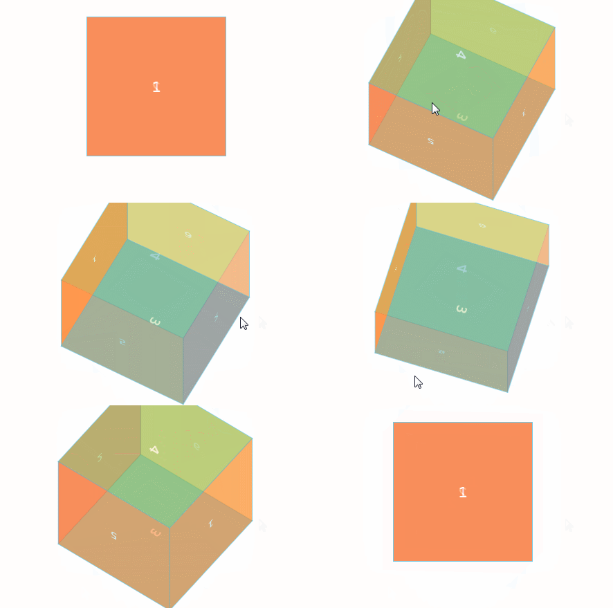
}Rendering:

Summary: The above is the entire content of this article. I hope that through this article, everyone can learn how to implement a rotating cube through CSS3
The above is the detailed content of How to implement rotating cube with CSS3. For more information, please follow other related articles on the PHP Chinese website!