

Code example of pure CSS3 to achieve 3D flip effect
Jan 25, 2019 am 11:41 AM
This article brings you code examples about pure CSS3 to achieve 3D flip effect. It has certain reference value. Friends in need can refer to it. I hope it will be helpful to you. .
As a required course for front-end developers, CSS3 can help us complete many basic dynamic effects. In this issue, we will use CSS3 to achieve the hover flip effect~
First step It's very simple. We simply draw a demonstration block and add transition and transform attributes to it :
// 本示例均使用Sass语法
.block {
  width: 200px;
  height: 200px;
  background: brown;
  cursor: pointer;
  transition: 0.8s;
  &:hover {
    transform: rotateY(180deg);
  }
} 
is: The transition attribute should be written on .block instead of hover. If the transition is only written on hover, it will not work when the mouse moves out. There is no transition effect. If we only write the transition on the hover:

The second step is more critical: we can easily find that it is always 1 Flip on a plane, it is not three-dimensional enough, so we need to change our thinking slightly - Use 2 layers of p nesting
// html部分
<div>
    <div></div>
</div>
// CSS部分
.block {
  width: 200px;
  height: 200px;
  cursor: pointer;

  &-in {
    background: brown;
    height: 100%;
    transition: 0.8s;
  }

  &:hover .block-in {
    transform: rotateY(180deg);
  }
}
The key step is here: we need toadd perspective and transform-style attributes to the outer layer to add 3D to the entire animation Transformation effect:
.block {
  width: 200px;
  height: 200px;
  cursor: pointer;
  /* 3D变形 */
  transform-style: preserve-3d;
  -webkit-perspective: 1000;
  -moz-perspective: 1000;
  -ms-perspective: 1000;
  perspective: 1000;

  &-in {
    background: brown;
    height: 100%;
    transition: 0.8s;
  }

  &:hover .block-in {
    transform: rotateY(180deg);
  }
}
1. Create two layers of div inside and outside, and hover the mouse to When the outer layer is used, add a flip transform to the inner div: rotateY(180deg)
2. Pay attention to adding the transition attribute to the div that needs to be flipped, not when hovering.
3. Add perspective and transform-style to the outer div Attribute, finally achieve 3D flip effect
The above is the detailed content of Code example of pure CSS3 to achieve 3D flip effect. For more information, please follow other related articles on the PHP Chinese website!

Hot Article

Hot tools Tags

Hot Article

Hot Article Tags

Notepad++7.3.1
Easy-to-use and free code editor

SublimeText3 Chinese version
Chinese version, very easy to use

Zend Studio 13.0.1
Powerful PHP integrated development environment

Dreamweaver CS6
Visual web development tools

SublimeText3 Mac version
God-level code editing software (SublimeText3)
Hot Topics


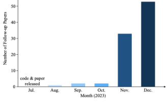 Why is Gaussian Splatting so popular in autonomous driving that NeRF is starting to be abandoned?
Jan 17, 2024 pm 02:57 PM
Why is Gaussian Splatting so popular in autonomous driving that NeRF is starting to be abandoned?
Jan 17, 2024 pm 02:57 PM
Why is Gaussian Splatting so popular in autonomous driving that NeRF is starting to be abandoned?
 Learn about 3D Fluent emojis in Microsoft Teams
Apr 24, 2023 pm 10:28 PM
Learn about 3D Fluent emojis in Microsoft Teams
Apr 24, 2023 pm 10:28 PM
Learn about 3D Fluent emojis in Microsoft Teams
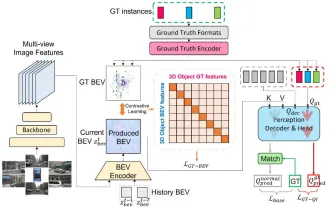 CLIP-BEVFormer: Explicitly supervise the BEVFormer structure to improve long-tail detection performance
Mar 26, 2024 pm 12:41 PM
CLIP-BEVFormer: Explicitly supervise the BEVFormer structure to improve long-tail detection performance
Mar 26, 2024 pm 12:41 PM
CLIP-BEVFormer: Explicitly supervise the BEVFormer structure to improve long-tail detection performance
 How to use CSS to achieve the rotating background animation effect of elements
Nov 21, 2023 am 09:05 AM
How to use CSS to achieve the rotating background animation effect of elements
Nov 21, 2023 am 09:05 AM
How to use CSS to achieve the rotating background animation effect of elements
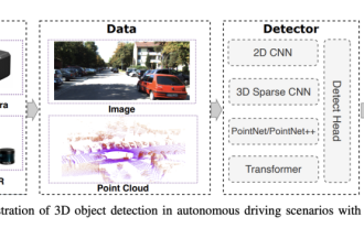 Choose camera or lidar? A recent review on achieving robust 3D object detection
Jan 26, 2024 am 11:18 AM
Choose camera or lidar? A recent review on achieving robust 3D object detection
Jan 26, 2024 am 11:18 AM
Choose camera or lidar? A recent review on achieving robust 3D object detection
 Use CSS skillfully to realize various strange-shaped buttons (with code)
Jul 19, 2022 am 11:28 AM
Use CSS skillfully to realize various strange-shaped buttons (with code)
Jul 19, 2022 am 11:28 AM
Use CSS skillfully to realize various strange-shaped buttons (with code)
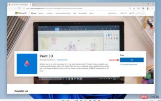 Paint 3D in Windows 11: Download, Installation, and Usage Guide
Apr 26, 2023 am 11:28 AM
Paint 3D in Windows 11: Download, Installation, and Usage Guide
Apr 26, 2023 am 11:28 AM
Paint 3D in Windows 11: Download, Installation, and Usage Guide
 Get a virtual 3D wife in 30 seconds with a single card! Text to 3D generates a high-precision digital human with clear pore details, seamlessly connecting with Maya, Unity and other production tools
May 23, 2023 pm 02:34 PM
Get a virtual 3D wife in 30 seconds with a single card! Text to 3D generates a high-precision digital human with clear pore details, seamlessly connecting with Maya, Unity and other production tools
May 23, 2023 pm 02:34 PM
Get a virtual 3D wife in 30 seconds with a single card! Text to 3D generates a high-precision digital human with clear pore details, seamlessly connecting with Maya, Unity and other production tools
