The transform-style attribute is used to specify how nested elements are rendered in three-dimensional space. When the value is flat, it means that all child elements are rendered in the 2D plane; when the value is preserve-3d, it means that all the child elements are rendered in the 3D space.

CSS3 transform-style property
Function: transform-style property Specifies how nested elements are rendered in 3D space.
Syntax:
transform-style: flat|preserve-3d;
flat: Child elements will not retain their 3D position.
preserve-3d: Child elements will retain their 3D position.
Note: This attribute must be used together with the transform attribute.
Example of using CSS3 transform-style attribute
<!DOCTYPE html>
<html>
<head>
<style>
#div1
{
position: relative;
height: 200px;
width: 200px;
margin: 100px;
padding:10px;
border: 1px solid black;
}
#div2
{
padding:50px;
position: absolute;
border: 1px solid black;
background-color: red;
transform: rotateY(60deg);
transform-style: preserve-3d;
-webkit-transform: rotateY(60deg); /* Safari and Chrome */
-webkit-transform-style: preserve-3d; /* Safari and Chrome */
}
#div3
{
padding:40px;
position: absolute;
border: 1px solid black;
background-color: yellow;
transform: rotateY(80deg);
-webkit-transform: rotateY(-60deg); /* Safari and Chrome */
}
</style>
</head>
<body>
<div id="div1">
  <div id="div2">HELLO
  <div id="div3">YELLOW</div>
  </div>
</div>
</body>
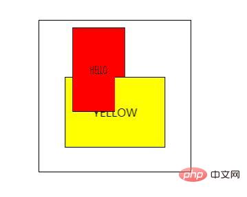
</html>Rendering:

The above is the detailed content of How to use transform-style attribute. For more information, please follow other related articles on the PHP Chinese website!