

How to use css align-items attribute?

css align-items attribute is used to specify the alignment of items in the float container in the horizontal axis direction. Its syntax is "align-items: stretch|center|flex-start|flex-end|baseline;" .
css align-items property is used to specify the alignment of items in the float container in the horizontal axis direction: stretch to fill the container, centered on the horizontal axis , vertically aligned at the top, vertically aligned at the bottom, and aligned at the baseline of the horizontal axis. [Video tutorial recommendation: CSS tutorial]
CSS align-items attribute
align-items attribute is Flexible Box Subproperty of the layout module.
Function: Defines the default (alignment) behavior of how to arrange flexible items along the horizontal axis of the current row.
Note: You can use the align-self attribute in each sub-item within the float container to override the style of the align-items attribute.
Syntax:
align-items: stretch|center|flex-start|flex-end|baseline;
stretch (default): Stretch to fill the container (still respecting min-width/max-width).
center: Items are centered on the horizontal axis; by default, the horizontal axis is vertical, which means flexbox items will be vertically centered.

flex-start: Items are aligned at the start of the horizontal axis, i.e. items will be vertically aligned at the top.
flex-end: The items are aligned at the end of the horizontal axis, i.e. the items will be vertically aligned at the bottom
baseline: Items are aligned at the baseline of the horizontal axis, i.e. the flexbox items will align themselves so that the baseline of their text is aligned along the horizontal line.
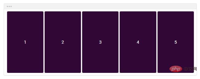
Usage example of CSS align-items attribute
<!DOCTYPE html>
<html>

	<head>
		<meta charset="UTF-8">
		<style>
			.flex-container {
				padding: 0;
				margin: 0;
				list-style: none;
				-ms-box-orient: horizontal;
				display: -webkit-box;
				display: -moz-box;
				display: -ms-flexbox;
				display: -moz-flex;
				display: -webkit-flex;
				display: flex;
				float: left;
			}

			.flex-start {
				-webkit-align-items: flex-start;
				align-items: flex-start;
			}

			.flex-end {
				-webkit-align-items: flex-end;
				align-items: flex-end;
			}

			.flex-end li {
				background: gold;
			}

			.center {
				-webkit-align-items: center;
				align-items: center;
			}

			.center li {
				background: deepskyblue;
			}

			.baseline {
				-webkit-align-items: baseline;
				align-items: baseline;
			}

			.baseline li {
				background: lightgreen;
			}

			.stretch {
				-webkit-align-items: stretch;
				align-items: stretch;
			}

			.stretch li {
				background: hotpink;
			}

			.flex-item {
				background: tomato;
				padding: 5px;
				width: 50px;
				margin: 5px;
				line-height: 50px;
				color: white;
				font-weight: bold;
				font-size: 2em;
				text-align: center;
			}
		</style>

	</head>

	<body>
		<div class="box">
			<ul class="flex-container flex-start">
				<li class="flex-item">1<br>2</li>
				<li class="flex-item">3</li>
				<li class="flex-item">4<br>5</li>
				<li class="flex-item">6</li>
			</ul>

			<ul class="flex-container flex-end">
				<li class="flex-item">1<br>2</li>
				<li class="flex-item">3</li>
				<li class="flex-item">4<br>5</li>
				<li class="flex-item">6</li>
			</ul>

			<ul class="flex-container center">
				<li class="flex-item">1<br>2</li>
				<li class="flex-item">3</li>
				<li class="flex-item">4<br>5</li>
				<li class="flex-item">6</li>
			</ul>

			<ul class="flex-container baseline">
				<li class="flex-item">1<br>2</li>
				<li class="flex-item">3</li>
				<li class="flex-item">4<br>5</li>
				<li class="flex-item">6</li>
			</ul>

			<ul class="flex-container stretch">
				<li class="flex-item">1<br>2</li>
				<li class="flex-item">3</li>
				<li class="flex-item">4<br>5</li>
				<li class="flex-item">6</li>
			</ul>
		</div>
	</body>

</html>Rendering:

The above is the entire content of this article, I hope it will be helpful to everyone's study. For more exciting content, you can pay attention to the relevant tutorial columns of the PHP Chinese website! ! !
The above is the detailed content of How to use css align-items attribute?. For more information, please follow other related articles on the PHP Chinese website!

Hot AI Tools

Undresser.AI Undress
AI-powered app for creating realistic nude photos

AI Clothes Remover
Online AI tool for removing clothes from photos.

Undress AI Tool
Undress images for free

Clothoff.io
AI clothes remover

AI Hentai Generator
Generate AI Hentai for free.

Hot Article
Hot Tools

Notepad++7.3.1
Easy-to-use and free code editor

SublimeText3 Chinese version
Chinese version, very easy to use

Zend Studio 13.0.1
Powerful PHP integrated development environment

Dreamweaver CS6
Visual web development tools

SublimeText3 Mac version
God-level code editing software (SublimeText3)
Hot Topics
 1377
1377
 52
52

 How to insert pictures on bootstrap
Apr 07, 2025 pm 03:30 PM
How to insert pictures on bootstrap
Apr 07, 2025 pm 03:30 PM
There are several ways to insert images in Bootstrap: insert images directly, using the HTML img tag. With the Bootstrap image component, you can provide responsive images and more styles. Set the image size, use the img-fluid class to make the image adaptable. Set the border, using the img-bordered class. Set the rounded corners and use the img-rounded class. Set the shadow, use the shadow class. Resize and position the image, using CSS style. Using the background image, use the background-image CSS property.
 How to resize bootstrap
Apr 07, 2025 pm 03:18 PM
How to resize bootstrap
Apr 07, 2025 pm 03:18 PM
To adjust the size of elements in Bootstrap, you can use the dimension class, which includes: adjusting width: .col-, .w-, .mw-adjust height: .h-, .min-h-, .max-h-
 How to set up the framework for bootstrap
Apr 07, 2025 pm 03:27 PM
How to set up the framework for bootstrap
Apr 07, 2025 pm 03:27 PM
To set up the Bootstrap framework, you need to follow these steps: 1. Reference the Bootstrap file via CDN; 2. Download and host the file on your own server; 3. Include the Bootstrap file in HTML; 4. Compile Sass/Less as needed; 5. Import a custom file (optional). Once setup is complete, you can use Bootstrap's grid systems, components, and styles to create responsive websites and applications.
 How to use bootstrap button
Apr 07, 2025 pm 03:09 PM
How to use bootstrap button
Apr 07, 2025 pm 03:09 PM
How to use the Bootstrap button? Introduce Bootstrap CSS to create button elements and add Bootstrap button class to add button text
 How to write split lines on bootstrap
Apr 07, 2025 pm 03:12 PM
How to write split lines on bootstrap
Apr 07, 2025 pm 03:12 PM
There are two ways to create a Bootstrap split line: using the tag, which creates a horizontal split line. Use the CSS border property to create custom style split lines.
 How to view the date of bootstrap
Apr 07, 2025 pm 03:03 PM
How to view the date of bootstrap
Apr 07, 2025 pm 03:03 PM
Answer: You can use the date picker component of Bootstrap to view dates in the page. Steps: Introduce the Bootstrap framework. Create a date selector input box in HTML. Bootstrap will automatically add styles to the selector. Use JavaScript to get the selected date.
 The Roles of HTML, CSS, and JavaScript: Core Responsibilities
Apr 08, 2025 pm 07:05 PM
The Roles of HTML, CSS, and JavaScript: Core Responsibilities
Apr 08, 2025 pm 07:05 PM
HTML defines the web structure, CSS is responsible for style and layout, and JavaScript gives dynamic interaction. The three perform their duties in web development and jointly build a colorful website.
 How to use bootstrap in vue
Apr 07, 2025 pm 11:33 PM
How to use bootstrap in vue
Apr 07, 2025 pm 11:33 PM
Using Bootstrap in Vue.js is divided into five steps: Install Bootstrap. Import Bootstrap in main.js. Use the Bootstrap component directly in the template. Optional: Custom style. Optional: Use plug-ins.
