

How to understand adaptive layout

Adaptive layout allows web pages to be adaptively displayed on terminal devices of different sizes. It has good compatibility for some large websites and efficient code, but it requires the development of multiple interfaces to adapt to different devices. Therefore, modification is difficult.
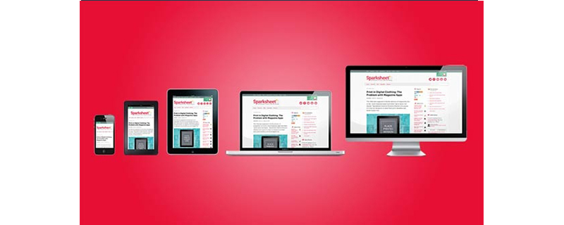
Adaptive layout refers to web design methods and technologies that enable web pages to be adaptively displayed on terminal devices of different sizes. Next, in the article, we will introduce the knowledge about adaptive layout in detail, which has certain reference value. I hope it will be helpful to everyone
[Recommended courses :CSS tutorial】
Adaptive layout:
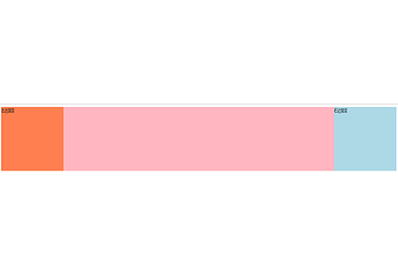
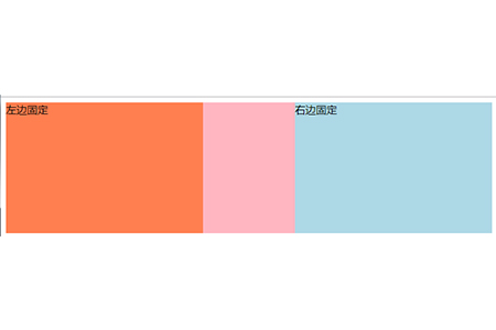
Adaptive layout The feature is to set different layout formats under different screen sizes. That is to say, if the element is in this place on a certain screen, but on a screen of a different size, the element may not be still in the original place, and may have been moved to another place. They are mainly layout changes but the elements do not change. Such an effect can be seen as a composition composed of multiple static layouts under different screens.
#When you shrink the window, you can see that the width of the adaptive part in the middle becomes smaller
Advantages and Disadvantages of Adaptive Layout
(1) It has better compatibility with some complex large websites and is more convenient to implement.
(2) The code is more efficient and testing is easier. (3) Highly controllable pictures
DisadvantagesBecause it has to adapt to different mobile device screens, the same website often needs Develop different pages for different devices, thus increasing development costs. Especially when requirements change, multiple sets of code may be changed. The process is cumbersome.
Summary: The above is the entire content of this article. I hope this article can help everyone better understand adaptive layout.
The above is the detailed content of How to understand adaptive layout. For more information, please follow other related articles on the PHP Chinese website!

Hot AI Tools

Undresser.AI Undress
AI-powered app for creating realistic nude photos

AI Clothes Remover
Online AI tool for removing clothes from photos.

Undress AI Tool
Undress images for free

Clothoff.io
AI clothes remover

Video Face Swap
Swap faces in any video effortlessly with our completely free AI face swap tool!

Hot Article
Hot Tools

Notepad++7.3.1
Easy-to-use and free code editor

SublimeText3 Chinese version
Chinese version, very easy to use

Zend Studio 13.0.1
Powerful PHP integrated development environment

Dreamweaver CS6
Visual web development tools

SublimeText3 Mac version
God-level code editing software (SublimeText3)
Hot Topics
 1392
1392
 52
36
110
52
36
110

 React responsive design guide: How to achieve adaptive front-end layout effects
Sep 26, 2023 am 11:34 AM
React responsive design guide: How to achieve adaptive front-end layout effects
Sep 26, 2023 am 11:34 AM
React Responsive Design Guide: How to Achieve Adaptive Front-end Layout Effects With the popularity of mobile devices and the increasing user demand for multi-screen experiences, responsive design has become one of the important considerations in modern front-end development. React, as one of the most popular front-end frameworks at present, provides a wealth of tools and components to help developers achieve adaptive layout effects. This article will share some guidelines and tips on implementing responsive design using React, and provide specific code examples for reference. Fle using React
 HTML tutorial: How to use Flexbox for adaptive equal-height, equal-width, equal-spacing layout
Oct 27, 2023 pm 05:51 PM
HTML tutorial: How to use Flexbox for adaptive equal-height, equal-width, equal-spacing layout
Oct 27, 2023 pm 05:51 PM
HTML tutorial: How to use Flexbox for adaptive equal-height, equal-width, equal-spacing layout, specific code examples are required. Introduction: In modern web design, layout is a very critical factor. For pages that need to display a large amount of content, how to reasonably arrange the position and size of elements to achieve good visibility and ease of use is an important issue. Flexbox (flexible box layout) is a very powerful tool through which various flexible layout needs can be easily realized. This article will introduce Flexbox in detail
 HTML tutorial: How to use Flexbox for adaptive equal height layout
Oct 21, 2023 am 10:00 AM
HTML tutorial: How to use Flexbox for adaptive equal height layout
Oct 21, 2023 am 10:00 AM
HTML tutorial: How to use Flexbox for adaptive equal-height layout, specific code examples are required. Introduction: In web design and development, implementing adaptive equal-height layout is a common requirement. Traditional CSS layout methods often face some difficulties when dealing with equal height layout, and Flexbox layout provides us with a simple and powerful solution. This article will introduce the basic concepts and common usage of Flexbox layout, and give specific code examples to help readers quickly master the use of Flexbox to implement their own
 How to use Vue to implement adaptive layout statistical charts
Aug 20, 2023 pm 10:25 PM
How to use Vue to implement adaptive layout statistical charts
Aug 20, 2023 pm 10:25 PM
Overview of how to use Vue to implement adaptive layout of statistical charts: In modern web applications, statistical charts are an important part of displaying data. Using Vue.js you can easily implement adaptive layout of statistical charts to adapt to different screen sizes and device types. This article will introduce how to use Vue and some commonly used charting libraries to achieve this goal. Create a Vue project and install dependencies First, we need to create a Vue project. You can use VueCLI to quickly build the project structure. In terminal run as
 How to use CSS to implement adaptive multi-column layout
Oct 19, 2023 am 09:25 AM
How to use CSS to implement adaptive multi-column layout
Oct 19, 2023 am 09:25 AM
How to use CSS to implement adaptive multi-column layout With the popularity of mobile devices, more and more websites need to adapt to different screen sizes. Using CSS to implement adaptive multi-column layout is an important skill that can make your website look good on various devices. This article will introduce how to use CSS to implement adaptive multi-column layout and give specific code examples. 1. Use Flexbox layout Flexbox layout is a powerful layout model in CSS3 that can easily implement multi-column layout. first,
 CSS adaptive layout property optimization tips: flex and grid
Oct 21, 2023 am 08:03 AM
CSS adaptive layout property optimization tips: flex and grid
Oct 21, 2023 am 08:03 AM
CSS adaptive layout attribute optimization tips: flex and grid In modern web development, implementing adaptive layout is a very important task. With the popularity of mobile devices and the diversification of screen sizes, it is an essential requirement to ensure that the website can be displayed well on various devices and adapt to different screen sizes. Fortunately, CSS provides some powerful properties and techniques for implementing adaptive layout. This article will focus on two commonly used properties: flex and grid, and provide specific code examples.
 Introducing the different width attributes in CSS
Feb 20, 2024 am 10:03 AM
Introducing the different width attributes in CSS
Feb 20, 2024 am 10:03 AM
An introduction to various widths in CSS requires specific code examples. In CSS, width (width) is a commonly used attribute used to define the width of an element. In actual development, we will encounter many situations where we need to set the width of elements, and CSS provides a variety of ways to meet our needs. This article will introduce the various width properties in CSS in detail and provide specific code examples. width:autoWhen we do not define the width of an element in CSS, the default width value is
 HTML tutorial: How to use Flexbox for adaptive proportional layout
Oct 25, 2023 am 11:46 AM
HTML tutorial: How to use Flexbox for adaptive proportional layout
Oct 25, 2023 am 11:46 AM
HTML tutorial: How to use Flexbox for adaptive proportional layout In modern web development, responsive layout is attracting more and more attention. Flexbox (flexible box layout) is a powerful layout model in CSS that can help developers easily implement adaptive proportional layout. This article will introduce how to use Flexbox to implement this layout, with specific code examples. Flexbox is a model based on containers and items. By setting the properties of the container, you can control
