

Detailed introduction to the basic syntax of flex layout

This article brings you a detailed introduction to the basic syntax of flex layout. It has certain reference value. Friends in need can refer to it. I hope it will be helpful to you.
In 2009, W3C proposed a new solution - Flex layout, which can realize various page layouts simply, completely and responsively. At present, it has been supported by all browsers, which means that it is safe to use this feature now
1. What is flex layout?
Flex is the abbreviation of Flexible Box, which means "flexible layout" and is used to provide maximum flexibility for box-shaped models.
flex layout: .box{display:flex;}
Inline elements can also use flex layout: .box{display:inline-flex;}
Browsers with Webkit core must add the -webkit prefix: .box{display:-webkit-flex; display:flex ;}
Note that after setting to Flex layout, the float, clear and vertical-align attributes of child elements will be invalid.
2. Basic concepts
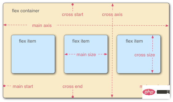
Flex container (flex container): Elements that adopt Flex layout are called flex containers.
Flex project (flex item): All child elements of the flex container automatically become container members, that is, flex items.
The two axes of the container: the horizontal main axis (main axis), the vertical cross axis (cross axis).
Main axis: start position->main start, end position->main end, projects are arranged along the main axis by default.
Cross axis: start position-> cross start, end position->cross end
The main axis space occupied by a single item in the container is called->main size, and the cross-axis space is called->cross size
3.FLex attributes
flex attributes are divided into container attributes and project attributes.
Container properties: flex-direction, flex-wrap, flex-flow, justify-content, align-items, align-content
Item properties: order, flex-grow, flex-shrink, flex-basis, flex , align-self
3.1ContainerProperties
flex-direction: Determine the direction of the main axis (i.e. the direction of item arrangement)
Row: Horizontal direction, from left to right. (Default attribute)
Row-reverse: Horizontal direction, from right to left.
Column: Vertical direction, from top to bottom.
column-reverse: Vertical direction, from bottom to top.
flex-wrap: Specifies how to wrap if an axis cannot fit.
nowrap: No line wrapping (default attribute)
Wrap: Line wrapping, the first line is at the top
wrap-reverse: Line wrapping, the first line is at the bottom, (only the number of lines is reversed, the single line still starts from Arranged from left to right, each row is).
flex-flow: Combining flex-direction and flex-wrap, the writing is as follows
.box{flex-flow :column wrap-reverse}
justify-content: Define the alignment of the item on the main axis
flex-start: Left-aligned (default value), the item is aligned on the main axis Align the starting point of
flex-end: right-aligned, the items are aligned with the end point of the main axis
center: centered
space-between: aligned at both ends, the intervals between items are equal
Space-around: The space on both sides of each item is equal. Therefore, the distance between items is twice as large as the distance between items and borders
align-items: Define the alignment of items on the cross axis (Only single line, multi-line alignment Defined by align-content)
stretch: If the item does not set a height or is set to auto, it will occupy the height of the entire container (default value)
flex-start: from top Go to the bottom, take the starting point of the cross axis as the baseline, and extend to the end point
flex-end: From bottom to top, take the end point of the cross axis as the baseline, and extend toward the starting point
center: Cross axis Align the midpoint of the item, and place the midpoint of the item on the midpoint of the cross axis
baseline: Align with the first line of text of each item in a line.
align- content: Defines the alignment along the cross axis when there are multi-line items in the container. If the item has only one axis, this property has no effect
stretch: The axis is full The entire cross axis (each row has an axis), default attribute
flex-start: align with the starting point of the cross axis
flex-end: align with the end point of the cross axis
Center: Align with the midpoint of the cross axis
Space-between: Multi-line items are evenly spaced on the cross axis
Space-around: Multi-line items are on both sides of the cross axis intervals are equal. Therefore, the distance between items on the cross axis is twice as large as the distance between items and borders
Note: justify-content, align-items and align-content are properties of the container, not the properties of the item. They are to set the items in a container to be aligned at a certain position on the axis
3.2 Project attributes
order: Define the order of items. The smaller the value, the higher the arrangement. The default value is 0, written as follows
.item{order:5}
flex-grow: Define the attribute item magnification ratio, the default is 1
If All items with a flex-grow property of 1 will equally divide the remaining space (if any). If the flex-grow property of an item is 2 and the other items are all 1, the former will occupy twice as much remaining space as the other items
flex-shrink: Define the shrinkage ratio of the item , the default is 1
If the flex-shrink property of all items is 1, when there is insufficient space, they will all be reduced proportionally. If the flex-shrink property of one item is 0 and the other items are 1, the former will not shrink when there is insufficient space. Negative values are invalid for this property
flex-basis : Defines the main axis space (main size) occupied by the project before allocating excess space. The browser calculates whether there is excess space on the main axis based on this attribute. Its default value is auto, which is the original size of the project
It can be set to the same value as the width or height attribute (such as 350px), then the project will occupy a fixed space
flex: Combining the properties of flex-grow, flex-shrink and flex-basis, the default value is 0 1 auto, it is recommended to use
This attribute has two shortcut values: auto (1 1 auto) and none (0 0 auto
align-self: allows a single item to be aligned with other items Different alignment methods can override the align-items attribute. The default value is auto, which means inheriting the align-items attribute of the parent element. If there is no parent element, it is equivalent to stretch
. This attribute may take 6 values. , except auto, everything else is exactly the same as the align-items attribute
[Related recommendations: CSS video tutorial]
The above is the detailed content of Detailed introduction to the basic syntax of flex layout. For more information, please follow other related articles on the PHP Chinese website!

Hot AI Tools

Undresser.AI Undress
AI-powered app for creating realistic nude photos

AI Clothes Remover
Online AI tool for removing clothes from photos.

Undress AI Tool
Undress images for free

Clothoff.io
AI clothes remover

Video Face Swap
Swap faces in any video effortlessly with our completely free AI face swap tool!

Hot Article
Hot Tools

Notepad++7.3.1
Easy-to-use and free code editor

SublimeText3 Chinese version
Chinese version, very easy to use

Zend Studio 13.0.1
Powerful PHP integrated development environment

Dreamweaver CS6
Visual web development tools

SublimeText3 Mac version
God-level code editing software (SublimeText3)
Hot Topics
 1389
1389
 52
52

 Guide to solving misalignment of WordPress web pages
Mar 05, 2024 pm 01:12 PM
Guide to solving misalignment of WordPress web pages
Mar 05, 2024 pm 01:12 PM
Guide to solving misaligned WordPress web pages In WordPress website development, sometimes we encounter web page elements that are misaligned. This may be due to screen sizes on different devices, browser compatibility, or improper CSS style settings. To solve this misalignment, we need to carefully analyze the problem, find possible causes, and debug and repair it step by step. This article will share some common WordPress web page misalignment problems and corresponding solutions, and provide specific code examples to help develop
 How to implement responsive layout using Vue
Nov 07, 2023 am 11:06 AM
How to implement responsive layout using Vue
Nov 07, 2023 am 11:06 AM
Vue is a very excellent front-end development framework. It adopts the MVVM mode and achieves a very good responsive layout through two-way binding of data. In our front-end development, responsive layout is a very important part, because it allows our pages to display the best effects for different devices, thereby improving user experience. In this article, we will introduce how to use Vue to implement responsive layout and provide specific code examples. 1. Use Bootstrap to implement responsive layout. Bootstrap is a
 Solve the problem of flex layout style in Vue
Jun 30, 2023 pm 08:51 PM
Solve the problem of flex layout style in Vue
Jun 30, 2023 pm 08:51 PM
Vue is a popular JavaScript framework that is widely used in front-end development. Its flexibility and powerful features allow developers to easily build interaction-rich web applications. In Vue development, flex layout is almost everywhere. However, when using flex layout, you sometimes encounter some styling issues. This article will introduce some methods to solve the style problems caused by flex layout. First, let us understand the basic concepts of flex layout. Flex layout provides a flexible box model
 What are the commonly used Flex layout properties?
Feb 25, 2024 am 10:42 AM
What are the commonly used Flex layout properties?
Feb 25, 2024 am 10:42 AM
What are the common properties of flex layout? Specific code examples are required. Flex layout is a powerful tool for designing responsive web page layouts. It makes it easy to control the arrangement and size of elements in a web page by using a flexible set of properties. In this article, I will introduce the common properties of Flex layout and provide specific code examples. display: Set the display mode of the element to Flex. .container{display:flex;}flex-directi
 How to implement two-column layout through CSS Flex layout
Sep 26, 2023 am 10:54 AM
How to implement two-column layout through CSS Flex layout
Sep 26, 2023 am 10:54 AM
How to implement two-column layout through CSSFlex flexible layout CSSFlex flexible layout is a modern layout technology that can simplify the process of web page layout, allowing designers and developers to easily create layouts that are flexible and adaptable to various screen sizes. Among them, implementing a two-column layout is one of the common requirements in Flex layout. In this article, we will introduce how to use CSSFlex elastic layout to implement a simple two-column layout and provide specific code examples. Using Flex containers and projects
 How to implement irregular grid layout through CSS Flex layout
Sep 28, 2023 pm 09:49 PM
How to implement irregular grid layout through CSS Flex layout
Sep 28, 2023 pm 09:49 PM
How to implement irregular grid layout through CSSFlex elastic layout. In web design, it is often necessary to use grid layout to achieve page segmentation and layout. Usually grid layout is regular, and each grid is the same size. Sometimes we may need to implement some irregular grid layout. CSSFlex elastic layout is a powerful layout method that can easily implement various grid layouts, including irregular grid layouts. Below we will introduce how to use CSSFlex elastic layout to achieve different
 Optimize WordPress layout and eliminate misalignment problems
Mar 05, 2024 pm 05:36 PM
Optimize WordPress layout and eliminate misalignment problems
Mar 05, 2024 pm 05:36 PM
Optimize WordPress layout and eliminate misalignment problems. In the process of building a website using WordPress, layout misalignment is a common problem, which brings trouble to users when browsing the website. Correct layout is a crucial part of website design, which directly affects user experience and page display effects. Therefore, in order to eliminate the misalignment problem, we need to optimize the WordPress layout and implement it through specific code examples. Here are some common layout problems and corresponding solutions: Responsive layout problems:
 How to achieve vertical centering of page elements through CSS Flex layout
Sep 27, 2023 pm 03:52 PM
How to achieve vertical centering of page elements through CSS Flex layout
Sep 27, 2023 pm 03:52 PM
How to achieve vertical centering of page elements through CSSFlex elastic layout In web design, we often encounter situations where page elements need to be vertically centered. CSSFlex elastic layout is an elegant, concise and flexible layout method that can easily achieve vertical centering of page elements. This article will introduce in detail how to use CSSFlex layout to achieve vertical centering of page elements and provide specific code examples. 1. Basic Principles To use CSSFlex layout to achieve vertical centering of page elements, the following are required:
