How to center and adapt images in css
The mobile terminal basically requires image adaptation processing, such as carousel images, product cover images, etc.; the images posted by users are not of the specified size. So, do friends who are doing mobile development encounter difficulties in adapting to images? Let me tell you, in fact, CSS has an object-fit attribute, which can be very convenient for us to adjust images. This article is the method of adjusting images in CSS compiled by the editor.
So what can be done? It just so happens that css3 has the
object-fit attribute Let’s talk about each attribute value
1.object-fit: cover;
This attribute value is the most commonly used one on the mobile terminal. Look at the example below
<img src="http://xxiaoyuan.top/static/js/upload/wz/152826027010892.jpg" alt="">

//css部分
img{
    border: 2px red solid;
	width: 300px;
	height: 300px;
    object-fit: cover;
}The cover is to fill the entire content in the center. One side will be completely filled, and the rest will be cropped (the filling here will definitely fill the entire content)
Rendering
Original image size ratio
 2.object-fit: fill;
fill is to fill the entire content, but will not exceed the content. When there is After filling one side, if there is still a blank space, it will be pulled up to fill the entire content
Rendering
See the original picture above 3.object-fit: contain;## When
See the original picture above
4.object-fit: scale-down;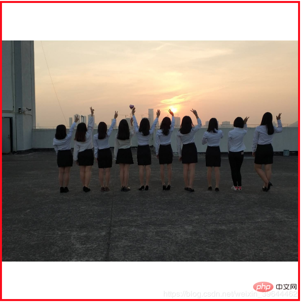
css video course
]The above is the detailed content of How to center and adapt images in css. For more information, please follow other related articles on the PHP Chinese website!

Hot AI Tools

Undresser.AI Undress
AI-powered app for creating realistic nude photos

AI Clothes Remover
Online AI tool for removing clothes from photos.

Undress AI Tool
Undress images for free

Clothoff.io
AI clothes remover

AI Hentai Generator
Generate AI Hentai for free.

Hot Article

Hot Tools

Notepad++7.3.1
Easy-to-use and free code editor

SublimeText3 Chinese version
Chinese version, very easy to use

Zend Studio 13.0.1
Powerful PHP integrated development environment

Dreamweaver CS6
Visual web development tools

SublimeText3 Mac version
God-level code editing software (SublimeText3)

Hot Topics
 How to draw a specific shape with an orange background color using CSS' clip-path property?
Apr 05, 2025 pm 04:36 PM
Practical application cases of CSS drawing function In modern web design, CSS can not only be used for layout and style, but also for creating complex graphics and animations. May...
 How to add loading animation to the a tag click and then jump?
Apr 05, 2025 pm 04:48 PM
Cleverly implementing the short animation and jump after clicking the a tag, many times, we hope that after clicking the a tag, the page can first display a short loading event...
 What are the encoded fonts used in the picture? How to apply this font style in a project?
Apr 05, 2025 pm 05:06 PM
Introduction and use of encoded fonts In programming and web design, choosing the right font can greatly improve the readability and aesthetics of the code. recent,...
 How to elegantly achieve high adaptability of the middle content in the three-line layout?
Apr 05, 2025 pm 04:39 PM
Discussion on the height of adaptive intermediate content in three-line layout In web layout, you often encounter the need to implement three-line layout and the intermediate content is highly variable...
 What is the
 What are the elements in CSS for? During the learning and using CSS, you may encounter some less common HTML elements, such as <...
 How to use locally installed 'Jingnanmai Round' on a web page without loading the font file?
Apr 05, 2025 pm 04:54 PM
How to use locally installed font files on web pages In web page development, sometimes we will encounter the situation where we need to use specific fonts installed on our computer...
 How to customize the hover effect of merge rows in el-table?
Apr 05, 2025 pm 06:54 PM
How to customize the hover effect of merge rows in el-table? Using Element...
 How to customize the hover effect of merged rows in el-table of Element UI?
Apr 05, 2025 pm 03:24 PM
How to customize the el-table merge hover effect when using Element...


