

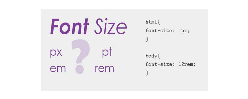
Should I use px or rem for web development?

px is a unit used for fixed size, mostly used for PC-side pages; while rem is a unit relative to the HTML root element, suitable for simple mobile-side pages. In the project, you still need to choose the most suitable length unit according to the specific development requirements
In front-end development, the length unit in CSS is essential, because many attributes in CSS need to rely on the length unit to display various page elements and effects. Next, we will introduce two commonly used length units, rem and px, in the article. I hope it will be helpful to everyone.
[Recommended course: CSS Tutorial】
px
px means pixels, which is relative to the monitor screen resolution. When setting the font size with px, the effect will be more stable and precise. However, there are some problems with using px, such as: IE browser cannot adjust the font size that uses px as the unit, so the page effect will change due to the device screen size
rem
rem is a new relative unit in CSS3. When using rem to set the font size for an element, it will be relative to the HTML root element. Through rem, we only need to modify the root element to adjust the size of all fonts proportionally, and at the same time, we can avoid the chain reaction of compounding font sizes layer by layer.
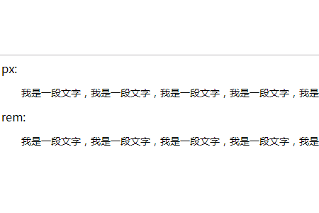
Example:
!DOCTYPE html>
<html>
<head>
<meta charset="UTF-8">
<title>Document</title>
</head>
<body>
<!-- 用px单位-->
px:<p style="font-size:14px; text-indent:28px">
我是一段文字,我是一段文字,我是一段文字,我是一段文字,我是一段文字,我是一段文字,我是一段文字</p>

<!-- 用rem单位,当前html的字体大小是16px-->
rem:<p style="font-size:14px; text-indent:1.75rem">
我是一段文字,我是一段文字,我是一段文字,我是一段文字,我是一段文字,我是一段文字,我是一段文字</p>
</body>
</html>
The rendering is as follows:
##How to choose px and rem
Reference for this article: https://www.html.cn/book/css/values/length/index.htm
The above is the detailed content of Should I use px or rem for web development?. For more information, please follow other related articles on the PHP Chinese website!

Hot AI Tools

Undresser.AI Undress
AI-powered app for creating realistic nude photos

AI Clothes Remover
Online AI tool for removing clothes from photos.

Undress AI Tool
Undress images for free

Clothoff.io
AI clothes remover

Video Face Swap
Swap faces in any video effortlessly with our completely free AI face swap tool!

Hot Article
Hot Tools

Notepad++7.3.1
Easy-to-use and free code editor

SublimeText3 Chinese version
Chinese version, very easy to use

Zend Studio 13.0.1
Powerful PHP integrated development environment

Dreamweaver CS6
Visual web development tools

SublimeText3 Mac version
God-level code editing software (SublimeText3)
Hot Topics


 What is REM (full name REMME)?
Feb 21, 2024 pm 05:00 PM
What is REM (full name REMME)?
Feb 21, 2024 pm 05:00 PM
What coin is REMME? REMME is a cryptocurrency based on blockchain technology dedicated to providing highly secure and decentralized network security and identity verification solutions. The project aims to use distributed encryption technology to enhance and simplify the user authentication process, thereby improving security and efficiency. The innovation of REMME is that it uses the immutability and transparency of the blockchain to provide users with a more reliable identity verification method. By storing authentication information on the blockchain, REMME eliminates the single point of failure of centralized authentication systems and reduces the risk of data theft or tampering. This blockchain-based authentication method is not only more secure and reliable, but also provides users with the background of REMME. In the current digital era, the network
 The evolution and application of CSS layout units: from pixels to relative units based on the font size of the root element
Jan 05, 2024 pm 05:41 PM
The evolution and application of CSS layout units: from pixels to relative units based on the font size of the root element
Jan 05, 2024 pm 05:41 PM
From px to rem: The evolution and application of CSS layout units Introduction: In front-end development, we often need to use CSS to implement page layout. Over the past few years, CSS layout units have evolved and developed. Initially we used pixels (px) as the unit to set the size and position of elements. However, with the rise of responsive design and the popularity of mobile devices, pixel units have gradually exposed some problems. In order to solve these problems, the new unit rem came into being and was gradually widely used in CSS layout. one
 CSS unit property optimization tips: em, rem, px and vw/vh
Oct 20, 2023 pm 12:54 PM
CSS unit property optimization tips: em, rem, px and vw/vh
Oct 20, 2023 pm 12:54 PM
CSS unit attribute optimization tips: em, rem, px and vw/vh Introduction: In web design and development, CSS unit attributes play a very important role. The correct selection and use of appropriate unit attributes can make the page display more beautiful and consistent on different devices and screen sizes. This article will introduce some commonly used CSS unit properties and provide specific code examples to help readers better master these optimization techniques. em unit: em unit is calculated relative to the font size of the parent element. For example
 Which units should be used to achieve the adaptive effect of responsive layout?
Jan 27, 2024 am 09:47 AM
Which units should be used to achieve the adaptive effect of responsive layout?
Jan 27, 2024 am 09:47 AM
In responsive layout, what kind of units are used to achieve adaptive effect? With the popularity of mobile devices and the emergence of screens of various sizes, responsive layout has become an important concept in modern web design and development. Through responsive layout, web pages can achieve adaptive effects on different devices and improve user experience. In the process of implementing responsive layout, it is very important to choose appropriate units for layout. This article will introduce some commonly used units and discuss their applicability in different scenarios. First, let’s discuss the most common
 What is the difference between px and em in html5
Aug 19, 2022 pm 05:36 PM
What is the difference between px and em in html5
Aug 19, 2022 pm 05:36 PM
Differences: 1. The unit length is different, px is the unit of digital image length, and em is a multiple of the character width; 2. The relative objects are different, px is relative to the monitor screen resolution, and em is relative to the font of the text in the current object. size. 3. The value of px is fixed, it is whatever you specify, and the calculation is easier; the value of em is not fixed, and em will inherit the font size of the parent element.
 Guide to CSS unit properties: em, rem, px and vw/vh
Oct 25, 2023 am 10:37 AM
Guide to CSS unit properties: em, rem, px and vw/vh
Oct 25, 2023 am 10:37 AM
Guide to CSS unit properties: em, rem, px and vw/vh When writing CSS styles, it is very important to choose the appropriate unit properties. This article will introduce several commonly used unit attributes: em, rem, px and vw/vh, and provide specific code examples. emem (font size unit) is a unit relative to the font size of the parent element. If the font size of the parent element is 16px, 1em is equal to 16px. When em is used for other attributes (such as width, height, etc.), it is also relative to the parent element
 How to solve the 1px pixel problem on Vue mobile terminal
Jun 30, 2023 pm 06:21 PM
How to solve the 1px pixel problem on Vue mobile terminal
Jun 30, 2023 pm 06:21 PM
How to solve the 1px pixel problem on the mobile side in Vue development. With the rapid development of the mobile Internet, the demand for mobile applications is increasing day by day. However, the diversity of mobile device screen sizes and pixel densities poses certain challenges for developers. One of the common problems is the 1px pixel problem on mobile. This article will introduce how to solve the 1px pixel problem on the mobile side in Vue development. The root of the problem The root of the 1px pixel problem on the mobile side lies in the mismatch between the physical pixels of the mobile device and the device-independent pixels. Device independent pixels (CSS like
 What are the commonly used CSS length units?
Feb 19, 2024 pm 09:10 PM
What are the commonly used CSS length units?
Feb 19, 2024 pm 09:10 PM
The most commonly used length units in CSS are pixels (px), percentages (%), and rem, em, vh, vw, pt, cm, mm, in, etc. These units can be used to set the element's width, height, border size, font size, etc. The pixel (px) unit is one of the most commonly used units. It is a fixed length unit calculated relative to the physical pixels of the electronic screen. Here is a code example: div{width:200px;heigh
