Bootstarp installation tutorial (detailed)
The content of this article is about the installation tutorial of Bootstarp (detailed). It has certain reference value. Friends in need can refer to it. I hope it will be helpful to you.
1. Installation
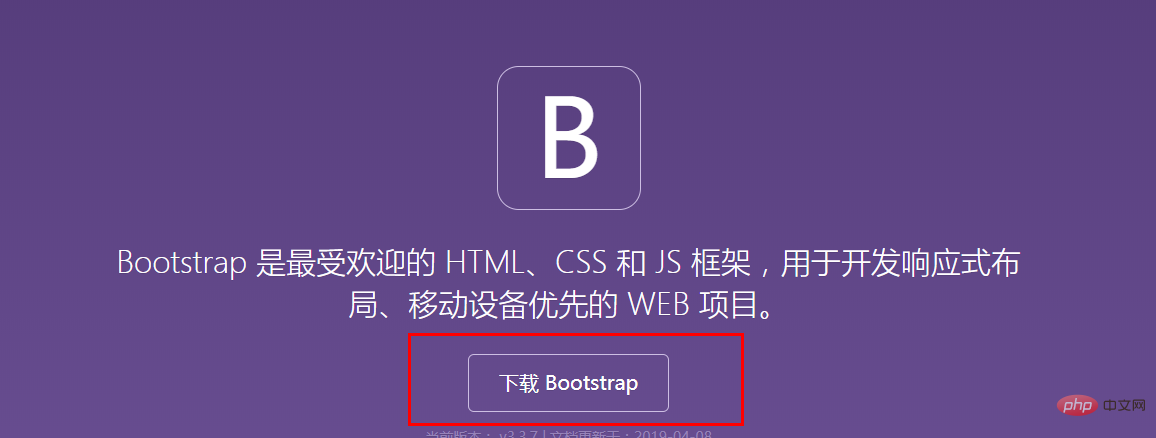
First open the official website of Bootstarp: https://v3.bootcss.com

After the download is completed, unzip it Compress the package and import the decompressed file into pycham
Import the bootstrap css file and js file in the style of the HTML page. It is recommended to import min.css, which will be smaller
Take my file path as an example:
<link rel="stylesheet" href="bootstrap/css/bootstrap.min.css">
<script src="bootstrap/js/bootstrap.js"></script>
Installation completed
##2. Change the default HTML page of pycharm (can be skipped)
Create a new HTML page in pycharm. If you still want to use Bootstarp, you can only re-import the above path
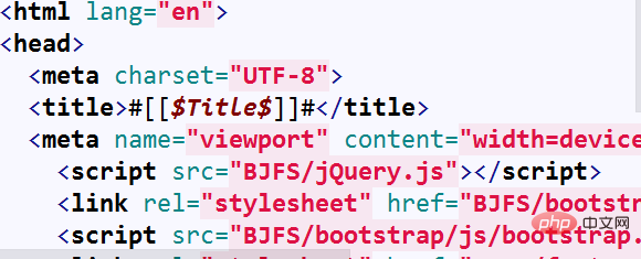
In order to avoid For repeated work, you can change the default HTML template
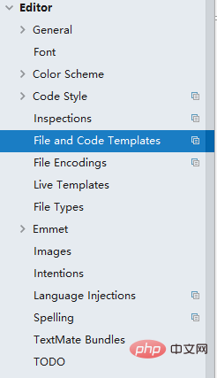
1. Open settings and find the following options


3. How to use Bootstarp:
1. Grid system
Important features of Bootstarp: Grid system
For the official explanation, please see the official website: https://v3.bootcss.com/css/#grid
My personal understanding is: within a container container, separated by lines, each line is divided into 12 units of length
//简单的模型
<div class='container'>
<div class='row'> </div>
<div class='row'> </div>
<div class='row'> </div>
</div>//c1中没有设置宽度,只设置了div的高度
<div class="container">
<div class="row">
<div class="c1 col-lg-1 ">1</div>
<div class="c1 col-lg-1 ">2</div>
<div class="c1 col-lg-1 ">3</div>
<div class="c1 col-lg-1 ">4</div>
<div class="c1 col-lg-1 ">5</div>
<div class="c1 col-lg-1 ">6</div>
<div class="c1 col-lg-1 ">7</div>
<div class="c1 col-lg-1 ">8</div>
<div class="c1 col-lg-1 ">9</div>
<div class="c1 col-lg-1 ">10</div>
<div class="c1 col-lg-1 ">11</div>
<div class="c1 col-lg-1 ">12</div>
<div class="c1 col-lg-1 ">13</div>
</div>
</div> .c1{
height: 50px;
background-color: red;
border: 1px black solid
}
<div class="container">
    <div class="row">
        <div class="c1 col-lg-3 ">1</div>
        <div class="c1 col-lg-3 ">2</div>
        <div class="c1 col-lg-3 ">3</div>
        <div class="c1 col-lg-3 ">4</div>

    </div>
</div>
There is another important point:
Each column of each row can be further divided The effect is as follows:
<div class="container">
    <div class="row">
       //在这个div里面进行切分
        <div class="c1 col-lg-3  row">
            <div class="c1 col-lg-4 "></div>
            <div class="c1 col-lg-4 "></div>
             <div class="c1 col-lg-4 "></div>
        </div>
       //结束
        <div class="c1 col-lg-3 ">2</div>
        <div class="c1 col-lg-3 ">3</div>
        <div class="c1 col-lg-3 ">4</div>

    </div>
</div>2. Obtaining components and various controls:
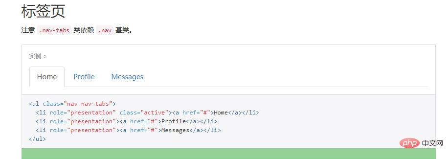
1. Get it by copying and pasting from the official website: (・´ω`・ )
 ##Copy the code directly and paste it where you need it
2. Developer mode:
F12 to enter developer mode (each browser may be different)

Whatever you like, select whatever you want. In the interface on the right, right-click copy->copy outHtml and import it into the HTML file
Okay Now, this component is yours
4. Check out the official website. . . .
Bootstarp has many components, which are introduced in detail on the official website. Please browse the official website.
The above is the detailed content of Bootstarp installation tutorial (detailed). For more information, please follow other related articles on the PHP Chinese website!

Hot AI Tools

Undresser.AI Undress
AI-powered app for creating realistic nude photos

AI Clothes Remover
Online AI tool for removing clothes from photos.

Undress AI Tool
Undress images for free

Clothoff.io
AI clothes remover

AI Hentai Generator
Generate AI Hentai for free.

Hot Article

Hot Tools

Notepad++7.3.1
Easy-to-use and free code editor

SublimeText3 Chinese version
Chinese version, very easy to use

Zend Studio 13.0.1
Powerful PHP integrated development environment

Dreamweaver CS6
Visual web development tools

SublimeText3 Mac version
God-level code editing software (SublimeText3)

Hot Topics
 Demystifying Screen Readers: Accessible Forms & Best Practices
Mar 08, 2025 am 09:45 AM
This is the 3rd post in a small series we did on form accessibility. If you missed the second post, check out "Managing User Focus with :focus-visible". In
 Create a JavaScript Contact Form With the Smart Forms Framework
Mar 07, 2025 am 11:33 AM
This tutorial demonstrates creating professional-looking JavaScript forms using the Smart Forms framework (note: no longer available). While the framework itself is unavailable, the principles and techniques remain relevant for other form builders.
 Adding Box Shadows to WordPress Blocks and Elements
Mar 09, 2025 pm 12:53 PM
The CSS box-shadow and outline properties gained theme.json support in WordPress 6.1. Let's look at a few examples of how it works in real themes, and what options we have to apply these styles to WordPress blocks and elements.
 Working With GraphQL Caching
Mar 19, 2025 am 09:36 AM
If you’ve recently started working with GraphQL, or reviewed its pros and cons, you’ve no doubt heard things like “GraphQL doesn’t support caching” or
 Making Your First Custom Svelte Transition
Mar 15, 2025 am 11:08 AM
The Svelte transition API provides a way to animate components when they enter or leave the document, including custom Svelte transitions.
 Classy and Cool Custom CSS Scrollbars: A Showcase
Mar 10, 2025 am 11:37 AM
In this article we will be diving into the world of scrollbars. I know, it doesn’t sound too glamorous, but trust me, a well-designed page goes hand-in-hand
 Show, Don't Tell
Mar 16, 2025 am 11:49 AM
How much time do you spend designing the content presentation for your websites? When you write a new blog post or create a new page, are you thinking about
 What the Heck Are npm Commands?
Mar 15, 2025 am 11:36 AM
npm commands run various tasks for you, either as a one-off or a continuously running process for things like starting a server or compiling code.


