
 Web Front-end
CSS Tutorial
How to implement CSS button? Introduction to several methods of CSS button implementation
Web Front-end
CSS Tutorial
How to implement CSS button? Introduction to several methods of CSS button implementation
How to implement CSS button? Introduction to several methods of CSS button implementation

In order to make the web page beautiful, sometimes we may need to implement button effects, so in this article we will introduce several implementation methods of CSS buttons. Friends in need can refer to them.
#The structure of all these buttons in this article only requires one anchor tag, since we will use the ::before pseudo-class to create the other elements.
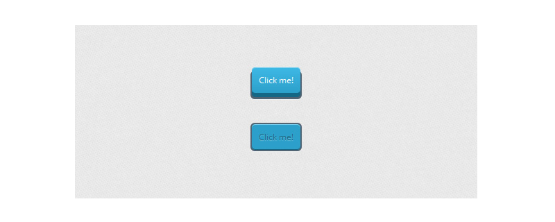
Example 1:
First, we will give the general style of the button, including its active state. It is important to pay attention to relative positioning as it will help us position the ::before element later:
CSS
.a_demo_one {
	background-color:#ba2323;
	padding:10px;
	position:relative;
	font-family: 'Open Sans', sans-serif;
	font-size:12px;
	text-decoration:none;
	color:#fff;
	border: solid 1px #831212;
	background-image: linear-gradient(bottom, rgb(171,27,27) 0%, rgb(212,51,51) 100%);
	border-radius: 5px;
}

.a_demo_one:active {
	padding-bottom:9px;
	padding-left:10px;
	padding-right:10px;
	padding-top:11px;
	top:1px;
	background-image: linear-gradient(bottom, rgb(171,27,27) 100%, rgb(212,51,51) 0%);
}Then, we create the gray container using the ::before pseudo-element. Use absolute positioning to position our elements:
CSS
.a_demo_one::before {
	background-color:#ccd0d5;
	content:"";
	display:block;
	position:absolute;
	width:100%;
	height:100%;
	padding:8px;
	left:-8px;
	top:-8px;
	z-index:-1;
	border-radius: 5px;
	box-shadow: inset 0px 1px 1px #909193, 0px 1px 0px #fff;
}Example 2:
CSS
.a_demo_two {
	background-color:#6fba26;
	padding:10px;
	position:relative;
	font-family: 'Open Sans', sans-serif;
	font-size:12px;
	text-decoration:none;
	color:#fff;
	background-image: linear-gradient(bottom, rgb(100,170,30) 0%, rgb(129,212,51) 100%);
	box-shadow: inset 0px 1px 0px #b2f17f, 0px 6px 0px #3d6f0d;
	border-radius: 5px;
}

.a_demo_two:active {
	top:7px;
	background-image: linear-gradient(bottom, rgb(100,170,30) 100%, rgb(129,212,51) 0%);
	box-shadow: inset 0px 1px 0px #b2f17f, inset 0px -1px 0px #3d6f0d;
	color: #156785;
	text-shadow: 0px 1px 1px rgba(255,255,255,0.3);
	background: rgb(44,160,202);
}Due to pseudo elements The position of the element depends on its parent element, so once the parent element is moved down a few pixels, the pseudo element with the same number of pixels must be moved up.
CSS
.a_demo_two::before {
	background-color:#072239;
	content:"";
	display:block;
	position:absolute;
	width:100%;
	height:100%;
	padding-left:2px;
	padding-right:2px;
	padding-bottom:4px;
	left:-2px;
	top:5px;
	z-index:-1;
	border-radius: 6px;
	box-shadow: 0px 1px 0px #fff;
}

.a_demo_two:active::before {
	top:-2px;
}Example 3:
The first thing we need to do is create the simple part. Here you'll notice a right margin, this is to compensate for the width of the pseudo element if you want the button to be centered.
.a_demo_three {
	background-color:#3bb3e0;
	font-family: 'Open Sans', sans-serif;
	font-size:12px;
	text-decoration:none;
	color:#fff;
	position:relative;
	padding:10px 20px;
	border-left:solid 1px #2ab7ec;
	margin-left:35px;
	background-image: linear-gradient(bottom, rgb(44,160,202) 0%, rgb(62,184,229) 100%);
	border-top-right-radius: 5px;
	border-bottom-right-radius: 5px;
	box-shadow: inset 0px 1px 0px #2ab7ec, 0px 5px 0px 0px #156785, 0px 10px 5px #999;
}

.a_demo_three:active {
	top:3px;
	background-image: linear-gradient(bottom, rgb(62,184,229) 0%, rgb(44,160,202) 100%);
	box-shadow: inset 0px 1px 0px #2ab7ec, 0px 2px 0px 0px #156785, 0px 5px 3px #999;
}Then there are pseudo elements:
.a_demo_three::before {
	content:"·";
	width:35px;
	max-height:29px;
	height:100%;
	position:absolute;
	display:block;
	padding-top:8px;
	top:0px;
	left:-36px;
	font-size:16px;
	font-weight:bold;
	color:#8fd1ea;
	text-shadow:1px 1px 0px #07526e;
	border-right:solid 1px #07526e;
	background-image: linear-gradient(bottom, rgb(10,94,125) 0%, rgb(14,139,184) 100%);
	border-top-left-radius: 5px;
	border-bottom-left-radius: 5px;
	box-shadow:inset 0px 1px 0px #2ab7ec, 0px 5px 0px 0px #032b3a, 0px 10px 5px #999 ;
}

.a_demo_three:active::before {
	top:-3px;
	box-shadow:inset 0px 1px 0px #2ab7ec, 0px 5px 0px 0px #032b3a, 1px 1px 0px 0px #044a64, 2px 2px 0px 0px #044a64, 2px 5px 0px 0px #044a64, 6px 4px 2px #0b698b, 0px 10px 5px #999 ;
}This article is all over here. For more exciting content, you can pay attention to the CSS video tutorial on the PHP Chinese website. Column! ! !
The above is the detailed content of How to implement CSS button? Introduction to several methods of CSS button implementation. For more information, please follow other related articles on the PHP Chinese website!

Hot AI Tools

Undresser.AI Undress
AI-powered app for creating realistic nude photos

AI Clothes Remover
Online AI tool for removing clothes from photos.

Undress AI Tool
Undress images for free

Clothoff.io
AI clothes remover

Video Face Swap
Swap faces in any video effortlessly with our completely free AI face swap tool!

Hot Article
Hot Tools

Notepad++7.3.1
Easy-to-use and free code editor

SublimeText3 Chinese version
Chinese version, very easy to use

Zend Studio 13.0.1
Powerful PHP integrated development environment

Dreamweaver CS6
Visual web development tools

SublimeText3 Mac version
God-level code editing software (SublimeText3)
Hot Topics
 1386
1386
 52
52

 Working With GraphQL Caching
Mar 19, 2025 am 09:36 AM
Working With GraphQL Caching
Mar 19, 2025 am 09:36 AM
If you’ve recently started working with GraphQL, or reviewed its pros and cons, you’ve no doubt heard things like “GraphQL doesn’t support caching” or
 Building an Ethereum app using Redwood.js and Fauna
Mar 28, 2025 am 09:18 AM
Building an Ethereum app using Redwood.js and Fauna
Mar 28, 2025 am 09:18 AM
With the recent climb of Bitcoin’s price over 20k $USD, and to it recently breaking 30k, I thought it’s worth taking a deep dive back into creating Ethereum
 Vue 3
Apr 02, 2025 pm 06:32 PM
Vue 3
Apr 02, 2025 pm 06:32 PM
It's out! Congrats to the Vue team for getting it done, I know it was a massive effort and a long time coming. All new docs, as well.
 Can you get valid CSS property values from the browser?
Apr 02, 2025 pm 06:17 PM
Can you get valid CSS property values from the browser?
Apr 02, 2025 pm 06:17 PM
I had someone write in with this very legit question. Lea just blogged about how you can get valid CSS properties themselves from the browser. That's like this.
 A bit on ci/cd
Apr 02, 2025 pm 06:21 PM
A bit on ci/cd
Apr 02, 2025 pm 06:21 PM
I'd say "website" fits better than "mobile app" but I like this framing from Max Lynch:
 Using Markdown and Localization in the WordPress Block Editor
Apr 02, 2025 am 04:27 AM
Using Markdown and Localization in the WordPress Block Editor
Apr 02, 2025 am 04:27 AM
If we need to show documentation to the user directly in the WordPress editor, what is the best way to do it?
 Comparing Browsers for Responsive Design
Apr 02, 2025 pm 06:25 PM
Comparing Browsers for Responsive Design
Apr 02, 2025 pm 06:25 PM
There are a number of these desktop apps where the goal is showing your site at different dimensions all at the same time. So you can, for example, be writing
 Stacked Cards with Sticky Positioning and a Dash of Sass
Apr 03, 2025 am 10:30 AM
Stacked Cards with Sticky Positioning and a Dash of Sass
Apr 03, 2025 am 10:30 AM
The other day, I spotted this particularly lovely bit from Corey Ginnivan’s website where a collection of cards stack on top of one another as you scroll.
