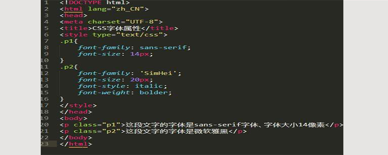
When writing code, choose those letters with consistent width; clear and regular outlines; l, 1, i are easy to distinguish, 0, o, O are easy to distinguish; the best is the font that can clearly distinguish punctuation marks, such as MONACO font Wait
For many programmers, the code written in some fonts not only looks pleasing to the eye, but is also very convenient when writing code. However, many programmers use the default font of the editor. The code written in this way is not only the same, but also boring. Let’s take a look at which fonts produce more beautiful code and which fonts are more suitable for writing code!

The width of the letters is the same
is also called a fixed-width font. Since the code file is ordinary text without styles, the same width is easy to arrange and align, and the position can be quickly found to improve readability.
In typography, this kind of monospaced font is called monospaced font. It is a large classification (family) of fonts, such as the common Courier and Courier New. Considering the current multi-language environment, in different systems, this font must be mapped to different specific fonts in different character sets. For example, our system generally maps Chinese to "Song Ti".
Clear outlines and rules
Only with clear and regular shapes can different characters be quickly distinguished, and it is not easy to feel tired after long readings
What I want to say here is that there are differences in font size between Westerners and Easterners. I know some foreigners who like to use 10px fonts to display codes when writing programs, and the screen resolution used is still very high. This is because their text is alphabetic, with less detail on each letter, and using small fonts allows more to be displayed on one screen. Therefore, use clear and regular fonts. Even if the font size is small, it can still be quickly distinguished on the screen.
l, 1, i are easy to distinguish, 0, o, O are easy to distinguish
The first three are lowercase L, the number 1 and the lowercase I, the last The three are the number 0, lowercase o and uppercase O. These letters are often easily confused in code.
For example, in C-style code, long integer numbers should be represented by adding the suffix L after the number, like "111111111111L". Generally, we recommend using uppercase "L" to prevent confusion. And if the three letters in the font can be easily distinguished, then even if we mistakenly type a lowercase l, there will be no confusion.
Clear and easy-to-distinguish punctuation
Punctuation also plays a very important part in the code. If a font cannot distinguish commas "," and periods ". ", ":" and ";", then it cannot be said to be a good font. Similarly, "`" "'" is also best in the form of matching, which is often used in some programming.
Which font to choose
宋体
Courier New
This font is also included in every Windows. The font is very beautiful. Apart from the difference of o O 0, it is also used by many people in programming.Bitstream Vera Sans Mono
Finally I would like to recommend Bitstream Vera Sans Mono to everyone, and its derivative font DejaVu Sans Mono - DejaVu extends some Unicode character. This is also a font recommended by many developers. In addition to fully meeting all the conditions mentioned above, it is also a TTF font. The basic font is sans-serif, suitable for screen reading. The most important thing is that it is an open source font. !Consolas
Microsoft's newly developed font, included in Vista, Office2007, and Visual Studio 2005. Since it is produced by MS, it will definitely work best under ClearType. However, the installation package on the official website is very cumbersome, and you need to install .net framework 3.5 first.MONACO
I believe that many programmers love to use this font without the editor introducing it.The above is the detailed content of What font is good to use when writing code?. For more information, please follow other related articles on the PHP Chinese website!