
Definition and Usage
The transform-origin attribute allows you to change the position of the element being transformed.
2D transform elements can change the x and y axes of the element. 3D transform elements can also change their Z-axis.
Note: This attribute must be used together with the transform attribute.
Example
Set the base point position of the rotated element:
div
{
transform: rotate(45deg);
transform-origin:20% 40%;

-ms-transform: rotate(45deg); 		/* IE 9 */
-ms-transform-origin:20% 40%; 		/* IE 9 */

-webkit-transform: rotate(45deg);	/* Safari 和 Chrome */
-webkit-transform-origin:20% 40%;	/* Safari 和 Chrome */

-moz-transform: rotate(45deg);		/* Firefox */
-moz-transform-origin:20% 40%;		/* Firefox */

-o-transform: rotate(45deg);		/* Opera */
-o-transform-origin:20% 40%;		/* Opera */
}Syntax
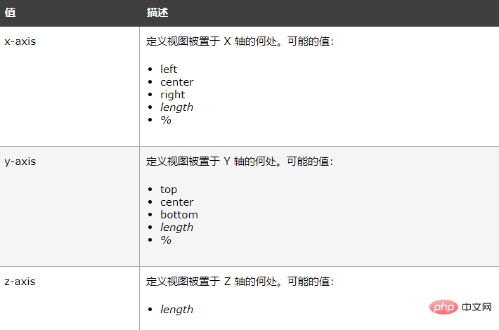
transform-origin: x-axis y-axis z-axis;

The above is the detailed content of How to use css transform-origin attribute. For more information, please follow other related articles on the PHP Chinese website!
 Features of ruby language
 What to do if the web page cannot be accessed
 How to add css style to html
 Why is my phone not turned off but when someone calls me it prompts me to turn it off?
 Detailed process of upgrading win7 system to win10 system
 How to open csv format file
 The difference between threads and processes
 Delete exif information