

How to use css border-style property

The border-style attribute is used to set the style of the element border. You can set the style for the four borders of an element at the same time, or set the border style for each side individually. The border may appear only if the value of this property is not none.
How to use the css border-style property?
The border-style attribute is used to set the style of all borders of an element, or to set the border style for each side individually. It can have one to four values, for example:
p.one {border-style:dotted dashed solid double;}
p.two {border-style:dotted solid double;}
p.three {border-style:dotted solid;}
p.four {border-style:dotted;}Rendering:
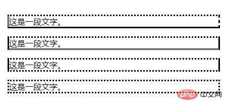
##Explanation: Only when this value is not none The border may appear.
Attribute values that can be set:
none: Define no border. hidden: Same as "none". Except when applied to tables, for which hidden is used to resolve border conflicts. dotted: Define dotted border. Renders as a solid line in most browsers. dashed: Define dashed line. Renders as a solid line in most browsers. solid: Define a solid line. double: Define double lines. The width of the double line is equal to the value of border-width. groove: Define the 3D groove border. The effect depends on the value of border-color. ridge: Define the 3D ridge border. The effect depends on the value of border-color. inset: Define the 3D inset border. The effect depends on the value of border-color. outset: Define the 3D outset border. The effect depends on the value of border-color. inherit: Specifies that the border style should be inherited from the parent element.Note: Any version of Internet Explorer (including IE8) does not support the attribute value "inherit" or "hidden".
css border-style property example
<!DOCTYPE html>
<html>
<head>
<meta charset="utf-8">
<style>
p.none {border-style:none;}
p.dotted {border-style:dotted;}
p.dashed {border-style:dashed;}
p.solid {border-style:solid;}
p.double {border-style:double;}
p.groove {border-style:groove;}
p.ridge {border-style:ridge;}
p.inset {border-style:inset;}
p.outset {border-style:outset;}
p.hidden {border-style:hidden;}
</style>
</head>
<body>
<p class="none">无边框。</p>
<p class="dotted">虚线边框。</p>
<p class="dashed">虚线边框。</p>
<p class="solid">实线边框。</p>
<p class="double">双边框。</p>
<p class="groove"> 凹槽边框。</p>
<p class="ridge">垄状边框。</p>
<p class="inset">嵌入边框。</p>
<p class="outset">外凸边框。</p>
<p class="hidden">隐藏边框。</p>
</body>
</html>
The above is the detailed content of How to use css border-style property. For more information, please follow other related articles on the PHP Chinese website!

Hot AI Tools

Undresser.AI Undress
AI-powered app for creating realistic nude photos

AI Clothes Remover
Online AI tool for removing clothes from photos.

Undress AI Tool
Undress images for free

Clothoff.io
AI clothes remover

AI Hentai Generator
Generate AI Hentai for free.

Hot Article
Hot Tools

Notepad++7.3.1
Easy-to-use and free code editor

SublimeText3 Chinese version
Chinese version, very easy to use

Zend Studio 13.0.1
Powerful PHP integrated development environment

Dreamweaver CS6
Visual web development tools

SublimeText3 Mac version
God-level code editing software (SublimeText3)
Hot Topics
 1376
1376
 52
52

 How to use bootstrap button
Apr 07, 2025 pm 03:09 PM
How to use bootstrap button
Apr 07, 2025 pm 03:09 PM
How to use the Bootstrap button? Introduce Bootstrap CSS to create button elements and add Bootstrap button class to add button text
 How to resize bootstrap
Apr 07, 2025 pm 03:18 PM
How to resize bootstrap
Apr 07, 2025 pm 03:18 PM
To adjust the size of elements in Bootstrap, you can use the dimension class, which includes: adjusting width: .col-, .w-, .mw-adjust height: .h-, .min-h-, .max-h-
 How to view the date of bootstrap
Apr 07, 2025 pm 03:03 PM
How to view the date of bootstrap
Apr 07, 2025 pm 03:03 PM
Answer: You can use the date picker component of Bootstrap to view dates in the page. Steps: Introduce the Bootstrap framework. Create a date selector input box in HTML. Bootstrap will automatically add styles to the selector. Use JavaScript to get the selected date.
 How to insert pictures on bootstrap
Apr 07, 2025 pm 03:30 PM
How to insert pictures on bootstrap
Apr 07, 2025 pm 03:30 PM
There are several ways to insert images in Bootstrap: insert images directly, using the HTML img tag. With the Bootstrap image component, you can provide responsive images and more styles. Set the image size, use the img-fluid class to make the image adaptable. Set the border, using the img-bordered class. Set the rounded corners and use the img-rounded class. Set the shadow, use the shadow class. Resize and position the image, using CSS style. Using the background image, use the background-image CSS property.
 How to write split lines on bootstrap
Apr 07, 2025 pm 03:12 PM
How to write split lines on bootstrap
Apr 07, 2025 pm 03:12 PM
There are two ways to create a Bootstrap split line: using the tag, which creates a horizontal split line. Use the CSS border property to create custom style split lines.
 How to set up the framework for bootstrap
Apr 07, 2025 pm 03:27 PM
How to set up the framework for bootstrap
Apr 07, 2025 pm 03:27 PM
To set up the Bootstrap framework, you need to follow these steps: 1. Reference the Bootstrap file via CDN; 2. Download and host the file on your own server; 3. Include the Bootstrap file in HTML; 4. Compile Sass/Less as needed; 5. Import a custom file (optional). Once setup is complete, you can use Bootstrap's grid systems, components, and styles to create responsive websites and applications.
 How to verify bootstrap date
Apr 07, 2025 pm 03:06 PM
How to verify bootstrap date
Apr 07, 2025 pm 03:06 PM
To verify dates in Bootstrap, follow these steps: Introduce the required scripts and styles; initialize the date selector component; set the data-bv-date attribute to enable verification; configure verification rules (such as date formats, error messages, etc.); integrate the Bootstrap verification framework and automatically verify date input when form is submitted.
 How to set the bootstrap navigation bar
Apr 07, 2025 pm 01:51 PM
How to set the bootstrap navigation bar
Apr 07, 2025 pm 01:51 PM
Bootstrap provides a simple guide to setting up navigation bars: Introducing the Bootstrap library to create navigation bar containers Add brand identity Create navigation links Add other elements (optional) Adjust styles (optional)
