Matplotlib is a Python 2D plotting library that can produce publication-quality graphics in a variety of hardcopy formats and interactive environments on a variety of platforms.

In the previous article we explained How to install the Matplotlib library. In this tutorial, we will discuss the legend, title and label in Matplotlib. Many times, graphs can be self-explanatory, but it is essential that the graph has a title, labels on the axes, and a legend to explain what each row is.
Note: Axes is the area surrounded by two coordinate axes.
Start here:
import matplotlib.pyplot as plt
x = [1,2,3]
y = [5,7,4]
x2 = [1,2,3]
y2 = [10,14,12]
So we can draw two lines, next:
plt.plot(x, y, label='First Line')
plt.plot(x2, y2, label='Second Line')
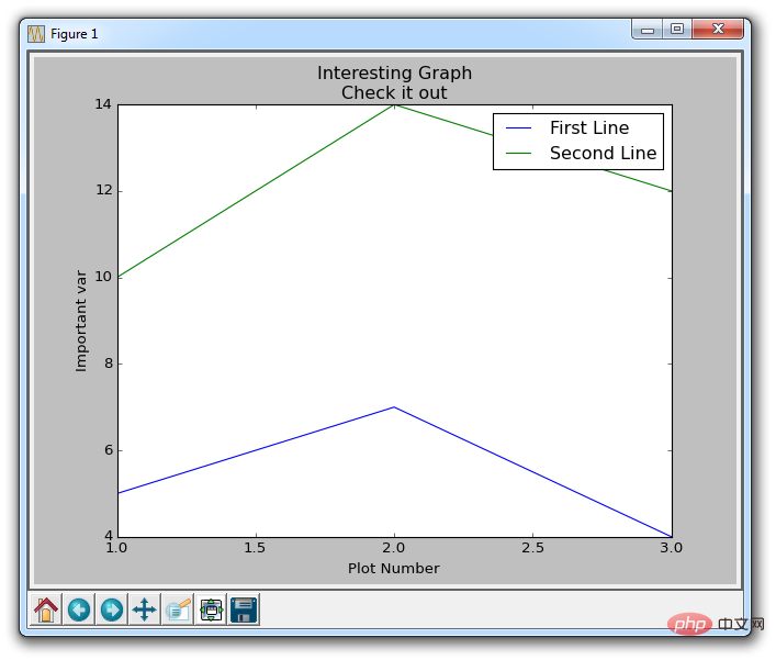
Here we draw what we have already seen stuff, but this time we add another parameter label. This allows us to give the line a name, which we can later display in the legend. The rest of our code is:
plt.xlabel('Plot Number')
plt.ylabel('Important var')
plt.title('Interesting Graph\nCheck it out')
plt.legend()
plt.show()
Using plt.xlabel and plt.ylabel we can create labels for these corresponding axes. Next, we can use plt.title to create a title for the figure, and then we can use plt.legend() to generate a default legend. The results are as follows:

The above is the detailed content of Introduction to legends, titles and labels of the python-based 2D image gallery Matplotlib. For more information, please follow other related articles on the PHP Chinese website!