

第 27 章 CSS 传统布局[上] - 水之原

学习要点:
1.布局模型
2.表格布局
3.浮动布局
主讲教师:李炎恢
本章主要探讨 HTML5 中 CSS 早期所使用的传统布局,很多情况下,这些布局方式还是非常有用的。
一.布局模型
在早期没有平板和智能手机等移动设备大行其道的时期,Web 页面的设计主要是面向 PC 端电脑分辨率展开的。这种分辨率比例比较单一,基本上只要满足最低分辨率设计即可。一般来说有 4:3、16:10、16:9 这样的主要分辨率。那么,从这种比例上来看,长度总是大于宽度的。从最低分辨率 1024 * 768 设计即可。为了使浏览器底部不出现滚动条,需要减去适当的宽度,比如减去 28,最终固定长度设置为 996 即可。当然,也有一些网站在近两年讲最低分辨率设置为 1280 减去滚动条宽度,因为大显示器逐步主流。
除了刚才所说的固定长度的布局,还有一种是流体布局,就是布局的长度为百分比,比如 100%。不管你是什么分辨率,它都能全屏显示,当然,局限性也特别大,只适合一些单一页面,复杂的页面,会随着不同浏览器产生各种阅读障碍。
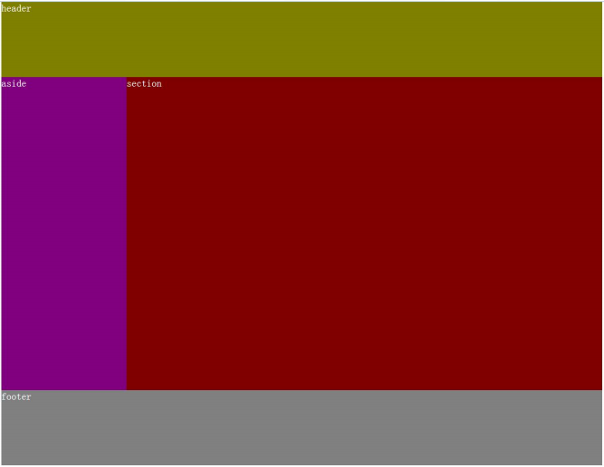
我们创建一个三行两列模型。并采用表格布局和浮动布局,构建固定和流体布局的方式,模型图如下:
二.表格布局
表格布局,就是通过设定固定的单元格,去除表格边框和填充实现的布局。当然这个布局非常不建议使用,只是教学了解。表格应该用它最为语义的地方,就是二维表的数据显示。
1.固定布局
//HTML 部分
<span style="color: #0000ff;"><span style="color: #800000;">table </span><span style="color: #ff0000;">border</span><span style="color: #0000ff;">="0"</span><span style="color: #0000ff;">></span>
    <span style="color: #0000ff;"><span style="color: #800000;">tr</span><span style="color: #0000ff;">></span>
        <span style="color: #0000ff;"><span style="color: #800000;">td </span><span style="color: #ff0000;">colspan</span><span style="color: #0000ff;">="2"</span><span style="color: #ff0000;"> class</span><span style="color: #0000ff;">="header"</span><span style="color: #0000ff;">></span>header<span style="color: #0000ff;"></span><span style="color: #800000;">td</span><span style="color: #0000ff;">></span>
    <span style="color: #0000ff;"></span><span style="color: #800000;">tr</span><span style="color: #0000ff;">></span>
    <span style="color: #0000ff;"><span style="color: #800000;">tr</span><span style="color: #0000ff;">></span>
        <span style="color: #0000ff;"><span style="color: #800000;">td </span><span style="color: #ff0000;">class</span><span style="color: #0000ff;">="aside"</span><span style="color: #0000ff;">></span>aside<span style="color: #0000ff;"></span><span style="color: #800000;">td</span><span style="color: #0000ff;">></span>
        <span style="color: #0000ff;"><span style="color: #800000;">td </span><span style="color: #ff0000;">class</span><span style="color: #0000ff;">="section"</span><span style="color: #0000ff;">></span>section<span style="color: #0000ff;"></span><span style="color: #800000;">td</span><span style="color: #0000ff;">></span>
    <span style="color: #0000ff;"></span><span style="color: #800000;">tr</span><span style="color: #0000ff;">></span>
    <span style="color: #0000ff;"><span style="color: #800000;">tr</span><span style="color: #0000ff;">></span>
        <span style="color: #0000ff;"><span style="color: #800000;">td </span><span style="color: #ff0000;">colspan</span><span style="color: #0000ff;">="2"</span><span style="color: #ff0000;"> class</span><span style="color: #0000ff;">="footer"</span><span style="color: #0000ff;">></span>footer<span style="color: #0000ff;"></span><span style="color: #800000;">td</span><span style="color: #0000ff;">></span>
    <span style="color: #0000ff;"></span><span style="color: #800000;">tr</span><span style="color: #0000ff;">></span>
<span style="color: #0000ff;"></span><span style="color: #800000;">table</span><span style="color: #0000ff;">></span></span></span></span></span></span></span></span></span>//CSS 部分
<span style="color: #800000;">body </span>{<span style="color: #ff0000;">
    margin</span>:<span style="color: #0000ff;"> 0</span>;
}<span style="color: #800000;">

table </span>{<span style="color: #ff0000;">
    margin</span>:<span style="color: #0000ff;"> 0 auto</span>;<span style="color: #ff0000;">
    width</span>:<span style="color: #0000ff;"> 960px</span>;<span style="color: #ff0000;">
    border-spacing</span>:<span style="color: #0000ff;"> 0</span>;
}<span style="color: #800000;">

.header </span>{<span style="color: #ff0000;">
    height</span>:<span style="color: #0000ff;"> 120px</span>;
}<span style="color: #800000;">

.aside </span>{<span style="color: #ff0000;">
    width</span>:<span style="color: #0000ff;"> 200px</span>;<span style="color: #ff0000;">
    height</span>:<span style="color: #0000ff;"> 500px</span>;
}<span style="color: #800000;">

.section </span>{<span style="color: #ff0000;">
    width</span>:<span style="color: #0000ff;"> 760px</span>;<span style="color: #ff0000;">
    height</span>:<span style="color: #0000ff;"> 500px</span>;
}<span style="color: #800000;">

.footer </span>{<span style="color: #ff0000;">
    height</span>:<span style="color: #0000ff;"> 120px</span>;
}2.流体布局
表格的固定布局改成流体布局非常简单,只需要设置 table 为 100%即可。
//修改 table
<span style="color: #800000;">table </span>{<span style="color: #ff0000;">
    width</span>:<span style="color: #0000ff;"> 100%</span>;
}
三.浮动布局
浮动布局主要采用 float 和 clear 两个属性来构建。
1.固定布局
//HTML 部分
<span style="color: #0000ff;"><span style="color: #800000;">header</span><span style="color: #0000ff;">></span><span style="color: #000000;">
    header
</span><span style="color: #0000ff;"></span><span style="color: #800000;">header</span><span style="color: #0000ff;">></span>

<span style="color: #0000ff;"><span style="color: #800000;">aside</span><span style="color: #0000ff;">></span><span style="color: #000000;">
    aside
</span><span style="color: #0000ff;"></span><span style="color: #800000;">aside</span><span style="color: #0000ff;">></span>

<span style="color: #0000ff;"><span style="color: #800000;">section</span><span style="color: #0000ff;">></span><span style="color: #000000;">
    section
</span><span style="color: #0000ff;"></span><span style="color: #800000;">section</span><span style="color: #0000ff;">></span>

<span style="color: #0000ff;"><span style="color: #800000;">footer</span><span style="color: #0000ff;">></span><span style="color: #000000;">
    footer
</span><span style="color: #0000ff;"></span><span style="color: #800000;">footer</span><span style="color: #0000ff;">></span></span></span></span></span>//CSS 部分
<span style="color: #800000;">body </span>{<span style="color: #ff0000;">
    width</span>:<span style="color: #0000ff;"> 960px</span>;<span style="color: #ff0000;">
    margin</span>:<span style="color: #0000ff;"> 0 auto</span>;<span style="color: #ff0000;">
    color</span>:<span style="color: #0000ff;"> white</span>;
}<span style="color: #800000;">

header </span>{<span style="color: #ff0000;">
    height</span>:<span style="color: #0000ff;"> 120px</span>;
}<span style="color: #800000;">

aside </span>{<span style="color: #ff0000;">
    width</span>:<span style="color: #0000ff;"> 200px</span>;<span style="color: #ff0000;">
    height</span>:<span style="color: #0000ff;"> 500px</span>;<span style="color: #ff0000;">
    float</span>:<span style="color: #0000ff;"> left</span>;
}<span style="color: #800000;">

section </span>{<span style="color: #ff0000;">
    width</span>:<span style="color: #0000ff;"> 760px</span>;<span style="color: #ff0000;">
    height</span>:<span style="color: #0000ff;"> 500px</span>;<span style="color: #ff0000;">
    float</span>:<span style="color: #0000ff;"> right</span>;
}<span style="color: #800000;">

footer </span>{<span style="color: #ff0000;">
    height</span>:<span style="color: #0000ff;"> 120px</span>;<span style="color: #ff0000;">
    clear</span>:<span style="color: #0000ff;"> both</span>;
}2.流体布局
流体布局只要更改 body 元素的限定长度为 auto 或 100%。然后左右两列分别设置 20% 和 80%即可。
//CSS 部分
<span style="color: #800000;">body </span>{<span style="color: #ff0000;">
    width</span>:<span style="color: #0000ff;"> auto</span>;
}<span style="color: #800000;">

aside </span>{<span style="color: #ff0000;">
    width</span>:<span style="color: #0000ff;"> 20%</span>;
}<span style="color: #800000;">

section </span>{<span style="color: #ff0000;">
    width</span>:<span style="color: #0000ff;"> 80%</span>;
}<span style="font-family: verdana, Arial, Helvetica, sans-serif; font-size: 14px; line-height: 1.5; background-color: #ffffff;"> </span>
Hot AI Tools

Undresser.AI Undress
AI-powered app for creating realistic nude photos

AI Clothes Remover
Online AI tool for removing clothes from photos.

Undress AI Tool
Undress images for free

Clothoff.io
AI clothes remover

AI Hentai Generator
Generate AI Hentai for free.

Hot Article
Hot Tools

Notepad++7.3.1
Easy-to-use and free code editor

SublimeText3 Chinese version
Chinese version, very easy to use

Zend Studio 13.0.1
Powerful PHP integrated development environment

Dreamweaver CS6
Visual web development tools

SublimeText3 Mac version
God-level code editing software (SublimeText3)
Hot Topics
 1378
1378
 52
52

 What is the purpose of the <progress> element?
Mar 21, 2025 pm 12:34 PM
What is the purpose of the <progress> element?
Mar 21, 2025 pm 12:34 PM
The article discusses the HTML <progress> element, its purpose, styling, and differences from the <meter> element. The main focus is on using <progress> for task completion and <meter> for stati
 What is the purpose of the <datalist> element?
Mar 21, 2025 pm 12:33 PM
What is the purpose of the <datalist> element?
Mar 21, 2025 pm 12:33 PM
The article discusses the HTML <datalist> element, which enhances forms by providing autocomplete suggestions, improving user experience and reducing errors.Character count: 159
 What are the best practices for cross-browser compatibility in HTML5?
Mar 17, 2025 pm 12:20 PM
What are the best practices for cross-browser compatibility in HTML5?
Mar 17, 2025 pm 12:20 PM
Article discusses best practices for ensuring HTML5 cross-browser compatibility, focusing on feature detection, progressive enhancement, and testing methods.
 What is the purpose of the <meter> element?
Mar 21, 2025 pm 12:35 PM
What is the purpose of the <meter> element?
Mar 21, 2025 pm 12:35 PM
The article discusses the HTML <meter> element, used for displaying scalar or fractional values within a range, and its common applications in web development. It differentiates <meter> from <progress> and ex
 How do I use HTML5 form validation attributes to validate user input?
Mar 17, 2025 pm 12:27 PM
How do I use HTML5 form validation attributes to validate user input?
Mar 17, 2025 pm 12:27 PM
The article discusses using HTML5 form validation attributes like required, pattern, min, max, and length limits to validate user input directly in the browser.
 What is the viewport meta tag? Why is it important for responsive design?
Mar 20, 2025 pm 05:56 PM
What is the viewport meta tag? Why is it important for responsive design?
Mar 20, 2025 pm 05:56 PM
The article discusses the viewport meta tag, essential for responsive web design on mobile devices. It explains how proper use ensures optimal content scaling and user interaction, while misuse can lead to design and accessibility issues.
 What is the purpose of the <iframe> tag? What are the security considerations when using it?
Mar 20, 2025 pm 06:05 PM
What is the purpose of the <iframe> tag? What are the security considerations when using it?
Mar 20, 2025 pm 06:05 PM
The article discusses the <iframe> tag's purpose in embedding external content into webpages, its common uses, security risks, and alternatives like object tags and APIs.
 Gitee Pages static website deployment failed: How to troubleshoot and resolve single file 404 errors?
Apr 04, 2025 pm 11:54 PM
Gitee Pages static website deployment failed: How to troubleshoot and resolve single file 404 errors?
Apr 04, 2025 pm 11:54 PM
GiteePages static website deployment failed: 404 error troubleshooting and resolution when using Gitee...
