

How to sort by clicking on the table header in bootstrap

Using Bootstrap, you can quickly create responsive web pages. Sometimes in projects, Bootstrap is used to click on the header column of the table to achieve ascending and descending sorting. This article records Bootstrap in detail table implements the steps to sort the column headers at the top of the table header field in ascending and descending order.
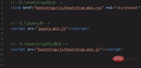
1. Introduce Bootstrap.
Download the latest version of the Bootstrap framework from the Bootstrap official website and introduce the CSS styles and js scripts used in the project.
Among them, there are three basic files that must be introduced:
①bootstrap.min.css
②jquery.min.js
③bootstrap.min. js
Note that ② must be introduced before ③ because the bootstrap script relies on the jQuery library.
#2. Introduce the DataTables plug-in.
Since the function we want to implement is to click on the Bootstrap table header column header to switch ascending and descending order, so we selected this excellent table view plug-in during the development process.
To use DataTables in the project, you only need to introduce three files:
①jQuery
②DataTables.js
③DataTables.css

3. Create Bootstrap table container DOM.
Bootstrap provides multiple styles of table classes, which can be added according to your own needs. For example, the table class="table table-striped table-bordered" I wrote in the picture below is the DOM of this Bootstrap table. Just click on the header column header to switch the table in ascending and descending order.
#4. Dynamically generate Bootstrap table grid.
Define DOM through DataTables as a grid layout of data table control elements. The attribute value of "sDom" can be written according to actual project needs. This Bootstrap table grid is used later to click on the header column. Header toggles the grid in ascending and descending order.
#5. Extend the DataTable "sWrapper" class.
Through "sWrapper": "dataTables_wrapper form-inline", you can extend the sWrapper class and wrap the elements in the form of a data table so that the elements are inline instead of as a block, thereby realizing the table of click Bootstrap table The header column header implements the ascending and descending sorting function.

6. Bootstrap table click the table header column header to switch to ascending and descending order.
Since Bootstrap abandoned tablesorter as a table library and result sorting class, we wrote the relevant CSS styles ourselves to achieve the effect.
The effect is as follows:

Bootstrap Tutorial column to learn!
The above is the detailed content of How to sort by clicking on the table header in bootstrap. For more information, please follow other related articles on the PHP Chinese website!

Hot AI Tools

Undresser.AI Undress
AI-powered app for creating realistic nude photos

AI Clothes Remover
Online AI tool for removing clothes from photos.

Undress AI Tool
Undress images for free

Clothoff.io
AI clothes remover

Video Face Swap
Swap faces in any video effortlessly with our completely free AI face swap tool!

Hot Article
Hot Tools

Notepad++7.3.1
Easy-to-use and free code editor

SublimeText3 Chinese version
Chinese version, very easy to use

Zend Studio 13.0.1
Powerful PHP integrated development environment

Dreamweaver CS6
Visual web development tools

SublimeText3 Mac version
God-level code editing software (SublimeText3)
Hot Topics
 1386
1386
 52
52

 Do I need to use flexbox in the center of the Bootstrap picture?
Apr 07, 2025 am 09:06 AM
Do I need to use flexbox in the center of the Bootstrap picture?
Apr 07, 2025 am 09:06 AM
There are many ways to center Bootstrap pictures, and you don’t have to use Flexbox. If you only need to center horizontally, the text-center class is enough; if you need to center vertically or multiple elements, Flexbox or Grid is more suitable. Flexbox is less compatible and may increase complexity, while Grid is more powerful and has a higher learning cost. When choosing a method, you should weigh the pros and cons and choose the most suitable method according to your needs and preferences.
 How to get the bootstrap search bar
Apr 07, 2025 pm 03:33 PM
How to get the bootstrap search bar
Apr 07, 2025 pm 03:33 PM
How to use Bootstrap to get the value of the search bar: Determines the ID or name of the search bar. Use JavaScript to get DOM elements. Gets the value of the element. Perform the required actions.
 How to write split lines on bootstrap
Apr 07, 2025 pm 03:12 PM
How to write split lines on bootstrap
Apr 07, 2025 pm 03:12 PM
There are two ways to create a Bootstrap split line: using the tag, which creates a horizontal split line. Use the CSS border property to create custom style split lines.
 How to do vertical centering of bootstrap
Apr 07, 2025 pm 03:21 PM
How to do vertical centering of bootstrap
Apr 07, 2025 pm 03:21 PM
Use Bootstrap to implement vertical centering: flexbox method: Use the d-flex, justify-content-center, and align-items-center classes to place elements in the flexbox container. align-items-center class method: For browsers that do not support flexbox, use the align-items-center class, provided that the parent element has a defined height.
 Bootstrap Accessibility: Building Inclusive and User-Friendly Websites
Apr 07, 2025 am 12:04 AM
Bootstrap Accessibility: Building Inclusive and User-Friendly Websites
Apr 07, 2025 am 12:04 AM
Building an inclusive and user-friendly website with Bootstrap can be achieved through the following steps: 1. Enhance screen reader support with ARIA tags; 2. Adjust color contrast to comply with WCAG standards; 3. Ensure keyboard navigation is friendly. These measures ensure that the website is friendly and accessible to all users, including those with barriers.
 How to insert pictures on bootstrap
Apr 07, 2025 pm 03:30 PM
How to insert pictures on bootstrap
Apr 07, 2025 pm 03:30 PM
There are several ways to insert images in Bootstrap: insert images directly, using the HTML img tag. With the Bootstrap image component, you can provide responsive images and more styles. Set the image size, use the img-fluid class to make the image adaptable. Set the border, using the img-bordered class. Set the rounded corners and use the img-rounded class. Set the shadow, use the shadow class. Resize and position the image, using CSS style. Using the background image, use the background-image CSS property.
 How to resize bootstrap
Apr 07, 2025 pm 03:18 PM
How to resize bootstrap
Apr 07, 2025 pm 03:18 PM
To adjust the size of elements in Bootstrap, you can use the dimension class, which includes: adjusting width: .col-, .w-, .mw-adjust height: .h-, .min-h-, .max-h-
 How to set up the framework for bootstrap
Apr 07, 2025 pm 03:27 PM
How to set up the framework for bootstrap
Apr 07, 2025 pm 03:27 PM
To set up the Bootstrap framework, you need to follow these steps: 1. Reference the Bootstrap file via CDN; 2. Download and host the file on your own server; 3. Include the Bootstrap file in HTML; 4. Compile Sass/Less as needed; 5. Import a custom file (optional). Once setup is complete, you can use Bootstrap's grid systems, components, and styles to create responsive websites and applications.
