How to use bootstrap font icon

If you want to know more about Bootstrap, you can click: Bootstrap Tutorial
This article will explain font icons (Glyphicons) and understand its use through some examples. Bootstrap comes bundled with glyphs in over 200 font formats. First, let us first understand what a font icon is.
What is a font icon
Font icon is an icon font used in web projects. Although, Glyphicons Halflings require a commercial license, you can use these icons for free through the project-based Bootstrap.
In order to express our gratitude to the icon author, we hope that you will include a link to the GLYPHICONS website when using it.
Get the font icon
The font icon can be found in the fonts folder, which contains the following files:
●glyphicons-halflings-regular.eot
●glyphicons-halflings-regular.svg
●glyphicons-halflings-regular.ttf
●glyphicons-halflings-regular.woff
Relevant CSS rules are written in the bootstrap.css and bootstrap-min.css files in the css folder in the dist folder.
Usage
To use icons, simply use the code below. Please leave appropriate space between the icon and text.
1 |
|
The following example demonstrates how to use font icons:
1 2 3 4 5 6 7 8 9 10 11 12 13 14 15 16 |
|
The result looks like this:

Navigation with font icons Column
1 2 3 4 5 6 7 8 9 10 11 12 13 14 15 16 17 18 19 20 21 22 23 24 25 26 27 28 29 30 |
|
Customize font icons
We have seen how to use font icons, next let’s look at how to customize font icons .
We will start with the above example and customize the icon by changing the font size, color and applying text shadow.
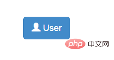
The following is the starting code:
1 2 |
|
The effect is as follows:

Customized font size
You can make an icon appear larger or smaller by increasing or decreasing its font size
1 2 |
|

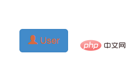
Customize font color
1 2 |
|

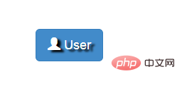
Apply text shadow
1 2 |
|

The above is the detailed content of How to use bootstrap font icon. For more information, please follow other related articles on the PHP Chinese website!

Hot AI Tools

Undresser.AI Undress
AI-powered app for creating realistic nude photos

AI Clothes Remover
Online AI tool for removing clothes from photos.

Undress AI Tool
Undress images for free

Clothoff.io
AI clothes remover

Video Face Swap
Swap faces in any video effortlessly with our completely free AI face swap tool!

Hot Article

Hot Tools

Notepad++7.3.1
Easy-to-use and free code editor

SublimeText3 Chinese version
Chinese version, very easy to use

Zend Studio 13.0.1
Powerful PHP integrated development environment

Dreamweaver CS6
Visual web development tools

SublimeText3 Mac version
God-level code editing software (SublimeText3)

Hot Topics
 1387
1387
 52
52
 Do I need to use flexbox in the center of the Bootstrap picture?
Apr 07, 2025 am 09:06 AM
There are many ways to center Bootstrap pictures, and you don’t have to use Flexbox. If you only need to center horizontally, the text-center class is enough; if you need to center vertically or multiple elements, Flexbox or Grid is more suitable. Flexbox is less compatible and may increase complexity, while Grid is more powerful and has a higher learning cost. When choosing a method, you should weigh the pros and cons and choose the most suitable method according to your needs and preferences.
 How to get the bootstrap search bar
Apr 07, 2025 pm 03:33 PM
How to use Bootstrap to get the value of the search bar: Determines the ID or name of the search bar. Use JavaScript to get DOM elements. Gets the value of the element. Perform the required actions.
 How to do vertical centering of bootstrap
Apr 07, 2025 pm 03:21 PM
Use Bootstrap to implement vertical centering: flexbox method: Use the d-flex, justify-content-center, and align-items-center classes to place elements in the flexbox container. align-items-center class method: For browsers that do not support flexbox, use the align-items-center class, provided that the parent element has a defined height.
 How to write split lines on bootstrap
Apr 07, 2025 pm 03:12 PM
There are two ways to create a Bootstrap split line: using the tag, which creates a horizontal split line. Use the CSS border property to create custom style split lines.
 Bootstrap Accessibility: Building Inclusive and User-Friendly Websites
Apr 07, 2025 am 12:04 AM
Building an inclusive and user-friendly website with Bootstrap can be achieved through the following steps: 1. Enhance screen reader support with ARIA tags; 2. Adjust color contrast to comply with WCAG standards; 3. Ensure keyboard navigation is friendly. These measures ensure that the website is friendly and accessible to all users, including those with barriers.
 How to resize bootstrap
Apr 07, 2025 pm 03:18 PM
To adjust the size of elements in Bootstrap, you can use the dimension class, which includes: adjusting width: .col-, .w-, .mw-adjust height: .h-, .min-h-, .max-h-
 How to use bootstrap button
Apr 07, 2025 pm 03:09 PM
How to use the Bootstrap button? Introduce Bootstrap CSS to create button elements and add Bootstrap button class to add button text
 How to set up the framework for bootstrap
Apr 07, 2025 pm 03:27 PM
To set up the Bootstrap framework, you need to follow these steps: 1. Reference the Bootstrap file via CDN; 2. Download and host the file on your own server; 3. Include the Bootstrap file in HTML; 4. Compile Sass/Less as needed; 5. Import a custom file (optional). Once setup is complete, you can use Bootstrap's grid systems, components, and styles to create responsive websites and applications.


