Use Bootstrap-Table to implement paging and sorting

After looking for several table plug-ins a few days ago, I started to study how to use one of the plug-ins to achieve the requirements. The requirements are as follows:
1. Be able to use jquery .load directly loads a fragment as the content of tbody.
2. You can click on the column header to sort.
3. Ability to paginate, and this paging can support server-side paging.
Finally implemented through the Bootstrap-Table plug-in. The following is an introduction to the specific implementation process:
1. Quoting the plug-in
According to the official website Getting started refers to the css and js files necessary for the plug-in, as follows:
<link rel="stylesheet" href="bootstrap.min.css">
<link rel="stylesheet" href="bootstrap-table.css">
<script src="jquery.min.js"></script>
<script src="bootstrap.min.js"></script>
<script src="bootstrap-table.js"></script>
<-- put your locale files after bootstrap-table.js -->
<script src="bootstrap-table-zh-CN.js"></script>
2. Create a Table
Create a Table for displaying data in the HTML page , this Table will be initialized by Bootstrap-Table in subsequent steps, as follows:
<table id="dataTable">
    <thead>
    <tr>
        <th data-field="fullname" data-sortable="true">名称</th>
        <th data-field="shortname" data-sortable="true">简称</th>
        <th data-field="address" data-sortable="true">地址</th>
        <th data-field="linkman" data-sortable="true">联系人</th>
        <th data-field="tel" data-sortable="true">联系电话</th>
        <th>操作</th>
    </tr>
    </thead>
    <tbody id="dataBody">

    </tbody>
</table>3. Initialize Table
Use Javascript to initialize the Table and customize some function to meet the previous needs, the code is as follows:
$(document).ready(function(){
initTable("dataTable");
});
//自定义ajax
function ajaxRequest(params){
//访问服务器获取所需要的数据
//比如使用$.ajax获得请求某个url获得数据
$.ajax({
type : 'post',
url : '/list.do',
data : parames.data,
success : function(e){
if(e.code == 200){
//表格加载数据
parames.success({
total : total,//符合查询条件的数据总量
rows : [{}]//创建一个空行,此处要注意,如果去除,将不会显示任何行
});
//加载一个片段,形如<tr><td>..</td>...</tr><tr><td>..</td>...</tr>
$.ajax({
type : 'post',
url : '/body.do',
data : parames.data,
dataType : 'html',
success : function(e){
$("#dataBody").html(e);
}
});
}
}
});
}
//自定义参数
function postQueryParams(params) {
params.cname = $("#customerName").val();
return params;
}
//初始化
function initTable(tableId){
$("#" + tableId).bootstrapTable({
classes : "table table-bordered table-hover table-striped",//加载的样式
ajax : "ajaxRequest",//自定义ajax
search : false,//不开启搜索文本框
sidePagination : "server",//使用服务器端分页
pagination : "true",//开启分页
queryParams : "postQueryParams",//自定义参数
pageSize : 8,//每页大小
pageList : [8, 16, 32, 64]//可以选择每页大小
});
}
//查询时,先销毁,然后再初始化
$("#btnSearch").click(function(){
$("#dataTable").bootstrapTable('destroy');
initTable("dataTable");
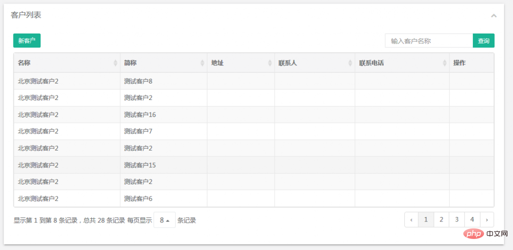
});After the above construction, the dataTable can meet the initial needs. Sorting and paging are completed by the server side. The data does not have to be converted on the server side, but is loaded through Implemented with a page fragment, it can be developed more conveniently. The effect is as follows:

Recommended tutorial: Bootstrap tutorial
The above is the detailed content of Use Bootstrap-Table to implement paging and sorting. For more information, please follow other related articles on the PHP Chinese website!

Hot AI Tools

Undresser.AI Undress
AI-powered app for creating realistic nude photos

AI Clothes Remover
Online AI tool for removing clothes from photos.

Undress AI Tool
Undress images for free

Clothoff.io
AI clothes remover

Video Face Swap
Swap faces in any video effortlessly with our completely free AI face swap tool!

Hot Article

Hot Tools

Notepad++7.3.1
Easy-to-use and free code editor

SublimeText3 Chinese version
Chinese version, very easy to use

Zend Studio 13.0.1
Powerful PHP integrated development environment

Dreamweaver CS6
Visual web development tools

SublimeText3 Mac version
God-level code editing software (SublimeText3)

Hot Topics
 1386
1386
 52
52
 Do I need to use flexbox in the center of the Bootstrap picture?
Apr 07, 2025 am 09:06 AM
There are many ways to center Bootstrap pictures, and you don’t have to use Flexbox. If you only need to center horizontally, the text-center class is enough; if you need to center vertically or multiple elements, Flexbox or Grid is more suitable. Flexbox is less compatible and may increase complexity, while Grid is more powerful and has a higher learning cost. When choosing a method, you should weigh the pros and cons and choose the most suitable method according to your needs and preferences.
 How to get the bootstrap search bar
Apr 07, 2025 pm 03:33 PM
How to use Bootstrap to get the value of the search bar: Determines the ID or name of the search bar. Use JavaScript to get DOM elements. Gets the value of the element. Perform the required actions.
 How to do vertical centering of bootstrap
Apr 07, 2025 pm 03:21 PM
Use Bootstrap to implement vertical centering: flexbox method: Use the d-flex, justify-content-center, and align-items-center classes to place elements in the flexbox container. align-items-center class method: For browsers that do not support flexbox, use the align-items-center class, provided that the parent element has a defined height.
 How to write split lines on bootstrap
Apr 07, 2025 pm 03:12 PM
There are two ways to create a Bootstrap split line: using the tag, which creates a horizontal split line. Use the CSS border property to create custom style split lines.
 Bootstrap Accessibility: Building Inclusive and User-Friendly Websites
Apr 07, 2025 am 12:04 AM
Building an inclusive and user-friendly website with Bootstrap can be achieved through the following steps: 1. Enhance screen reader support with ARIA tags; 2. Adjust color contrast to comply with WCAG standards; 3. Ensure keyboard navigation is friendly. These measures ensure that the website is friendly and accessible to all users, including those with barriers.
 How to set up the framework for bootstrap
Apr 07, 2025 pm 03:27 PM
To set up the Bootstrap framework, you need to follow these steps: 1. Reference the Bootstrap file via CDN; 2. Download and host the file on your own server; 3. Include the Bootstrap file in HTML; 4. Compile Sass/Less as needed; 5. Import a custom file (optional). Once setup is complete, you can use Bootstrap's grid systems, components, and styles to create responsive websites and applications.
 How to insert pictures on bootstrap
Apr 07, 2025 pm 03:30 PM
There are several ways to insert images in Bootstrap: insert images directly, using the HTML img tag. With the Bootstrap image component, you can provide responsive images and more styles. Set the image size, use the img-fluid class to make the image adaptable. Set the border, using the img-bordered class. Set the rounded corners and use the img-rounded class. Set the shadow, use the shadow class. Resize and position the image, using CSS style. Using the background image, use the background-image CSS property.
 How to resize bootstrap
Apr 07, 2025 pm 03:18 PM
To adjust the size of elements in Bootstrap, you can use the dimension class, which includes: adjusting width: .col-, .w-, .mw-adjust height: .h-, .min-h-, .max-h-


