 Backend Development
 Python Tutorial
 From bronze to king, five Python libraries for advanced data visualization 2.0!
From bronze to king, five Python libraries for advanced data visualization 2.0!

The tools and libraries for data visualization have become extremely abundant. When you get used to one or more of them, you will do a great job, but if you become complacent, you will be disappointed. You'll miss out on new tools and libraries from Bronze to King. If you're still stuck with Matplotlib (which is amazing), Seaborn (which is also amazing), Pandas (basic, simple visualizations), and Bokeh, then you really need to stop and learn something new. For example, there are many amazing visualization libraries in Python that are already very general, such as these five:
Plotly
Cufflinks
Folium
Altair Vega
D3.js (Personally think it is the best choice since I also code in JS)
If you understand and use the libraries mentioned above, you are on the right track of evolution. They can help generate some impressive visualizations, and the syntax isn't difficult either. Generally speaking, I prefer Plotly Cufflinks and D3.js. Here are the details:
Plotly
Plotly is an open source, interactive and browser-based Python graphics library. It is possible to create interactive charts that can be used in dashboards or websites (you can save them as html files or static images). Plotly is based on plotly.js, which in turn is based on D3.js, so it is a high-level charting library. Like Bokeh, Plotly's strength is making interactive charts. There are more than 30 chart types, providing some in most Charts that are not in the library, such as contour charts, tree charts, scientific charts, statistical charts, 3D charts, financial charts, etc. The best thing about plotly is that it can be used in a Jupyter notebook or a standalone HTML page. You can also use it online on their website, but I prefer to use it offline, you can also save the visualization as an image, very easy to use and very useful.
– How to use Plotly in Jupyter Notebook (offline)
First, install the plotly library.
pip install plotly
Then open jupyter notebook and type:
from plotly import __version__
from plotly.offline import download_plotlyjs,init_notebook_mode,plot,iplot init_notebook_mode(connected = True)
The syntax is super simple! In Pandas, you use dataframe.plot(), here, you use dataframe.iplot(). This "i" changes the entire definition of visualization.
With just one line of code, I generated the scatter plot below. You can customize it according to your needs. Remember to specify the pattern tag, otherwise you'll get some lines.
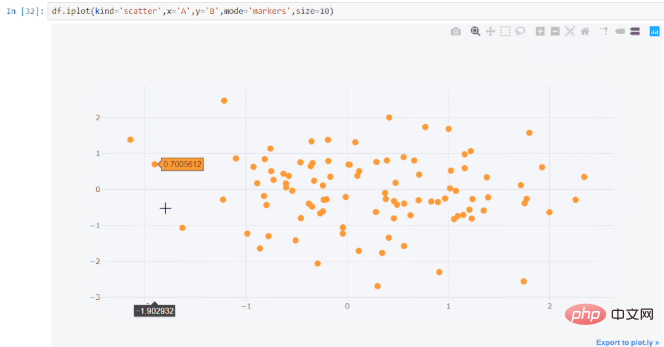
Please note that as the data increases, plotly will start to get stuck. So, I will use plotly only when the data points are less than 500K.
Related recommendations: "Python Video Tutorial"
Cufflinks
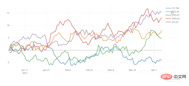
Cufflinks binds Plotly directly to the pandas data frame. This combination is amazing, combining the flexibility of Pandas with more efficiency than Plotly and an even simpler syntax than plotly. Using plotly's Python library, you can use a DataFrame's series and indices to describe the graph, but using Cufflinks allows you to plot it directly. As in the following example:
df = cf.datagen.lines()py.iplot([{  'x':df.index, 'y':df [col], 'name':col }
<strong>for</strong> col <strong>in</strong> df.columns])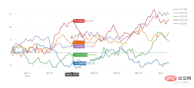
df.iplot(kind= 'scatter')
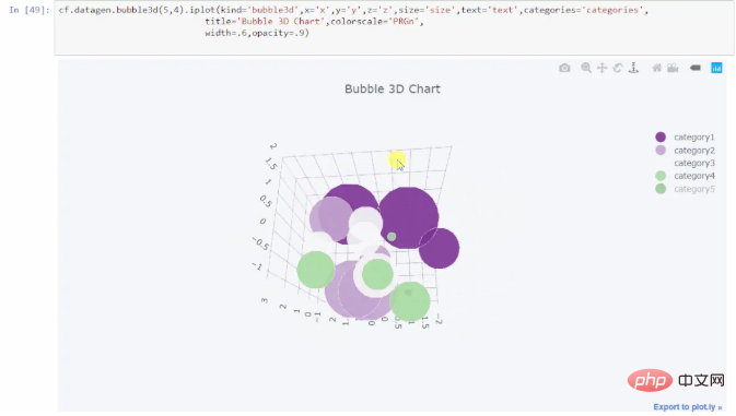
c.NotebookApp.iopub_data_rate_limit = 1.0e10
import plotly.graph_objs as go
import plotly.plotly as py
import cufflinks as cf
from plotly.offline import iplot,init_notebook_mode
cf.go_offline()
#Set global theme
cf.set_config_file(world_readable = True,theme ='pearl',offline = True )
init_notebook_mode()
Folium
Folium is built on the data advantages of the Python ecosystem and the mapping advantages of the Leaflet.js library. You can manipulate the data in python and then visualize it in a Leaflet map via folium. Folium is a "magic library" for mapping spatial data. You can also use folium to generate heat maps and choropleth plots. Let's learn about folium: A map is defined as a folium.Map object, and other folium objects can be added on top of the folium. You can use different map layers for Folium rendered maps such as MapBox, OpenStreetMap and several others, you can check this github repository folder or this documentation page. You can also choose different map projections. There are many projections to choose from. Let’s generate a Choropleth map using the Geojson of Unemployment in the United States. Here's the snippet:map = folium.Map([43, -100], zoom_start=4) choropleth = folium.Choropleth( geo_data=us_states, data=state_data, columns=['State', 'Unemployment'], key_on='feature.id', fill_color='YlGn', name='Unenployment', show=<strong>False</strong>,).add_to(m) <em> # 底层的GeoJson和StepColormap对象是可访问的 </em> print(type(choropleth.geojson)) print(type(choropleth.color_scale)) folium.LayerControl(collapsed=<strong>False</strong>).add_to(m) map.save(os.path.join('results', 'GeoChoro.html')) map
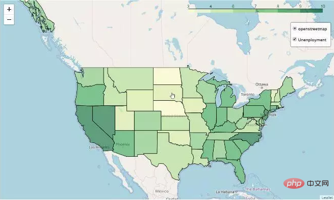
Altair + Vega
Altair是一个声明性统计可视化库,基于Vega和Vega-Lite。
声明意味着只需要提供数据列与编码通道之间的链接,例如x轴,y轴,颜色等,其余的绘图细节它会自动处理。声明使Altair变得简单,友好和一致。使用Altair可以轻松设计出有效且美观的可视化代码。
Altair使您能够使用强大而简洁的可视化语法快速开发各种统计可视化图表。如果您使用的是Jupyter Notebook,则需要按以下方式安装它。它还包括一些示例vega数据集。
pip install -U altair vega_datasets notebook vega
Altair主要依赖Vega,为了使图表在屏幕上可见,你需要安装Vega,并且还需要为每个新会话运行此命令:
alt.renderers.enable(‘notebook’)
Altair中的数据是围绕Pandas Dataframe构建的。统计可视化最明显的特征是以整洁的Dataframes开始。您还可以将绘图另存为图像或在vega编辑器中打开它以获得更多选项。Altair可能不是最好的,但绝对值得一试。
下面这个例子,我使用了汽车数据集;
import altair as altfrom vega_datasets
import datasource = data.cars()
brush = alt.selection(type='interval')
points = alt.Chart().mark_point().encode( x='Horsepower:Q', y='Miles_per_Gallon:Q',
color=alt.condition(brush, 'Origin:N', alt.value('lightgray'))).add_selection( brush)
bars = alt.Chart().mark_bar().encode( y='Origin:N', color='Origin:N',
x='count(Origin):Q').transform_filter( brush)
alt.vconcat(points, bars, data=source)
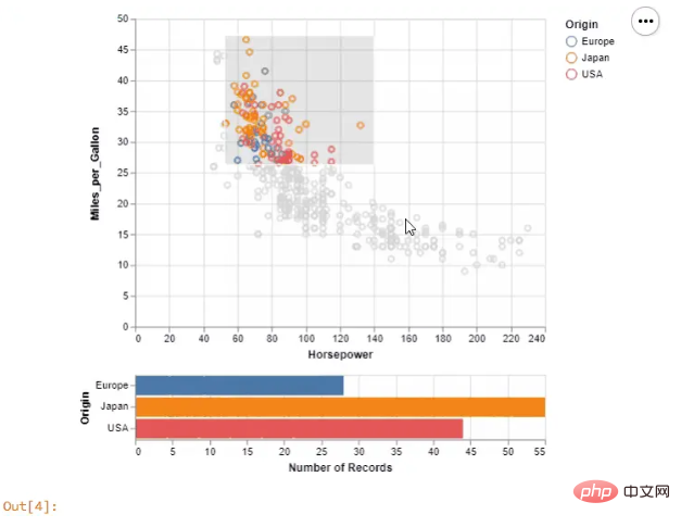
Altair和Vega生成的分散图和直方图
D3.js(数据驱动文档DDD)
D3.js是一个JavaScript库,根据数据操作文档。您可以使用HTML,SVG和CSS将数据变成活灵活现的图表。D3并不要求您将自己绑定到任何专有框架,因为现代浏览器拥有D3所需的一切,它还用于组合强大的可视化组件和数据驱动的DOM操作方法。
D3.js是目前市场上最好的数据可视化库。 您可以将它与python一起使用,也可以与R一起使用。最初,它可以与JavaScript一起使用,因为JS具有广泛的功能并且需要大量的学习和经验,但是如果你是JS专业人员则不需要犹豫。虽然 Python 和 R 使D3.js变得更简单,但只是一点点!总之D3.js是绝对不会错的上佳之选。
D3py有3个主要依赖项:
NumPy
Pandas
NetworkX
我建议你使用JavaScript或R,而不是python,因为版本已经过时,最后一次更新是在2016年。而且只是D3.js的一个瘦的python包装器。
R提供D3可视化接口。使用 r2d3 ,您可以将数据从R绑定到D3可视化。使用 r2d3 创建的D3可视化就像RStudio,R Markdown文档和Shiny应用程序中的R图一样工作。您可以按如下方式从CRAN 安装 r2d3 软件包:
install.packages(“r2d3”)
你可以做一些惊人的可视化,例如下面这几个:
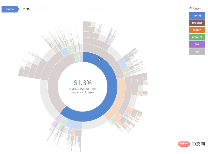
Sequences Sunburst — Kerry Rodden’s Block (Source)

The above is the detailed content of From bronze to king, five Python libraries for advanced data visualization 2.0!. For more information, please follow other related articles on the PHP Chinese website!

Hot AI Tools

Undresser.AI Undress
AI-powered app for creating realistic nude photos

AI Clothes Remover
Online AI tool for removing clothes from photos.

Undress AI Tool
Undress images for free

Clothoff.io
AI clothes remover

Video Face Swap
Swap faces in any video effortlessly with our completely free AI face swap tool!

Hot Article

Hot Tools

Notepad++7.3.1
Easy-to-use and free code editor

SublimeText3 Chinese version
Chinese version, very easy to use

Zend Studio 13.0.1
Powerful PHP integrated development environment

Dreamweaver CS6
Visual web development tools

SublimeText3 Mac version
God-level code editing software (SublimeText3)

Hot Topics
 1386
1386
 52
52
 Can visual studio code be used in python
Apr 15, 2025 pm 08:18 PM
VS Code can be used to write Python and provides many features that make it an ideal tool for developing Python applications. It allows users to: install Python extensions to get functions such as code completion, syntax highlighting, and debugging. Use the debugger to track code step by step, find and fix errors. Integrate Git for version control. Use code formatting tools to maintain code consistency. Use the Linting tool to spot potential problems ahead of time.
 How to run programs in terminal vscode
Apr 15, 2025 pm 06:42 PM
In VS Code, you can run the program in the terminal through the following steps: Prepare the code and open the integrated terminal to ensure that the code directory is consistent with the terminal working directory. Select the run command according to the programming language (such as Python's python your_file_name.py) to check whether it runs successfully and resolve errors. Use the debugger to improve debugging efficiency.
 Can vs code run in Windows 8
Apr 15, 2025 pm 07:24 PM
VS Code can run on Windows 8, but the experience may not be great. First make sure the system has been updated to the latest patch, then download the VS Code installation package that matches the system architecture and install it as prompted. After installation, be aware that some extensions may be incompatible with Windows 8 and need to look for alternative extensions or use newer Windows systems in a virtual machine. Install the necessary extensions to check whether they work properly. Although VS Code is feasible on Windows 8, it is recommended to upgrade to a newer Windows system for a better development experience and security.
 Is the vscode extension malicious?
Apr 15, 2025 pm 07:57 PM
VS Code extensions pose malicious risks, such as hiding malicious code, exploiting vulnerabilities, and masturbating as legitimate extensions. Methods to identify malicious extensions include: checking publishers, reading comments, checking code, and installing with caution. Security measures also include: security awareness, good habits, regular updates and antivirus software.
 Python: Automation, Scripting, and Task Management
Apr 16, 2025 am 12:14 AM
Python excels in automation, scripting, and task management. 1) Automation: File backup is realized through standard libraries such as os and shutil. 2) Script writing: Use the psutil library to monitor system resources. 3) Task management: Use the schedule library to schedule tasks. Python's ease of use and rich library support makes it the preferred tool in these areas.
 What is vscode What is vscode for?
Apr 15, 2025 pm 06:45 PM
VS Code is the full name Visual Studio Code, which is a free and open source cross-platform code editor and development environment developed by Microsoft. It supports a wide range of programming languages and provides syntax highlighting, code automatic completion, code snippets and smart prompts to improve development efficiency. Through a rich extension ecosystem, users can add extensions to specific needs and languages, such as debuggers, code formatting tools, and Git integrations. VS Code also includes an intuitive debugger that helps quickly find and resolve bugs in your code.
 Can vs code run python
Apr 15, 2025 pm 08:21 PM
Yes, VS Code can run Python code. To run Python efficiently in VS Code, complete the following steps: Install the Python interpreter and configure environment variables. Install the Python extension in VS Code. Run Python code in VS Code's terminal via the command line. Use VS Code's debugging capabilities and code formatting to improve development efficiency. Adopt good programming habits and use performance analysis tools to optimize code performance.
 Can visual studio code run python
Apr 15, 2025 pm 08:00 PM
VS Code not only can run Python, but also provides powerful functions, including: automatically identifying Python files after installing Python extensions, providing functions such as code completion, syntax highlighting, and debugging. Relying on the installed Python environment, extensions act as bridge connection editing and Python environment. The debugging functions include setting breakpoints, step-by-step debugging, viewing variable values, and improving debugging efficiency. The integrated terminal supports running complex commands such as unit testing and package management. Supports extended configuration and enhances features such as code formatting, analysis and version control.


