

Principle 1: High legibility
Case analysis: This catalog page is obviously not suitable for use in demonstrations. The yellow brightness below is too High makes the title text difficult to read.
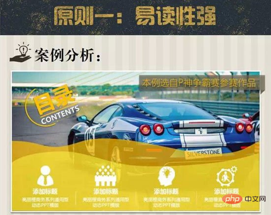
Common methods
1. Add a color block background to this text;
2. Increase the text color and color block color Brightness contrast;
3. Add corresponding icons to the directory items to strengthen the impression;
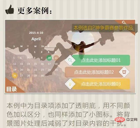
More cases
In this example, a transparent background is added to the directory items, using different Colors are used to distinguish them, and small icons are also added. Processing the background image reduces the interference to the directory content.
Related recommendations: "php Basic Tutorial"
Principle 2: Hierarchy Unification
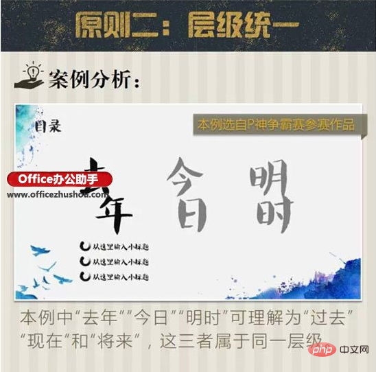
Case analysis: In this example, "last year" and "mingshi" can be understood as "past", "present" and "future", and these three belong to the same level.
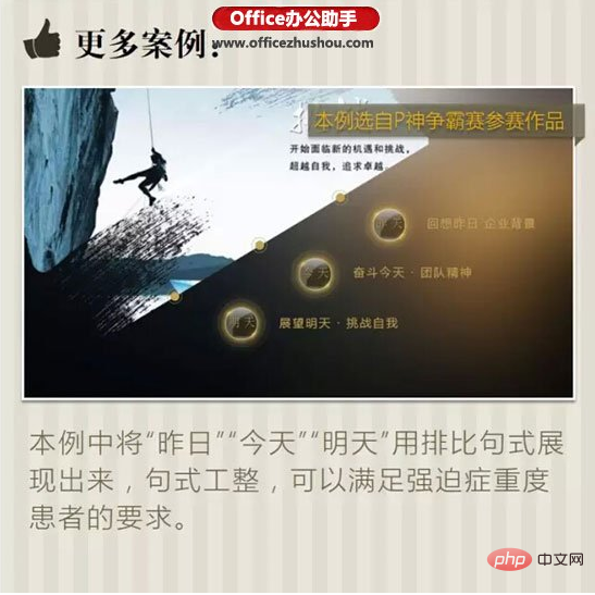
More cases
In this example, "yesterday", "today" and "tomorrow" are presented in parallel sentences. The sentences are neat and can meet the requirements of patients with severe obsessive-compulsive disorder.
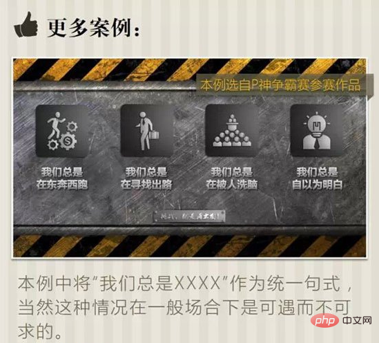
In this case, "We always XXXX" is used as a unified sentence pattern. Of course, this situation is rare in general situations.
Principle 3: Clear order
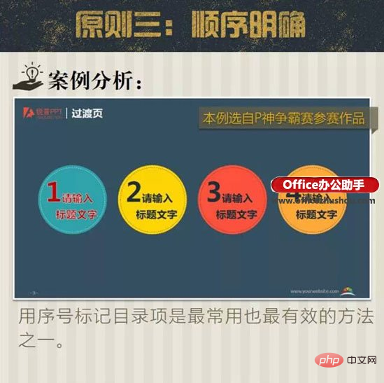
Case analysis: Use serial numbers to mark directory items One of the most commonly used and most effective methods.
More cases
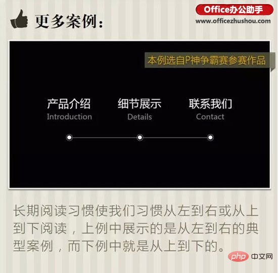
Long-term reading habits have made us accustomed to reading from left to right or top to bottom. In the above example, the A typical case is from left to right, while the example below is from top to bottom.
Principle 4: Layout balance
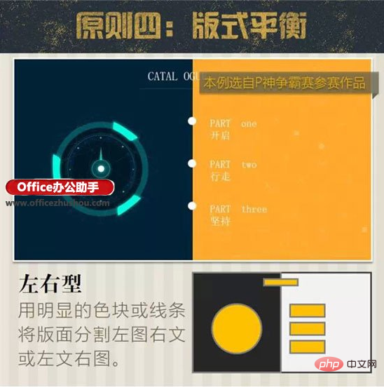
1. Left-right type: use obvious color blocks or lines to divide the layout into left image and right text or left text and right image.
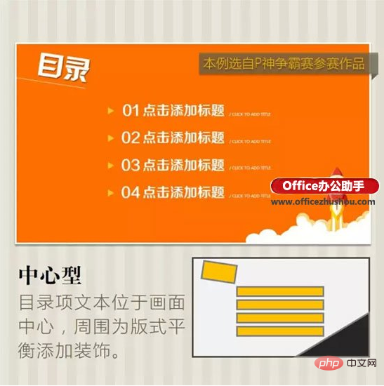
#2. Center type: The catalog item text is located in the center of the screen, and the surrounding decoration is added for layout balance.
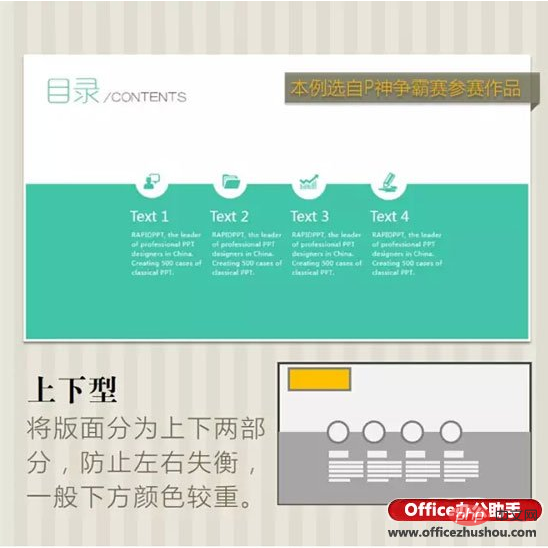
#3. Up-and-down type: Divide the layout atmosphere into upper and lower parts to prevent left and right imbalance. Generally, the color at the bottom is heavier.
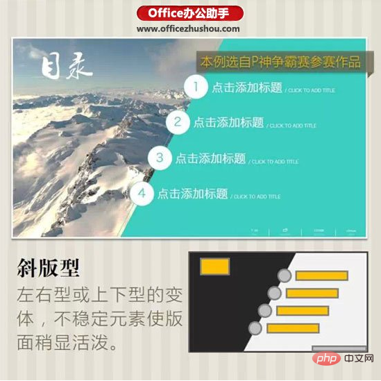
#4. Oblique layout: Left-right or up-and-down layout. Unstable elements make the layout slightly lively.
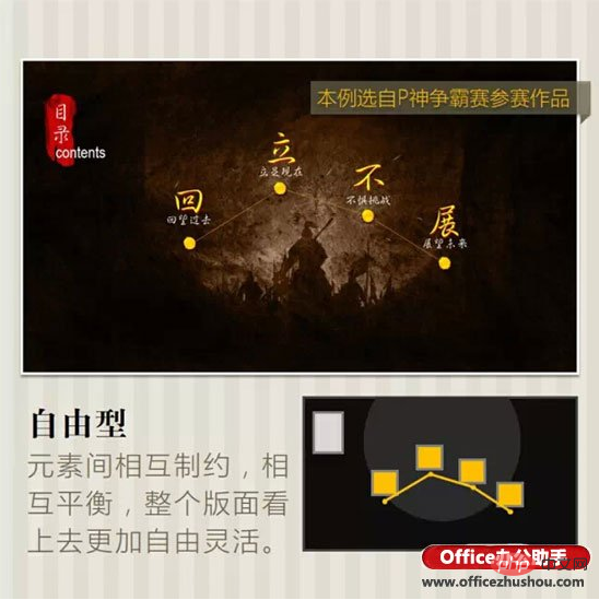
#5. Free type: The elements restrict and balance each other, making the entire layout look more free and flexible.
Summary
1. High legibility: The PPT catalog text must be highly recognizable to ensure that the audience can read it clear.
2. Unified levels: Several PPT directory items must be logically at the same level and cannot have an include or be included relationship.
3. Clear order: The order of most directory items cannot be reversed. Pay attention to giving correct visual guidance.
4. Layout balance: All elements should form a balanced layout, and must not be top-heavy or unbalanced.
The above is the detailed content of What are the basic principles for preparing PPT content pages?. For more information, please follow other related articles on the PHP Chinese website!


