Detailed explanation of layui.layer independent component

layer is still the representative work of layui. Her wide audience is not accidental, but the persistence of more than five years, continuous improvement and maintenance, continuous construction and improvement of community services, which makes ape They spread it spontaneously one after another, and it has become the most powerful driving force for Layui today.
Currently, layer has become the most commonly used web elastic layer component in China. GitHub naturally has Stars 3000, and the official website has a cumulative download volume of 300,000. About 200,000 web platforms are using layer.
Usage scenarios:
Since layer can be used independently, it can also be used modularly through Layui. So please choose according to your actual needs
layer is still the representative work of layui. Her wide audience is not accidental, but the persistence of more than five years, continuous improvement and maintenance, continuous construction and improvement of community services , which caused the apes to spread spontaneously one after another, and even became the most powerful driving force for Layui today.
Currently, layer has become the most commonly used web elastic layer component in China. GitHub naturally has Stars 3000, and the official website has a cumulative download volume of 300,000. About 200,000 web platforms are using layer.
Usage scenarios:
Since layer can be used independently, it can also be used modularly through Layui. So please choose
according to your actual needs. 1. Use layer
引入好layer.js后,直接用即可 <script ></script> <script> layer.msg('hello'); </script>
as an independent component. 2. Use layer
layui.use('layer', function(){
  var layer = layui.layer;
  layer.msg('hello');
});in layui. Except for the above differences, other All exactly the same.
Basic parameters:
The basic parameters we mentioned mainly refer to the configuration items used when calling methods, such as: layer.open({content: ''})layer.msg(' ', {time: 3}), etc. The content and time are the basic parameters, which exist in the form of key values. The basic parameters can be reasonably applied to any layer type. You do not need to configure all of them, most of them can be Chosen. Among them, layer.open and layer.msg are built-in methods. Note that starting from 2.3, there is no need to load the expansion module through layer.config
type - Basic layer type
Type: Number, default: 0
layer provides 5 layer types. The values that can be passed in are: 0 (information box, default) 1 (page layer) 2 (iframe layer) 3 (loading layer) 4 (tips layer). If you use layer.open({type: 1}) to call, type is required (except for information boxes)
title - Title
Type: String/Array/Boolean, default: 'information'
title supports three types of values. If you pass in an ordinary string, such as title:'I am the title', then only the title will be changed. Text; if you also need to customize the title area style, then you can title: ['text', 'font-size:18px;'], and the second item of the array can write any css style; if you do not want to display the title bar, you Can title: false
content - Content
Type: String/DOM/Array, default: ''
content The value that can be passed in is It is flexible and changeable. Not only can ordinary HTML content be passed in, but the DOM can also be specified, and it can also vary according to different types. For example:
/!*
 如果是页面层
 */
layer.open({
  type: 1,
  content: '传入任意的文本或html' //这里content是一个普通的String
});
layer.open({
  type: 1,
  content: $('#id') //这里content是一个DOM,注意:最好该元素要存放在body最外层,否则可能被其它的相对元素所影响
});
//Ajax获取
$.post('url', {}, function(str){
  layer.open({
    type: 1,
    content: str //注意,如果str是object,那么需要字符拼接。
  });
});
/!*
 如果是iframe层
 */
layer.open({
  type: 2,
  content: 'http://sentsin.com' //这里content是一个URL,如果你不想让iframe出现滚动条,你还可以content: ['http://sentsin.com', 'no']
});
/!*
 如果是用layer.open执行tips层
 */
layer.open({
  type: 4,
  content: ['内容', '#id'] //数组第二项即吸附元素选择器或者DOM
});skin - style class name
Type: String, default: ''
skin not only allows you to pass in the layer's built-in styles class name, you can also pass in your customized class name. This is a good entry point, which means you can easily complete different style customizations with the help of skin.
Currently, the built-in skins of layer are: layui-layer-lanlayui-layer-molv. We will selectively build more in the future, but it is recommended that you define it yourself. The following is a simple example of a custom style
//单个使用
layer.open({
  skin: 'demo-class'
});
//全局使用。即所有弹出层都默认采用,但是单个配置skin的优先级更高
layer.config({
  skin: 'demo-class'
})
//CSS
body .demo-class .layui-layer-title{background:#c00; color:#fff; border: none;}
body .demo-class .layui-layer-btn{border-top:1px solid #E9E7E7}
body .demo-class .layui-layer-btn a{background:#333;}
body .demo-class .layui-layer-btn .layui-layer-btn1{background:#999;}
…
加上body是为了保证优先级。你可以借助Chrome调试工具,定义更多样式控制层更多的区域。area - width and height
Type: String/Array, default: 'auto'
at By default, the layer is adaptive in width and height, but when you only want to define the width, you can area: '500px', and the height is still adaptive. When you want to define both width and height, you can area: ['500px', '300px']
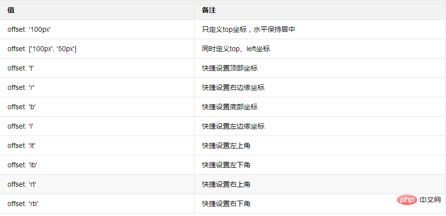
offset - Coordinates
Type: String/Array, default: vertical and horizontal Center
offset is not set by default. But if you don't want to center it vertically and horizontally, you can also make the following assignment:
icon - icon. Private parameters of the information box and loading layer
Type: Number, default: -1 (information box)/0 (loading layer)
The information box does not display the icon by default. When you want to display the icon, you can pass in 0-6 for the default skin. If it is a loading layer, you can pass in 0-2. Such as:
//eg1
layer.alert('酷毙了', {icon: 1});
//eg2
layer.msg('不开心。。', {icon: 5});
//eg3
layer.load(1); //风格1的加载btn - Button
Type: String/Array, default: 'Confirm'
In information box mode, btn defaults to one Confirm button. Other layer types are not displayed by default. Loading layers and tips layers are invalid. When you only want to customize one button, you can btn: 'I know', when you want to define two buttons, you can btn: ['yes', 'no']. Of course, you can also define more buttons, such as: btn: ['Button 1', 'Button 2', 'Button 3', ...], the callback for button 1 is yes, and starting from button 2, the callback is btn2 : function(){}, and so on. Such as:
//eg1
layer.confirm('纳尼?', {
  btn: ['按钮一', '按钮二', '按钮三'] //可以无限个按钮
  ,btn3: function(index, layero){
    //按钮【按钮三】的回调
  }
}, function(index, layero){
  //按钮【按钮一】的回调
}, function(index){
  //按钮【按钮二】的回调
});

//eg2
layer.open({
  content: 'test'
  ,btn: ['按钮一', '按钮二', '按钮三']
  ,yes: function(index, layero){
    //按钮【按钮一】的回调
  }
  ,btn2: function(index, layero){
    //按钮【按钮二】的回调

    //return false 开启该代码可禁止点击该按钮关闭
  }
  ,btn3: function(index, layero){
    //按钮【按钮三】的回调

    //return false 开启该代码可禁止点击该按钮关闭
  }
  ,cancel: function(){
    //右上角关闭回调

    //return false 开启该代码可禁止点击该按钮关闭
  }
});btnAlign - button arrangement
Type: String, default: r
你可以快捷定义按钮的排列位置,btnAlign的默认值为r,即右对齐。该参数可支持的赋值如下:

closeBtn - 关闭按钮
类型:String/Boolean,默认:1
layer提供了两种风格的关闭按钮,可通过配置1和2来展示,如果不显示,则closeBtn: 0
shade - 遮罩
类型:String/Array/Boolean,默认:0.3
即弹层外区域。默认是0.3透明度的黑色背景('#000')。如果你想定义别的颜色,可以shade: [0.8, '#393D49'];如果你不想显示遮罩,可以shade: 0
shadeClose - 是否点击遮罩关闭
类型:Boolean,默认:false
如果你的shade是存在的,那么你可以设定shadeClose来控制点击弹层外区域关闭。
time - 自动关闭所需毫秒
类型:Number,默认:0
默认不会自动关闭。当你想自动关闭时,可以time: 5000,即代表5秒后自动关闭,注意单位是毫秒(1秒=1000毫秒)
id - 用于控制弹层唯一标识
类型:String,默认:空字符
设置该值后,不管是什么类型的层,都只允许同时弹出一个。一般用于页面层和iframe层模式
anim - 弹出动画
类型:Number,默认:0
我们的出场动画全部采用CSS3。这意味着除了ie6-9,其它所有浏览器都是支持的。目前anim可支持的动画类型有0-6 如果不想显示动画,设置 anim: -1 即可。另外需要注意的是,3.0之前的版本用的是 shift 参数
isOutAnim - 关闭动画 (layer 3.0.3新增)
类型:Boolean,默认:true
默认情况下,关闭层时会有一个过度动画。如果你不想开启,设置 isOutAnim: false 即可
maxmin - 最大最小化。
类型:Boolean,默认:false
该参数值对type:1和type:2有效。默认不显示最大小化按钮。需要显示配置maxmin: true即可
fixed - 固定
类型:Boolean,默认:true
即鼠标滚动时,层是否固定在可视区域。如果不想,设置fixed: false即可
resize - 是否允许拉伸
类型:Boolean,默认:true
默认情况下,你可以在弹层右下角拖动来拉伸尺寸。如果对指定的弹层屏蔽该功能,设置 false即可。该参数对loading、tips层无效
resizing - 监听窗口拉伸动作
类型:Function,默认:null
当你拖拽弹层右下角对窗体进行尺寸调整时,如果你设定了该回调,则会执行。回调返回一个参数:当前层的DOM对象
resizing: function(layero){
  console.log(layero);
}scrollbar - 是否允许浏览器出现滚动条
类型:Boolean,默认:true
默认允许浏览器滚动,如果设定scrollbar: false,则屏蔽
maxWidth - 最大宽度
类型:,默认:360
请注意:只有当area: 'auto'时,maxWidth的设定才有效。
zIndex - 层叠顺序
类型:,默认:19891014(贤心生日 0.0)
一般用于解决和其它组件的层叠冲突。
move - 触发拖动的元素
类型:String/DOM/Boolean,默认:'.layui-layer-title'
默认是触发标题区域拖拽。如果你想单独定义,指向元素的选择器或者DOM即可。如move: '.mine-move'。你还配置设定move: false来禁止拖拽
moveOut - 是否允许拖拽到窗口外
类型:Boolean,默认:false
默认只能在窗口内拖拽,如果你想让拖到窗外,那么设定moveOut: true即可
moveEnd - 拖动完毕后的回调方法
类型:Function,默认:null
默认不会触发moveEnd,如果你需要,设定moveEnd: function(layero){}即可。其中layero为当前层的DOM对象
tips - tips方向和颜色
类型:Number/Array,默认:2
tips层的私有参数。支持上右下左四个方向,通过1-4进行方向设定。如tips: 3则表示在元素的下面出现。有时你还可能会定义一些颜色,可以设定tips: [1, '#c00']
tipsMore - 是否允许多个tips
类型:Boolean,默认:false
允许多个意味着不会销毁之前的tips层。通过tipsMore: true开启
success - 层弹出后的成功回调方法
类型:Function,默认:null
当你需要在层创建完毕时即执行一些语句,可以通过该回调。success会携带两个参数,分别是当前层DOM当前层索引。如:
layer.open({
  content: '测试回调',
  success: function(layero, index){
    console.log(layero, index);
  }
});yes - 确定按钮回调方法
类型:Function,默认:null
该回调携带两个参数,分别为当前层索引、当前层DOM对象。如:
layer.open({
  content: '测试回调',
  yes: function(index, layero){
    //do something
    layer.close(index); //如果设定了yes回调,需进行手工关闭
  }
});cancel - 右上角关闭按钮触发的回调
类型:Function,默认:null
该回调携带两个参数,分别为:当前层索引参数(index)、当前层的DOM对象(layero),默认会自动触发关闭。如果不想关闭,return false即可,如;
cancel: function(index, layero){
  if(confirm('确定要关闭么')){ //只有当点击confirm框的确定时,该层才会关闭
    layer.close(index)
  }
  return false;
}更多layui知识请关注layui使用教程栏目。
The above is the detailed content of Detailed explanation of layui.layer independent component. For more information, please follow other related articles on the PHP Chinese website!

Hot AI Tools

Undresser.AI Undress
AI-powered app for creating realistic nude photos

AI Clothes Remover
Online AI tool for removing clothes from photos.

Undress AI Tool
Undress images for free

Clothoff.io
AI clothes remover

AI Hentai Generator
Generate AI Hentai for free.

Hot Article

Hot Tools

Notepad++7.3.1
Easy-to-use and free code editor

SublimeText3 Chinese version
Chinese version, very easy to use

Zend Studio 13.0.1
Powerful PHP integrated development environment

Dreamweaver CS6
Visual web development tools

SublimeText3 Mac version
God-level code editing software (SublimeText3)

Hot Topics
 1359
1359
 52
52
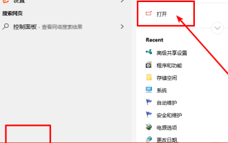 How to install the Windows 10 old version component DirectPlay
Dec 28, 2023 pm 03:43 PM
Many users always encounter some problems when playing some games on win10, such as screen freezes and blurred screens. At this time, we can solve the problem by turning on the directplay function, and the operation method of the function is also Very simple. How to install directplay, the old component of win10 1. Enter "Control Panel" in the search box and open it 2. Select large icons as the viewing method 3. Find "Programs and Features" 4. Click on the left to enable or turn off win functions 5. Select the old version here Just check the box
 How to get form data in layui
Apr 04, 2024 am 03:39 AM
layui provides a variety of methods for obtaining form data, including directly obtaining all field data of the form, obtaining the value of a single form element, using the formAPI.getVal() method to obtain the specified field value, serializing the form data and using it as an AJAX request parameter, and listening Form submission event gets data.
 How to set up jump on layui login page
Apr 04, 2024 am 03:12 AM
Layui login page jump setting steps: Add jump code: Add judgment in the login form submit button click event, and jump to the specified page through window.location.href after successful login. Modify the form configuration: add a hidden input field to the form element of lay-filter="login", with the name "redirect" and the value being the target page address.
 Angular components and their display properties: understanding non-block default values
Mar 15, 2024 pm 04:51 PM
The default display behavior for components in the Angular framework is not for block-level elements. This design choice promotes encapsulation of component styles and encourages developers to consciously define how each component is displayed. By explicitly setting the CSS property display, the display of Angular components can be fully controlled to achieve the desired layout and responsiveness.
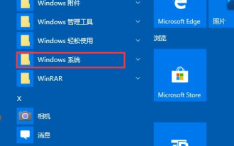 How to open the settings of the old version of win10 components
Dec 22, 2023 am 08:45 AM
Win10 old version components need to be turned on by users themselves in the settings, because many components are usually closed by default. First we need to enter the settings. The operation is very simple. Just follow the steps below. Where are the win10 old version components? Open 1. Click Start, then click "Win System" 2. Click to enter the Control Panel 3. Then click the program below 4. Click "Enable or turn off Win functions" 5. Here you can choose what you want to open
 How layui implements self-adaptation
Apr 26, 2024 am 03:00 AM
Adaptive layout can be achieved by using the responsive layout function of the layui framework. The steps include: referencing the layui framework. Define an adaptive layout container and set the layui-container class. Use responsive breakpoints (xs/sm/md/lg) to hide elements under specific breakpoints. Specify element width using the grid system (layui-col-). Create spacing via offset (layui-offset-). Use responsive utilities (layui-invisible/show/block/inline) to control the visibility of elements and how they appear.
 What is the difference between layui and vue?
Apr 04, 2024 am 03:54 AM
The difference between layui and Vue is mainly reflected in functions and concerns. Layui focuses on rapid development of UI elements and provides prefabricated components to simplify page construction; Vue is a full-stack framework that focuses on data binding, component development and state management, and is more suitable for building complex applications. Layui is easy to learn and suitable for quickly building pages; Vue has a steep learning curve but helps build scalable and easy-to-maintain applications. Depending on the project needs and developer skill level, the appropriate framework can be selected.
 How to run layui
Apr 04, 2024 am 03:42 AM
To run layui, perform the following steps: 1. Import layui script; 2. Initialize layui; 3. Use layui components; 4. Import layui styles (optional); 5. Ensure script compatibility and pay attention to other considerations. With these steps, you can build web applications using the power of layui.


