 Web Front-end
 JS Tutorial
 Detailed explanation of the application of charts generated by echarts in three.js
Detailed explanation of the application of charts generated by echarts in three.js

Recently, several people in the group asked how to paste the echarts chart on the three.js model. This problem is actually very simple, because both are rendered into canvas, and you can directly use the canvas generated by echarts as a texture.
The method is sure to be feasible, then we will start coding directly.
Let’s first build a basic scene of three, which I won’t repeat here.
Then create a new plane, and we can paste the picture on this plane.
[Related course recommendations: JavaScript Video Tutorial]
addPlane() {
    var geometry = new THREE.PlaneGeometry(10,10);
    var material = new THREE.MeshBasicMaterial({
        side: THREE.DoubleSide,
        // transparent:true
    });
    this.plane = new THREE.Mesh(geometry, material);
    this.scene.add(this.plane);
}Set the angle of the camera. At this time, there is a whiteboard in the scene.

Then open the official website of echarts, find the case, and create a dashboard. Copy the code. start running.
For the convenience of demonstration, I created two divs in the body as containers for three and the chart respectively. In actual development, the container of the chart does not need to be displayed, nor does it need to be added to the body.
<div id="webgl"   style="max-width:90%"></div>
<div id="echart" style="width:512px;height: 512px;margin-left: 620px;"></div>
var myChart = echarts.init(document.getElementById('echart'));
option = {
tooltip: {
formatter: "{a} <br/>{b} : {c}%"
},
//toolbox会在右上角生成两个功能按钮,咱们不需要,直接干掉。
// toolbox: {
// feature: {
// restore: {},
// saveAsImage: {}
// }
// },
series: [
{
name: '业务指标',
type: 'gauge',
detail: { formatter: '{value}%' },
data: [{ value: 50, name: '完成率' }]
}
]
};
option.series[0].data[0].value = (Math.random() * 100).toFixed(2) - 0;
myChart.setOption(option, true);
const dom = document.getElementById("webgl");
const scene = new Basescene(dom);
scene.addPlane();At this time I saw the following page:
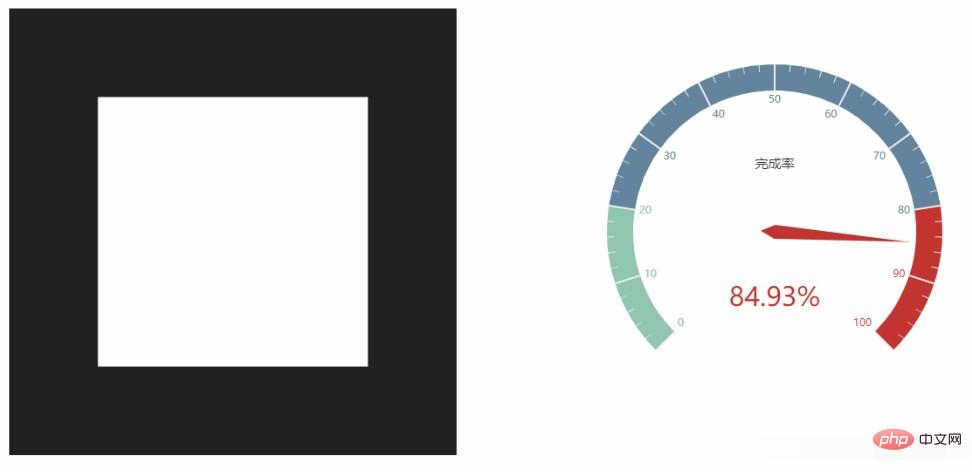
Method 1: CanvasTexture
three.js has a api:CanvasTexture. You can pass in a canvas object and use this method to complete the above tasks.
CanvasTexture( canvas : HTMLElement, mapping : Constant, wrapS : Constant, wrapT : Constant, magFilter : Constant, minFilter : Constant, format : Constant, type : Constant, anisotropy : Number )
changeTextureT(texture){
    this.plane.material.map = new THREE.CanvasTexture(texture)
    this.plane.material.needsUpdate = true
    var thiscancas = document.getElementById("echart").getElementsByTagName('canvas')[0]
    scene.changeTextureT(thiscancas)
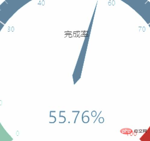
}The running results are as follows, which are indeed unclear and are the same as the problems they encountered. Try to draw echarts larger, but this is adaptive, resulting in an ugly dashboard, which is not what you imagined. If you draw the table yourself, you can deal with it this way.
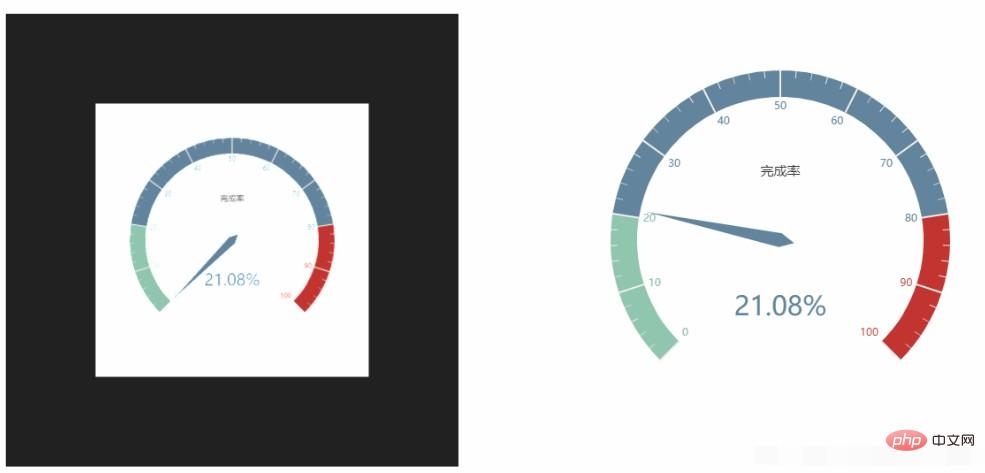
Method 2: getDataURL
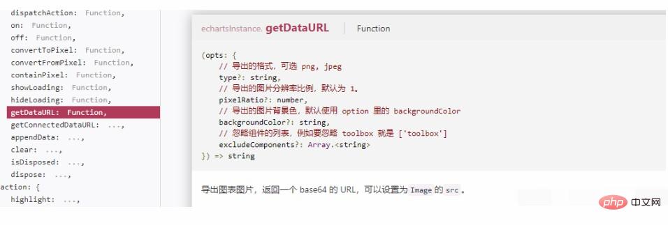
Since echarts also renders canvas, look at the API, there should be a way to export images. It is the API below, and there are optional parameters to set the resolution.
changeTextureE(texture){
    this.plane.material.map = new THREE.TextureLoader().load(texture)
    this.plane.material.needsUpdate = true
}
var texture = myChart.getDataURL({
    pixelRatio: 4,
    backgroundColor: '#fff'
});
scene.changeTextureE(texture)Setting the resolution to 4 is indeed much clearer.
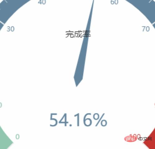
The following three pictures are the comparison of the effects of resolution 1, resolution 4 and method 1 respectively.



<!DOCTYPE html>
<html>
<head>
<meta charset="UTF-8">
<meta name="viewport" content="width=device-width, initial-scale=1.0">
<meta http-equiv="X-UA-Compatible" content="ie=edge">
<title>three.js使用Echarts贴图</title>
<script src="../js/three.js"></script>
<script src="../js/controls/OrbitControls.js"></script>
<script src="./echarts.js"></script>
</head>
<body>
<div id="webgl" style="width:512px;height: 512px;float: left;"></div>
<div id="echart" style="width:512px;height: 512px;margin-left: 620px;"></div>
<script>
var myChart = echarts.init(document.getElementById('echart'));
option = {
tooltip: {
formatter: "{a} <br/>{b} : {c}%"
},
// toolbox: {
// feature: {
// restore: {},
// saveAsImage: {}
// }
// },
series: [
{
name: '业务指标',
type: 'gauge',
detail: { formatter: '{value}%' },
data: [{ value: 50, name: '完成率' }]
}
]
};
option.series[0].data[0].value = (Math.random() * 100).toFixed(2) - 0;
myChart.setOption(option, true);
class Basescene {
constructor(dom) {
this.id = (new Date()).getTime();
this.dom = dom;
this.divWidth = this.dom.offsetWidth;
this.divHeight = this.dom.offsetHeight;
this.scene = new THREE.Scene();
this.camera = new THREE.PerspectiveCamera(45, this.divWidth / this.divHeight, 1, 2000);
this.renderer = new THREE.WebGLRenderer({
alpha: true,
antialias: true
});
this.controls = new THREE.OrbitControls(this.camera, this.renderer.domElement);
this.init();
}
init() {
this.camera.position.set(0, 0, 20);
this.camera.lookAt(this.scene.position);
this.renderer.setClearColor(0x222222);
this.renderer.setSize(this.divWidth, this.divHeight);
this.dom.appendChild(this.renderer.domElement);
// this.scene.add(new THREE.AxesHelper(10));
this.animate();
this.addLight();
console.log(this.scene);
}
addLight() {
const light = new THREE.AmbientLight(0xffffff);
this.scene.add(light);
}
render() {
this.renderer.render(this.scene, this.camera);
}
animate = () => {
this.request = requestAnimationFrame(this.animate);
this.render();
}
addPlane() {
var geometry = new THREE.PlaneGeometry(10, 10);
var material = new THREE.MeshBasicMaterial({
side: THREE.DoubleSide,
// transparent:true
});
this.plane = new THREE.Mesh(geometry, material);
this.scene.add(this.plane);
}
changeTextureE(texture) {
this.plane.material.map = new THREE.TextureLoader().load(texture)
this.plane.material.needsUpdate = true
}
changeTextureT(texture) {
this.plane.material.map = new THREE.CanvasTexture(texture)
this.plane.material.needsUpdate = true
}
}
const dom = document.getElementById("webgl");
const scene = new Basescene(dom);
scene.addPlane();
setTimeout(() => {
var thiscancas = document.getElementById("echart").getElementsByTagName('canvas')[0]
scene.changeTextureT(thiscancas)
}, 2000);
setTimeout(() => {
var texture = myChart.getDataURL({
pixelRatio: 4,
backgroundColor: '#fff'
});
scene.changeTextureE(texture)
}, 4000);
</script>
</body>
</html>js tutorial column, welcome to learn!
The above is the detailed content of Detailed explanation of the application of charts generated by echarts in three.js. For more information, please follow other related articles on the PHP Chinese website!

Hot AI Tools

Undresser.AI Undress
AI-powered app for creating realistic nude photos

AI Clothes Remover
Online AI tool for removing clothes from photos.

Undress AI Tool
Undress images for free

Clothoff.io
AI clothes remover

Video Face Swap
Swap faces in any video effortlessly with our completely free AI face swap tool!

Hot Article

Hot Tools

Notepad++7.3.1
Easy-to-use and free code editor

SublimeText3 Chinese version
Chinese version, very easy to use

Zend Studio 13.0.1
Powerful PHP integrated development environment

Dreamweaver CS6
Visual web development tools

SublimeText3 Mac version
God-level code editing software (SublimeText3)

Hot Topics
 1387
1387
 52
52
 ECharts and Java interface: How to quickly implement statistical charts such as line charts, bar charts, pie charts, etc.
Dec 17, 2023 pm 10:37 PM
ECharts and Java interface: How to quickly implement statistical charts such as line charts, bar charts, and pie charts. Specific code examples are required. With the advent of the Internet era, data analysis has become more and more important. Statistical charts are a very intuitive and powerful display method. Charts can display data more clearly, allowing people to better understand the connotation and patterns of the data. In Java development, we can use ECharts and Java interfaces to quickly display various statistical charts. ECharts is a software developed by Baidu
 How to use php interface and ECharts to generate visual statistical charts
Dec 18, 2023 am 11:39 AM
In today's context where data visualization is becoming more and more important, many developers hope to use various tools to quickly generate various charts and reports so that they can better display data and help decision-makers make quick judgments. In this context, using the Php interface and ECharts library can help many developers quickly generate visual statistical charts. This article will introduce in detail how to use the Php interface and ECharts library to generate visual statistical charts. In the specific implementation, we will use MySQL
 Steps to draw dashboard using ECharts and Python interface
Dec 18, 2023 am 08:40 AM
The steps to draw a dashboard using ECharts and Python interface require specific code examples. Summary: ECharts is an excellent data visualization tool that can easily perform data processing and graphics drawing through the Python interface. This article will introduce the specific steps to draw a dashboard using ECharts and Python interface, and provide sample code. Keywords: ECharts, Python interface, dashboard, data visualization Introduction Dashboard is a commonly used form of data visualization, which uses
 How to use map heat map to display city heat in ECharts
Dec 18, 2023 pm 04:00 PM
How to use a map heat map to display city heat in ECharts ECharts is a powerful visual chart library that provides various chart types for developers to use, including map heat maps. Map heat maps can be used to show the popularity of cities or regions, helping us quickly understand the popularity or density of different places. This article will introduce how to use the map heat map in ECharts to display city heat, and provide code examples for reference. First, we need a map file containing geographic information, EC
 How to use calendar charts to display time data in ECharts
Dec 18, 2023 am 08:52 AM
How to use calendar charts to display time data in ECharts ECharts (Baidu’s open source JavaScript chart library) is a powerful and easy-to-use data visualization tool. It offers a variety of chart types, including line charts, bar charts, pie charts, and more. The calendar chart is a very distinctive and practical chart type in ECharts, which can be used to display time-related data. This article will introduce how to use calendar charts in ECharts and provide specific code examples. First, you need to use
 ECharts and golang technical guide: practical tips for creating various statistical charts
Dec 17, 2023 pm 09:56 PM
ECharts and golang technical guide: Practical tips for creating various statistical charts, specific code examples are required. Introduction: In the field of modern data visualization, statistical charts are an important tool for data analysis and visualization. ECharts is a powerful data visualization library, while golang is a fast, reliable and efficient programming language. This article will introduce you to how to use ECharts and golang to create various types of statistical charts, and provide code examples to help you master this skill. Preparation
 Does ECharts depend on jQuery? In-depth analysis
Feb 27, 2024 am 08:39 AM
Does ECharts need to rely on jQuery? Detailed interpretation requires specific code examples. ECharts is an excellent data visualization library that provides a rich range of chart types and interactive functions and is widely used in web development. When using ECharts, many people will have a question: Does ECharts need to rely on jQuery? This article will explain this in detail and give specific code examples. First, to be clear, ECharts itself does not rely on jQuery;
 How to use histogram to display data in ECharts
Dec 18, 2023 pm 02:21 PM
How to use histograms to display data in ECharts ECharts is a JavaScript-based data visualization library that is very popular and widely used in the field of data visualization. Among them, the histogram is the most common and commonly used chart type, which can be used to display the size, comparison and trend analysis of various numerical data. This article will introduce how to use ECharts to draw histograms and provide code examples. First, we need to introduce the ECharts library into the HTML file, which can be introduced in the following way


