

PPT building structure principles

## 亲: Organize a clear content structure (Recommended Learning: PHPSTORM )
## First of all, all isolated elements in PPT are classified according to the logical relationship of the content. Related content is put together and closer in distance. The tags are categorized and arranged neatly and clearly, which helps organize information, reduce confusion, and provide a clear structure. In addition, we can better distinguish levels by adding frames and lines.Intimacy makes related content closer in distance, making it easier to sort out the structure of the content.
Comparison: highlight the key words and sentences
The second step is to extract the subtitles of each part as a summary. This summary should be sufficiently different from the main text to attract attention. Commonly used contrast techniques include: increasing font size, changing colors, and contrasting color blocks. Different techniques are often used simultaneously. In addition, changing the shape is also a good contrast.Contrast, in order to highlight the conclusion and avoid the content on the page being too similar, elements (font size, size, color, shape, etc.) need to be changed.
Only with contrast can there be distinction between priority and secondary.Create exquisite vision
Nothing on the PPT can be placed randomly! There should be some visual connection between each element. This will give you a simple and clear look. Two pages of the same content, aligned or misaligned, will have a very different visual experience. PPT with aligned content is easy to read and looks more professional. The basic alignment methods are "left alignment", "right alignment" and "center alignment". Because the typesetting is left-right, the text on the left side is suitable for left alignment. We can check whether the page elements are really aligned by adding guides. Secondly, "horizontal distribution" and "vertical distribution". These two alignments refer to spacing.Align, by creating virtual lines, the page content becomes more organized, establishes visual connections, and facilitates reading.
Repeat: Unify the overall style of PPT
We often hear that "to make a PPT, you need to unify the fonts and colors", but do you know why we need to unify it? ? right! It is to form a unified style. As a visual design element, font color will definitely appear in many places throughout the PPT, so unifying it can increase organization. With the yellow and black color scheme and the cartoon characters, you can tell at a glance that it is the work of PPT master @Simon_Awen. This is the power of repetition! Continuous repetition can deepen the audience's impression. In addition, in company PPT templates, you can often see the company logo appearing repeatedly in a fixed position on each PPT page. This is also a repeated application. Duplicate objects are not limited to font color, but also shapes, lines, sizes, spatial relationships, etc.Repetition, the repeated use of visual design elements increases organization and forms a unified style.
The above is the detailed content of PPT building structure principles. For more information, please follow other related articles on the PHP Chinese website!

Hot AI Tools

Undresser.AI Undress
AI-powered app for creating realistic nude photos

AI Clothes Remover
Online AI tool for removing clothes from photos.

Undress AI Tool
Undress images for free

Clothoff.io
AI clothes remover

AI Hentai Generator
Generate AI Hentai for free.

Hot Article
Hot Tools

Notepad++7.3.1
Easy-to-use and free code editor

SublimeText3 Chinese version
Chinese version, very easy to use

Zend Studio 13.0.1
Powerful PHP integrated development environment

Dreamweaver CS6
Visual web development tools

SublimeText3 Mac version
God-level code editing software (SublimeText3)
Hot Topics
 1375
1375
 52
52

 Steps to adjust the format of pictures inserted in PPT tables
Mar 26, 2024 pm 04:16 PM
Steps to adjust the format of pictures inserted in PPT tables
Mar 26, 2024 pm 04:16 PM
1. Create a new PPT file and name it [PPT Tips] as an example. 2. Double-click [PPT Tips] to open the PPT file. 3. Insert a table with two rows and two columns as an example. 4. Double-click on the border of the table, and the [Design] option will appear on the upper toolbar. 5. Click the [Shading] option and click [Picture]. 6. Click [Picture] to pop up the fill options dialog box with the picture as the background. 7. Find the tray you want to insert in the directory and click OK to insert the picture. 8. Right-click on the table box to bring up the settings dialog box. 9. Click [Format Cells] and check [Tile images as shading]. 10. Set [Center], [Mirror] and other functions you need, and click OK. Note: The default is for pictures to be filled in the table
 Introduction to the method of making a human icon in PPT
Mar 26, 2024 pm 04:21 PM
Introduction to the method of making a human icon in PPT
Mar 26, 2024 pm 04:21 PM
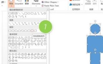
1. Create a new PPT page, insert a circle, a rounded rectangle on the same side (1 in the picture below) and a rectangle in the graphic, and then combine it to create a human-shaped graphic effect. Note that the circle (head) and rectangle (legs) are the same width, with the rounded rectangle slightly wider on the same side. Pay attention to the proportions between the human figures. 2. Next, select all three shapes, remove their outlines, change the color to gray, and use the shape [join] function (2 in the figure below) to turn the three shapes into a humanoid shape. 3. After zooming out, you can use the fast copy method of Ctrl+D for efficient copying. 4. Color the villain part. If there is no technical content in coloring them all, just change the color of the villain to green. 2. Color the human icon 1. Copy a little person separately. Then insert a [
 How to insert excel icons into PPT slides
Mar 26, 2024 pm 05:40 PM
How to insert excel icons into PPT slides
Mar 26, 2024 pm 05:40 PM
1. Open the PPT and turn the page to the page where you need to insert the excel icon. Click the Insert tab. 2. Click [Object]. 3. The following dialog box will pop up. 4. Click [Create from file] and click [Browse]. 5. Select the excel table to be inserted. 6. Click OK and the following page will pop up. 7. Check [Show as icon]. 8. Click OK.
 Detailed method of inserting formula effect flow chart into PPT
Mar 26, 2024 pm 04:36 PM
Detailed method of inserting formula effect flow chart into PPT
Mar 26, 2024 pm 04:36 PM
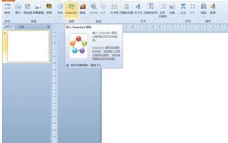
1. Open PPT, click the [Insert] tab, and click the [smartArt] button in the [Illustrations] group. 2. Click [Process] in the [Select smartArt graphics] dialog box that opens. 3. Select the [Formula] flow chart in the [Process] pane that opens. 4. Click [OK], and the [Formula] flow chart will be inserted into the slide pane. 5. Click [Text] in the [Type text here] column, or click [Text] on the graphic to enter content. 6. Select the shape in the graphic, click the [Design] tab of [smartArt Tools], and click the [Add Shape] button in the [Create Graphics] group to add a shape. 7. The shapes in the graphics can also be selected and deleted. Of course, you can also delete them in smar as needed.
 How to remove the date that appears automatically when printing from PPT handouts
Mar 26, 2024 pm 08:16 PM
How to remove the date that appears automatically when printing from PPT handouts
Mar 26, 2024 pm 08:16 PM
1. Let me first talk about the method I used at the beginning, maybe everyone is using it too. First, open [View]——]Remarks Template[. 2. A place where you can actually see the date after opening it. 3. Select it first and delete it. 4. After deleting, click [Close Master View]. 5. Open the print preview again and find that the date is still there. 6. In fact, this date was not deleted here. It should be in the [Handout Master]. Look at the picture below. 7. Delete the date after you find it. 8. Now when you open the preview and take a look, the date is no longer there. Note: In fact, this method is also very easy to remember, because the printed handouts are handouts, so you should look for the [Handout Master].
 PPT operation content for drawing the animation of a bird flying over
Mar 26, 2024 pm 05:06 PM
PPT operation content for drawing the animation of a bird flying over
Mar 26, 2024 pm 05:06 PM
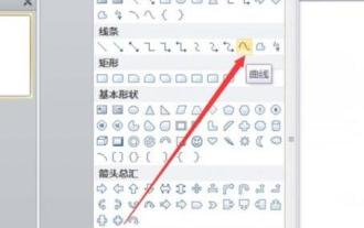
1. Open the PPT software, create a new slide, and insert an arc from the menu bar. 2. Copy the arc that has been set, and then move the arc to form the shape of the sea surface. 3. Insert a picture of a bird from [Insert], [Picture] in the menu bar. Then set the image size larger. 4. Click [Animation] on the menu bar, select the picture, set the animation to a custom path, and select left. 5. Copy a picture and set the custom animation path to arc downward. 6. Select the first picture, set the picture animation duration to a longer point, and then extend the picture animation path to the left end of the slide.
 How to deal with blanks when playing PPT slides
Mar 26, 2024 pm 07:51 PM
How to deal with blanks when playing PPT slides
Mar 26, 2024 pm 07:51 PM
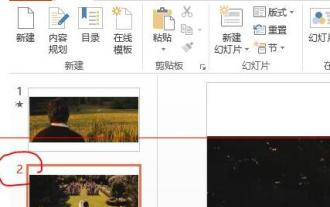
1. Open the PPT file you created and select the second slide. 2. On the second slide, select one of the pictures, and then select [Animation] to add any animation effect. 3. In the start column of the animation bar, change [While Standalone] to [After Previous Animation], and you will see that the picture animation label [1] will change to [0]. Do the same for subsequent slides, and you can see the effect by playing the slide at the end.
 How to create underline animation when mouse clicks text in PPT
Mar 26, 2024 pm 06:40 PM
How to create underline animation when mouse clicks text in PPT
Mar 26, 2024 pm 06:40 PM
1. Enter text. 2. Select the shape under Insert and select Line within it. 3. Draw a straight line below the word love. 4. Select the straight line, then select the animation menu, and choose an animation effect from it. 5. Play the animation. At this time, there are no horizontal lines under the text. 6. Click the mouse, and a horizontal line will appear under the text.