

Use CSS to implement cool charging animations

Step by step, see what kind of charging animation effect you can create using only CSS.
Draw a battery
Of course, to charge the battery, you must first use CSS to draw a battery. This is not difficult, just make one:

European, barely this is it. Now that you have the battery, let’s just charge it. The simplest animation is to fill the entire battery with color.
There are many methods, and the code is also very simple. Just look at the effect:
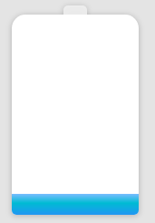
It has an internal flavor. If the requirements are not high, this can barely be enough. . The power is represented by a blue gradient, and the charging animation is realized through the displacement animation of the color block. But it always felt like something was missing.
Increase shadow and color changes
If you want to continue optimizing, you need to add some details.
We know that when the battery is low, the battery is usually indicated in red, and when the battery is high, it is indicated in green. Then add some shadow changes and a breathing feeling to the entire color block to make the charging effect look really moving.

Knowledge point
At this point, there is actually only one knowledge point:
- Use filter: hue-rotate() for Gradient color for color transition animation
We cannot directly animate a gradient color. Here we adjust the hue through a filter, thereby realizing the gradient color transformation animation.
Complete Demo of the above example: CodePen Demo -- Battery Animation One
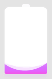
Add waves
ok, just counted one Small milestone, next step. The top of the battery is a straight line, which feels a bit dull. Here we will transform it. If we can change the top straight line to wavy rolling, the effect will be more realistic.
The effect after the transformation:
Using CSS to achieve this wavy scrolling effect is actually just a blinding method. The specifics can be what I wrote earlier. This article:
Pure CSS to achieve wave effect!
Knowledge Points
One of the knowledge points here is the above-mentioned use of CSS to achieve a simple wave effect, which is achieved through blindness. You will understand it by looking at the picture:

Complete Demo of the above example: CodePen Demo -- Battery Animation Two
OK, at this point, the above effects plus digital changes have been It can be considered a relatively good effect. Of course, the above effect still looks very CSS, but at first glance, I feel that it can be done using CSS.
Use powerful CSS filters to achieve Android charging animation effect
What about the following one?
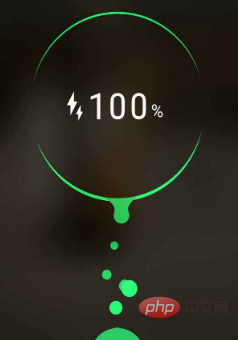
# Students who use Android phones must be familiar with it. This is the effect of Android phones when charging. When I saw this, I was curious, can it be done using CSS?
After some attempts, I found that using CSS can also simulate this animation effect very well:
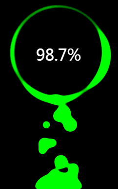
The above Gif recorded renderings are completely using CSS simulated effects.
Complete Demo of the above example: HuaWei Battery Charging Animation
Knowledge points
Dismantle the knowledge points, the most important thing is actually the use of filter: contrast() and filter : blur() These two filters can achieve this fusion effect very well.
Take out the two filters separately. Their functions are:
- filter: blur(): Set the Gaussian blur effect to the image.
- filter: contrast(): Adjust the contrast of the image.
However, when they "fitted together", a wonderful fusion phenomenon occurred.
Let’s look at a simple example first:

Look carefully at the process of intersecting two circles. When the edges touch each other, a boundary fusion effect will be produced. Use the contrast filter to remove the blurred edges of Gaussian blur, and use Gaussian blur to achieve the fusion effect.
Of course, this effect has been mentioned many times in previous articles. For more details, you can take a look:
- CSS flame? Needless to say
- CSS filter skills and details you don’t know
Color transformation
Of course, you can also add color transformation here to achieve the best effect Also very good:

Complete Demo of the above example: HuaWei Battery Charging Animation
Easily overlooked Click
By adjusting the values of filter: blur() and filter: contrast() attributes, the animation effect will actually change to a great extent. Good effects require constant debugging. Of course, experience also plays a very important role in it. In the final analysis, you still need to try more.
Finally
The several charging animations given in this article have gradually enhanced effects. This article only points out the core knowledge points. However, there are many small details in the actual output process that are not mentioned in this article. Interested students should still click on the Demo to take a closer look at the source code or implement it by themselves.
This article comes from the PHP Chinese website, CSS tutorial column, welcome to learn
The above is the detailed content of Use CSS to implement cool charging animations. For more information, please follow other related articles on the PHP Chinese website!

Hot AI Tools

Undresser.AI Undress
AI-powered app for creating realistic nude photos

AI Clothes Remover
Online AI tool for removing clothes from photos.

Undress AI Tool
Undress images for free

Clothoff.io
AI clothes remover

AI Hentai Generator
Generate AI Hentai for free.

Hot Article
Hot Tools

Notepad++7.3.1
Easy-to-use and free code editor

SublimeText3 Chinese version
Chinese version, very easy to use

Zend Studio 13.0.1
Powerful PHP integrated development environment

Dreamweaver CS6
Visual web development tools

SublimeText3 Mac version
God-level code editing software (SublimeText3)
Hot Topics
 1386
1386
 52
52

 CSS Animation Guide: Teach you step-by-step how to create lightning effects
Oct 20, 2023 pm 03:55 PM
CSS Animation Guide: Teach you step-by-step how to create lightning effects
Oct 20, 2023 pm 03:55 PM
CSS Animation Guide: Teach you step by step how to create lightning effects Introduction: CSS animation is an indispensable part of modern web design. It can bring vivid effects and interactivity to web pages and enhance user experience. In this guide, we’ll take a closer look at how to use CSS to create a lightning effect, along with specific code examples. 1. Create an HTML structure: First, we need to create an HTML structure to accommodate our lightning effects. We can use a <div> element to wrap the lightning effect and provide
 CSS Animation Tutorial: Teach you step-by-step to achieve page turning effects
Oct 24, 2023 am 09:30 AM
CSS Animation Tutorial: Teach you step-by-step to achieve page turning effects
Oct 24, 2023 am 09:30 AM
CSS Animation Tutorial: Teach you step-by-step to implement page turning effects, specific code examples are required CSS animation is an essential part of modern website design. It can add vividness to web pages, attract users' attention, and improve user experience. One of the common CSS animation effects is the page turning effect. In this tutorial, I'll take you step by step to achieve this eye-catching effect and provide specific code examples. First, we need to create a basic HTML structure. The code is as follows: <!DOCTYPE
 CSS Animation Tutorial: Teach you step by step how to implement pulse effects
Oct 21, 2023 pm 12:09 PM
CSS Animation Tutorial: Teach you step by step how to implement pulse effects
Oct 21, 2023 pm 12:09 PM
CSS Animation Tutorial: Teach you step-by-step to implement pulse effects, specific code examples are required. Introduction: CSS animation is a commonly used effect in web design. It can add vitality and visual appeal to web pages. This article will give you an in-depth understanding of how to use CSS to achieve pulse effects, and provide specific code examples to teach you how to complete it step by step. 1. Understand the pulse effect. The pulse effect is a cyclic animation effect. It is usually used on buttons, icons or other elements to give it a beating and flashing effect. Animating properties and keys via CSS
 CSS Animation Tutorial: Teach you step-by-step to achieve the special effect of flowing water
Oct 21, 2023 am 08:52 AM
CSS Animation Tutorial: Teach you step-by-step to achieve the special effect of flowing water
Oct 21, 2023 am 08:52 AM
CSS Animation Tutorial: Teach you step-by-step to implement the special effect of flowing water. Specific code examples are required. Foreword: CSS animation is a commonly used technology in web design. It makes web pages more lively and interesting and attracts users' attention. In this tutorial, we will learn how to use CSS to achieve a flowing water effect and provide specific code examples. let's start! Step One: HTML Structure First, we need to create a basic HTML structure. Add a <di to the <body> tag of the document
 Tips and methods to use CSS to achieve jitter effects when the mouse is hovering
Oct 21, 2023 am 08:37 AM
Tips and methods to use CSS to achieve jitter effects when the mouse is hovering
Oct 21, 2023 am 08:37 AM
Tips and methods to use CSS to achieve jitter effects when the mouse is hovering. The jitter effects when the mouse is hovering can add some dynamics and interest to the web page and attract the user's attention. In this article, we will introduce some techniques and methods of using CSS to achieve mouse hover jitter effects, and provide specific code examples. The principle of jitter In CSS, we can use keyframe animation (keyframes) and transform properties to achieve the jitter effect. Keyframe animation allows us to define an animation sequence by
 CSS Animation Guide: Teach you step-by-step to create a blinking effect
Oct 20, 2023 pm 03:24 PM
CSS Animation Guide: Teach you step-by-step to create a blinking effect
Oct 20, 2023 pm 03:24 PM
CSS Animation Guide: Teach you step-by-step to create the blinking effect. The blinking effect is a common CSS animation effect that can bring vivid and unique effects through simple code. This article will provide you with a step-by-step guide on how to use CSS to create a blink effect, with specific code examples. Create an HTML structure First, we need to create an HTML structure to display the blinking effect. The code is as follows: <!DOCTYPEhtml><html>&
 Tips and methods for using CSS to achieve special effects for image display
Oct 24, 2023 pm 12:52 PM
Tips and methods for using CSS to achieve special effects for image display
Oct 24, 2023 pm 12:52 PM
Tips and methods for using CSS to achieve special effects for image display. Whether it is web design or application development, image display is a very common requirement. In order to improve the user experience, we can use CSS to achieve some cool image display effects. This article will introduce several commonly used techniques and methods, and provide corresponding code examples to help readers get started quickly. 1. Picture zoom special effects Zoom mouse hover effect When the mouse is hovering over the picture, the interactivity can be increased through the zoom effect. The code example is as follows: .image-zoom{
 CSS Animation Tutorial: Teach you step-by-step to achieve the fade-in and fade-out effect
Oct 18, 2023 am 09:22 AM
CSS Animation Tutorial: Teach you step-by-step to achieve the fade-in and fade-out effect
Oct 18, 2023 am 09:22 AM
CSS Animation Tutorial: Teach you step-by-step to implement the fade-in and fade-out effect, including specific code examples. In web design and development, animation effects can make the page more vivid and attractive. CSS animation is a simple and powerful way to achieve this effect. This article will teach you step by step how to use CSS to achieve the fade effect, and provide specific code examples for reference. 1. Fade-in effect The fade-in effect refers to the effect in which an element gradually changes from a transparency of 0 to a transparency of 1. Here are the steps and code example to achieve the fade-in effect: Step 1:
