

css implements ellipses display when text is too long

This article introduces the CSS method to display ellipses when text is too long. It has certain reference value. I hope it will be helpful to friends who are learning CSS!
1. CSS style solves the problem of displaying ellipses when text is too long
1. General style
General css style, when the width is not enough , a line break effect may occur. This effect will definitely not work at some point. You can modify the css style to solve this problem.
<!DOCTYPE html><html>
<head>
<meta http-equiv="Content-Type" content="text/html; charset=utf-8" />
<title>text-overflow</title>
<link rel="stylesheet" type="text/css" href="http://unpkg.com/view-design/dist/styles/iview.css">
<script type="text/javascript" src="http://vuejs.org/js/vue.min.js"></script>
<script type="text/javascript" src="http://unpkg.com/view-design/dist/iview.min.js"></script>
<style type="text/css">
.demo-split {
width: 500px;
height: 100px;
border: 1px solid #dcdee2;
background: palegreen;
}
.demo-split-pane {
padding: 10px;
color: red;
}
</style>
</head>
<body>
<p id="app">
<p class="demo-split">
<Split v-model="split">
<p slot="left" class="demo-split-pane">
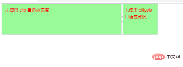
未使用 clip 自适应宽度 </p>
<p slot="right" class="demo-split-pane">
未使用 ellipsis 自适应宽度 </p>
</Split>
</p>
</p>
</body>
<script type="text/javascript">
new Vue({
el: '#app',
data() { return {
split: 0.4
}
}
}) </script></html>The width on the left side becomes smaller and the text wraps.
(Recommended learning: CSS tutorial)

The width on the right side becomes smaller and the text wraps.
2. If the text is too long, the ellipsis will be displayed or the effect of interception will be displayed.
【通常写法:】<style type="text/css">
.test_demo_clip {
text-overflow: clip;
overflow: hidden;
white-space: nowrap;
width: 200px;
background: palegreen;
}
.test_demo_ellipsis {
text-overflow: ellipsis;
overflow: hidden;
white-space: nowrap;
width: 200px;
background: palegreen;
}</style>【说明:】
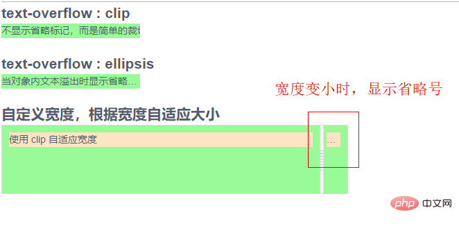
text-overflow:表示当文本溢出时是否显示省略标记,ellipsis表示省略号效果,clip 表示截取的效果。
overflow:hidden; 将文本溢出的内容隐藏。
white-space:nowrap; 是禁止文字换行。
width: (可选)可以写固定值,也可以根据宽度自适应显示效果。<!DOCTYPE html><html>
<head>
<meta http-equiv="Content-Type" content="text/html; charset=utf-8" />
<title>text-overflow</title>
<link rel="stylesheet" type="text/css" href="http://unpkg.com/view-design/dist/styles/iview.css">
<script type="text/javascript" src="http://vuejs.org/js/vue.min.js"></script>
<script type="text/javascript" src="http://unpkg.com/view-design/dist/iview.min.js"></script>
<style type="text/css">
.test_demo_clip {
text-overflow: clip;
overflow: hidden;
white-space: nowrap;
width: 200px;
background: palegreen;
}
.test_demo_ellipsis {
text-overflow: ellipsis;
overflow: hidden;
white-space: nowrap;
width: 200px;
background: palegreen;
}
.test_demo_defined_Width_clip {
text-overflow: clip;
overflow: hidden;
white-space: nowrap;
background: bisque;
}
.test_demo_defined_Width_ellipsis {
text-overflow: ellipsis;
overflow: hidden;
white-space: nowrap;
background: bisque;
}
.demo-split {
width: 500px;
height: 100px;
border: 1px solid #dcdee2;
background: palegreen;
}
.demo-split-pane {
padding: 10px;
}
</style>
</head>
<body>
<p id="app">
<h2>text-overflow : clip </h2>
<p class="test_demo_clip">
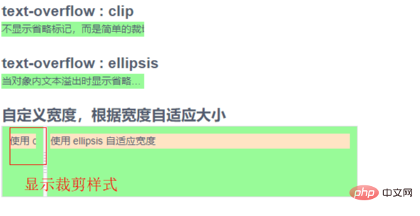
不显示省略标记,而是简单的裁切条 </p>
<br>
<h2>text-overflow : ellipsis </h2>
<p class="test_demo_ellipsis">
当对象内文本溢出时显示省略标记 </p>
<br>
<h2>自定义宽度,根据宽度自适应大小</h2>
<p class="demo-split">
<Split v-model="split">
<p slot="left" class="demo-split-pane">
<p class="test_demo_defined_Width_clip">
使用 clip 自适应宽度 </p>
</p>
<p slot="right" class="demo-split-pane">
<p class="test_demo_defined_Width_ellipsis">
使用 ellipsis 自适应宽度 </p>
</p>
</Split>
</p>
</p>
</body>
<script type="text/javascript">
new Vue({
el: '#app',
data() { return {
split: 0.4
}
}
}) </script></html>clip will display the effect of cropping, and ellipsis will display the effect of ellipsis.

PHP Chinese website, a large number of programming tutorials, welcome to learn!
The above is the detailed content of css implements ellipses display when text is too long. For more information, please follow other related articles on the PHP Chinese website!

Hot AI Tools

Undresser.AI Undress
AI-powered app for creating realistic nude photos

AI Clothes Remover
Online AI tool for removing clothes from photos.

Undress AI Tool
Undress images for free

Clothoff.io
AI clothes remover

AI Hentai Generator
Generate AI Hentai for free.

Hot Article
Hot Tools

Notepad++7.3.1
Easy-to-use and free code editor

SublimeText3 Chinese version
Chinese version, very easy to use

Zend Studio 13.0.1
Powerful PHP integrated development environment

Dreamweaver CS6
Visual web development tools

SublimeText3 Mac version
God-level code editing software (SublimeText3)
Hot Topics
 1378
1378
 52
52

 How to write split lines on bootstrap
Apr 07, 2025 pm 03:12 PM
How to write split lines on bootstrap
Apr 07, 2025 pm 03:12 PM
There are two ways to create a Bootstrap split line: using the tag, which creates a horizontal split line. Use the CSS border property to create custom style split lines.
 The Roles of HTML, CSS, and JavaScript: Core Responsibilities
Apr 08, 2025 pm 07:05 PM
The Roles of HTML, CSS, and JavaScript: Core Responsibilities
Apr 08, 2025 pm 07:05 PM
HTML defines the web structure, CSS is responsible for style and layout, and JavaScript gives dynamic interaction. The three perform their duties in web development and jointly build a colorful website.
 How to use bootstrap in vue
Apr 07, 2025 pm 11:33 PM
How to use bootstrap in vue
Apr 07, 2025 pm 11:33 PM
Using Bootstrap in Vue.js is divided into five steps: Install Bootstrap. Import Bootstrap in main.js. Use the Bootstrap component directly in the template. Optional: Custom style. Optional: Use plug-ins.
 How to insert pictures on bootstrap
Apr 07, 2025 pm 03:30 PM
How to insert pictures on bootstrap
Apr 07, 2025 pm 03:30 PM
There are several ways to insert images in Bootstrap: insert images directly, using the HTML img tag. With the Bootstrap image component, you can provide responsive images and more styles. Set the image size, use the img-fluid class to make the image adaptable. Set the border, using the img-bordered class. Set the rounded corners and use the img-rounded class. Set the shadow, use the shadow class. Resize and position the image, using CSS style. Using the background image, use the background-image CSS property.
 How to resize bootstrap
Apr 07, 2025 pm 03:18 PM
How to resize bootstrap
Apr 07, 2025 pm 03:18 PM
To adjust the size of elements in Bootstrap, you can use the dimension class, which includes: adjusting width: .col-, .w-, .mw-adjust height: .h-, .min-h-, .max-h-
 How to set up the framework for bootstrap
Apr 07, 2025 pm 03:27 PM
How to set up the framework for bootstrap
Apr 07, 2025 pm 03:27 PM
To set up the Bootstrap framework, you need to follow these steps: 1. Reference the Bootstrap file via CDN; 2. Download and host the file on your own server; 3. Include the Bootstrap file in HTML; 4. Compile Sass/Less as needed; 5. Import a custom file (optional). Once setup is complete, you can use Bootstrap's grid systems, components, and styles to create responsive websites and applications.
 How to use bootstrap button
Apr 07, 2025 pm 03:09 PM
How to use bootstrap button
Apr 07, 2025 pm 03:09 PM
How to use the Bootstrap button? Introduce Bootstrap CSS to create button elements and add Bootstrap button class to add button text
 How to view the date of bootstrap
Apr 07, 2025 pm 03:03 PM
How to view the date of bootstrap
Apr 07, 2025 pm 03:03 PM
Answer: You can use the date picker component of Bootstrap to view dates in the page. Steps: Introduce the Bootstrap framework. Create a date selector input box in HTML. Bootstrap will automatically add styles to the selector. Use JavaScript to get the selected date.
