 WeChat Applet
 Mini Program Development
 How to develop a WeChat applet search component from scratch
How to develop a WeChat applet search component from scratch
This article introduces the method of developing a WeChat applet search component from scratch. I hope it will be helpful to friends who are learning WeChat applet development!

How to develop a WeChat applet search component from scratch
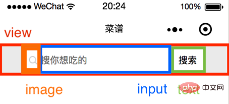
Set a container for the component, place the search icon and input in the container box, clear text button, and search button.
<view class="input-wrapper">
<icon class="search-icon"/>
<input
placeholder='{{placeholder}}'
value='{{inputValue}}'
bindinput='handleInput'
bindconfirm='handleSearch'
bindfocus='inputFocused'>
</input>
<view class="close-icon-wrapper">
<icon class="close-icon"/>
</view>
搜索
</view>Component style (recommended learning: 小program development)
container: height 100 rpx, background color# eee, flex layout.
input-wrapper: height 80 rpx, background color #fff, flex layout, border-radius: 20rpx.
search-icon: width and height 32 rpx.
input: font and cursor color #000, font size 32 rpx.
close-icon-wrapper: width and height 80 rpx, absolute positioning.
text: Search button 110 rpx wide, 65 rpx high, absolutely positioned, left border 2rpx solid #eee.
.container {
    background: #eee;
    height: 100rpx;
    width: 100%;
    display: flex;
    justify-content: center;
    align-items: center;
}
.input-wrapper {
    display: flex;
    align-items: center;
    height: 80rpx;
    width: 80%;
    background: #fff;
    border-radius: 20rpx;
}
.input-wrapper .search-icon {
    margin-left: 20rpx;
    width: 32rpx;
    height: 32rpx;
}
.input-wrapper input {
    margin-left: 10rpx;
    color: #000;
    font-size: 32rpx;
    caret-color: #000;
    width: 60%;
}
.input-wrapper .close-icon-wrapper{
    position: absolute;
    left: 480rpx;
    width: 80rpx;
    height: 80rpx;
    background:#fff;
    display: flex;
    justify-content: center;
    align-items: center;
}
.input-wrapper .close-icon {
    width: 42rpx;
    height: 42rpx;
}
.input-wrapper text {
    position: absolute;
    right: 80rpx;
    width: 110rpx;
    height: 65rpx;
    padding: 0;
    background: #fff;
    display: flex;
    justify-content: center;
    align-items: center;
    font-size: 32rpx;
    border-left: 2rpx solid #eee;
}Component function

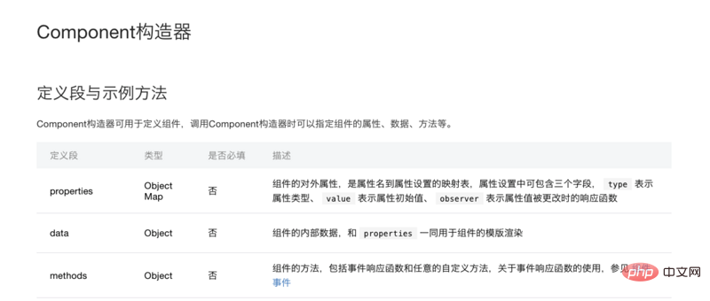
In the constructor of the component, pay attention to distinguishing properties and data. Write the component in properties. For external properties, data writes the internal properties of the component. In this search component, placeholder and value are passed from the page, so they are written in properties, and showCloseIcon, which controls whether the clear button appears, is written in data.
properties: {
    placeholder: {
        type: String,
        value: '搜索' // 如果页面不传placeholder,显示“搜索”
    },
    inputValue: {
        type: String
    }
},
data: {
    showCloseIcon: false,
},2. Method settings
Event process
(1) The cursor is not focused and there is no input - the search icon, placeholder and search are displayed button.
(2) The cursor is focused and there is no input - the cursor flashes and the search icon, placeholder and search button are displayed.
(3) The cursor is focused and there is input - the cursor flashes and the search icon, input text, clear button and search button are displayed.
(4) The cursor is not focused and there is input - the search icon, input text, clear button and search button are displayed.
(5) Press Enter to search - the clear button is hidden.
(6) Click the search button - clear the button to hide.
It can be seen that the input component's focus and keyboard input events are required.
<view
placeholder='{{placeholder}}'
value='{{inputValue}}'
bindinput='handleInput'
bindconfirm='handleSearch'
bindfocus='inputFocused'>
</view>inputFocused: If there is content in the input box during focus, closeIcon is displayed;
handleInput: If there is no content during input, it is not displayed. closeIcon has content, displays closeIcon and stores the value in value.
handleSearch: After clicking Enter, closeIcon is not displayed.
triggerEvent: When a custom component triggers an event, you need to use the triggerEvent method to specify the event name, detail object and event options.
inputFocused(e) {
            if (e.detail.value !== '') {
                this.setData({
                    showCloseIcon: true,
                });
            }
        },
        handleInput(e) {
            if (e.detail.value == '') {
                this.setData({
                    showCloseIcon: false,
                });
            } else {
                this.setData({
                    showCloseIcon: true,
                });
                this.triggerEvent('handleInput', {
                    value: e.detail.value
                });
            }
        },
        handleSearch() { // 点击键盘上的回车,调用此方法
            this.setData({
                showCloseIcon: false,
            });
            console.log('handleSearch', this.data.inputValue);
},Search adds click events for closeIcon and search button respectively.
Add click events for closeIcon and search button respectively.
clearValue() {
            this.triggerEvent('handleInput', {
                value: ''
            });
            this.setData({
                showCloseIcon: false,
            });
        },
        onTap() {
            this.setData({
                showCloseIcon: false,
            });
            console.log('onTap', this.data.inputValue);
        },组件 json
{
  component:true
}Page json
The name of the project is cookbook, and the component prefix here is uniformly ck.
{
    usingComponents:{
        ck-input:/components/search/index
    }
}Page wxml
<input
placeholder='搜你想吃的'
inputValue={{inputValue}}
bind:handleInput=handleInput>
</input>Page js
handleInput(e) {
        this.setData({
            inputValue: e.detail.value,
        });
},At this point, the initial development of the search component has been completed.
PHP Chinese website, a large number of jquery video tutorials, welcome to learn!
The above is the detailed content of How to develop a WeChat applet search component from scratch. For more information, please follow other related articles on the PHP Chinese website!

Hot AI Tools

Undresser.AI Undress
AI-powered app for creating realistic nude photos

AI Clothes Remover
Online AI tool for removing clothes from photos.

Undress AI Tool
Undress images for free

Clothoff.io
AI clothes remover

AI Hentai Generator
Generate AI Hentai for free.

Hot Article

Hot Tools

Notepad++7.3.1
Easy-to-use and free code editor

SublimeText3 Chinese version
Chinese version, very easy to use

Zend Studio 13.0.1
Powerful PHP integrated development environment

Dreamweaver CS6
Visual web development tools

SublimeText3 Mac version
God-level code editing software (SublimeText3)

Hot Topics
 1378
1378
 52
52
 Develop WeChat applet using Python
Jun 17, 2023 pm 06:34 PM
With the popularity of mobile Internet technology and smartphones, WeChat has become an indispensable application in people's lives. WeChat mini programs allow people to directly use mini programs to solve some simple needs without downloading and installing applications. This article will introduce how to use Python to develop WeChat applet. 1. Preparation Before using Python to develop WeChat applet, you need to install the relevant Python library. It is recommended to use the two libraries wxpy and itchat here. wxpy is a WeChat machine
 Can small programs use react?
Dec 29, 2022 am 11:06 AM
Mini programs can use react. How to use it: 1. Implement a renderer based on "react-reconciler" and generate a DSL; 2. Create a mini program component to parse and render DSL; 3. Install npm and execute the developer Build npm in the tool; 4. Introduce the package into your own page, and then use the API to complete the development.
 Implement card flipping effects in WeChat mini programs
Nov 21, 2023 am 10:55 AM
Implementing card flipping effects in WeChat mini programs In WeChat mini programs, implementing card flipping effects is a common animation effect that can improve user experience and the attractiveness of interface interactions. The following will introduce in detail how to implement the special effect of card flipping in the WeChat applet and provide relevant code examples. First, you need to define two card elements in the page layout file of the mini program, one for displaying the front content and one for displaying the back content. The specific sample code is as follows: <!--index.wxml-->&l
 Alipay launched the 'Chinese Character Picking-Rare Characters' mini program to collect and supplement the rare character library
Oct 31, 2023 pm 09:25 PM
According to news from this site on October 31, on May 27 this year, Ant Group announced the launch of the "Chinese Character Picking Project", and recently ushered in new progress: Alipay launched the "Chinese Character Picking-Uncommon Characters" mini program to collect collections from the society Rare characters supplement the rare character library and provide different input experiences for rare characters to help improve the rare character input method in Alipay. Currently, users can enter the "Uncommon Characters" applet by searching for keywords such as "Chinese character pick-up" and "rare characters". In the mini program, users can submit pictures of rare characters that have not been recognized and entered by the system. After confirmation, Alipay engineers will make additional entries into the font library. This website noticed that users can also experience the latest word-splitting input method in the mini program. This input method is designed for rare words with unclear pronunciation. User dismantling
 How uniapp achieves rapid conversion between mini programs and H5
Oct 20, 2023 pm 02:12 PM
How uniapp can achieve rapid conversion between mini programs and H5 requires specific code examples. In recent years, with the development of the mobile Internet and the popularity of smartphones, mini programs and H5 have become indispensable application forms. As a cross-platform development framework, uniapp can quickly realize the conversion between small programs and H5 based on a set of codes, greatly improving development efficiency. This article will introduce how uniapp can achieve rapid conversion between mini programs and H5, and give specific code examples. 1. Introduction to uniapp unia
 Tutorial on writing a simple chat program in Python
May 08, 2023 pm 06:37 PM
Implementation idea: Establishing the server side of thread, so as to process the various functions of the chat room. The establishment of the x02 client is much simpler than the server. The function of the client is only to send and receive messages, and to enter specific characters according to specific rules. To achieve the use of different functions, therefore, on the client side, you only need to use two threads, one is dedicated to receiving messages, and the other is dedicated to sending messages. As for why not use one, that is because, only
 How to operate mini program registration
Sep 13, 2023 pm 04:36 PM
Mini program registration operation steps: 1. Prepare copies of personal ID cards, corporate business licenses, legal person ID cards and other filing materials; 2. Log in to the mini program management background; 3. Enter the mini program settings page; 4. Select " "Basic Settings"; 5. Fill in the filing information; 6. Upload the filing materials; 7. Submit the filing application; 8. Wait for the review results. If the filing is not passed, make modifications based on the reasons and resubmit the filing application; 9. The follow-up operations for the filing are Can.
 How to get membership in WeChat mini program
May 07, 2024 am 10:24 AM
1. Open the WeChat mini program and enter the corresponding mini program page. 2. Find the member-related entrance on the mini program page. Usually the member entrance is in the bottom navigation bar or personal center. 3. Click the membership portal to enter the membership application page. 4. On the membership application page, fill in relevant information, such as mobile phone number, name, etc. After completing the information, submit the application. 5. The mini program will review the membership application. After passing the review, the user can become a member of the WeChat mini program. 6. As a member, users will enjoy more membership rights, such as points, coupons, member-exclusive activities, etc.


