Detailed explanation of the usage of position attribute in CSS
This article introduces the usage, classification and usage effect display of the position attribute in CSS. I hope it will be helpful to friends who are learning CSS!

Detailed explanation of the usage of position attribute in CSS
1. What is the role of position attribute?
The CSS position property is used to specify how an element is positioned in the document. The top, right, bottom and left attributes determine the final position of the element. (MDN definition).
(Recommended learning: CSS tutorial)
2. What are the classifications of position?
1, static
Normal layout behavior, the current layout position of the element in the regular flow of the document. At this time the top, right, bottom, left and z-index properties have no effect.
The position remains unchanged.
2, relative
Under this keyword, the element is first placed at the position when no positioning is added, and then the position of the element is adjusted without changing the page layout (therefore, the element will be placed where the positioning is not added). Leave the location blank when adding targeting). position:relative is not valid for table-*-group, table-row, table-column, table-cell, table-caption elements.
Offset relative to its own position.
3. Absolute
Does not reserve space for the element, and determines the position of the element by specifying the offset of the element relative to the nearest non-static positioned ancestor element. Absolutely positioned elements can have margins set and will not be merged with other margins.
As if this element never existed, the offset of the element will be determined based on the non-static ancestor elements of this element.
4, fixed
Does not reserve space for elements, but specifies the position of the element by specifying its position relative to the screen viewport (viewport). The element's position does not change when the screen scrolls. When printing, the element will appear at a fixed location on each page. The fixed attribute creates a new stacking context. When the transform attribute of an element's ancestor is non-none, the container is changed from the viewport to that ancestor.
Lower versions of IE are not compatible.
5, sticky
The box position is calculated according to the normal flow (this is called the position in the normal flow), and then relative to the flow root (BFC) and containing block (of the element in the flow) nearest block-level ancestor). In all cases (even when the positioned element is a table), the positioning of this element does not affect subsequent elements. When element B is sticky positioned, the position of subsequent elements is still determined by the position of B when it was not positioned. position: sticky has the same effect as position: relative on table elements.
At the same time, sticky has the following problems:
1. Sticky will not trigger BFC.
2. The style sheet z-index is invalid. Writing style inline is valid.
3. Sticky is container-related, which means that the sticky feature will only take effect in the container it is in. This point is emphasized because in actual use, when the body is set to height: 100%, the sticky element stops at a certain position.
3. Test code
The public code of the test code is as follows:
<html html>
<head>
    <meta charset="utf-8">
    <title>position</title>
</head>
<style>
    .main-app{
        display: flex;
        justify-content: center;
        align-items: center;
    }
    .app-container {
        width: 100%;
        height: 300px;
        display: flex;
        justify-content: center;
        align-items: center;
    }
    #the-box{
        position: static;
        /* position: relative;
        top:100px;
        left:200px; */
    }
    .sub-box {
        width: 50px;
        height: 50px;
    }
</style>

<body>
    <div class="main-app">
        <div class="app-container">
            <div class="sub-box" style="background: gray;"></div>
            <div id="the-box" class="sub-box" style="background: green;"></div>
            <div class="sub-box" style="background: yellow;"></div>
            <div class="sub-box" style="background: red;"></div>
        </div>
    </div>
</body>

</html>I selected the second element as our test object this time , the test environment is chrome 75 version.
1, static
#the-box{
    position: static;
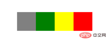
}Result:
Normal document flow display
2, relative
#the-box{
    position: relative;
    top:100px;
    left:200px;
}Result:
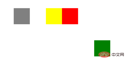
The set position is offset from its original position, but the original position is retained.
3, absolute
#the-box{
    position: absolute;
    top: 100px;
    left: 200px;
}Result:

The original fixed position is occupied by other elements, because the parent element is non-static (flex ), so the current element is offset by the set position relative to the parent element.
4. sticky
You must specify one of the four thresholds top, right, bottom or left before sticky positioning can take effect. Otherwise the behavior is the same as relative positioning.
This feature is that the position of the element is fixed in the viewport. If the page does not have a scroll axis, the feature will not be displayed. At this time, we slightly change its parent element to make the page appear with a scroll axis.
.app-container {
    width: 100%;
    height: 3000px;
    display: flex;
    justify-content: center;
    align-items: center;
}
#the-box{
    position: sticky;
    top: 100px;
}Result:
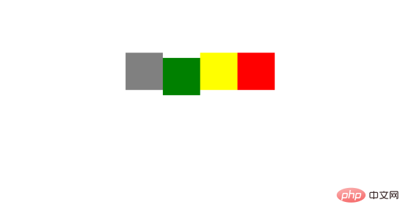
When we scroll the page and the element is more than 100px from the top, the current element position relative to the viewport remains unchanged when scrolling down. This feature can be used as a fixed table header.
5, fixed
cannot be used for versions below IE7. In fact, it is equivalent to fixing the position of the element in the browser window.
#the-box{
    position: fixed;
    top: 100px;
    left: 200px;
}Result:
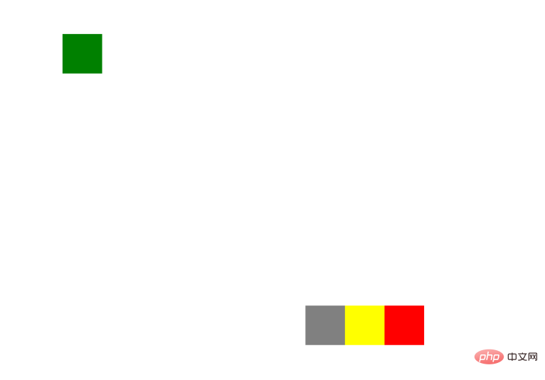
No matter how you scroll the scroll axis, the element position always remains the same.
6、inherit
Specifies that the value of the position attribute should be inherited from the parent element.
7, initial
The initial keyword is used to set CSS properties to their default values and can be applied to any CSS style. (IE does not support this keyword)
8, unset
As the name suggests, the unset keyword can be simply understood as not setting. Actually, it is a combination of keywords initial and inherit.
When we set unset to a CSS property:
If the property is a default inherited property, the value is equivalent to inherit
If the property is a non-inherited property, the value Equivalent to initial
9, revert
is not yet included in the specification.
The above is the detailed content of Detailed explanation of the usage of position attribute in CSS. For more information, please follow other related articles on the PHP Chinese website!

Hot AI Tools

Undresser.AI Undress
AI-powered app for creating realistic nude photos

AI Clothes Remover
Online AI tool for removing clothes from photos.

Undress AI Tool
Undress images for free

Clothoff.io
AI clothes remover

AI Hentai Generator
Generate AI Hentai for free.

Hot Article

Hot Tools

Notepad++7.3.1
Easy-to-use and free code editor

SublimeText3 Chinese version
Chinese version, very easy to use

Zend Studio 13.0.1
Powerful PHP integrated development environment

Dreamweaver CS6
Visual web development tools

SublimeText3 Mac version
God-level code editing software (SublimeText3)

Hot Topics
 1375
1375
 52
52
 How to use bootstrap button
Apr 07, 2025 pm 03:09 PM
How to use the Bootstrap button? Introduce Bootstrap CSS to create button elements and add Bootstrap button class to add button text
 How to insert pictures on bootstrap
Apr 07, 2025 pm 03:30 PM
There are several ways to insert images in Bootstrap: insert images directly, using the HTML img tag. With the Bootstrap image component, you can provide responsive images and more styles. Set the image size, use the img-fluid class to make the image adaptable. Set the border, using the img-bordered class. Set the rounded corners and use the img-rounded class. Set the shadow, use the shadow class. Resize and position the image, using CSS style. Using the background image, use the background-image CSS property.
 How to resize bootstrap
Apr 07, 2025 pm 03:18 PM
To adjust the size of elements in Bootstrap, you can use the dimension class, which includes: adjusting width: .col-, .w-, .mw-adjust height: .h-, .min-h-, .max-h-
 How to set up the framework for bootstrap
Apr 07, 2025 pm 03:27 PM
To set up the Bootstrap framework, you need to follow these steps: 1. Reference the Bootstrap file via CDN; 2. Download and host the file on your own server; 3. Include the Bootstrap file in HTML; 4. Compile Sass/Less as needed; 5. Import a custom file (optional). Once setup is complete, you can use Bootstrap's grid systems, components, and styles to create responsive websites and applications.
 How to upload files on bootstrap
Apr 07, 2025 pm 01:09 PM
The file upload function can be implemented through Bootstrap. The steps are as follows: introduce Bootstrap CSS and JavaScript files; create file input fields; create file upload buttons; handle file uploads (using FormData to collect data and then send to the server); custom style (optional).
 How to verify bootstrap date
Apr 07, 2025 pm 03:06 PM
To verify dates in Bootstrap, follow these steps: Introduce the required scripts and styles; initialize the date selector component; set the data-bv-date attribute to enable verification; configure verification rules (such as date formats, error messages, etc.); integrate the Bootstrap verification framework and automatically verify date input when form is submitted.
 How to change the size of a Bootstrap list?
Apr 07, 2025 am 10:45 AM
The size of a Bootstrap list depends on the size of the container that contains the list, not the list itself. Using Bootstrap's grid system or Flexbox can control the size of the container, thereby indirectly resizing the list items.
 How to set the bootstrap navigation bar
Apr 07, 2025 pm 01:51 PM
Bootstrap provides a simple guide to setting up navigation bars: Introducing the Bootstrap library to create navigation bar containers Add brand identity Create navigation links Add other elements (optional) Adjust styles (optional)


