
In development, it is most common to see pictures and text displayed on one line. The alignment of two in-line elements is usually the most troublesome. Sometimes the most commonly used Alignment method, but there are always some deviations. Let’s take a look at the most basic example:
html part:
<div class="wrap">
    <img src="/static/imghw/default1.png"  data-src="https://avatars3.githubusercontent.com/u/16339041?s=60&v=4"  class="lazy"   alt="">
    xx测试对齐Style-
</div> Recommended tutorial: CSS introductory tutorial
css part:
.wrap {
      width: 300px;
      text-align: center;
      margin: 20px auto;
      font-size: 14px;
 }
 .wrap img {
      width: 20px;
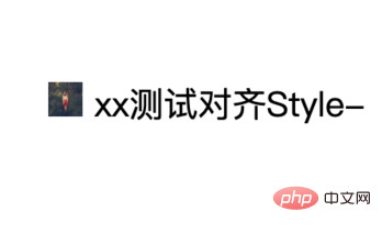
}The effect of not using alignment is as follows:

The default alignment is baseline, also It's the bottom line of the x letter.
This also answers the first question. When the browser's images and text are not additionally set, they are based on the lower edge of the lowercase letter x, which is vertical-align:baseline;.
Several common centering solutions
1. Use vertical-align center alignment
.wrap {
    vertical-align: middle;
    }
.wrap img {
    vertical-align: middle;
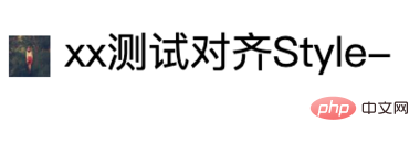
}When we use the commonly used vertical-align to align text and pictures, it is actually the same There is a certain deviation, as shown below: The middle value of

vertical-align is actually relative to half the height of the lowercase letter x, so the picture will follow x start to align in the middle, but for other characters such as S and Chinese, you will find that there will be a slight deviation anyway, and the picture will be relatively lower.
2. Use vertical-align and span to wrap the text.
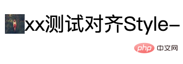
Let’s make a slight change and wrap the text part with a span tag, and use vertical-align: middle; style alignment for the span. . You will find that the picture moves up a little at this time.
The effect is as follows:

3. Use flex layout
display: flex;
align-items: center;

But even if it is flex layout , sometimes there will be a slight deviation, for example: the image size is an even number, the font-size is an even number, the line-height is aligned when it is an even number; when it is an odd number, it is 1px higher.
4. Use the ex unit
ex is the height of the lowercase letter x, which can be used for the vertical center alignment effect of inline elements that are not affected by fonts and font sizes.
PS: However, this is very practical when the height of the icon is the same as the text. For example, if an arrow is added after the character (click to expand).
.wrap img {
    height: 1ex;
}5. Use of vertical-align numerical method
vertical-align attribute value can use numerical type and percentage value. For example, it is still the basic case above: if the image height is 20px, When the text font-size is 22px, the default alignment is the baseline of the text, so the image will be 2px upward. At this time, you only need to offset the image 2px downward to achieve the alignment effect, and the numerical value of the vertical-align attribute has Very good compatibility.
.wrap {
            width: 100%;
            padding-top: 200px;
            text-align: center;
            margin: 20px auto;
            font-size: 22px;
            height: 40px;

        }
        .wrap img {
            width: 20px;
            vertical-align: -2px;
} Recommended related video tutorials: css video tutorial
The above is the detailed content of How to achieve text icon alignment with css. For more information, please follow other related articles on the PHP Chinese website!