How to use Rem layout to achieve adaptive effects in css

Why should we adapt?
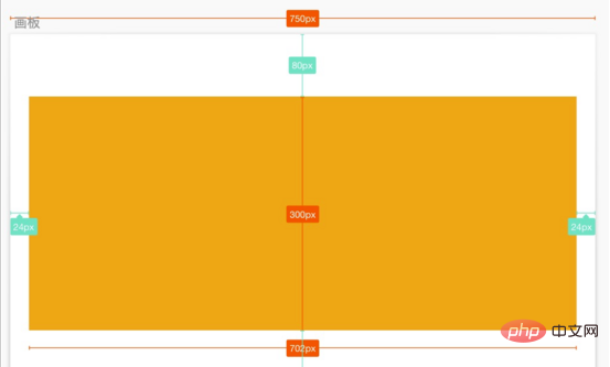
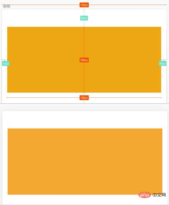
For example, for a mobile page, the visual draft given by the designer has a canvas width of 750, and the size of a yellow area in the visual draft is 702 x 300, and is centered in the artboard. We hope that the presentation ratio in any device is the same as in the mockup, scaling proportionally according to the width of the layout viewport.

On the mobile side, we generally set the layout viewport width = device width, that is, the area where the content is presented is within the device screen.
<meta name="viewport" content="width=device-width, initial-scale=1.0">
But different devices have different widths, so the width of the layout viewport is also different. For example, the layout viewport width of iPhone 6 is 375, and the layout viewport width of iPhone6 Plus is 414.
(Related video tutorial recommendation: css video tutorial)
For a given visual draft with a canvas width of 750, if the layout viewport width is 375 on an iPhone 6 To render on the device, we can divide the pixel value of the element in the visual draft by 2. The code is as follows:
.box{
    width: 351px;
    height: 150px;
    margin-top: 40px;
    background: #F5A623;
}Then the rendering on the iPhone 6 is as shown on the right, which is consistent with the layout of the visual draft on the left.

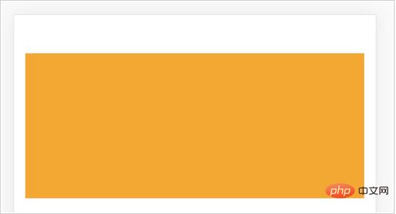
But the same code appears differently on the iPhone 6 Plus, and the distance between the two sides becomes larger. Because the layout viewport of iPhone 6 Plus is wider than that of iPhone 6, the size of the rectangular frame has not changed, it is still 315 x 150.

For a given mockup with a canvas width of 750, if rendered on an iPhone 6 Plus device with a layout viewport width of 414, we can change the size of the elements in the mockup The pixel value is divided proportionally by (750 / 414), that is:
.box{
    width: 387.5px;
    height: 165.6px;
    margin-top: 44.2px;
    background: #F5A623;
}The page rendering effect can also be the same as the visual draft.

In order to render the same effect as the visual draft on pages with different device widths (different viewport widths), different CSS pixel values need to be written. Our goal is to use the same CSS code to display the same effect as the visual draft on devices of different widths. In layman's terms, it means scaling equally on different devices according to the size ratio of the elements in the visual draft to the canvas, so as to achieve the same effect on different devices. Adaptive effects on the device.
Use Rem layout to solve adaptive problems
How to use the same CSS code to make the element size change with the width of the layout viewport according to the proportion in the visual draft, etc. Than Zoom?
We combine the characteristics of the relative unit rem in CSS. The pixel value of the rem unit is relative to the font-size of the root element (HTML element). For example: if the font-size of HTML is 100px, and the width of an element is set to 2rem in the CSS style, then the width of this element on the page will be 200px.
Find such a relationship based on the proportional scaling of the elements in the visual draft:
视觉稿元素尺寸 / 视觉稿画布宽度
= (rem 值 * HTML 元素的 font-size) / 布局视口宽度
= rem 值 * (HTML 元素的 font-size / 布局视口宽度)
= rem 值 / (布局视口宽度  /  HTML 元素的 font-size)
If:
布局视口宽度 / HTML 元素的 font-size = 定值 N
It can be achieved with the same CSS code Adaptable in any device.
rem 值 = N * (视觉稿元素尺寸 / 视觉稿画布宽度 )
So, we only need to determine an N value and complete two more steps to achieve self-adaptation:
Step 1: Dynamically set the font-size of the HTML element = layout viewport width / N
Step 2: Convert the CSS pixel value of the element exported in the visual draft into rem unit: rem value = N * (visual draft element size / visual draft canvas width)
If The canvas width of your mockup is 750. In order to facilitate the calculation of the rem value, you can choose to set N = 7.5. In this way, you only need to divide the size value in the mockup by 100 to get the CSS pixel value in rem units.
Recommended tutorial: CSS introductory tutorial
The above is the detailed content of How to use Rem layout to achieve adaptive effects in css. For more information, please follow other related articles on the PHP Chinese website!

Hot AI Tools

Undresser.AI Undress
AI-powered app for creating realistic nude photos

AI Clothes Remover
Online AI tool for removing clothes from photos.

Undress AI Tool
Undress images for free

Clothoff.io
AI clothes remover

AI Hentai Generator
Generate AI Hentai for free.

Hot Article

Hot Tools

Notepad++7.3.1
Easy-to-use and free code editor

SublimeText3 Chinese version
Chinese version, very easy to use

Zend Studio 13.0.1
Powerful PHP integrated development environment

Dreamweaver CS6
Visual web development tools

SublimeText3 Mac version
God-level code editing software (SublimeText3)

Hot Topics
 How to correctly display the locally installed 'Jingnan Mai Round Body' on the web page?
Apr 05, 2025 pm 10:33 PM
Using locally installed font files in web pages Recently, I downloaded a free font from the internet and successfully installed it into my system. Now...
 How to select a child element with the first class name item through CSS?
Apr 05, 2025 pm 11:24 PM
When the number of elements is not fixed, how to select the first child element of the specified class name through CSS. When processing HTML structure, you often encounter different elements...
 Does H5 page production require continuous maintenance?
Apr 05, 2025 pm 11:27 PM
The H5 page needs to be maintained continuously, because of factors such as code vulnerabilities, browser compatibility, performance optimization, security updates and user experience improvements. Effective maintenance methods include establishing a complete testing system, using version control tools, regularly monitoring page performance, collecting user feedback and formulating maintenance plans.
 How to make progress bar with h5
Apr 06, 2025 pm 12:09 PM
Create a progress bar using HTML5 or CSS: Create a progress bar container. Set the progress bar width. Create internal elements of the progress bar. Sets the internal element width of the progress bar. Use JavaScript, CSS, or progress bar library to display progress.
 How to compatible with multi-line overflow omission on mobile terminal?
Apr 05, 2025 pm 10:36 PM
Compatibility issues of multi-row overflow on mobile terminal omitted on different devices When developing mobile applications using Vue 2.0, you often encounter the need to overflow text...
 What application scenarios are suitable for H5 page production
Apr 05, 2025 pm 11:36 PM
H5 (HTML5) is suitable for lightweight applications, such as marketing campaign pages, product display pages and corporate promotion micro-websites. Its advantages lie in cross-platformity and rich interactivity, but its limitations lie in complex interactions and animations, local resource access and offline capabilities.
 How to use the shape-outside attribute of CSS to achieve the display effect of gradually shortening text?
Apr 05, 2025 pm 10:54 PM
Implementing the display effect of gradually shortening text In web design, how to achieve a special text display effect to make the text length gradually shortening? This effect...
 Is H5 page production a front-end development?
Apr 05, 2025 pm 11:42 PM
Yes, H5 page production is an important implementation method for front-end development, involving core technologies such as HTML, CSS and JavaScript. Developers build dynamic and powerful H5 pages by cleverly combining these technologies, such as using the <canvas> tag to draw graphics or using JavaScript to control interaction behavior.


