CSS3 to achieve card effect
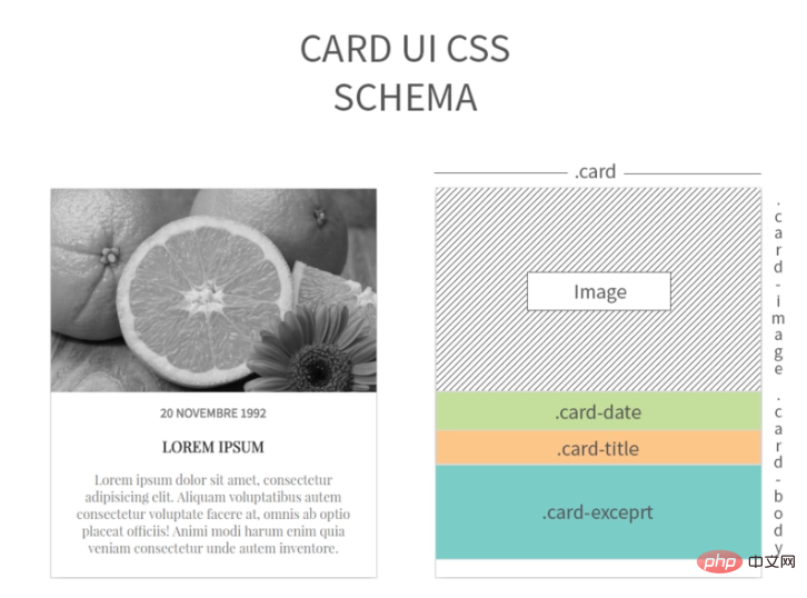
Step One: Determine the HTML Code Structure
Before creating the HTML code, you should first imagine its structure. When you have a good model, you should immediately list the page structure you imagined or your CSS module on paper in time. A well-designed and well-structured HTML page will make your subsequent work extremely easy.
<a id="case-title" href=" http://www.loveo.cc/using-css-to-make-cards-ui.html">
    利用css制作卡片UI -- 墨丶水瓶
</a>
<div class="card">
    <a href="#.">
        <div class="card-image">
            <img src="/static/imghw/default1.png"  data-src="http://www.loveo.cc/wp-content/uploads/2017/02/card-image.jpg"  class="lazy"
            alt="Orange" />
        </div>
        <div class="card-body">
            <div class="card-date">
                <time>
                    20 Novembre 1992
                </time>
            </div>
            <div class="card-title">
                <h3>
                    Lorem Ipsum
                </h3>
            </div>
            <div class="card-exceprt">
                <p>
                    Lorem ipsum dolor sit amet, consectetur adipisicing elit. Aliquam voluptatibus
                    autem consectetur voluptate facere at, omnis ab optio placeat officiis!
                    Animi modi harum enim quia veniam consectetur unde autem inventore.
                </p>
            </div>
        </div>
    </a>
</div>Step 2: Define Css rules
Once the Html structure is established, we will start writing Css styles for it. I will post the CSS code for each part separately below.
.card
.card {
    width:400px;
    margin:0px auto;
    background-color:white;
    box-shadow:0px 5px 20px #999;
}
.card a {
    color:#333;
    text-decoration:none;
}
.card:hover .card-image img {
    width:160%;
    filter:grayscale(0);
}Set .card to a fixed size.
The centering method is margin:0px auto;
In order to facilitate distinction in a slightly darker background, set the block element to white.
Added a small shadow to create an overlay effect.
Define the color and underline modification of the element a tag.
Define the element to be enlarged when the mouse moves up and the filter grayscale is set to "0".
.card-image
.card-image {
    height:250px;
    position:relative;
    overflow:hidden;
}
.card-image img {
    width:150%;
    position:absolute;
    top:50%;
    left:50%;
    transform:translate(-50%, -50%);
    filter:grayscale(1);
    transition-property:filter width;
    transition-duration:.3s;
    transition-timing-function:ease;
}Fixed the size of the block element that contains our image, this allows us to make any image available for use in a card as long as it meets the size requirements.
Set the relative positioning method, because it contains absolutely positioned elements.
Define the content to be cropped and hidden when it overflows the element box.
We can increase the default size of images based on 100% of the fixed size if needed, but do not add images smaller than 400px and do not forget to respect their width/height ratio to avoid whitespace.
In order to fully display the image in the parent element and use the center of .card-image as the starting point, we need to set the positioning method to absolute at the same time. top and left are 50%, and then you can set the displacement through transform:translate(-50%, -50%) so that the center point of .card-image
is used as the starting point.
Define the element to be 100% grayscale.
Make the element start slowly within 300 milliseconds, then become faster, and then end slowly when the mouse is moved over.
.card-body
.card-body {
    text-align:center;
    padding: 15px 20px;
    box-sizing: border-box;
}Define the text alignment of the .card-bady element to center alignment.
Set the padding of the element.
The element box-sizing attribute value is border-box.
Fonts and others
.card-date {
    font-family: 'Source Sans Pro', sans-serif;
}
.card-title, .card-excerpt {
    font-family: 'Playfair Display', serif;
}
.card-date, .card-title {
    text-align:center;
    text-transform:uppercase;
    font-weight: bold;
}
.card-date, .card-excerpt {
    color: #777;
}Recommended tutorial: "CSS Tutorial"
The above is the detailed content of CSS3 to achieve card effect. For more information, please follow other related articles on the PHP Chinese website!

Hot AI Tools

Undresser.AI Undress
AI-powered app for creating realistic nude photos

AI Clothes Remover
Online AI tool for removing clothes from photos.

Undress AI Tool
Undress images for free

Clothoff.io
AI clothes remover

AI Hentai Generator
Generate AI Hentai for free.

Hot Article

Hot Tools

Notepad++7.3.1
Easy-to-use and free code editor

SublimeText3 Chinese version
Chinese version, very easy to use

Zend Studio 13.0.1
Powerful PHP integrated development environment

Dreamweaver CS6
Visual web development tools

SublimeText3 Mac version
God-level code editing software (SublimeText3)

Hot Topics
 1385
1385
 52
52
 How to use bootstrap in vue
Apr 07, 2025 pm 11:33 PM
Using Bootstrap in Vue.js is divided into five steps: Install Bootstrap. Import Bootstrap in main.js. Use the Bootstrap component directly in the template. Optional: Custom style. Optional: Use plug-ins.
 The Roles of HTML, CSS, and JavaScript: Core Responsibilities
Apr 08, 2025 pm 07:05 PM
HTML defines the web structure, CSS is responsible for style and layout, and JavaScript gives dynamic interaction. The three perform their duties in web development and jointly build a colorful website.
 How to write split lines on bootstrap
Apr 07, 2025 pm 03:12 PM
There are two ways to create a Bootstrap split line: using the tag, which creates a horizontal split line. Use the CSS border property to create custom style split lines.
 Understanding HTML, CSS, and JavaScript: A Beginner's Guide
Apr 12, 2025 am 12:02 AM
WebdevelopmentreliesonHTML,CSS,andJavaScript:1)HTMLstructurescontent,2)CSSstylesit,and3)JavaScriptaddsinteractivity,formingthebasisofmodernwebexperiences.
 How to resize bootstrap
Apr 07, 2025 pm 03:18 PM
To adjust the size of elements in Bootstrap, you can use the dimension class, which includes: adjusting width: .col-, .w-, .mw-adjust height: .h-, .min-h-, .max-h-
 How to set up the framework for bootstrap
Apr 07, 2025 pm 03:27 PM
To set up the Bootstrap framework, you need to follow these steps: 1. Reference the Bootstrap file via CDN; 2. Download and host the file on your own server; 3. Include the Bootstrap file in HTML; 4. Compile Sass/Less as needed; 5. Import a custom file (optional). Once setup is complete, you can use Bootstrap's grid systems, components, and styles to create responsive websites and applications.
 How to insert pictures on bootstrap
Apr 07, 2025 pm 03:30 PM
There are several ways to insert images in Bootstrap: insert images directly, using the HTML img tag. With the Bootstrap image component, you can provide responsive images and more styles. Set the image size, use the img-fluid class to make the image adaptable. Set the border, using the img-bordered class. Set the rounded corners and use the img-rounded class. Set the shadow, use the shadow class. Resize and position the image, using CSS style. Using the background image, use the background-image CSS property.
 How to use bootstrap button
Apr 07, 2025 pm 03:09 PM
How to use the Bootstrap button? Introduce Bootstrap CSS to create button elements and add Bootstrap button class to add button text


