7 properties in CSS you must know
Learning CSS is a way to build beautiful web pages. However, during the learning process, we tend to limit ourselves (most of the time) to using the same attributes over and over again. After all, we are creatures of habit and we use what we are accustomed to and familiar with.
Therefore, in this article, I will introduce you to 7 relatively rare and easy-to-use CSS properties. I hope it will be helpful to you.
1. vertical-align
CSS attribute vertical-align is used to specify the vertical alignment of inline elements (inline) or table-cell elements (table-cell) Way.
As the definition says, this property allows you to vertically align text. It is particularly useful for sequence indicators (st, nd, etc.), required input asterisks (*), or icons that are not centered correctly. vertical-align takes one of the values: super | top | middle | bottom | baseline (default) | sub | text-top | text-bottom, or the length from the baseline (px, %, em, rem, etc.).
baseline: Align the element's baseline with the parent element's baseline. The HTML specification does not specify the baseline for some replaceable elements, such as
**sub:** Align the element's baseline with the parent element's subscript baseline.
**super:**Aligns the element's baseline with the parent element's superscript baseline.
**text-top:**Aligns the element's baseline with the parent element's superscript baseline.
**text-bottom:** Align the bottom of the element with the font bottom of the parent element.
**middle: **Align the middle of the element with the parent element's baseline plus half of the parent element's x-height (Annotation: x-height).
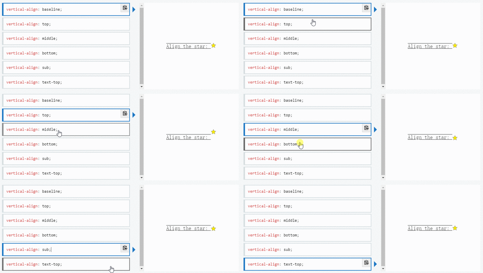
Note vertical-align only takes effect on inline elements and table cell elements: you cannot use it to vertically align block-level elements.
2. writing-mode
The writing-mode attribute defines the horizontal or vertical layout of text and the direction of text travel in block-level elements. When setting book for the entire document, it should be set on the root element (for HTML documents it should be set on the html element). It takes one of the following values: horizontal-tb (default) | vertical-rl | vertical-lr.
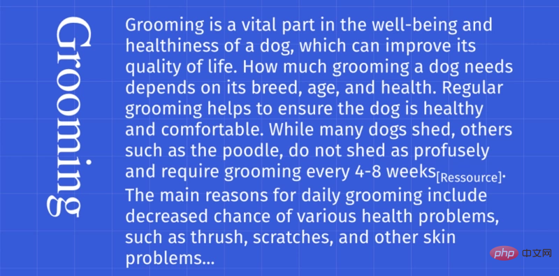
**horizontal-tb:** For left-aligned (ltr) scripts, content flows horizontally from left to right. For right-aligned (rtr) scripts, content flows horizontally from right to left. The next horizontal row is below the previous row.
**vertical-rl:** For left-aligned (ltr) scripts, content flows vertically from top to bottom, with the next vertical line to the left of the previous line. For right-aligned (rtr) scripts, content flows vertically from bottom to top, with the next vertical line to the right of the previous line.
**vertical-lr:** For left-aligned (ltr) scripts, content flows vertically from top to bottom, with the next vertical line to the right of the previous line. For right-aligned (rtr) scripts, content flows vertically from bottom to top, with the next vertical line to the left of the previous line.
3. font-variant-numeric
The font-variant-numeric CSS property controls the use of alternative glyphs for number, fraction, and ordinal markers.
It takes one of these values: normal | ordinal | slashed-zero | lining-nums | oldstyle-nums | proportional-nums | tabular-nums | diagonal-fractions | stacked-fractions.
This property is useful for setting number styles. Depending on the situation, you may want to display old-fashioned numbers or zeros with slashes, for these cases font-feature-settings can be useful.
Please note that font-variant-numeric is part of the font-feature-settings group properties. Properties such as font-variant-caps or font-variant-ligatures also belong to this group.
4. user-select
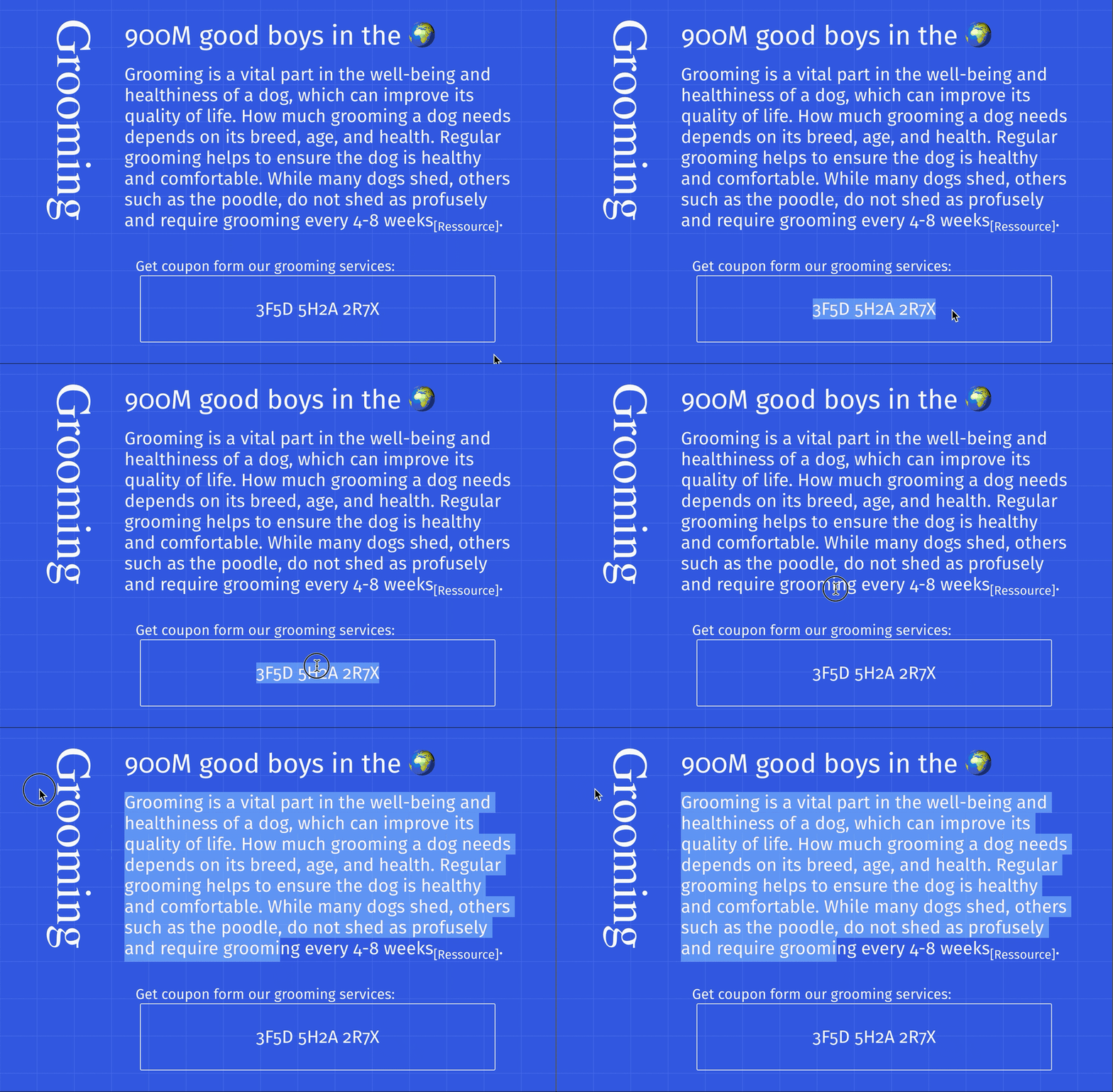
Whenever we have text that we don’t want the user to select, or conversely if a double click or context click occurs and want all text to be selected The user-select attribute will be very useful.
This property takes one of the following values: none | auto | text | all.
**none: The text of the ** element and its sub-elements cannot be selected. Please note that this Selection object can contain these elements. Starting in Firefox 21, none behaves like -moz-none, so you can use -moz-user-select: text to re-enable selection on child elements.
auto
#The specific value of auto depends on a series of conditions, as follows:
On the ::before and ::after pseudo-elements, the attribute value used is none
If the element is an editable element, the attribute value adopted is contain
Otherwise, if the user-select attribute value adopted by the parent element of this element is all, the element adopts The attribute value of The attribute value is text
**text: **The user can select text.
**all: **In an HTML editor, when a child element or context is double-clicked, the top-level element containing the child element will also be selected.
5. clip-path
The clip-path CSS property can create a clipping area where only part of the element can be displayed. Parts within the area are displayed and parts outside the area are hidden. The clipping region is a path defined by a reference to an embedded URL or an external svg, or as a shape such as circle(). The clip-path property replaces the now-deprecated clip property.
This attribute takes one of the following values: circle() | ellipse() | polygon() | path() | url().
Since this is an introduction to the property, we won't delve into each value here.
The two values I use most are circle and polygon. The circle(radius at pair) value has two parameters. The first parameter is the radius of the circle, and the second parameter is the point representing the center of the circle. The polygon(pair, pair, pair...) value takes 3 or more points, representing a triangle, a rectangle, etc.

6. shape-outside
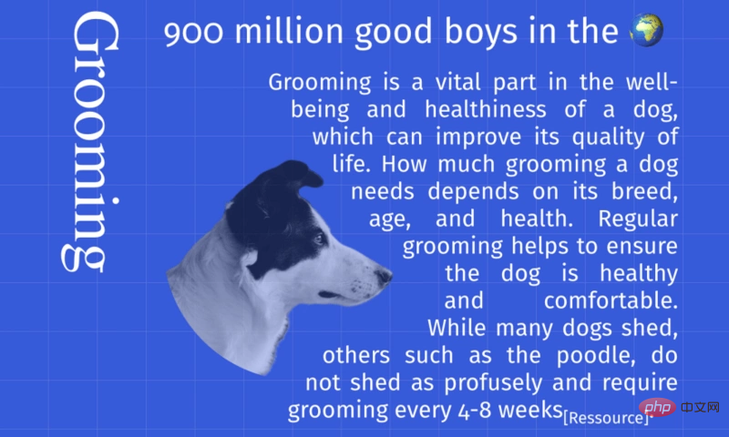
The shape-outside CSS property defines a shape that can be non-rectangular, adjacent Inline content should be wrapped around the shape. By default, inline content wraps its margin box; shape-outside provides a way to customize this wrapping to wrap text around a complex object rather than a simple box. It takes the same value as clip-path.
clip-path defines how users view the element, and shape-outside defines how other HTML elements view the element.
7. background-clip
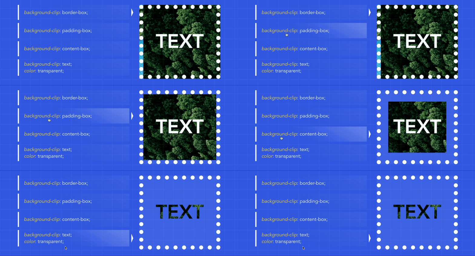
Finally, the backgroundclip CSS property sets whether the element's background extends to its border, padding, or content under the box.
This attribute takes one of the following values: border-box (default) | padding-box | content-box | text
Recommended tutorial:《CSSTutorial》
The above is the detailed content of 7 properties in CSS you must know. For more information, please follow other related articles on the PHP Chinese website!

Hot AI Tools

Undresser.AI Undress
AI-powered app for creating realistic nude photos

AI Clothes Remover
Online AI tool for removing clothes from photos.

Undress AI Tool
Undress images for free

Clothoff.io
AI clothes remover

AI Hentai Generator
Generate AI Hentai for free.

Hot Article

Hot Tools

Notepad++7.3.1
Easy-to-use and free code editor

SublimeText3 Chinese version
Chinese version, very easy to use

Zend Studio 13.0.1
Powerful PHP integrated development environment

Dreamweaver CS6
Visual web development tools

SublimeText3 Mac version
God-level code editing software (SublimeText3)

Hot Topics
 1386
1386
 52
52
 How to use bootstrap in vue
Apr 07, 2025 pm 11:33 PM
Using Bootstrap in Vue.js is divided into five steps: Install Bootstrap. Import Bootstrap in main.js. Use the Bootstrap component directly in the template. Optional: Custom style. Optional: Use plug-ins.
 The Roles of HTML, CSS, and JavaScript: Core Responsibilities
Apr 08, 2025 pm 07:05 PM
HTML defines the web structure, CSS is responsible for style and layout, and JavaScript gives dynamic interaction. The three perform their duties in web development and jointly build a colorful website.
 How to write split lines on bootstrap
Apr 07, 2025 pm 03:12 PM
There are two ways to create a Bootstrap split line: using the tag, which creates a horizontal split line. Use the CSS border property to create custom style split lines.
 Understanding HTML, CSS, and JavaScript: A Beginner's Guide
Apr 12, 2025 am 12:02 AM
WebdevelopmentreliesonHTML,CSS,andJavaScript:1)HTMLstructurescontent,2)CSSstylesit,and3)JavaScriptaddsinteractivity,formingthebasisofmodernwebexperiences.
 How to resize bootstrap
Apr 07, 2025 pm 03:18 PM
To adjust the size of elements in Bootstrap, you can use the dimension class, which includes: adjusting width: .col-, .w-, .mw-adjust height: .h-, .min-h-, .max-h-
 How to set up the framework for bootstrap
Apr 07, 2025 pm 03:27 PM
To set up the Bootstrap framework, you need to follow these steps: 1. Reference the Bootstrap file via CDN; 2. Download and host the file on your own server; 3. Include the Bootstrap file in HTML; 4. Compile Sass/Less as needed; 5. Import a custom file (optional). Once setup is complete, you can use Bootstrap's grid systems, components, and styles to create responsive websites and applications.
 How to insert pictures on bootstrap
Apr 07, 2025 pm 03:30 PM
There are several ways to insert images in Bootstrap: insert images directly, using the HTML img tag. With the Bootstrap image component, you can provide responsive images and more styles. Set the image size, use the img-fluid class to make the image adaptable. Set the border, using the img-bordered class. Set the rounded corners and use the img-rounded class. Set the shadow, use the shadow class. Resize and position the image, using CSS style. Using the background image, use the background-image CSS property.
 How to use bootstrap button
Apr 07, 2025 pm 03:09 PM
How to use the Bootstrap button? Introduce Bootstrap CSS to create button elements and add Bootstrap button class to add button text


