How to make data curve chart

How to make a data curve chart?
1. Create a new excel file on the computer desktop (the operation process is to right-click, select the "New" option in the options, and then select "excel file" to successfully create a new excel file. file)
2. Double-click to open the newly created excel file, enter the data you need to statistically create a curve, remember to enter the X-axis data at the top and the Y-axis data at the bottom. .
3. Then select the data with a larger X-axis range required and draw the curve first. Among the editor's data, the data below has a larger range, so select all the data below first.
4. Then switch the upper menu bar to the "Insert" option, click the small triangle below "Scatter Plot", and select the curve type with smooth lines in it.
5. A graph of these data will pop up in the interface. Then select the data, right-click, and select the "Select Data" option.
6. A small window will pop up as shown in the figure below, click the "Add" option, and a selection data box will appear as shown below.
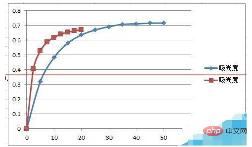
7. Select the data name in "Series Name", this picture is "Absorbance"; select the data to be added in "X-Axis Series Value" and "Y-Axis Series Value" respectively.
8. After clicking "OK", two curves will be successfully formed on one graph in the interface. The picture below is the rendering after production.
Recommended: "Excel Tutorial"
The above is the detailed content of How to make data curve chart. For more information, please follow other related articles on the PHP Chinese website!

Hot AI Tools

Undresser.AI Undress
AI-powered app for creating realistic nude photos

AI Clothes Remover
Online AI tool for removing clothes from photos.

Undress AI Tool
Undress images for free

Clothoff.io
AI clothes remover

AI Hentai Generator
Generate AI Hentai for free.

Hot Article

Hot Tools

Notepad++7.3.1
Easy-to-use and free code editor

SublimeText3 Chinese version
Chinese version, very easy to use

Zend Studio 13.0.1
Powerful PHP integrated development environment

Dreamweaver CS6
Visual web development tools

SublimeText3 Mac version
God-level code editing software (SublimeText3)

Hot Topics
 1386
1386
 52
52
 How to create timeline in Excel to filter pivot tables and charts
Mar 22, 2025 am 11:20 AM
This article will guide you through the process of creating a timeline for Excel pivot tables and charts and demonstrate how you can use it to interact with your data in a dynamic and engaging way. You've got your data organized in a pivo
 Excel formula to find top 3, 5, 10 values in column or row
Apr 01, 2025 am 05:09 AM
This tutorial demonstrates how to efficiently locate the top N values within a dataset and retrieve associated data using Excel formulas. Whether you need the highest, lowest, or those meeting specific criteria, this guide provides solutions. Findi
 All you need to know to sort any data in Google Sheets
Mar 22, 2025 am 10:47 AM
Mastering Google Sheets Sorting: A Comprehensive Guide Sorting data in Google Sheets needn't be complex. This guide covers various techniques, from sorting entire sheets to specific ranges, by color, date, and multiple columns. Whether you're a novi
 Regex to extract strings in Excel (one or all matches)
Mar 28, 2025 pm 12:19 PM
In this tutorial, you'll learn how to use regular expressions in Excel to find and extract substrings matching a given pattern. Microsoft Excel provides a number of functions to extract text from cells. Those functions can cope with most
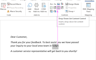 Add a dropdown list to Outlook email template
Apr 01, 2025 am 05:13 AM
This tutorial shows you how to add dropdown lists to your Outlook email templates, including multiple selections and database population. While Outlook doesn't directly support dropdowns, this guide provides creative workarounds. Email templates sav
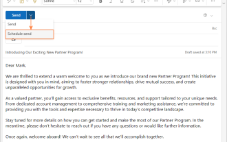 How to schedule send in Outlook
Mar 22, 2025 am 09:57 AM
Wouldn't it be convenient if you could compose an email now and have it sent at a later, more opportune time? With Outlook's scheduling feature, you can do just that! Imagine that you are working late at night, inspired by a brilliant ide
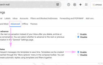 How to enable templates in Gmail — quick setup guide
Mar 21, 2025 pm 12:03 PM
This guide shows you two easy ways to enable email templates in Gmail: using Gmail's built-in settings or installing the Shared Email Templates for Gmail Chrome extension. Gmail templates are a huge time-saver for frequently sent emails, eliminating
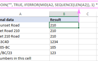 How to remove / split text and numbers in Excel cell
Apr 01, 2025 am 05:07 AM
This tutorial demonstrates several methods for separating text and numbers within Excel cells, utilizing both built-in functions and custom VBA functions. You'll learn how to extract numbers while removing text, isolate text while discarding numbers


