Text-shadow in CSS3 implements text shadow effect (code example)
Goal of this article:
1. Master the usage of text-shadow
Question:
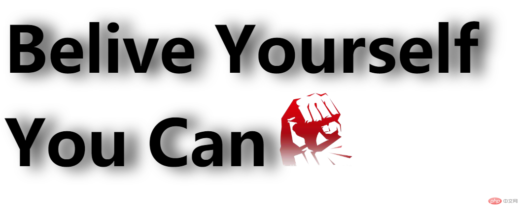
Use pure div css to achieve the following effects

Additional notes:
1. There are 4 characters in total: Belive Yourself You Can
2. The text size is 86px
3. The spacing between the text on the right and the text on the left is 20px
4. The image size and width are: 100px
5. The horizontal translation of the shadow is 15px, the vertical translation is 2, and the blur is 20. The color is #333333
. The specific operations are as follows:
1. Prepare the materials, create a new images directory, and save the picture files in this directory for easy management. The materials are

2. Create index.html, write the architecture, how to analyze the architecture
Thinking Analysis:
1. The structure is divided into upper and lower parts. The upper part displays 2 English words, one is Belive and the other is Yourself, but the text has a shadow effect
2. The lower part of the structure is also displayed 2 English words and a picture, one English word is You and the other is Can, and the text should also have a shadow effect
According to the analysis, we got the following code
<!DOCTYPE html>
<html>
<head>
<meta charset="utf-8">
<title>text-shadow实现文字阴影</title>

</head>
<body>
<div class="container">
    <div class="top">
        <strong class="word">Belive</strong>
        <strong class="word rword">Yourself</strong>
    </div>
    <div class="bottom">
        <strong class="word">You</strong>
        <strong class="word rword">Can</strong>
        <img  src="/static/imghw/default1.png"  data-src="https://img.php.cn/upload/image/688/223/705/1591366888178376.png"  class="lazy"   / alt="Text-shadow in CSS3 implements text shadow effect (code example)" >
    </div>
</div>
</body>
</html>3. Writing style , create a css directory, and create a new file index.css in it. The idea analysis in css is as follows
Idea analysis:
1..container *
Idea analysis
1. In order to set the common styles of all elements in the container, we can write these common codes into the .container * style
So add the following code to index.css:
.container *{
    padding:0;
    margin:0;
}2. .word text
Idea analysis:
1. According to the requirements, the text size is 86px and has a shadow effect. According to the required shadow settings, it is converted into code For text-shadow: 15px 2px 20px #333333;
So add the code to index.css as follows
.word{
    font-size: 86px;
    text-shadow: 15px 2px 20px #333333;
}3. The text on the right side of rword
Idea analysis:
1. According to the requirements, the distance between the right text and the left text is 20px, so margin-left:20px;
So add the code to index.css as follows
.rword{
     margin-left:20px;
}4. Image settings
Idea analysis:
1. According to the requirements, width=100px, and then the distance between it and the text on the left is 10px
So add the code to index.css as follows
.bottom img{
    margin-left:10px;
    width:100px;
}So far, the entire content of index.css is as follows:
.container *{
    padding:0;
    margin:0;
}

.word{
    font-size: 86px;
    text-shadow: 15px 2px 20px #333333;
}

.rword{
    margin-left:20px;
}
.bottom img{
    margin-left:10px;
    width:100px;
}Next, introduce index.css into index.html
<!DOCTYPE html>
<html>
<head>
<meta charset="utf-8">
<title>text-shadow实现文字阴影</title>
<link rel="stylesheet" href="css/index.css" />
</head>
<body>
<div class="container">
    <div class="top">
        <strong class="word">Belive</strong>
        <strong class="word rword">Yourself</strong>
    </div>
    <div class="bottom">
        <strong class="word">You</strong>
        <strong class="word rword">Can</strong>
        <img  src="/static/imghw/default1.png"  data-src="https://img.php.cn/upload/image/688/223/705/1591366888178376.png"  class="lazy"   / alt="Text-shadow in CSS3 implements text shadow effect (code example)" >
    </div>
</div>
</body>
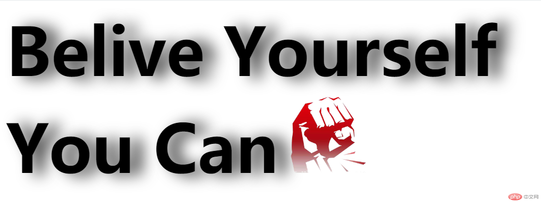
</html>The running results are as follows:

So far, we have achieved all the requirements
Summary:
1. Learn text The usage of -shadow, the main format is: text-shadow: horizontal offset vertical offset blur color
The offset can be positive or negative, positive means horizontally to the left or vertically downward, negative number means On the contrary
I hope this article can bring some help to everyone, thank you! ! !
The above is the detailed content of Text-shadow in CSS3 implements text shadow effect (code example). For more information, please follow other related articles on the PHP Chinese website!

Hot AI Tools

Undresser.AI Undress
AI-powered app for creating realistic nude photos

AI Clothes Remover
Online AI tool for removing clothes from photos.

Undress AI Tool
Undress images for free

Clothoff.io
AI clothes remover

AI Hentai Generator
Generate AI Hentai for free.

Hot Article

Hot Tools

Notepad++7.3.1
Easy-to-use and free code editor

SublimeText3 Chinese version
Chinese version, very easy to use

Zend Studio 13.0.1
Powerful PHP integrated development environment

Dreamweaver CS6
Visual web development tools

SublimeText3 Mac version
God-level code editing software (SublimeText3)

Hot Topics
 1385
1385
 52
52
 How to achieve wave effect with pure CSS3? (code example)
Jun 28, 2022 pm 01:39 PM
How to achieve wave effect with pure CSS3? This article will introduce to you how to use SVG and CSS animation to create wave effects. I hope it will be helpful to you!
 Use CSS skillfully to realize various strange-shaped buttons (with code)
Jul 19, 2022 am 11:28 AM
This article will show you how to use CSS to easily realize various weird-shaped buttons that appear frequently. I hope it will be helpful to you!
 How to hide elements in css without taking up space
Jun 01, 2022 pm 07:15 PM
Two methods: 1. Using the display attribute, just add the "display:none;" style to the element. 2. Use the position and top attributes to set the absolute positioning of the element to hide the element. Just add the "position:absolute;top:-9999px;" style to the element.
 How to implement lace borders in css3
Sep 16, 2022 pm 07:11 PM
In CSS, you can use the border-image attribute to achieve a lace border. The border-image attribute can use images to create borders, that is, add a background image to the border. You only need to specify the background image as a lace style; the syntax "border-image: url (image path) offsets the image border width inward. Whether outset is repeated;".
 It turns out that text carousel and image carousel can also be realized using pure CSS!
Jun 10, 2022 pm 01:00 PM
How to create text carousel and image carousel? The first thing everyone thinks of is whether to use js. In fact, text carousel and image carousel can also be realized using pure CSS. Let’s take a look at the implementation method. I hope it will be helpful to everyone!
 How to enlarge the image by clicking the mouse in css3
Apr 25, 2022 pm 04:52 PM
Implementation method: 1. Use the ":active" selector to select the state of the mouse click on the picture; 2. Use the transform attribute and scale() function to achieve the picture magnification effect, the syntax "img:active {transform: scale(x-axis magnification, y Axis magnification);}".
 How to set animation rotation speed in css3
Apr 28, 2022 pm 04:32 PM
In CSS3, you can use the "animation-timing-function" attribute to set the animation rotation speed. This attribute is used to specify how the animation will complete a cycle and set the speed curve of the animation. The syntax is "element {animation-timing-function: speed attribute value;}".
 Does css3 animation effect have deformation?
Apr 28, 2022 pm 02:20 PM
The animation effect in css3 has deformation; you can use "animation: animation attribute @keyframes ..{..{transform: transformation attribute}}" to achieve deformation animation effect. The animation attribute is used to set the animation style, and the transform attribute is used to set the deformation style. .


