
This article will introduce to you through code examples how to use pure CSS to achieve the plus sign " " effect. It has certain reference value. Friends in need can refer to it. I hope it will be helpful to everyone.
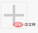
Achieve the plus sign effect in the picture below:

If you want to achieve this effect, you only need one div element.
You need to use css for before, after, and border features.
First set a div note
<div class="add"></div>
Then set a border:
.add {
  border: 1px solid;
  width: 100px;
  height: 100px;
  color: #ccc;
  transition: color .25s;
  position: relative;
}At this time the border is like this:
We can use the pseudo-class before and its border-top to set a "horizontal":
.add::before{
  content: '';
  position: absolute;
  left: 50%;
  top: 50%;
  width: 80px;
  margin-left: -40px;
  margin-top: -5px;
border-top: 10px solid;}
Note that we use absolute positioning. At this time it becomes like this:
Referring to the above, we can use the after pseudo-class and border-bottom to set a "vertical":
.add::after {
 content: '';
 position: absolute;
 left: 50%;
 top: 50%;
 height: 80px;
 margin-left: -5px;
 margin-top: -40px;
 border-left: 10px solid;
}After adding Go to the hover pseudo-class and set the color when the mouse hovers up:
Final style:

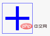
When the mouse hovers up, it will change color:

More cool CSS3, html5, javascript special effects codes, all in: js special effects collection
For more related tutorials, please visit CSS3 latest version reference manual
The above is the detailed content of Pure CSS to achieve the plus sign '+' effect (code example). For more information, please follow other related articles on the PHP Chinese website!