
Suitable for beginners to learn CSS3 to implement cute animals
Today, I want to show you how to skillfully use HTML and CSS sorting animations and SVG filters to bring one of the cutest things in life—animals—to the web. We'll explore two techniques for drawing animals: one using pure HTML and CSS, and the other using an inline SVG background image.
This demo is highly experimental - the animated SVG filter is currently only available in Chrome.
The animation involved is also complex, so this tutorial will focus on the different techniques involved in creating these animals and their lifelike movements. Let your creativity run wild and create your own unique and playful animal animations.
Without further ado, let’s get started!

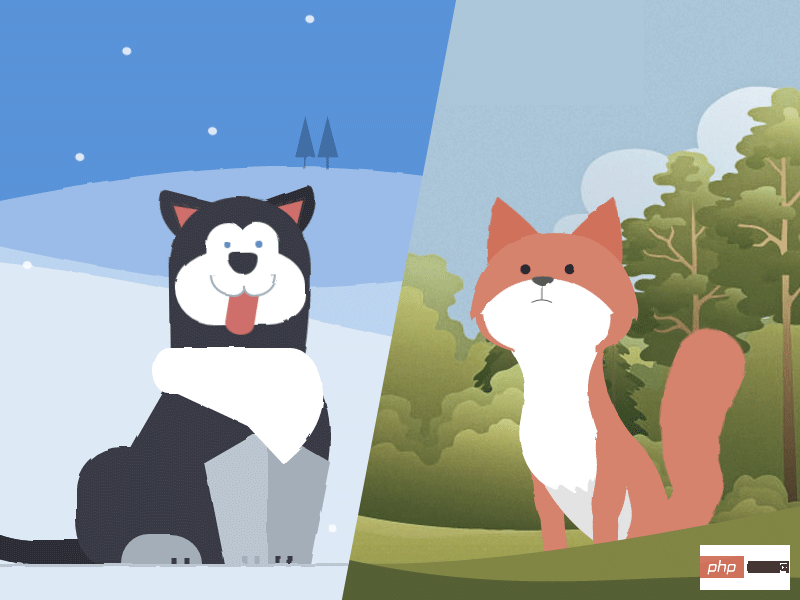
Demonstrates the use of two different techniques to create the shapes of different body parts of an animal. The husky uses the CSS border-radius property and the fox uses an inline background SVG image because the latter has a more complex shape.
Both animals use nested HTML sections to group body parts. The concept of grouping is very important for creating realistic animations - when the head moves, the eyes and ears should also keep moving together because they are on the head.
<!-- Markup for the fox head -->
<p class="fox-head">
  <p class="fox-face">
    <p class="fox-ears">
      <p class="fox-ear"></p>
      <p class="fox-ear"></p>
    </p>
    <p class="fox-skull"></p>
    <p class="fox-front"></p>
    <p class="fox-eyes"></p>
    <p class="fox-nose"></p>
  </p>
</p>
<!-- Markup for the husky head -->
<p class="husky-head">
  <p class="husky-ear"></p>
  <p class="husky-ear"></p>
  <p class="husky-face">
    <p class="husky-eye"></p>
    <p class="husky-eye"></p>
    <p class="husky-nose"></p>
    <p class="husky-mouth">
      <p class="husky-lips"></p>
      <p class="husky-tongue"></p>
    </p>
  </p>
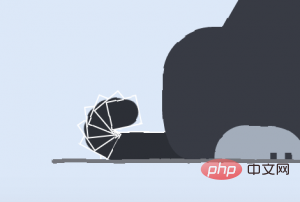
</p>Each part can be moved independently and with the movement of its parent element, which results in a more realistic effect. I don’t know if you noticed it, but the tail is deeply nested into other tail components. When each tail section is positioned relative to its parent body and then rotated by the same amount, the visual perception of a uniform curve is created.

The border-radius property of CSS is widely used to shape the image of the husky. For many elemental features, each boundary radius needs to be controlled individually. For example, here's the code for how to construct a husky's hind legs:
.husky-hind-leg {
  // ...
  border-top-left-radius: 35% 100%;
  border-top-right-radius: 40% 100%;
}The first number represents the depth of the curve starting from the top/bottom edge, and the second number represents the depth of the curve starting from the left/right edge.
Other shapes, such as the front legs, cannot be shaped with border-radius alone and need to be shaped using transform:
.husky-front-legs > .husky-leg:before {
  transform: skewY(-30deg) skewX(10deg);
  transform-origin: top right;
}Once the shape is in place, each element can be shaped within its parent element Gives an absolute percentage-based position. This ensures precise placement of each body part as well as responsiveness.
As for the fox, Sass-SVG was used to create complex SVG shapes for each body part. SVG images can be used as background images, and even better, can be written inline (for maximum browser support) as long as they are based on 64 or UTF-8 encoding.
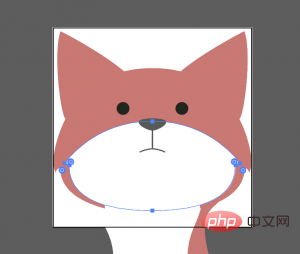
However, SVG code is very tricky to write by hand. I used Adobe Illustrator to create the initial shapes:

Then I saved each body part as an SVG image. SVG code is transferred to SCSS stylesheets via Sass-SVG. For example, this is a fox's nose:
.fox-nose:before {
  @include svg((viewBox: (0 0 168 168))) {
    // the nose
    @include svg('path', (
      fill: $color-nose,
      d: 'M83.7,86.7c3.3,0,11.6-3.9,11.6-7.1c0-3.2-9.4-3.2-11.6-3.2c-2.2,0-11.6,0-11.6,3.2   C72.1,82.8,80.4,86.7,83.7,86.7z'
    ));
    // the line connecting the nose to the mouth
    @include svg('path', (
      stroke: $color-nose,
      fill: none,
      d: 'M83.7,102.3V86.7'
    ));
    // the mouth
    @include svg('path', (
      stroke: $color-nose,
      fill: none,
      d: 'M94.5,104.9c0,0-5.2-2.7-10.8-2.7c-5.6,0-10.8,2.7-10.8,2.7'
    ));
  }
}This will generate an encoded inline SVG string in `url()` that looks like this:
.fox-nose:before {
  background-image: url("data:image/svg+xml;charset=utf8,%3Csvg...");
}Since SVG is a A background image so it can be transformed and animated just like an HTML element. With Sass-SVG, Sass $variables can be used to fully control SVG fill and stroke colors.
Making Fox responsive is easy with inline SVG. The viewbox attribute value ((viewBox: (0 0 168 168))) comes directly from the SVG file, but the element containing the SVG background image can be any size as long as the height/width ratio is maintained. All parts of the fox's head are absolutely positioned, with the same height and width as .fox-head.
Squigglevision is an animation technique that simulates hand-drawn animation by wiggling the outlines of shapes. This makes scenes like the fox and husky look more dynamic and hand-drawn, even when the animals are stationary.
SVG has a filter called
<svg xmlns="http://www.w3.org/2000/svg" version="1.1">
  <defs>
    <filter id="squiggly-0">
      <feTurbulence id="turbulence" baseFrequency="0.02" numOctaves="3" result="noise" seed="0"/>
      <feDisplacementMap id="displacement" in="SourceGraphic" in2="noise" scale="2" />
    </filter>
    <filter id="squiggly-1">
      <feTurbulence id="turbulence" baseFrequency="0.02" numOctaves="3" result="noise" seed="1"/>
<feDisplacementMap in="SourceGraphic" in2="noise" scale="3" />
    </filter>
    <filter id="squiggly-2">
      <feTurbulence id="turbulence" baseFrequency="0.02" numOctaves="3" result="noise" seed="2"/>
<feDisplacementMap in="SourceGraphic" in2="noise" scale="2" />
    </filter>
    <filter id="squiggly-3">
      <feTurbulence id="turbulence" baseFrequency="0.02" numOctaves="3" result="noise" seed="3"/>
<feDisplacementMap in="SourceGraphic" in2="noise" scale="3" />
    </filter>
    <filter id="squiggly-4">
      <feTurbulence id="turbulence" baseFrequency="0.02" numOctaves="3" result="noise" seed="4"/>
<feDisplacementMap in="SourceGraphic" in2="noise" scale="1" />
    </filter>
  </defs>
</svg>attribute of any element. To create the "squigglevision" effect, keyframe animation quickly sets one filter at a time
@keyframes squigglevision {
  0% {
    -webkit-filter: url('#squiggly-0');
    filter: url('#squiggly-0');
  }
  25% {
    -webkit-filter: url('#squiggly-1');
    filter: url('#squiggly-1');
  }
  50% {
    -webkit-filter: url('#squiggly-2');
    filter: url('#squiggly-2');
  }
  75% {
    -webkit-filter: url('#squiggly-3');
    filter: url('#squiggly-3');
  }
  100% {
    -webkit-filter: url('#squiggly-4');
    filter: url('#squiggly-4');
  }
}NOTE: These SVG filters don't seem to work in Firefox at the moment, so it's possible to animate a filter like this Considered as a progressive enhancement process.
CSS关键帧不能为我们提供一种方便的排序和组合动画的方法。解决这个问题的最好方法是将动画计划(故事板)作为时间轴,并使用预处理器,如Sass,生成关键帧。
例如狐狸,在概述每个动画应发生的故事板之后,转换和绝对时间偏移(秒)被用于对每个身体部分进行动画处理。以下是SCSS中对狐狸鼻子进行概述的一个例子:
$animations: (
  // ...
  'nose': (
    // resting position
    (4s, 5s, 7s): rotateY(-4deg),
    // nose down
    4.5s: rotateY(-4deg) rotateX(-3deg),
    // fox looks left
    (7.5s, 9s): rotateX(-3deg) rotateY(-28deg) rotateZ(-11deg),
    // fox looks right
    (9.5s, 12s): rotateY(7deg),
    // fox looks straight ahead
    13s: rotateY(0),
  ),
  // ...
);在这里,$animations是一类Sass map,其中键是动画的名称(例如“nose”)。每个动画名称的值是另一个map,其中键是以秒为单位的偏移或偏移列表(例如(7.5s,9s)),并且值是每个偏移键的transform属性。
那么,我们怎么把这个map变成@keyframe动画呢?首先,设置全局的$duration: 17s变量——这将是每个动画的总持续时间。然后,使用嵌套的Sass @each ... in ... 循环,我们可以通过对$animations map循环为每个动画生成预期的CSS @keyframe声明:
@each $animation-name, $animation in $animations {
  // keyframe declaration
  @keyframes #{$animation-name} {
    @each $offsets, $transform in $animation {
      @each $offset in $offsets {
        // offset declaration block
        #{percentage($offset / $duration)} {
          // transform property
          transform: #{$transform};
        }
      }
    }
  }
}这将生成如下所示的关键帧:
@keyframes nose {
  14.70588% {
    transform: rotateY(-4deg); }
  23.52941% {
    transform: rotateY(-4deg); }
  29.41176% {
    transform: rotateY(-4deg); }
  41.17647% {
    transform: rotateY(-4deg); }
  26.47059% {
    transform: rotateY(-4deg) rotateX(-3deg); }
  44.11765% {
    transform: rotateX(-3deg) rotateY(-28deg) rotateZ(-11deg); }
  52.94118% {
    transform: rotateX(-3deg) rotateY(-28deg) rotateZ(-11deg); }
  55.88235% {
    transform: rotateY(7deg); }
  70.58824% {
    transform: rotateY(7deg); }
  76.47059% {
transform: rotateY(0); } }在不使用SCSS的情况下,这些百分比的计算可能非常繁琐。它们代表动画的每个步骤中每个所需时间值相对于总$duration的百分比偏移量。
然后可以将动画应用于它们各自的身体部位,例如animation: nose $duration none infinite;。每个动画的持续时间都得是一样的,这样它们可以无缝循环。
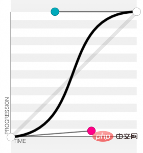
制作动画的另一个重要组成部分是看上去要逼真,所以要为动画的每个部分仔细选择(或创建)Easing Curves。最为生动的Easing Curves是“正弦曲线”——换句话说,是平滑起伏的Easing Curves。这样一来,自然动作就不会僵硬地起动或停止,animation-timing-function应该能反映出来。
对于狐狸和哈士奇,我使用cubic-bezier(0.645, 0.045, 0.355, 1)(在这里预览)。此曲线(见下文)开始略快,然后平稳地停住。当然,最好试验曲线以找到最适合动画的那种。

最后:在Chrome中,你可以直观地检查所有排序的动画,以确保它们在正确的时间发生。你只需打开控制台,单击Style选项卡,然后单击播放按钮即可:
希望本教程可以帮助启发你创建更多的序列CSS动物动画!
更多相关知识,请访问 PHP中文网!!
The above is the detailed content of CSS3 suitable for beginners to learn cute animals. For more information, please follow other related articles on the PHP Chinese website!
 css3 tutorial
 What are the production methods of html5 animation production?
 What are the css3 gradient properties?
 The difference between HTML and HTML5
 What data does redis cache generally store?
 Webstorm startup project method
 How to return to the homepage from an html subpage
 How to enter root privileges in linux
 jquery each