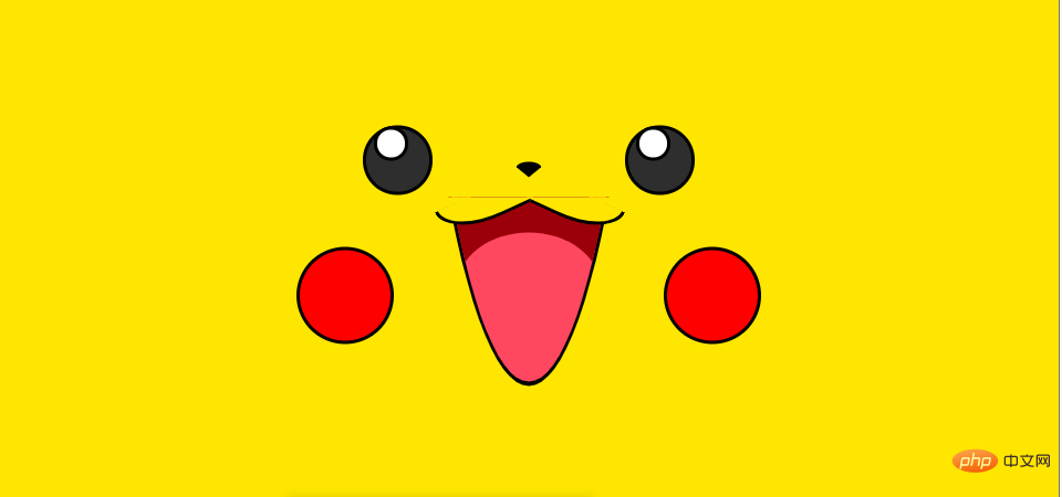

After I finished learning css and js, an idea came to my mind. Implement a cute cartoon character yourself. So I went to codepen to look for materials, and finally chose Pikachu, as shown below.

Before starting to write Pikachu, I first observed the entire page of Pikachu. I found that if you want to implement this Pikachu well, you can't lay it out from left to right like writing a traditional web page, but you have to lay it out from the middle, because the left and right sides are symmetrical. After clarifying the idea, now start writing the page structure.
    <p>
        </p><p></p>
        <p></p>
        <p>
            </p><p></p>

        <p>
            </p><p>
                </p><p></p>
                <p></p>

            <p>
                </p><p>
                    </p><p></p>


        <p></p>
        <p>
            <img  src="/static/imghw/default1.png" data-src="src/img/flash.gif" class="lazy" alt="Implementing Pikachu using CSS" >
        </p>
        <p>
            <img  src="/static/imghw/default1.png" data-src="src/img/flash.gif" class="lazy" alt="Implementing Pikachu using CSS" >
        </p>
The page structure is as shown in the picture above. When we finish writing the html structure, we can start writing css.
We can stop here temporarily and clarify our thoughts again. What's the hardest part about this Pikachu? It lies in the arc on Pikachu’s mouth and the oval tongue underneath.
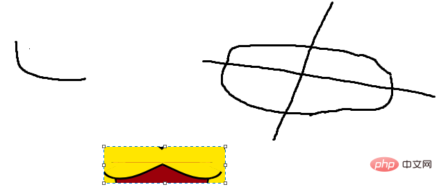
When implementing the arc on Pikachu's mouth, I had two ideas. The first is to wrap it with one label to realize the arc, and the second is to wrap it with two tags to realize the two arcs. In the end I chose the second option. Here I observed the arc on Pikachu's mouth and found that this arc is one quarter of the rounded rectangle. By adding rotation, these two arcs can be achieved.

The specific implementation is as follows
.mouth .up {    position: relative;    top: -20px;    z-index: 1;
}.mouth .up .lip {    border: 3px solid black;    height: 30px;    width: 100px;    background: #ffe600;    border-top-color: transparent;    border-right-color: transparent;    position: relative;    position: absolute;    left: 50%;    margin-left: -50px;
}.mouth .up .lip.left {    border-radius: 0 0 0 35px;    transform: rotate(-20deg) translateX(-53px);
}.mouth .up .lip.right {    border-radius: 0 0 35px 0;    transform: rotate(20deg) translateX(53px);
}.mouth .up .lip::before {    content: '';    display: block;    width: 7px;    height: 30px;    position: absolute;    bottom: 0;    background: #ffe600;
}.mouth .up .lip.left::before {    right: -6px;
}.mouth .up .lip.right::before {    left:  -6px;
}The first major difficulty has been solved, and the second difficulty will be solved next. How to achieve Pikachu's lower lip.
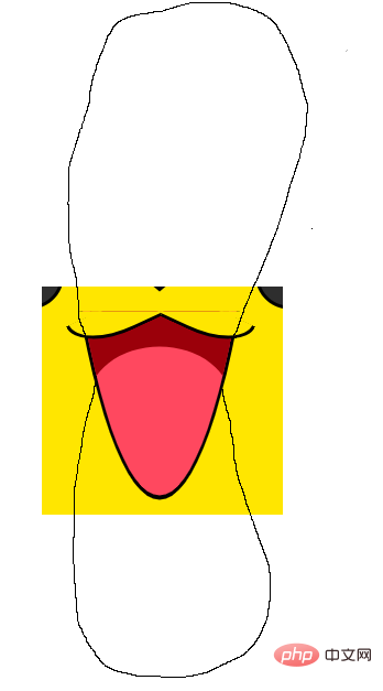
Observing Pikachu's tongue, I found that it is actually part of an ellipse or a part of a rounded rectangle. Then I need to cut off part of the ellipse or rounded rectangle to realize Pikachu's tongue. The second solution point is how to realize the pink part of Pikachu's tongue. After having the above idea, continue to think along this idea. In fact, this is achieved at the junction of two rounded rectangles or ovals.

The painting is not very good, please forgive me.
The specific code implementation is as follows
.mouth .down {    height: 180px;    position: absolute;    top: 5px;    width: 100%;    overflow: hidden;
}.mouth .down .yuan1 {    border: 3px solid black;    width: 150px;    height: 1000px;    position: absolute;    bottom: 0;    left: 50%;    margin-left: -75px;    border-radius: 75px/300px;    background: #9b000a;    overflow: hidden;
}.mouth .down .yuan1 .yuan2 {    width: 200px;    height: 300px;    background: #ff485f;    position: absolute;    bottom: -160px;    left: 50%;    margin-left: -100px;    border-radius: 100px;
}After solving these two difficulties, almost half of the entire Pikachu is completed, and the rest can be completed by yourself.
After I finished writing Pikachu’s css, I could only sigh at the magic of css, which also gave me a deeper understanding of css. Before this, I thought CSS was very simple, but when it came to actually making Pikachu, it was still very difficult. The difficulty lies in the fact that you need to use a variety of methods to achieve the effect you want, which requires a good foundation and ideas. , I would like to thank all the teachers and classmates who guided me.
Recommended tutorial: "CSS"
The above is the detailed content of Implementing Pikachu using CSS. For more information, please follow other related articles on the PHP Chinese website!