

CSS3 implements responsive accordion

Recently I watched a video of a foreign master using CSS3 to achieve the accordion effect, so I wrote it after studying it and recorded it in the form of a blog to facilitate my future review. The code structure is as follows ( The font used is Genericons):
Video tutorial recommendation: "CSS Video Tutorial-Jade Girl Heart Sutra Edition"
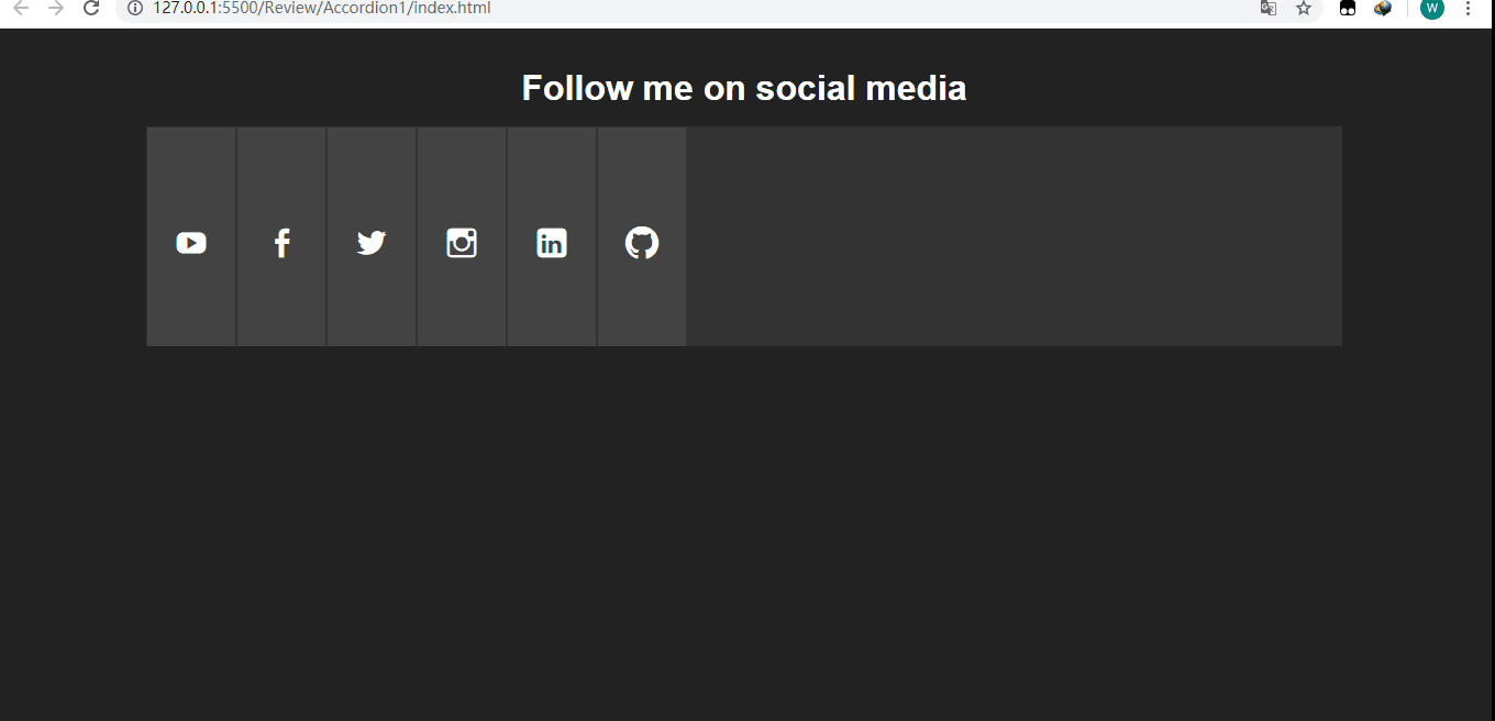
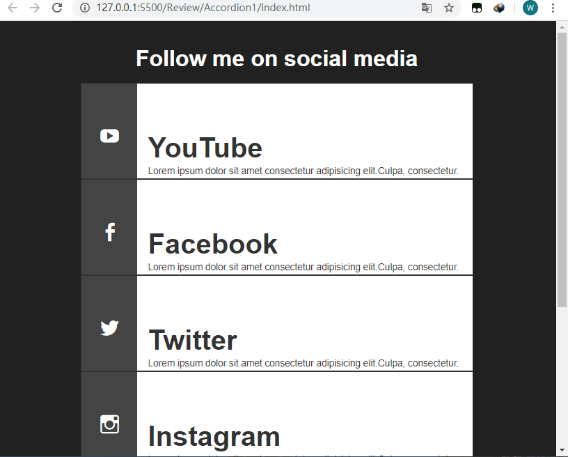
The final effect is as follows:
When full screen:
When the screen width is less than 960px:
Let’s take a look at the basic structure of the page (index.html):
<!DOCTYPE html>
<html lang="en">
<head>
  <meta charset="UTF-8">
  <meta name="viewport" content="width=device-width, initial-scale=1.0">
  <title>Document</title>
  <link rel="stylesheet" href="style.css">
</head>
<body>
  <p class="container">
      <!--标题-->
    <header>
      <h1>Follow me on social media</h1>
    </header>

      <!--手风琴部分-->
    <ul class="accordion">
      <li class="tab">
        <p class="social youtube">
          <a href="#">YouTube</a>
        </p>
        <p class="content">
          <h1>YouTube</h1>
          <p>Lorem ipsum dolor sit amet consectetur
            adipisicing elit.Culpa, consectetur.</p>
        </p>
      </li>
      <li class="tab">
        <p class="social facebook">
          <a href="#">Facebook</a>
        </p>
        <p class="content">
          <h1>Facebook</h1>
          <p>Lorem ipsum dolor sit amet consectetur
            adipisicing elit.Culpa, consectetur.</p>
        </p>
      </li>
      <li class="tab">
        <p class="social twitter">
          <a href="#">Twitter</a>
        </p>
        <p class="content">
          <h1>Twitter</h1>
          <p>Lorem ipsum dolor sit amet consectetur
            adipisicing elit.Culpa, consectetur.</p>
        </p>
      </li>
      <li class="tab">
        <p class="social instagram">
          <a href="#">Instagram</a>
        </p>
        <p class="content">
          <h1>Instagram</h1>
          <p>Lorem ipsum dolor sit amet consectetur
            adipisicing elit.Culpa, consectetur.</p>
        </p>
      </li>
      <li class="tab">
        <p class="social linkedin">
          <a href="#">Linkedin</a>
        </p>
        <p class="content">
          <h1>Linkedin</h1>
          <p>Lorem ipsum dolor sit amet consectetur
            adipisicing elit.Culpa, consectetur.</p>
        </p>
      </li>
       <li class="tab">
        <p class="social github">
          <a href="#">Github</a>
        </p>
        <p class="content">
          <h1>Github</h1>
          <p>Lorem ipsum dolor sit amet consectetur
            adipisicing elit.Culpa, consectetur.</p>
        </p>
      </li>
    </ul>
  </p>
</body>
</html>Style (style.css):
*{
  margin: 0;
  padding: 0;
  border: none;
}

body{
  font-family: Arial, Helvetica, sans-serif;
  background-color: #222;
  color: #fff;
}

/*设置字体,因为后面的图标需要用到*/
@font-face {
  font-family: 'Genericons';
  src: url('font/genericons-regular-webfont.woff') format('woff'),
  url('font/genericons-regular-webfont.eot') format('truetype');
}

/*设置外面容器的宽度*/
.container{
  width: 80%;
  margin: 20px auto;
}

header h1{
  font-size: 2rem;
  padding: 1rem;
  text-align: center;
}

/*注意这里font-size设置为0,不然会出现非常糟糕的画面,我们后面再去单独对需要现实的文本设置字体大小
,因为a链接不想让它显示内容*/
.accordion{
  width: 100%;
  min-width: 800px;
  height: 200px;
  background-color: #333;
  list-style: none;
  display: block;
  overflow: hidden;
  font-size: 0;
}

/*对每一个li设置为inline-block,让其排列在一行,溢出隐藏,因为.tab下面的.content宽度为360,而且.tab只有在hover的时候宽度才会变成450px,那时候.content刚好显示.另外设置过渡,使其宽度增长的过程平缓*/
.tab{
  width: 80px;
  height: 100%;
  display: inline-block;
  position: relative;
  margin: 0;
  background-color: #444;
  border: 1px solid #333;
  overflow: hidden;
  transition: all .5s ease .1s;
}

.tab:hover{
  width: 450px;
}
.tab:hover .social a:after{
  transform: translateX(-80px);
}
.tab:hover .social a:before{
  transform: translateX(-100px);
}

/*设置定位为相对定位,不然.content会有部分内容被遮住*/
.tab .content{
  position: relative;
  width: 360px;
  height: 100%;
  background-color: #fff;
  color: #333;
  margin-left: 80px;
  padding: 50px 0 0 15px;
}

.tab .content h1{
  font-size: 2.5rem;
  margin-top: 20px;
}
.tab .content p{
  font-size: .85rem;
  line-height: 1.6;
}

/设置为元素的宽高及字体为Genericons,不然图标无法显现,只会显示白色的空框框/
.social a:before,
.social a:after{
  position: absolute;
  width: 80px;
  height: 200px;
  display: block;
  text-indent: 0;
  padding-top: 90px;
  padding-left: 25px;
  font:normal 30px Genericons;
  color: #fff;
  transition: all .5s ease;
}

/*因为当我们hover上去的时候图标会更大,所以after伪类的字体及padding要重新设置,同时
要将margin-left设置为80px,这要默认情况下显示的就是before伪类的小图标*/
.social a:after{
  font-size: 48px;
  padding-top: 80px;
  padding-left: 20px;
  margin-left: 80px;
}

/*Add icons*/
.youtube a:before,
.youtube a:after{
  content: '\f213';
}

.youtube a:after{
  background-color: #fc0000;
}

.twitter a:before,
.twitter a:after{
  content: '\f202';
}

.twitter a:after{
  background-color: #6dc5dd;
}

.facebook a:before,
.facebook a:after{
  content: '\f204';
}

.facebook a:after{
  background-color: #3b5998;
}

.linkedin a:before,
.linkedin a:after{
  content: '\f208';
}

.linkedin a:after{
  background-color: #00a9cd;
}

.instagram a:before,
.instagram a:after{
  content: '\f215';
}

.instagram a:after{
  background-color: #6dc993;
}

.github a:before,
.github a:after{
  content: '\f200';
}

.github a:after{
  background-color: #6e5494;
}

/*当屏幕最大宽度为960px时*/
@media(max-width:960px){
  .container{
    width: 70%;
  }
    /*让高度为auto*/
  .accordion{
    min-width: 450px;
    height: auto;
  }

    /*让li显示为block,这样就会依次往下排*/
  .tab{
    width: 100%;
    display: block;
    border-bottom: 1px solid #333;
  }
    /*这个一定要设置,因为原本的.tab:hover时宽度为450px,假如.tab的宽度有600px,在hover时就回剩余150px的空白,不是我们想要的效果*/
  .tab:hover{
    width: 100%;
  }
  .tab .content{
    width: 85%;
  }
    /*设置对应伪类的padding值,使其大概显示在中间*/
  .social a:before{
    padding-top: 60px;
    padding-left: 25px;
  }
  .social a:after{
    padding-top: 50px;
    padding-left: 20px;
  }
}Recommended tutorial: "CSS Tutorial"
The above is the detailed content of CSS3 implements responsive accordion. For more information, please follow other related articles on the PHP Chinese website!

Hot AI Tools

Undresser.AI Undress
AI-powered app for creating realistic nude photos

AI Clothes Remover
Online AI tool for removing clothes from photos.

Undress AI Tool
Undress images for free

Clothoff.io
AI clothes remover

AI Hentai Generator
Generate AI Hentai for free.

Hot Article
Hot Tools

Notepad++7.3.1
Easy-to-use and free code editor

SublimeText3 Chinese version
Chinese version, very easy to use

Zend Studio 13.0.1
Powerful PHP integrated development environment

Dreamweaver CS6
Visual web development tools

SublimeText3 Mac version
God-level code editing software (SublimeText3)
Hot Topics


 Tutorial on using CSS to implement responsive image automatic carousel effect
Nov 21, 2023 am 08:37 AM
Tutorial on using CSS to implement responsive image automatic carousel effect
Nov 21, 2023 am 08:37 AM
With the popularity of mobile devices, web design needs to take into account factors such as device resolution and screen size of different terminals to achieve a good user experience. When implementing responsive design of a website, it is often necessary to use the image carousel effect to display the content of multiple images in a limited visual window, and at the same time, it can also enhance the visual effect of the website. This article will introduce how to use CSS to achieve a responsive image automatic carousel effect, and provide code examples and analysis. Implementation ideas The implementation of responsive image carousel can be implemented through CSS flex layout. exist
 Tutorial on implementing responsive sliding menu using CSS
Nov 21, 2023 am 08:08 AM
Tutorial on implementing responsive sliding menu using CSS
Nov 21, 2023 am 08:08 AM
A tutorial on using CSS to implement a responsive sliding menu requires specific code examples. In modern web design, responsive design has become an essential skill. To accommodate different devices and screen sizes, we need to add a responsive menu to the website. Today, we will use CSS to implement a responsive sliding menu and provide you with specific code examples. First, let's take a look at the implementation. We will create a navigation bar that automatically collapses when the screen width is smaller than a certain threshold and expands by clicking the menu button.
 How to create a responsive tag cloud using HTML, CSS and jQuery
Oct 27, 2023 am 10:46 AM
How to create a responsive tag cloud using HTML, CSS and jQuery
Oct 27, 2023 am 10:46 AM
How to use HTML, CSS and jQuery to create a responsive tag cloud. A tag cloud is a common web element used to display various keywords or tags. It usually displays the importance of keywords in different font sizes or colors. In this article, we will introduce how to use HTML, CSS and jQuery to create a responsive tag cloud, and give specific code examples. Creating the HTML Structure First, we need to create the basic structure of the tag cloud in HTML. You can use an unordered list to represent tags
 How to use JavaFX to build responsive UI interfaces in Java 9
Jul 30, 2023 pm 06:36 PM
How to use JavaFX to build responsive UI interfaces in Java 9
Jul 30, 2023 pm 06:36 PM
How to use JavaFX to build a responsive UI interface in Java9 Introduction: In the development process of computer applications, the user interface (UI) is a very important part. A good UI can improve the user experience and make the application more attractive. JavaFX is a graphical user interface (GUI) framework on the Java platform. It provides a rich set of tools and APIs to quickly build interactive UI interfaces. In Java 9, JavaFX has become a JavaSE
 How to create a responsive carousel layout using HTML and CSS
Oct 20, 2023 pm 04:24 PM
How to create a responsive carousel layout using HTML and CSS
Oct 20, 2023 pm 04:24 PM
How to create a responsive carousel layout using HTML and CSS Carousels are a common element in modern web design. It can attract the user's attention, display multiple contents or images, and switch automatically. In this article, we will introduce how to create a responsive carousel layout using HTML and CSS. First, we need to create a basic HTML structure and add the required CSS styles. The following is a simple HTML structure: <!DOCTYPEhtml&g
 How to create a responsive scrolling notification bar using HTML, CSS and jQuery
Oct 26, 2023 pm 12:12 PM
How to create a responsive scrolling notification bar using HTML, CSS and jQuery
Oct 26, 2023 pm 12:12 PM
How to use HTML, CSS and jQuery to create a responsive scrolling notification bar. With the popularity of mobile devices and the increase in user requirements for website access experience, designing a responsive scrolling notification bar has become more and more important. Responsive design ensures that the website displays properly on different devices and that users can easily view notification content. This article will introduce how to use HTML, CSS and jQuery to create a responsive scrolling notification bar, and provide specific code examples. First we need to create the HTM
 How to use Layui to implement responsive calendar functions
Oct 25, 2023 pm 12:06 PM
How to use Layui to implement responsive calendar functions
Oct 25, 2023 pm 12:06 PM
How to use Layui to implement responsive calendar function 1. Introduction In web development, calendar function is one of the common requirements. Layui is an excellent front-end framework that provides a wealth of UI components, including calendar components. This article will introduce how to use Layui to implement a responsive calendar function and give specific code examples. 2. HTML structure In order to implement the calendar function, we first need to create a suitable HTML structure. You can use the div element as the outermost container, and then within it
 Implementation method of folding box/accordion component in Vue document
Jun 20, 2023 am 09:52 AM
Implementation method of folding box/accordion component in Vue document
Jun 20, 2023 am 09:52 AM
As a popular JavaScript framework, Vue provides many components and functions that facilitate development. One common UI component is the accordion (also called an accordion), which allows users to expand and collapse content to save space. In the Vue documentation, we can find a simple but fully functional folding box component. Let's introduce its implementation method. First, in the Vue component, we need to define some data to control the expanded state of the folding box. This data can be a boolean value, such as isColla
