

Custom select drop-down option box component in WeChat applet
Knowledge points:Component,animation,Get the index and content of the currently clicked element
WeChat Mini There is no select drop-down option box in the program, so there is only customization. If you want to customize, you can choose the template method, or you can choose the component method to create it.
This time I chose components, so that I only need to introduce components and add data, and don’t worry about other things, so that it can be reused in multiple places.
Step 1: Create the files required for the component
I like to put all shared content at the same level as the pages file , so we have the following directory structure
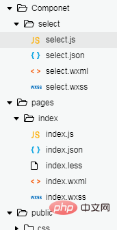
First create a folder with a custom name, such as my Componet
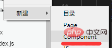
above Create another select folder, then: right-click this folder and create the following Component. Then enter the name that needs to be created. I took the name of select here for convenience. Then 4 files , js, json, wxml, and wxss will be created automatically.
##Step 2: Start configuring components
Note: If you created it through the first step, you can skip the second step directly.
- The component folder created in the first step has been automatically configured. Just
- when introducing the component
, configure the name and location of the component in the json file of the page where the component is introduced.
If you manually create the js, json, wxml, and wxss files of the component, you need to fill in the json file -
"component ": true represents a custom component declaration. The js file also needs to be written in this format:
Component({
  properties: {    // 这里定义了innerText属性,属性值可以在组件使用时指定    innerText: {
      type: String,
      value: 'default value',
    }
  },
  data: {    // 这里是一些组件内部数据    someData: {}
  },
  methods: {    // 这里是一个自定义方法
    customMethod: function(){}
  }
})
Copy after login
Step 3: Customize the component style and js.
Note: You can put the component location in pages of app.json Put the page in the first place, so that you can write code on the component page. For example, my directory structure above: it needs to be written as "Component/select/select", followed by other pages. This is much more convenient.
1. Component wxml<view class='com-selectBox'>
<view class='com-sContent' bindtap='selectToggle'>
<view class='com-sTxt'>{{nowText}}</view>
<image src='../../public/img/local/down.png' class='com-sImg' animation="{{animationData}}"></image>
</view>
<view class='com-sList' wx:if="{{selectShow}}">
<view wx:for="{{propArray}}" data-index="{{index}}" wx:key='' class='com-sItem' bindtap='setText'>{{item.text}}</view>
</view></view>Copy after login
<view class='com-selectBox'>
<view class='com-sContent' bindtap='selectToggle'>
<view class='com-sTxt'>{{nowText}}</view>
<image src='../../public/img/local/down.png' class='com-sImg' animation="{{animationData}}"></image>
</view>
<view class='com-sList' wx:if="{{selectShow}}">
<view wx:for="{{propArray}}" data-index="{{index}}" wx:key='' class='com-sItem' bindtap='setText'>{{item.text}}</view>
</view></view>- (1)
animation="{{animationData}}" This is the animation effect of the down arrow
(2) data-index="{{index}}" This is the index of the current element when it is clicked
(3) selectToggle is an event that imitates the hiding and display of the drop-down option box. - (4) setText is an event that sets the content after imitating the drop-down option box to select a sub-item.
- (5) selectShow indicates whether the option option is displayed
2. wxss of the component.com-selectBox{
width: 200px;
}.com-sContent{
border: 1px solid #e2e2e2;
background: white;
font-size: 16px;
position: relative;
height: 30px;
line-height: 30px;
}.com-sImg{
position: absolute;
right: 10px;
top: 11px;
width: 16px;
height: 9px;
transition: all .3s ease;
}.com-sTxt{
overflow: hidden;
text-overflow: ellipsis;
white-space: nowrap;
padding:0 20px 0 6px;
font-size: 14px;
}.com-sList{
background: white;
width: inherit;
position: absolute;
border: 1px solid #e2e2e2;
border-top: none;
box-sizing: border-box;
z-index: 3;
max-height: 120px;
overflow: auto;
}.com-sItem{
height: 30px;
line-height: 30px;
border-top: 1px solid #e2e2e2;
padding: 0 6px;
text-align: left;
overflow: hidden;
text-overflow: ellipsis;
white-space: nowrap;
font-size: 14px;
}.com-sItem:first-child{
border-top: none;
}
3. Component’s js// Componet/Componet.jsComponent({ /**
* 组件的属性列表 */
properties: {
propArray:{
type:Array,
}
}, /**
* 组件的初始数据 */
data: {
selectShow:false,//初始option不显示
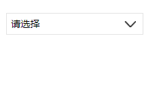
nowText:"请选择",//初始内容
animationData:{}//右边箭头的动画 }, /**
* 组件的方法列表 */
methods: {
//option的显示与否
selectToggle:function(){ var nowShow=this.data.selectShow;//获取当前option显示的状态
//创建动画
var animation = wx.createAnimation({
timingFunction:"ease"
}) this.animation=animation; if(nowShow){
animation.rotate(0).step(); this.setData({
animationData: animation.export()
})
}else{
animation.rotate(180).step();
this.setData({
animationData: animation.export()
})
} this.setData({
selectShow: !nowShow
})
}, //设置内容
setText:function(e){ var nowData = this.properties.propArray;//当前option的数据是引入组件的页面传过来的,所以这里获取数据只有通过this.properties
var nowIdx = e.target.dataset.index;//当前点击的索引
var nowText = nowData[nowIdx].text;//当前点击的内容
//再次执行动画,注意这里一定,一定,一定是this.animation来使用动画
this.animation.rotate(0).step(); this.setData({
selectShow: false,
nowText:nowText,
animationData: this.animation.export()
})
}
}
})Copy after login
// Componet/Componet.jsComponent({  /**
   * 组件的属性列表   */
    properties: {
        propArray:{
            type:Array,
        }
    },  /**
   * 组件的初始数据   */
    data: {
        selectShow:false,//初始option不显示
        nowText:"请选择",//初始内容
        animationData:{}//右边箭头的动画    },  /**
   * 组件的方法列表   */
    methods: {
   //option的显示与否
        selectToggle:function(){            var nowShow=this.data.selectShow;//获取当前option显示的状态
            //创建动画
            var animation = wx.createAnimation({
                timingFunction:"ease"
            })            this.animation=animation;            if(nowShow){
                animation.rotate(0).step();                this.setData({
                    animationData: animation.export()
                })
            }else{
                animation.rotate(180).step();
                this.setData({
                    animationData: animation.export()
                })
            }            this.setData({
                selectShow: !nowShow
            })
        },        //设置内容
        setText:function(e){            var nowData = this.properties.propArray;//当前option的数据是引入组件的页面传过来的,所以这里获取数据只有通过this.properties
            var nowIdx = e.target.dataset.index;//当前点击的索引
            var nowText = nowData[nowIdx].text;//当前点击的内容
            //再次执行动画,注意这里一定,一定,一定是this.animation来使用动画
            this.animation.rotate(0).step();            this.setData({
                selectShow: false,
                nowText:nowText,
                animationData: this.animation.export()
            })
        }
    }
})- (1) Component’s
- properties
Attribute is an external attribute. What I understand is that it can be used as data. It is an object with three attributes, namely type
indicating the attribute type,valuerepresents the initial value of the attribute,observerrepresents the response function when the attribute value is changed.type is required, others are optional. If there is only type, it can be written as: Attribute name: type type. (2) The data of the component is the same as the data of the ordinary page. It is the internal data of the component and is used for the component together with properties
Template rendering.(3) 组件的 method 是专门用于 事件响应函数 和 任意的自定义方法。在这里面获取数据有两种方法:一种是获取data里的数据: this.data.属性名;一种是获取 properties 中的属性值: this.properties.属性名
(4) 创建animation动画,作用在通过 true 和 false 切换显示状态的内容上没有过渡、没有过渡、没有过渡。
第四步:引入组件,传入组件所需数据
1. 引入前,需要在引入组件的页面的json文件中配置,比如我要在 index.wxml 中引入,那么在 index.json 中我就需要配置:
"usingComponents": { "Select": "/Componet/select/select"}(1) Select 是你定义的组件的名称,后面的是组件所在的位置。 / 单斜杠表示根目录,是绝对路径。
(2) 如果出现下面这种说没找到路径的,一定是自己填写的路径不对,认真查找。

2. 配置好后,就可以引入组件。
<Select prop-array='{{selectArray}}'></Select>(1) prop-array 是我自定义的属性名,这个是和组件所在的 js 中properties中的属性是对应的。在 properties 定义的属性中,属性名采用驼峰写法(例如:propArray);在引入组件的 wxml 中,指定属性值时则对应使用连字符写法(例如:prop-array="...")。
3. 最后就是传入数据了。在引入组件的js的data中,添加:
selectArray: [{ "id": "10", "text": "会计类"}, { "id": "21", "text": "工程类"}]最终结果:
如果引入两个相同的组件,传入的数据也相同:
<Select prop-array='{{selectArray}}'></Select><Select prop-array='{{selectArray}}'></Select>这样的方式组件并不会相互影响,都是独立的。
对了,组件样式的规则可以查看官方的规则
第五步:获取点击的内容,即组件间的通信
效果有了,最关键的是获取选中的内容。这个怎么实现呢,这时候需要组建间通信与事件了。
1. 对组件的事件进行监听:
<Select prop-array='{{selectArray}}' bind:myget='getDate'></Select>(1) 这里myget是自定义的子组件需要触发的事件名,getDate是引入组件的页面需要获取传过来的数据的自定义的事件名。
2. 子组件触发事件
因为这里的select组件是点击下拉列表的内容才进行内容的更新,所以这里只需要在下拉列表里添加一个点击事件,而原来已经设置了setText事件。所以只需要在setText函数里面写触发事件就行了。
在setText函数的内容里加上:
var nowDate={
    id:nowIdx,
    text:nowText
}this.triggerEvent('myget', nowDate)(1) 这里的 myget 和 bind:myget ,名称一定要对应。
(2) nowDate是需要传回的数据,不一定要弄成对象,想传什么传什么,我这里只是演示而已。我试了一下也可以传函数。。。
3. 引入组件的页面的js
添加引入组件时,自定义的函数:
getDate:function(e){
    console.log(e.detail)
}e的内容为:
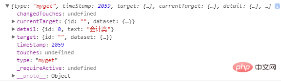
传过来的值就在detail里面。
到此,一个完整的select组件就完成了。
更新:
如果要select组件默认显示传入的第一个数据,做法是:
(1) 在select组件的wxml页面,在class为com-sTxt的view标签中,原来的 {{ nowText }} 改为 {{ nowText==' ' ? propArray[0].text : nowText }}。
(2) 然后在 select 组件 js文件 中原来nowText的值修改为 ‘ ’ 空。
(3) 这样的话就表示如果最初nowText为空,就显示传入数据的第一个值,否则就是选中的值
推荐教程:《微信小程序》
The above is the detailed content of Custom select drop-down option box component in WeChat applet. For more information, please follow other related articles on the PHP Chinese website!

Hot AI Tools

Undresser.AI Undress
AI-powered app for creating realistic nude photos

AI Clothes Remover
Online AI tool for removing clothes from photos.

Undress AI Tool
Undress images for free

Clothoff.io
AI clothes remover

AI Hentai Generator
Generate AI Hentai for free.

Hot Article
Hot Tools

Notepad++7.3.1
Easy-to-use and free code editor

SublimeText3 Chinese version
Chinese version, very easy to use

Zend Studio 13.0.1
Powerful PHP integrated development environment

Dreamweaver CS6
Visual web development tools

SublimeText3 Mac version
God-level code editing software (SublimeText3)
Hot Topics
 1371
1371
 52
52

 Xianyu WeChat mini program officially launched
Feb 10, 2024 pm 10:39 PM
Xianyu WeChat mini program officially launched
Feb 10, 2024 pm 10:39 PM
Xianyu's official WeChat mini program has quietly been launched. In the mini program, you can post private messages to communicate with buyers/sellers, view personal information and orders, search for items, etc. If you are curious about what the Xianyu WeChat mini program is called, take a look now. What is the name of the Xianyu WeChat applet? Answer: Xianyu, idle transactions, second-hand sales, valuations and recycling. 1. In the mini program, you can post idle messages, communicate with buyers/sellers via private messages, view personal information and orders, search for specified items, etc.; 2. On the mini program page, there are homepage, nearby, post idle, messages, and mine. 5 functions; 3. If you want to use it, you must activate WeChat payment before you can purchase it;
 WeChat applet implements image upload function
Nov 21, 2023 am 09:08 AM
WeChat applet implements image upload function
Nov 21, 2023 am 09:08 AM
WeChat applet implements picture upload function With the development of mobile Internet, WeChat applet has become an indispensable part of people's lives. WeChat mini programs not only provide a wealth of application scenarios, but also support developer-defined functions, including image upload functions. This article will introduce how to implement the image upload function in the WeChat applet and provide specific code examples. 1. Preparatory work Before starting to write code, we need to download and install the WeChat developer tools and register as a WeChat developer. At the same time, you also need to understand WeChat
 Implement the drop-down menu effect in WeChat applet
Nov 21, 2023 pm 03:03 PM
Implement the drop-down menu effect in WeChat applet
Nov 21, 2023 pm 03:03 PM
To implement the drop-down menu effect in WeChat Mini Programs, specific code examples are required. With the popularity of mobile Internet, WeChat Mini Programs have become an important part of Internet development, and more and more people have begun to pay attention to and use WeChat Mini Programs. The development of WeChat mini programs is simpler and faster than traditional APP development, but it also requires mastering certain development skills. In the development of WeChat mini programs, drop-down menus are a common UI component, achieving a better user experience. This article will introduce in detail how to implement the drop-down menu effect in the WeChat applet and provide practical
 Use WeChat applet to achieve carousel switching effect
Nov 21, 2023 pm 05:59 PM
Use WeChat applet to achieve carousel switching effect
Nov 21, 2023 pm 05:59 PM
Use the WeChat applet to achieve the carousel switching effect. The WeChat applet is a lightweight application that is simple and efficient to develop and use. In WeChat mini programs, it is a common requirement to achieve carousel switching effects. This article will introduce how to use the WeChat applet to achieve the carousel switching effect, and give specific code examples. First, add a carousel component to the page file of the WeChat applet. For example, you can use the <swiper> tag to achieve the switching effect of the carousel. In this component, you can pass b
 Implement image filter effects in WeChat mini programs
Nov 21, 2023 pm 06:22 PM
Implement image filter effects in WeChat mini programs
Nov 21, 2023 pm 06:22 PM
Implementing picture filter effects in WeChat mini programs With the popularity of social media applications, people are increasingly fond of applying filter effects to photos to enhance the artistic effect and attractiveness of the photos. Picture filter effects can also be implemented in WeChat mini programs, providing users with more interesting and creative photo editing functions. This article will introduce how to implement image filter effects in WeChat mini programs and provide specific code examples. First, we need to use the canvas component in the WeChat applet to load and edit images. The canvas component can be used on the page
 What is the name of Xianyu WeChat applet?
Feb 27, 2024 pm 01:11 PM
What is the name of Xianyu WeChat applet?
Feb 27, 2024 pm 01:11 PM
The official WeChat mini program of Xianyu has been quietly launched. It provides users with a convenient platform that allows you to easily publish and trade idle items. In the mini program, you can communicate with buyers or sellers via private messages, view personal information and orders, and search for the items you want. So what exactly is Xianyu called in the WeChat mini program? This tutorial guide will introduce it to you in detail. Users who want to know, please follow this article and continue reading! What is the name of the Xianyu WeChat applet? Answer: Xianyu, idle transactions, second-hand sales, valuations and recycling. 1. In the mini program, you can post idle messages, communicate with buyers/sellers via private messages, view personal information and orders, search for specified items, etc.; 2. On the mini program page, there are homepage, nearby, post idle, messages, and mine. 5 functions; 3.
 How to use PHP to develop the second-hand transaction function of WeChat applet?
Oct 27, 2023 pm 05:15 PM
How to use PHP to develop the second-hand transaction function of WeChat applet?
Oct 27, 2023 pm 05:15 PM
How to use PHP to develop the second-hand transaction function of WeChat applet? As a popular mobile application development platform, WeChat applet is used by more and more developers. In WeChat mini programs, second-hand transactions are a common functional requirement. This article will introduce how to use PHP to develop the second-hand transaction function of the WeChat applet and provide specific code examples. 1. Preparation work Before starting development, you need to ensure that the following conditions are met: the development environment of the WeChat applet has been set up, including registering the AppID of the applet and setting it in the background of the applet.
 Implement image rotation effect in WeChat applet
Nov 21, 2023 am 08:26 AM
Implement image rotation effect in WeChat applet
Nov 21, 2023 am 08:26 AM
To implement the picture rotation effect in WeChat Mini Program, specific code examples are required. WeChat Mini Program is a lightweight application that provides users with rich functions and a good user experience. In mini programs, developers can use various components and APIs to achieve various effects. Among them, the picture rotation effect is a common animation effect that can add interest and visual effects to the mini program. To achieve image rotation effects in WeChat mini programs, you need to use the animation API provided by the mini program. The following is a specific code example that shows how to
