
We have learned some layout models before, such as floating, absolute positioning, etc., but these layout methods are not simple enough, but the scope of use is indeed too narrow.
The flex model has many attributes to set various layout methods. Next, we will introduce in detail how various attributes change the layout, and finally make a summary of the attributes.
Look first Let’s take a look at the basic model of flex, as shown in the figure below:
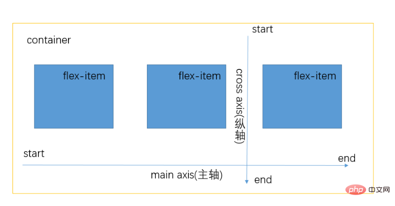
container There are three child elements flex-item in the parent container. When you set display:flex; for the parent container, the direct child elements will have a layout model. In the above figure, the main axis and the vertical axis are respectively one direction of the layout. The following attributes will be discussed in detail.
Next, let’s start with the flex-container properties
1.flex-container
1.1 flex-direction (spindle direction )
flex-direction:row; (The layout is one row, starting from start)
flex-direction:row-reverse; ( The layout is one row, starting from end)
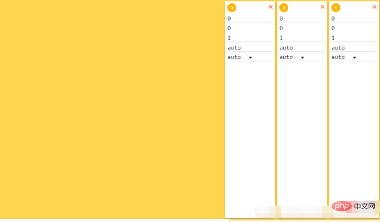
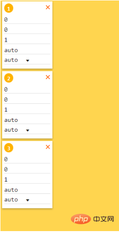
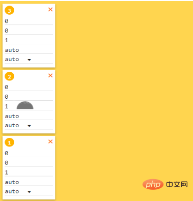
flex-wrap: nowrap; (without wrapping, displayed in one line, even if the width or height of the child element is greater than the width or height of the parent element, it will be displayed in one line)
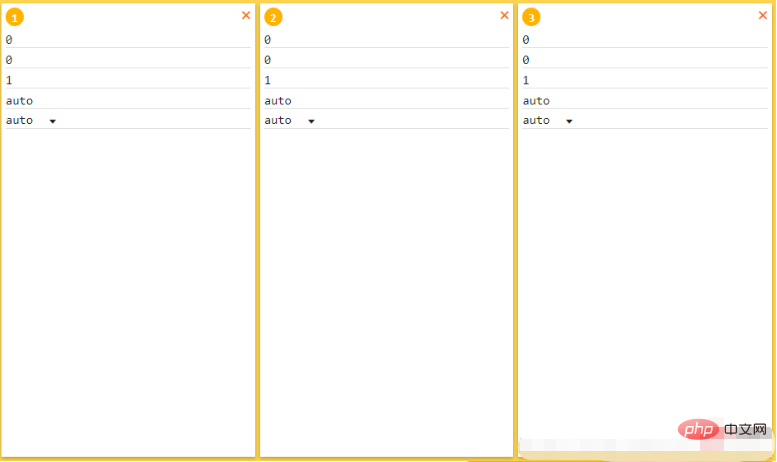 flex-wrap:wrap; (wrap after the content exceeds)
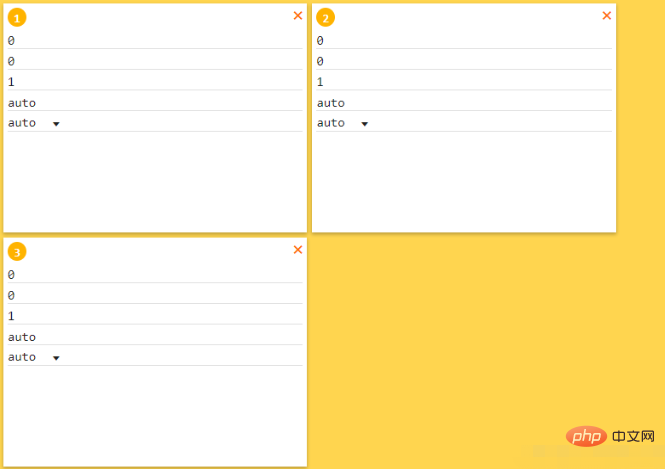 flex-wrap:wrap-reverse; (wrap after the content exceeds Two axes, reverse is to reverse the order of the axis arrangement)
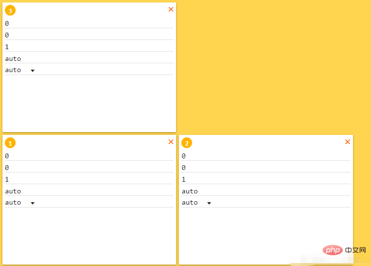
justify-content:flex-start; (start side aligned, left aligned)
##justify-content:flex-end; (end side aligned, right aligned)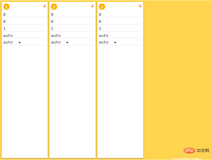
justify-content:center (center alignment) 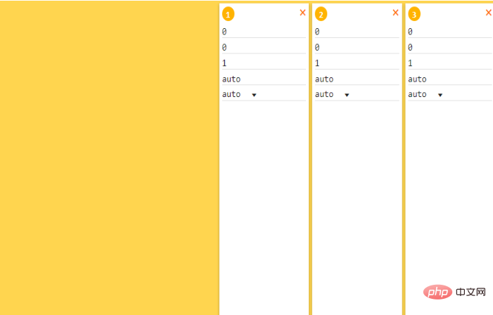
justify-content:space-between; (no spacing on the left and right sides , the middle spacing is the same)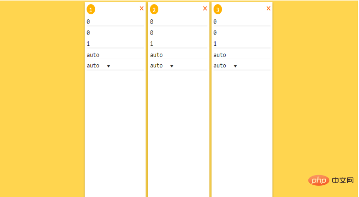
justify-content:space-around; (The spacing on the left and right sides is half of the middle spacing)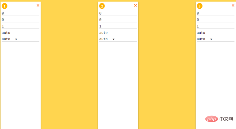
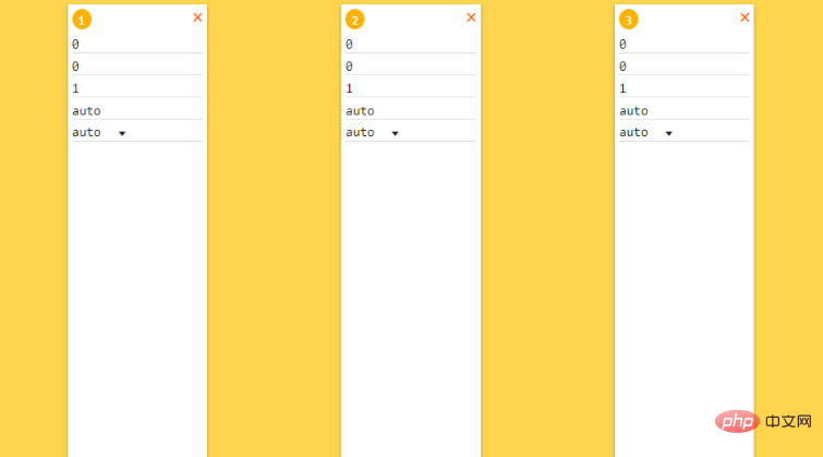 1.4 align-items (cross-axis alignment)
align-items:stretch; (stretch)
align-items:flex-start; (Start from the start side, align top)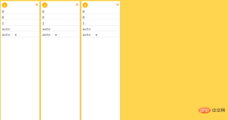
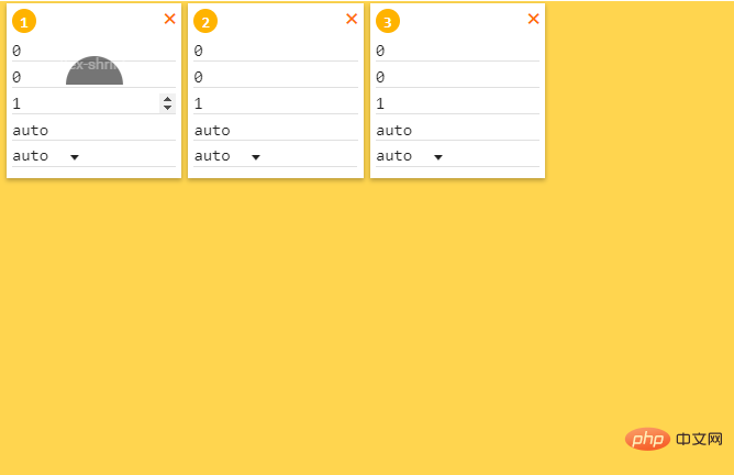
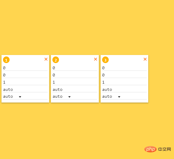
align-items:baseline; (Baseline alignment)
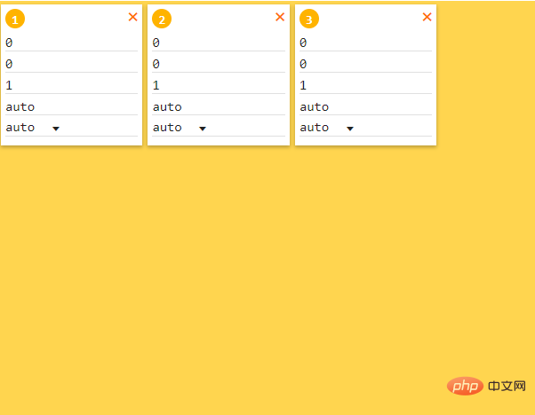
1.5 align-content (Multiple axis alignment )
align-content :stretch; (Stretch)
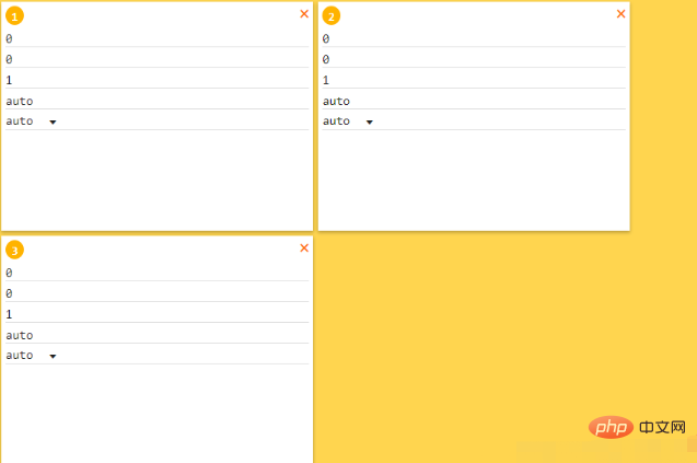
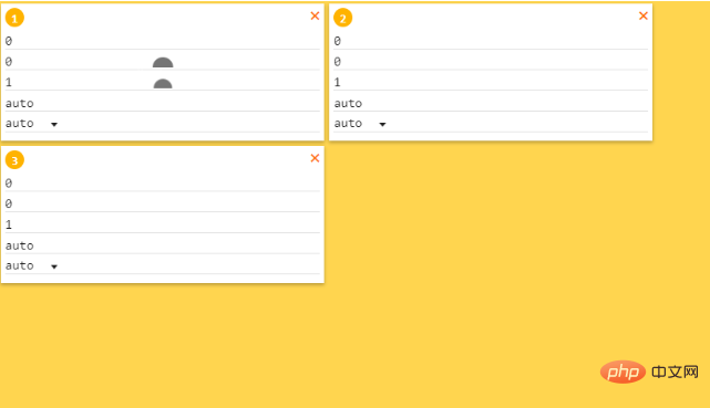
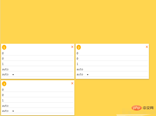 ##align-content :center; (center alignment)
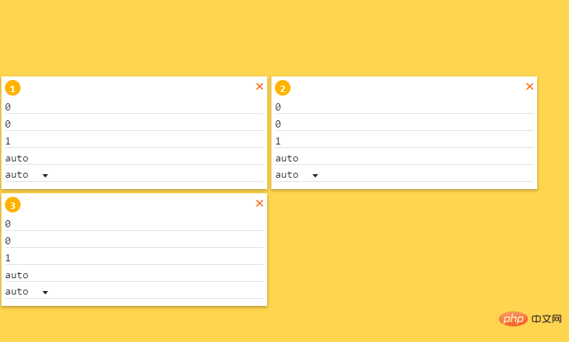 align-content:space-between; (no spacing between top and bottom, the spacing between sub-elements in the middle is the same)
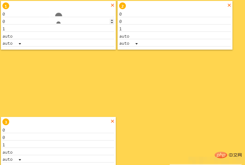 align-content:space-around; (The sum of the upper and lower spacing is equal to the middle spacing)
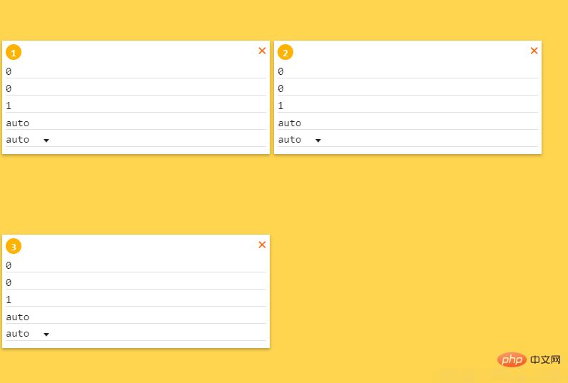
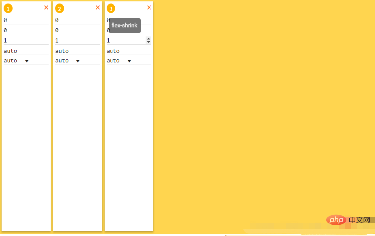
The five attributes in flex-item are order, flex-grow, flex-shrink, flex-basis, flex-self (corresponding to the following 0, 0, 1, auto, auto respectively) The initial order is 123)
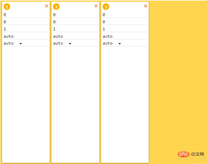 2.1 order(arrangement order)
##2.2 flex-grow(enlarge Ratio, how to allocate the remaining space, as shown in the figure below, the allocation ratio of the remaining space is 1:2:1) 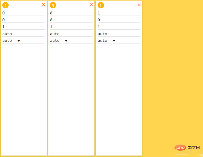
2.3 flex-shrink (reduce the ratio, what if the space is exceeded? Compression)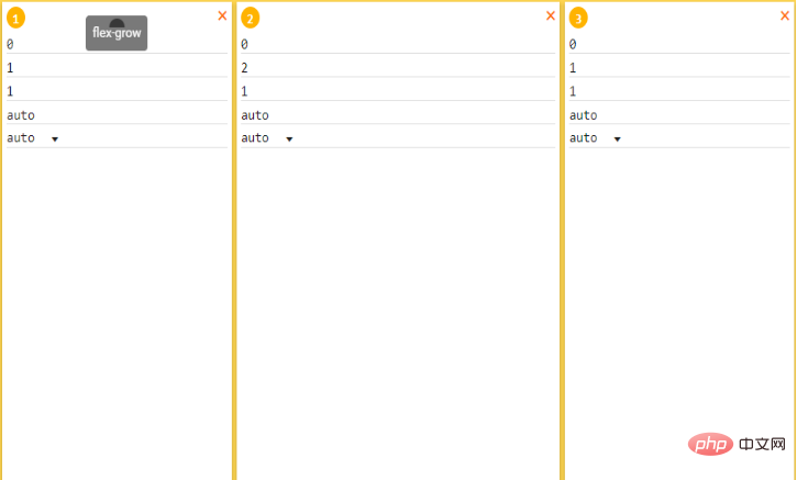
2.4 flex-basis (the main axis space occupied by item, the priority is higher than width)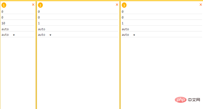
2.5 align-self (alignment, the value is the same as align, covering align-items)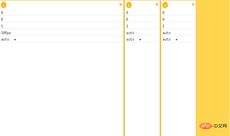
##3. Attribute summary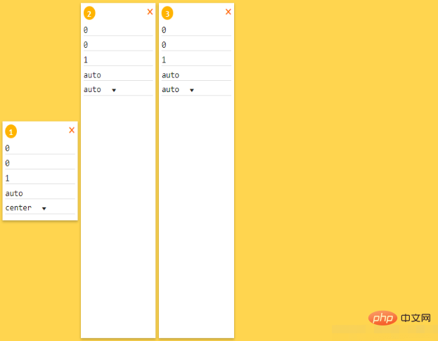
The properties of flex-container include flex-direction, flex-wrap, justify-content, align-items, align-content
flex-direction(main axis direction): 1) row (the layout is one row, starting from start)
2) row-reverse (the layout is one row, starting from end) 3) column (layout is one column, starting from start Start arranging)
4) column-reverse (the layout is one column, starting from the end)
flex-wrap(How to wrap if one axis cannot fit): 1) NOWARP (No change, display in a line)
2) wrap Turn it upside down) justify-content(Spindle alignment): 1) flex-start (start side aligned, left aligned) 2) flex-end (end side aligned, right aligned) (There is no spacing on the left and right sides, and the spacing in the middle is the same) 5) justify-content:space-around (The spacing between the left and right sides is half of the middle spacing) (cross-axis alignment): 1) align-items:stretch; (stretch) 2) Align-ITEMS: Flex-Start (starting on the start, alignment) 3) Align-Items: Flex-End (END Side Start, lower right) align-content 4) Align-content: center (enlargement ratio, how to allocate the remaining space , as shown in the figure below, the allocation ratio of the remaining space is 1:2:1) flex-shrink (Reduce the ratio, how to compress if the space is exceeded) flex-basis (The main axis space occupied by item has higher priority than width) align-self (Alignment method, covering align-items) As long as you understand the function of each attribute and debug and demonstrate it yourself, there should be no problem with flex layout! ! Combined with these attributes, you can really make a lot of layouts! ! Thank you all for reading, I hope you will benefit a lot This article is reproduced from: https://blog.csdn.net/Allenyhy/article/details/81605547 Recommended tutorial: 《CSSTutorial》
The above is the detailed content of Discuss in detail the flex layout of CSS (picture and text introduction). For more information, please follow other related articles on the PHP Chinese website!
