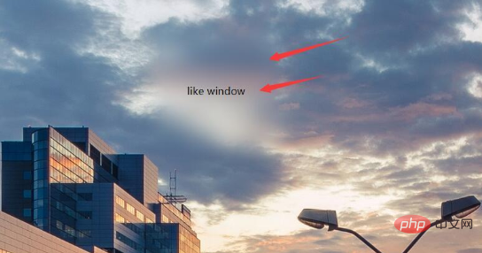

Normal background blur
(Recommended tutorial: css quick start)
Cannot be used for the sake of beauty The text in front of the background is blurred, and the filter attribute will make the descendants of the entire div and have a white border. In other words, this effect cannot be achieved. How to do it? We can use pseudo elements, which also solves the problem of white edges.
Implementation ideas:
Set the background in the parent container and use relative positioning to facilitate the overlap of pseudo elements. In :after, you only need to inherit the background, set blur, and absolutely position it to cover the parent element. This way the child elements in the parent container are not affected by the blur. Because the blurriness of a pseudo-element cannot be inherited by the descendants of the parent element.
html layout
<div class="bg">
   <div class="drag">like window</div>
</div>
css code:
/*背景模糊*/
.bg{
    width:100%;
    height:100%;
    position: relative;
    background: url("../image/banner/banner.jpg") no-repeat fixed;
    padding:1px;
    box-sizing:border-box;
    z-index:1;
}
.bg:after{
    content: "";
    width:100%;
    height:100%;
    position: absolute;
    left:0;
    top:0;
    background: inherit;
    filter: blur(2px);
    z-index: 2;
}
.drag{
    position: absolute;
    left:50%;
    top:50%;
    transform: translate(-50%,-50%);
    width:200px;
    height:200px;
    text-align: center;

    z-index:11;
}Of course, after reading the above code, you can find that the child elements under the parent container also need to Use absolute positioning, but this will not affect the subsequent layout, so please feel free to use it. What should be noted is that to use z-index to determine the hierarchical relationship, you must ensure that the descendant elements (that is, the drag here) are at the top. Otherwise, the text of the descendant elements will not appear.
Effect:

Partial blurring of the background
Compared with the previous effect, the partial blurring of the background is It's relatively simple. At this time, the parent element does not need to set the pseudo element to be blurry at all. Directly analogous to the above code, the child elements are blurred, but the descendants of the child elements may not be blurred (note this, the solution is as described in the previous effect).
HTML layout:
<div class="bg">
   <div class="drag">
        <div>like window</div>
   </div>
</div>css code:
/*背景局部模糊*/
.bg{
    width:100%;
    height:100%;
    background: url("../image/banner/banner.jpg") no-repeat fixed;
    padding:1px;
    box-sizing:border-box;
    z-index:1;
}
.drag{
    margin:100px auto;
    width:200px;
    height:200px;

    background: inherit;

    position: relative;
}
.drag >div{
    width:100%;
    height: 100%;
    text-align: center;
    line-height:200px;
    position: absolute;
    left:0;
    top:0;
    z-index: 11;
}
.drag:after{
    content: "";
    width:100%;
    height:100%;
    position: absolute;
    left:0;
    top:0;
    background: inherit;
    filter: blur(15px);/*为了模糊更明显,调高模糊度*/
    z-index: 2;
}The effect is as follows:

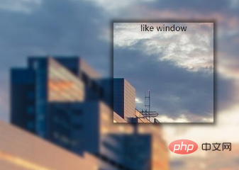
The background is partially clear
The background is partially clear. This effect is neither simple nor difficult. The key is to apply the background:inherit attribute. You can't use transform here to center it vertically. You should choose flex layout. If the transform attribute is used here, the background will also be offset. In this way, there is no local clear effect.
html layout is the same as above.
css code:
/*背景局部清晰*/
.bg{
    width:100%;
    height:100%;
    position: relative;
    background: url("../image/banner/banner.jpg") no-repeat fixed;
    padding:1px;
    box-sizing:border-box;
}
.bg:after{
    content: "";
    width:100%;
    height:100%;
    position: absolute;
    left:0;
    top:0;
    background: inherit;
    filter: blur(3px);
    z-index: 1;
}
.drag{
    position: absolute;
    left:40%;
    top:30%;
    /*transform: translate(-50%,-50%);*/
    width:200px;
    height:200px;
    text-align: center;

    background: inherit;
    z-index:11;

    box-shadow:  0 0 10px 6px rgba(0,0,0,.5);
}Effect:

The above is the detailed content of How to achieve blurred background effect in css. For more information, please follow other related articles on the PHP Chinese website!