
 Daily Programming
CSS Knowledge
css sets the background image to be blurry and the content not to be blurry
Daily Programming
CSS Knowledge
css sets the background image to be blurry and the content not to be blurry
css sets the background image to be blurry and the content not to be blurry
 Requirement: A p has set the background: url. Now it is necessary to blur the background of the picture and display the text in the p clearly.
Original code:
<!DOCTYPE html><html lang="en"><head>
<meta charset="utf-8">
<style type="text/css">
.content { color: #ffffff; font-size: 40px; }
.bg { background: url('1.jpg'); background-repeat: no-repeat; background-position: center; background-size: cover; height:600px; text-align: center; line-height: 600px; }
</style></head><body><p class="bg">
<p class="content">我是内容</p></p></body></html>Original effect: 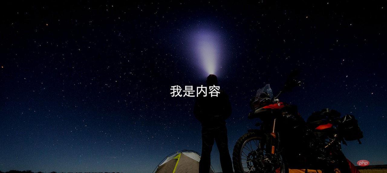
Solution: The content and image are placed in a p respectively, and the background p blur is set through css , set the absolute position of content p.
html code:
<!DOCTYPE html><html lang="en"><head>
<meta charset="utf-8">
<style type="text/css">
.content { color: #ffffff; font-size: 40px; }
.bg { background: url('1.jpg'); height:600px; text-align: center; line-height: 600px; }
.bg-blur { float: left; width: 100%; background-repeat: no-repeat; background-position: center; background-size: cover; -webkit-filter: blur(15px); -moz-filter: blur(15px); -o-filter: blur(15px); -ms-filter: blur(15px); filter: blur(15px); }
.content-front { position:absolute; left: 10px; right: 10px; height:600px; line-height: 600px; text-align: center; }
</style></head><body>
<p>
<p class="bg bg-blur"></p>
<p class="content content-front">我是内容</p>
</p></p></body></html>Effect: 
<!DOCTYPE html><html lang="en"><head>
<meta charset="utf-8">
<style type="text/css">
.content { color: #ffffff; font-size: 40px; }
.bg { background: url('1.jpg'); background-repeat: no-repeat; background-position: center; background-size: cover; height:600px; text-align: center; line-height: 600px; }
</style></head><body><p class="bg">
<p class="content">我是内容</p></p></body></html>
<!DOCTYPE html><html lang="en"><head>
<meta charset="utf-8">
<style type="text/css">
.content { color: #ffffff; font-size: 40px; }
.bg { background: url('1.jpg'); height:600px; text-align: center; line-height: 600px; }
.bg-blur { float: left; width: 100%; background-repeat: no-repeat; background-position: center; background-size: cover; -webkit-filter: blur(15px); -moz-filter: blur(15px); -o-filter: blur(15px); -ms-filter: blur(15px); filter: blur(15px); }
.content-front { position:absolute; left: 10px; right: 10px; height:600px; line-height: 600px; text-align: center; }
</style></head><body>
<p>
<p class="bg bg-blur"></p>
<p class="content content-front">我是内容</p>
</p></p></body></html>
https://blog.csdn.net/oHeHeHou/article/details/51975539
Recommended tutorial:The above is the detailed content of css sets the background image to be blurry and the content not to be blurry. For more information, please follow other related articles on the PHP Chinese website!

Hot AI Tools

Undresser.AI Undress
AI-powered app for creating realistic nude photos

AI Clothes Remover
Online AI tool for removing clothes from photos.

Undress AI Tool
Undress images for free

Clothoff.io
AI clothes remover

AI Hentai Generator
Generate AI Hentai for free.

Hot Article
Hot Tools

Notepad++7.3.1
Easy-to-use and free code editor

SublimeText3 Chinese version
Chinese version, very easy to use

Zend Studio 13.0.1
Powerful PHP integrated development environment

Dreamweaver CS6
Visual web development tools

SublimeText3 Mac version
God-level code editing software (SublimeText3)
Hot Topics
 1386
1386
 52
52