What are the four principles of text layout?
Four principles: 1. The principle of intimacy; if there is a relationship between elements, then they should also be visually related. 2. Alignment principle: Every element in the project must ensure a certain alignment relationship with other elements. 3. The principle of repetition; design elements must learn to reuse, making the design more unified and consistent, and strengthening the user's impression of use. 3. Comparison principle.

Text layout is the basic skill of a designer. It determines the style tendency of the entire page and is also the place that best reflects the design details.
Four major principles of text layout
##Principle 1: Intimacy
If elements are related to each other, then they should be related visually. If the content is related, or there is a correlation in the understanding, then they should be placed close to each other during typesetting. Just like when we go to a party, we always look for people we are familiar with. People with strong correlations should be visually close.

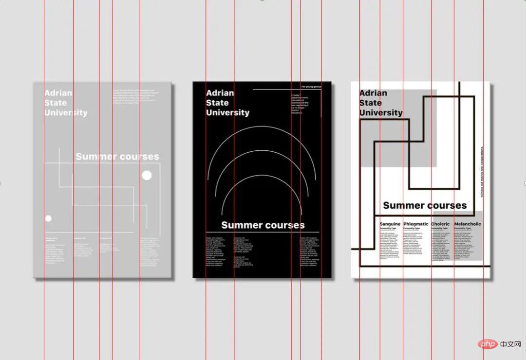
Principle 2: Alignment




Principle 3: Repeat
Design elements must learn to reuse, making the design more unified and consistent, strengthening the user’s impression of use, and also conducive to the design Teachers improve efficiency. There are many elements that can be reused: fonts, colors, white spaces, symbols, layouts, lines... The reused elements may not be exactly the same, but there must be some kind of connection, here it is related to modularization Design thinking has different approaches but similar approaches.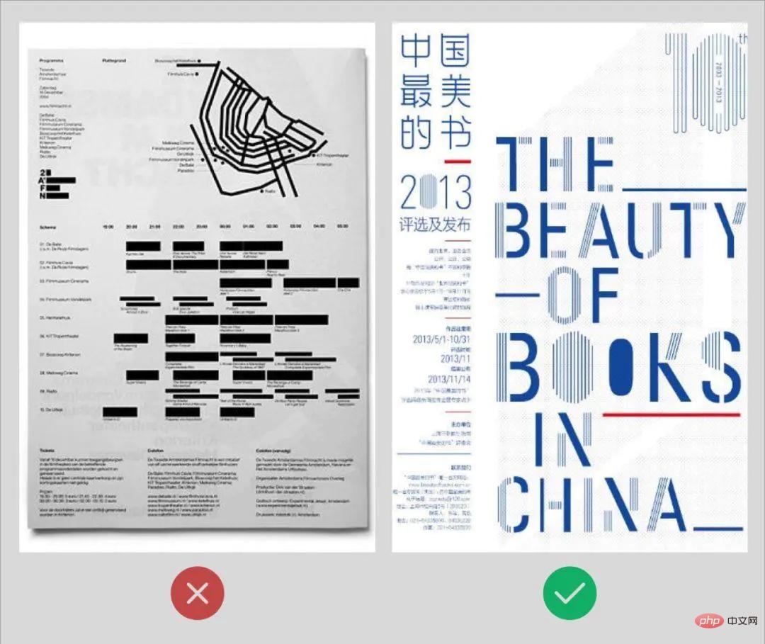
▲But be careful not to repeat an element too much. For example, if you use one color of text or color blocks on a page, it will be difficult to find the key point. If you only use one main color, the page will be unavoidable. Seems too monotonous and boring. Learn to use this principle interchangeably.
Principle 4: Contrast
Contrast will make the page more attractive, prevent elements from being too similar, and at the same time open up the visual hierarchy and create focus. Common contrasts: size contrast, color contrast, density contrast, text and white space contrast, virtual and real contrast, thickness contrast, etc.
a. The key point of contrast is that it must be bold and strong! Don't be afraid! Don’t compare 28px text with 29px text. The sizes are too similar. To increase the contrast of text, it is best to increase it in multiples of 4. Generally, it is better to increase it by 2 times of 4, which is 8px. Many apps now use popular large titles, which can be appropriately larger to increase visual contrast.

▲ Elements that are not exactly the same must have a contrasting effect. Since they need to be compared, they must be completely different to make it clear at a glance and reduce the cost of filtering information for users.
b. Don’t be afraid to make some items small. This not only makes it easier to contrast with other items, but also allows more white space to highlight key content. If the reader is not interested, they will not read it even if you enlarge the font size. If they are interested, they will read it even if the font size is small. In design, we often encounter clients who ask us to make the font size larger and the logo larger. I'm afraid that others won't see it, which makes many designers distressed and unable to do anything. In the future, they will just use this principle to smash it, which is reasonable and well-founded. (But if it really doesn’t work, you have to be scared. After all, the job is more important)
tips:
Unless it is a title or decorative text, do not use special fonts and make sure the content is clear and easy to read. . Especially for large paragraphs of text, try to use basic fonts, such as bold or Song font, so that it will not be difficult to read.
For more related knowledge, please visit: PHP Chinese website!
The above is the detailed content of What are the four principles of text layout?. For more information, please follow other related articles on the PHP Chinese website!

Hot AI Tools

Undresser.AI Undress
AI-powered app for creating realistic nude photos

AI Clothes Remover
Online AI tool for removing clothes from photos.

Undress AI Tool
Undress images for free

Clothoff.io
AI clothes remover

Video Face Swap
Swap faces in any video effortlessly with our completely free AI face swap tool!

Hot Article

Hot Tools

Notepad++7.3.1
Easy-to-use and free code editor

SublimeText3 Chinese version
Chinese version, very easy to use

Zend Studio 13.0.1
Powerful PHP integrated development environment

Dreamweaver CS6
Visual web development tools

SublimeText3 Mac version
God-level code editing software (SublimeText3)

Hot Topics
 1386
1386
 52
52
 What is useEffect? How do you use it to perform side effects?
Mar 19, 2025 pm 03:58 PM
The article discusses useEffect in React, a hook for managing side effects like data fetching and DOM manipulation in functional components. It explains usage, common side effects, and cleanup to prevent issues like memory leaks.
 What is useContext? How do you use it to share state between components?
Mar 19, 2025 pm 03:59 PM
The article explains useContext in React, which simplifies state management by avoiding prop drilling. It discusses benefits like centralized state and performance improvements through reduced re-renders.
 How do you connect React components to the Redux store using connect()?
Mar 21, 2025 pm 06:23 PM
Article discusses connecting React components to Redux store using connect(), explaining mapStateToProps, mapDispatchToProps, and performance impacts.
 How do you prevent default behavior in event handlers?
Mar 19, 2025 pm 04:10 PM
Article discusses preventing default behavior in event handlers using preventDefault() method, its benefits like enhanced user experience, and potential issues like accessibility concerns.
 What are the advantages and disadvantages of controlled and uncontrolled components?
Mar 19, 2025 pm 04:16 PM
The article discusses the advantages and disadvantages of controlled and uncontrolled components in React, focusing on aspects like predictability, performance, and use cases. It advises on factors to consider when choosing between them.
 What are the limitations of Vue 2's reactivity system with regard to array and object changes?
Mar 25, 2025 pm 02:07 PM
Vue 2's reactivity system struggles with direct array index setting, length modification, and object property addition/deletion. Developers can use Vue's mutation methods and Vue.set() to ensure reactivity.
 How do you define routes using the <Route> component?
Mar 21, 2025 am 11:47 AM
The article discusses defining routes in React Router using the <Route> component, covering props like path, component, render, children, exact, and nested routing.
 React's Role in HTML: Enhancing User Experience
Apr 09, 2025 am 12:11 AM
React combines JSX and HTML to improve user experience. 1) JSX embeds HTML to make development more intuitive. 2) The virtual DOM mechanism optimizes performance and reduces DOM operations. 3) Component-based management UI to improve maintainability. 4) State management and event processing enhance interactivity.


