Ways to Design Better Landing Pages (15 Psychology Strategies)

【Related learning recommendations: Website production video tutorial】
There are many things that subconsciously affect our daily decisions, and many of them are subtle psychological factors at work. To put it bluntly, everyone knows that user experience design is related to psychology and can even directly affect the conversion rate of a product. The following takes the login page as an example to see how to improve the user experience.
1. “Circle” important content areas
Regional emphasis can easily attract people’s attention and help people who are hesitant to make decisions quickly.
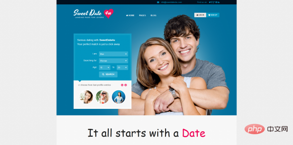
SweetDate is a blind date website that visually emphasizes the mate selection request form, allowing users to quickly submit and enter the experience.
2. Use color and contrast
People have emotional and emotional reactions to colors, so it is very important to choose the appropriate color matching. At the same time, using contrast can help people quickly jump out of the landing page and enter the destination. According to the "domino effect" theory, people tend to remember things that are different, even if they are slightly different. Taking full advantage of this may greatly increase the conversion rate.
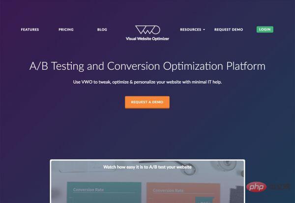
VWO uses the contrasting color “yellow” to attract users to experience the product demo.
3. Use white space
Reduce cognitive costs as much as possible and improve usability. White space is not just an aesthetic choice by the visual designer, its ultimate purpose is to make the content expressed on the interface easier to digest and understand. White space will subconsciously provide users with breathing space, highlight important elements of the page, and allow target users to pause and make decisions.
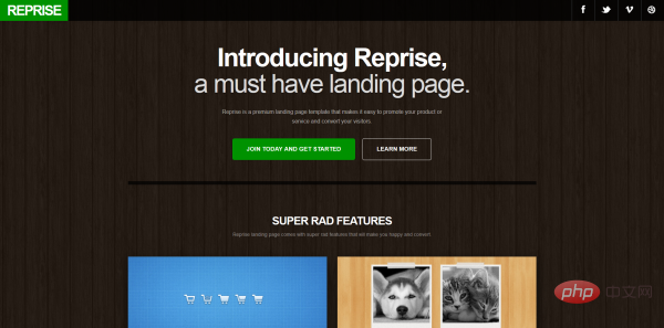
Reprise leaves a lot of background space in order to highlight the buttons.
4. Maintain consistency
By providing a consistent user experience, eliminate users’ potential concerns and gain the trust of target users. Whether it is advertising, message notifications or customer service, they all need to be seamlessly combined to provide unified information and a trustworthy experience to obtain higher conversion rates.
5. Use pictures
Pictures are usually easier to capture and remember than words. On the login page, providing emotionally resonant pictures that are related to product appeals will greatly improve users' awareness and expectations of the product, and will also help lead to the following and further call on users to take action. Almost all landing page designs use images.
6. Primacy Effect
People tend to remember the first thing in a bunch of things more easily. The content that the target users hear or see for the first time has been emphasized invisibly, and we can take this opportunity to create a good first image.

Duolingo’s login page uses only one very concise and targeted text, which leaves a deep impression on people.
7. Recency effect
Corresponding to the primacy effect, people tend to remember the first image and the last content more easily. The placement of information on the page layout is very important to avoid ending in an anticlimax. At the bottom of the login page, you can provide some information and buttons that serve the same purpose as the beginning of the page.
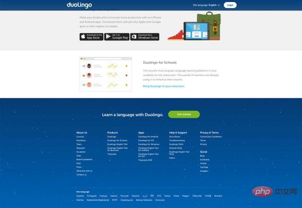
At the bottom of Duolingo’s login page, a call to action is placed, calling on target users to quickly experience the product
8. Repeat, repeat, Repeat
Otherwise, "first" and "last" are easier to remember. But this does not mean that the intermediate content is not important. We can make full use of the space to reiterate the value and advantages of the product from all angles so that users can truly receive the information.
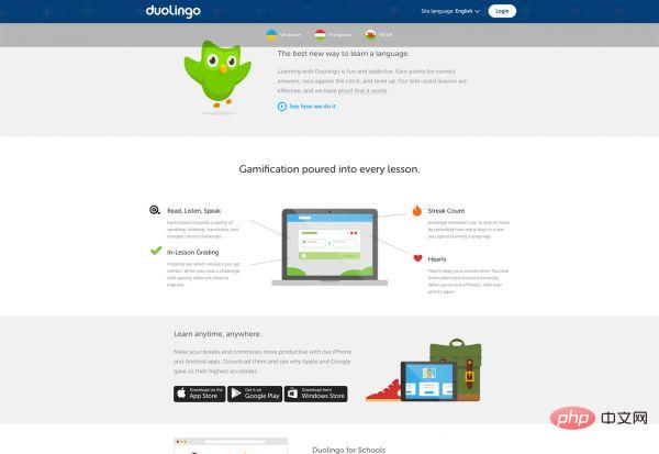
Still taking Duolingo as an example, it strengthens the product information on the login page
9. Use social attributes
People are complex social groups, and we all need to adapt to society. When we see many people doing the same thing, we subconsciously think that it is the right thing to do, and we will do it accordingly. Therefore, using strong and sincere recommendation content (graphical) can increase the conversion rate of the landing page.
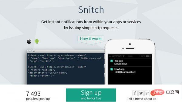
Snitch tells potential users directly that 7,493 people have registered to use it.
10. Express authority
Are there any well-known brands, companies or institutions using your product? If so, please place the relevant logo on the login page , let target users feel how popular and trustworthy our products are. People generally respect authority, which can help develop potential users into real users.
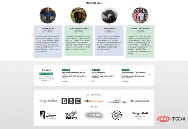
Trusted Housesitters displays the logos of well-known companies currently serving and the awards it has received.
11. Fear of missing out
People are usually afraid of missing out, far more than they want to gain. We need to clearly tell potential users what they will miss if they don't use our product. Of course, you can't say it too coldly or bluntly, otherwise the people who receive the message will feel panic and uneasy.
12. Express urgency and scarcity
It is somewhat similar to the meaning of "hungry marketing", such as providing users with a period of trial or limited-time purchase. Display the quantity sold or the quantity currently available to choose from, allowing users to feel a sense of urgency and take action quickly. (At this time, the editor’s eyes were full of “998” floating across the screen)
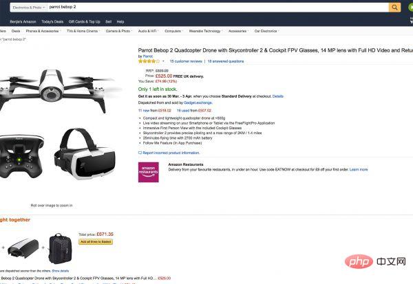
Amazon uses red to express that the inventory is low to attract the user’s attention.
13. Encourage reciprocity
Users want to know what valuable things they can get after logging in. What we want is to get user information and even more. So what we need to do is to come up with some content that users care about in return, and take this opportunity to show that our products and services far exceed expectations. For example, after logging in to a design learning website, you can obtain content that potential users are interested in, such as psd material packages.
14. Storytelling
The charm of stories is very powerful. Regardless of cultural background, people are usually 22 times more capable of remembering stories than the facts themselves. Use the art of storytelling to trigger the emotions of target users. Excellent copywriting, pictures or audio and video images can help you quickly demonstrate the advantages of your product, triggering emotional resonance and user conversion rates.
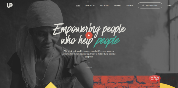
upstreamint is an international charity aid website. The login page has several vivid examples. The content and purpose of the website are easy to remember.
15. Provide free services or content
Everyone likes to be free. Provide quick and accessible services or product trials so that users can dispel their previous concerns during the trial process. The purpose of the try-before-you-buy model is to provide a good user experience and ultimately win the trust of users.
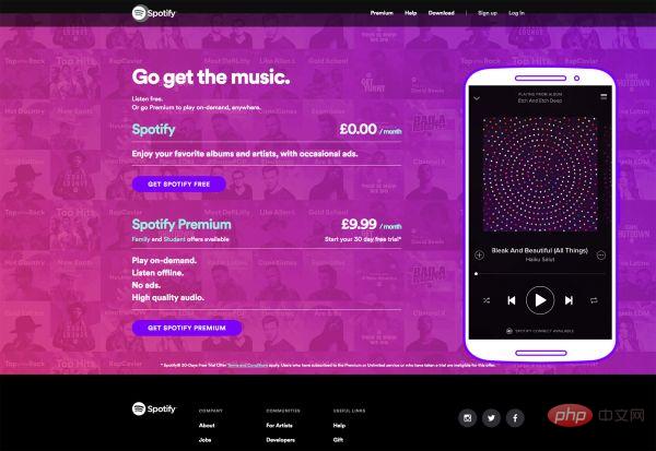
Spotify offers a 30-day free subscription service to attract users.
The above is the detailed content of Ways to Design Better Landing Pages (15 Psychology Strategies). For more information, please follow other related articles on the PHP Chinese website!

Hot AI Tools

Undresser.AI Undress
AI-powered app for creating realistic nude photos

AI Clothes Remover
Online AI tool for removing clothes from photos.

Undress AI Tool
Undress images for free

Clothoff.io
AI clothes remover

AI Hentai Generator
Generate AI Hentai for free.

Hot Article

Hot Tools

Notepad++7.3.1
Easy-to-use and free code editor

SublimeText3 Chinese version
Chinese version, very easy to use

Zend Studio 13.0.1
Powerful PHP integrated development environment

Dreamweaver CS6
Visual web development tools

SublimeText3 Mac version
God-level code editing software (SublimeText3)

Hot Topics
 1359
1359
 52
52
 What is useEffect? How do you use it to perform side effects?
Mar 19, 2025 pm 03:58 PM
The article discusses useEffect in React, a hook for managing side effects like data fetching and DOM manipulation in functional components. It explains usage, common side effects, and cleanup to prevent issues like memory leaks.
 Explain the concept of lazy loading.
Mar 13, 2025 pm 07:47 PM
Lazy loading delays loading of content until needed, improving web performance and user experience by reducing initial load times and server load.
 How does currying work in JavaScript, and what are its benefits?
Mar 18, 2025 pm 01:45 PM
The article discusses currying in JavaScript, a technique transforming multi-argument functions into single-argument function sequences. It explores currying's implementation, benefits like partial application, and practical uses, enhancing code read
 What are higher-order functions in JavaScript, and how can they be used to write more concise and reusable code?
Mar 18, 2025 pm 01:44 PM
Higher-order functions in JavaScript enhance code conciseness, reusability, modularity, and performance through abstraction, common patterns, and optimization techniques.
 How does the React reconciliation algorithm work?
Mar 18, 2025 pm 01:58 PM
The article explains React's reconciliation algorithm, which efficiently updates the DOM by comparing Virtual DOM trees. It discusses performance benefits, optimization techniques, and impacts on user experience.Character count: 159
 How do you connect React components to the Redux store using connect()?
Mar 21, 2025 pm 06:23 PM
Article discusses connecting React components to Redux store using connect(), explaining mapStateToProps, mapDispatchToProps, and performance impacts.
 What is useContext? How do you use it to share state between components?
Mar 19, 2025 pm 03:59 PM
The article explains useContext in React, which simplifies state management by avoiding prop drilling. It discusses benefits like centralized state and performance improvements through reduced re-renders.
 How do you prevent default behavior in event handlers?
Mar 19, 2025 pm 04:10 PM
Article discusses preventing default behavior in event handlers using preventDefault() method, its benefits like enhanced user experience, and potential issues like accessibility concerns.


