
 Backend Development
Python Tutorial
From now on, you can control charts with matplotlib, a powerful drawing tool in Python.
Backend Development
Python Tutorial
From now on, you can control charts with matplotlib, a powerful drawing tool in Python.
From now on, you can control charts with matplotlib, a powerful drawing tool in Python.


Related learning recommendations: python tutorial
Let me first introduce to you another very useful data analysis library ——matplotlib.
Introduction to matplotlib
If you are attending in college If you have participated in a mathematical modeling competition or used MATLAB, you will be more impressed by the drawing function in this software. MATLAB can make various functions and numerical distribution images very easy and convenient. It doesn’t matter if you haven’t used it, it’s good to know this. Although MATLAB is easy to use, it is a paid software after all, and many people prefer Python's syntax to MATLAB.
So MATLAB was taken into consideration. Later, a master imitated the drawing tool in MATLAB and developed a similar drawing tool in Python. This is the matplotlib we are going to talk about in this article today. It is also the most widely used drawing toolkit in the fields of Python, data analysis and machine learning, almost none of them. Some time ago, the U.S. government was involved in something that caused MATLAB to announce a ban on the use of MATLAB in several universities in China. Some people suggested that we could use some open source tools in Python instead. Of course, there are many other powerful tools in MATLAB. Function, Python may not necessarily be able to replace it, but at least it is no problem in the field of graphics.
Basic usage of matplotlib
matplotlib is widely popular The main reason is that it is convenient and easy to use. Let’s take a look at a few classic examples. You can create very high-quality pictures in just a few lines of code. We are using the pyplot library under the matplotlib package. We can also see from the name that it is a Python library. If you have installed a complete Python package management tool like Anaconda, this package should already be installed by default. If not, you can use pip to install it. The command is also very simple.pip install matplotlib复制代码
After installing the package, our usual usage practice is to rename it to plt, so if you read some source code and the code of other masters, plt will often appear when drawing. xxx, that’s how it came about.
import matplotlib.pyplot as plt复制代码
There are several commonly used drawing tools in plot. The first one is to make line graphs or curve graphs, which is called plot. The second type is to make a bar chart called hist, the third type is to make a scatter chart and is called scatter, and the fourth type is to make a pie chart of. In addition, you can also create some three-dimensional images, but they are rarely used in daily life and are mostly used to show off your skills.
Curve graph
plot is actually used to make curve graphs. The method used is to draw points Present, it will connect our data points into a smooth curve. Of course, polylines and straight lines are also possible. The final effect of the graph is completely determined by our data.
Its usage is very simple. In the most basic usage, we only need to pass in two lists, representing the values of the x-axis and y-axis respectively. For example, we want to make a logistic function image. We can do this:x = np.linspace(-10, 10, 100)y = 1 / (1 + np.exp(-x))plt.plot(x, y)plt.show()复制代码
. I think everyone should be familiar with this function. x is a list of one hundred points, and the corresponding y is also a list of one hundred points. That is to say, an x corresponding to a y forms a point pair, which represents a coordinate in the picture.
We don’t need to do any conversion, we just need to pass these two arrays into plt, and it will automatically complete the coordinate mapping for us. The final effect is as follows.
Histogram
hist can be used to drawhistogram, which is why we are very Common images. In the financial field, we often use histograms to reflect the trend of a data. In data analysis and machine learning, we also often use histograms to reflect the distribution of a certain feature or value.
在直方图当中我们只需要传入一个数组,就是我们要求分布的数组,另外我们需要再输入一个参数bins,表示我们希望将数据分桶的数量。然后它会绘制出每个桶中数据数量的直方图,这样我们就可以很直观地看出分布来了。
x = np.random.normal(size=200)plt.hist(x,bins=30)plt.show()复制代码
这里我们调用numpy当中以正态分布概率随机的函数,得到的结果应该是正态分布的。
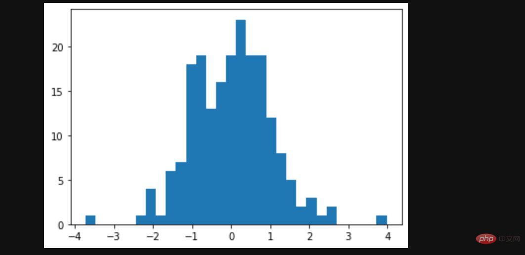
我们查看图像,这个结果和我们的预期基本吻合。
点状图
第三种图像叫做散点图,它反应的是每个点的分布情况。比如我们之前在介绍KNN和Kmeans模型的时候曾经都作过散点图,一个点代表一个样本,通过散点图我们观察的也是样本和数据分布的情况。但是和直方图相比它更加得直观,我们能直接看到分布,而不是一个分布的统计结果。
但是它也有缺点,缺点就是我们只能观察二维平面当中的点的分布,毕竟超过3维的维度就没办法绘制了。而且3维的数据分布也不是很好观察。
同样散点图的绘制也很简单,我们只需要调用scatter函数传入x和y的数组即可。
x = np.random.rand(100)y = np.random.rand(100)plt.scatter(x, y)复制代码
这里我们的x和y都是随机分布,所以得到的结果是散乱没有规律的点。

饼状图
最后我们来看下饼状图,饼状图也很常用,虽然也是反映的数据分布,但是它更多是体现某一个值占的比例。通过饼状图,我们可以很直观地了解到这点。
我们可以传入一个list进入pie函数,plot会根据list当中值在总体的占比绘制饼状图。我们来看个很简单的例子:
a = np.array([0.5, 0.3, 0.2, 0.1, 0.8])plt.pie(a)复制代码
得到的结果如下:

Compared with the previous results, the pie chart is slightly unclear, because although it uses different colors to distinguish different areas, it is difficult for us to visually see each area. What do they represent? This problem can be solved. We can pass in some parameters and settings to make it display more information and make the data more vivid and clear.
If you want to know more about programming learning, please pay attention to the php training column!
The above is the detailed content of From now on, you can control charts with matplotlib, a powerful drawing tool in Python.. For more information, please follow other related articles on the PHP Chinese website!

Hot AI Tools

Undresser.AI Undress
AI-powered app for creating realistic nude photos

AI Clothes Remover
Online AI tool for removing clothes from photos.

Undress AI Tool
Undress images for free

Clothoff.io
AI clothes remover

AI Hentai Generator
Generate AI Hentai for free.

Hot Article
Hot Tools

Notepad++7.3.1
Easy-to-use and free code editor

SublimeText3 Chinese version
Chinese version, very easy to use

Zend Studio 13.0.1
Powerful PHP integrated development environment

Dreamweaver CS6
Visual web development tools

SublimeText3 Mac version
God-level code editing software (SublimeText3)
Hot Topics
 1377
1377
 52
52

 Do mysql need to pay
Apr 08, 2025 pm 05:36 PM
Do mysql need to pay
Apr 08, 2025 pm 05:36 PM
MySQL has a free community version and a paid enterprise version. The community version can be used and modified for free, but the support is limited and is suitable for applications with low stability requirements and strong technical capabilities. The Enterprise Edition provides comprehensive commercial support for applications that require a stable, reliable, high-performance database and willing to pay for support. Factors considered when choosing a version include application criticality, budgeting, and technical skills. There is no perfect option, only the most suitable option, and you need to choose carefully according to the specific situation.
 HadiDB: A lightweight, horizontally scalable database in Python
Apr 08, 2025 pm 06:12 PM
HadiDB: A lightweight, horizontally scalable database in Python
Apr 08, 2025 pm 06:12 PM
HadiDB: A lightweight, high-level scalable Python database HadiDB (hadidb) is a lightweight database written in Python, with a high level of scalability. Install HadiDB using pip installation: pipinstallhadidb User Management Create user: createuser() method to create a new user. The authentication() method authenticates the user's identity. fromhadidb.operationimportuseruser_obj=user("admin","admin")user_obj.
 Can mysql workbench connect to mariadb
Apr 08, 2025 pm 02:33 PM
Can mysql workbench connect to mariadb
Apr 08, 2025 pm 02:33 PM
MySQL Workbench can connect to MariaDB, provided that the configuration is correct. First select "MariaDB" as the connector type. In the connection configuration, set HOST, PORT, USER, PASSWORD, and DATABASE correctly. When testing the connection, check that the MariaDB service is started, whether the username and password are correct, whether the port number is correct, whether the firewall allows connections, and whether the database exists. In advanced usage, use connection pooling technology to optimize performance. Common errors include insufficient permissions, network connection problems, etc. When debugging errors, carefully analyze error information and use debugging tools. Optimizing network configuration can improve performance
 Navicat's method to view MongoDB database password
Apr 08, 2025 pm 09:39 PM
Navicat's method to view MongoDB database password
Apr 08, 2025 pm 09:39 PM
It is impossible to view MongoDB password directly through Navicat because it is stored as hash values. How to retrieve lost passwords: 1. Reset passwords; 2. Check configuration files (may contain hash values); 3. Check codes (may hardcode passwords).
 How to solve mysql cannot connect to local host
Apr 08, 2025 pm 02:24 PM
How to solve mysql cannot connect to local host
Apr 08, 2025 pm 02:24 PM
The MySQL connection may be due to the following reasons: MySQL service is not started, the firewall intercepts the connection, the port number is incorrect, the user name or password is incorrect, the listening address in my.cnf is improperly configured, etc. The troubleshooting steps include: 1. Check whether the MySQL service is running; 2. Adjust the firewall settings to allow MySQL to listen to port 3306; 3. Confirm that the port number is consistent with the actual port number; 4. Check whether the user name and password are correct; 5. Make sure the bind-address settings in my.cnf are correct.
 Does mysql need the internet
Apr 08, 2025 pm 02:18 PM
Does mysql need the internet
Apr 08, 2025 pm 02:18 PM
MySQL can run without network connections for basic data storage and management. However, network connection is required for interaction with other systems, remote access, or using advanced features such as replication and clustering. Additionally, security measures (such as firewalls), performance optimization (choose the right network connection), and data backup are critical to connecting to the Internet.
 How to optimize MySQL performance for high-load applications?
Apr 08, 2025 pm 06:03 PM
How to optimize MySQL performance for high-load applications?
Apr 08, 2025 pm 06:03 PM
MySQL database performance optimization guide In resource-intensive applications, MySQL database plays a crucial role and is responsible for managing massive transactions. However, as the scale of application expands, database performance bottlenecks often become a constraint. This article will explore a series of effective MySQL performance optimization strategies to ensure that your application remains efficient and responsive under high loads. We will combine actual cases to explain in-depth key technologies such as indexing, query optimization, database design and caching. 1. Database architecture design and optimized database architecture is the cornerstone of MySQL performance optimization. Here are some core principles: Selecting the right data type and selecting the smallest data type that meets the needs can not only save storage space, but also improve data processing speed.
 How to use AWS Glue crawler with Amazon Athena
Apr 09, 2025 pm 03:09 PM
How to use AWS Glue crawler with Amazon Athena
Apr 09, 2025 pm 03:09 PM
As a data professional, you need to process large amounts of data from various sources. This can pose challenges to data management and analysis. Fortunately, two AWS services can help: AWS Glue and Amazon Athena.
