How to visualize excel data processing in python
How to visualize excel data processing in python: first install the xlrd and xlwt libraries to read tables; then use pyecharts to generate the Echarts chart class library; finally install Echarts to read and display Excel data.

How to visualize excel data processing in python:
Excel table operation
Python mainly uses the two libraries xlrd and xlwt to operate excel, that is, xlrd is a library for reading excel, and xlwt is a library for writing excel.

Install xlrd
pip install xlrd
Simple table reading
import xlrd
#读取表格
data=xlrd.open_workbook("table.xlsx")
#获取表格的sheets
table=data.sheets()[0]
#输出行数量
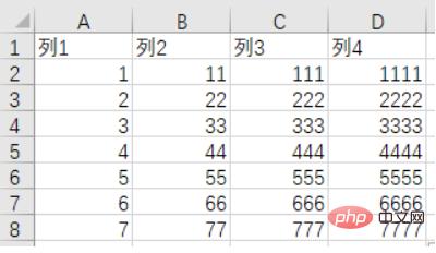
print(table.nrows)#8
#输出列数量
print(table.ncols)#4
#获取第一行数据
row1data=table.row_values(0)
print(row1data)#['列1', '列2', '列3', '列4']
print(row1data[0])#列1Data visualization
pyecharts is a class library for generating Echarts charts. Echarts is a data visualization JS library open sourced by Baidu. The graph visualization effect generated by Echarts is very good. In order to connect with Python, it is convenient to directly use data to generate graphs in Python
Installation
pip install pyecharts
Read Excel Data and display

import xlrd
from pyecharts.charts import Bar
#读取表格
data=xlrd.open_workbook("table.xlsx")
#获取表格的sheets
table=data.sheets()[0]
#输出行数量
print(table.nrows)
#输出列数量
print(table.ncols)
#获取第一行数据
row1data=table.row_values(0)
print(row1data)#['列1', '列2', '列3', '列4']
print(row1data[0])#列1
xdata=[]
ydata=[]
for i in range(1,table.nrows):
    print(table.row_values(i))
    xdata.append(table.row_values(i)[0])
    ydata.append(table.row_values(i)[1])
print(xdata)
print(ydata)
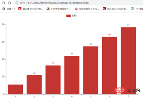
#数据可视化,柱状图
bar=Bar()
bar.add_xaxis(xdata)
bar.add_yaxis("名称1",ydata)
bar.render("show.html")Related free learning recommendations: python video tutorial
The above is the detailed content of How to visualize excel data processing in python. For more information, please follow other related articles on the PHP Chinese website!

Hot AI Tools

Undresser.AI Undress
AI-powered app for creating realistic nude photos

AI Clothes Remover
Online AI tool for removing clothes from photos.

Undress AI Tool
Undress images for free

Clothoff.io
AI clothes remover

AI Hentai Generator
Generate AI Hentai for free.

Hot Article

Hot Tools

Notepad++7.3.1
Easy-to-use and free code editor

SublimeText3 Chinese version
Chinese version, very easy to use

Zend Studio 13.0.1
Powerful PHP integrated development environment

Dreamweaver CS6
Visual web development tools

SublimeText3 Mac version
God-level code editing software (SublimeText3)

Hot Topics
 What is the function of C language sum?
Apr 03, 2025 pm 02:21 PM
There is no built-in sum function in C language, so it needs to be written by yourself. Sum can be achieved by traversing the array and accumulating elements: Loop version: Sum is calculated using for loop and array length. Pointer version: Use pointers to point to array elements, and efficient summing is achieved through self-increment pointers. Dynamically allocate array version: Dynamically allocate arrays and manage memory yourself, ensuring that allocated memory is freed to prevent memory leaks.
 Is the conversion speed fast when converting XML to PDF on mobile phone?
Apr 02, 2025 pm 10:09 PM
The speed of mobile XML to PDF depends on the following factors: the complexity of XML structure. Mobile hardware configuration conversion method (library, algorithm) code quality optimization methods (select efficient libraries, optimize algorithms, cache data, and utilize multi-threading). Overall, there is no absolute answer and it needs to be optimized according to the specific situation.
 How to convert XML files to PDF on your phone?
Apr 02, 2025 pm 10:12 PM
It is impossible to complete XML to PDF conversion directly on your phone with a single application. It is necessary to use cloud services, which can be achieved through two steps: 1. Convert XML to PDF in the cloud, 2. Access or download the converted PDF file on the mobile phone.
 Is there any mobile app that can convert XML into PDF?
Apr 02, 2025 pm 08:54 PM
An application that converts XML directly to PDF cannot be found because they are two fundamentally different formats. XML is used to store data, while PDF is used to display documents. To complete the transformation, you can use programming languages and libraries such as Python and ReportLab to parse XML data and generate PDF documents.
 How to convert xml into pictures
Apr 03, 2025 am 07:39 AM
XML can be converted to images by using an XSLT converter or image library. XSLT Converter: Use an XSLT processor and stylesheet to convert XML to images. Image Library: Use libraries such as PIL or ImageMagick to create images from XML data, such as drawing shapes and text.
 How to control the size of XML converted to images?
Apr 02, 2025 pm 07:24 PM
To generate images through XML, you need to use graph libraries (such as Pillow and JFreeChart) as bridges to generate images based on metadata (size, color) in XML. The key to controlling the size of the image is to adjust the values of the <width> and <height> tags in XML. However, in practical applications, the complexity of XML structure, the fineness of graph drawing, the speed of image generation and memory consumption, and the selection of image formats all have an impact on the generated image size. Therefore, it is necessary to have a deep understanding of XML structure, proficient in the graphics library, and consider factors such as optimization algorithms and image format selection.
 Recommended XML formatting tool
Apr 02, 2025 pm 09:03 PM
XML formatting tools can type code according to rules to improve readability and understanding. When selecting a tool, pay attention to customization capabilities, handling of special circumstances, performance and ease of use. Commonly used tool types include online tools, IDE plug-ins, and command-line tools.
 What is the process of converting XML into images?
Apr 02, 2025 pm 08:24 PM
To convert XML images, you need to determine the XML data structure first, then select a suitable graphical library (such as Python's matplotlib) and method, select a visualization strategy based on the data structure, consider the data volume and image format, perform batch processing or use efficient libraries, and finally save it as PNG, JPEG, or SVG according to the needs.


