 Web Front-end
 CSS Tutorial
 Tips for building complex layouts using css grid! (worth collecting)
Tips for building complex layouts using css grid! (worth collecting)

(Recommended tutorial: CSS Tutorial)
Grid layout is a modern CSS One of the most powerful features. Using grid layout helps us build complex, fast layouts without any external UI framework. In this article, we’ll cover everything we need to know about CSS Grid.
Basic knowledge of CSS grid
We go directly to the code, as shown below, first write some tags, the source code is in this link: https://codepen.io/Shadid/pen/ zYqNvgv
<p>
  <header>Header</header>
  <aside>Aside 1</aside>
  <section>Section</section>
  <aside>Aside 2</aside>
  <footer>Footer</footer>
</p>
Above, we created a header, two aside and a footer elements and wrapped them in a container element. We add a background color and font size to all elements within the container element.
.container > * {
  background: aquamarine;
  font-size: 30px;
}The running web page is as follows:

Now we add some grid properties:
.container {
  display: grid;
  grid-gap: 5px;
  grid-template-areas:
    "header"
    "aside-1"
    "aside-2"
    "section"
    "footer"
}

/* Assign grid areas to elements */
header {
  grid-area: header;
}

aside:nth-of-type(1) {
  grid-area: aside-1;
}

aside:nth-of-type(2) {
  grid-area: aside-2;
}

section {
  grid-area: section;
}

footer {
  grid-area: footer;
}First, we define display:grid, which will enable grid layout, and then we use grid-gap to add gaps in the grid elements.
Next, we assigned a grid area name to each html element. In the container class, we can use the grid-template-areas` attribute to define the appearance of the html template. Pay attention to how the grid template areas are arranged.
grid-template-areas:
    "header"
    "aside-1"
    "aside-2"
    "section"
    "footer"
The order of elements is different from the dom structure. However, it is ultimately presented in the order of our network regions.

The next step is to make our page responsive. We want to use a different layout on a larger screen. CSS Grid makes it very easy to handle media queries and create responsive layouts. Look at the code below:
@media (min-width: 670px) {
  .container {
    grid-template-areas:
      "header  header  header"
      "aside-1 section  aside-2"
      "footer    footer    footer"
  }
}All we have to do is reorder the grid template areas in the media query.

Grid columns and rows
How to use CSS grid to organize columns and rows? Start with the following code:
<p>
  </p><p>One</p>
  <p>Two</p>
  <p>Three</p>
  <p>Four</p>
  <p>Five</p>
  <p>Six</p>
Add some basic css
.container {
  display: grid;
  height: 100vh;
  grid-gap: 10px;
}

.item {
  background: lightcoral;
}We used a grid layout for the dom structure above and added it using grid-gap space between styles. Now, we use the grid-template-columns property to add some columns.
.container {
    display: grid;
    height: 100vh;
    grid-gap: 10px;
    grid-template-columns: 100px 200px auto auto;
}Just like this, we used columns. We specify the first column as 100px and the second column as 200px. Since we applied auto in columns 3 and 4, the remaining screen length will be split in half there.
You can see that there is a blank space in the page now. What if I want to move sixth column to third column and fourth column? For this we can use the grid-column-start and grid-column-end properties.
.item:nth-of-type(6) {
  grid-column-start: 3;
  grid-column-end: 5;
}Note that we use grid-column-end: 5, with the value 5 pointing to the column line. The fourth column ends in the fifth row of the grid. The grid-column-start and grid-column-end values refer to the grid lines.
If you find the grid line values confusing, you can also use span, which will have the same effect as above:
.item:nth-of-type(6) {
  grid-column-start: 3;
  grid-column-end: span 2;
}For span 2 , specifies that p occupies two slots in the grid. Now, suppose you want to expand the second column to fill the empty space below. We can also do this easily via the grid-column-start attribute.
.item:nth-of-type(2) {
  grid-row-start: span 2;
} We use span and grid-row-start to specify that we want to occupy two slots.

As you can see above, we have been able to build very complex layouts using a small number of CSS grid properties.
Using grid-templates effectively
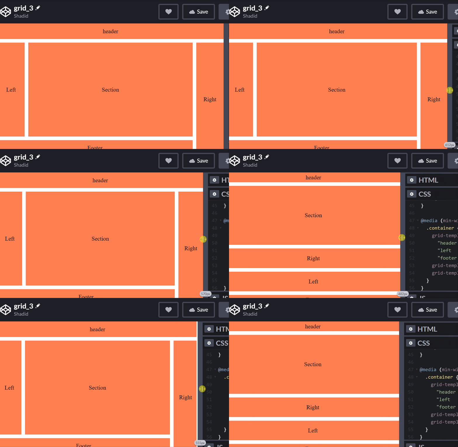
Now let’s take a look at grid-templates, in this section we will discuss how to create different layouts for different screen sizes .
First of all, let’s start with a dom structure:
<p>
  <header>header</header>
  <aside>Left</aside>
  <section>Section</section>
  <aside>Right</aside>
  <footer>Footer</footer>
</p>
Then, add some styles:
``
.container {
 display: grid;
 height: 100vh;
 grid-gap: 10px;
}
.container > * {
 background: coral;
 display: flex;
 justify-content: center;
 align-items: center;
}`
``We added a background color to the element. As you can see from the above code, we also use the flex attribute. We can combine flex and grid together. In this particular example, we center align the content using the flex property.

对于移动端,我们希望section在header下面,right 在 section 下面,我们可以使用网格区域来完成。首先,我们定义网格区域:
.container {
  display: grid;
  height: 100vh;
  grid-gap: 10px;
  grid-template-areas:
   "header"
    "section"
    "right"
    "left"
    "footer"
}

aside:nth-of-type(1) {
  grid-area: left;
}

aside:nth-of-type(2) {
  grid-area: right;
}

section {
  grid-area: section;
}

footer {
  grid-area: footer;
}

header {
  grid-area: header;
}在 grid-template-areas 中可以看到,我们先有header ,然后是section,然后是right,最后是left。此外,我们希望我们的section比 left 和 right都大点。为了实现这一点,我们可以使用rid-template-rows 属性
.container {
  display: grid;
  height: 100vh;
  grid-gap: 10px;
  grid-template-areas:
    "header"
    "section"
    "right"
    "left"
    "footer";
  grid-template-rows: 1fr 6fr 2fr 2fr 1fr;
}
我们可以根据需要设置移动端的视图,接下我们使用媒体查询来适配一下大屏幕:
@media (min-width: 500px)  {
  .container {
    grid-template-areas:
      "header header  header"
      "left   section right"
      "footer footer  right";
    grid-template-rows: 1fr 6fr 1fr;
    grid-template-columns: 1fr 6fr 1fr;
  }
}如何使用minmax函数动态跟踪元素的大小
假设我们有两列,它们均匀地占据了屏幕上的可用空间。通过使用 grid-template-columns,我们可以很容易地做到这一点。但是,如果我们想要其中一个在200px到500px之间呢?我们的列可以适应不同的屏幕尺寸,但其中一个永远不会大于500px或小于200px。
对于这些类型的场景,我们使用minmax函数。 让我们来看看它的实际效果。
<p class="container">
  <p class="one">One</p>
  <p class="two">Two</p>
</p>
.container {
  display: grid;
  height: 100vh;
  grid-template-columns: minmax(200px, 500px) minmax(100px, auto);
}
.one {
  background: cyan;
}
.two {
  background: pink;
}在这个例子中,第一列总是在200px到500px之间。然而,第二列的最小值可以是100px,对于更大的屏幕,它将覆盖屏幕的其余部分。
如何使用 repeat 函数?
我们讨论一下元素中的重复模式。我们如何处理它们?我们可以重复我们的代码或使用javascript。不过,还有另一种方法可以用css来实现。repeat函数表示轨道列表的一个重复片段,允许以更紧凑的形式编写显示重复模式的大量列或行。
<p id="container">
  <p>
    This item is 50 pixels wide.
  </p>
  <p>
    Item with flexible width.
  </p>
  <p>
    This item is 50 pixels wide.
  </p>
  <p>
    Item with flexible width.
  </p>
  <p>
    Inflexible item of 100 pixels width.
  </p>
</p>#container {
display: grid;
grid-template-columns: repeat(2, 50px 1fr) 100px;
grid-gap: 5px;
box-sizing: border-box;
height: 200px;
width: 100%;
background-color: #8cffa0;
padding: 10px;
}
#container > p {
background-color: #8ca0ff;
padding: 5px;
}嵌套网格
我还可以将网格嵌套在另一个网格中, 来看看如何实现这一点:
<p class="container">
  <p class="item">One</p>
  <p class="item">Two</p>
  <p class="item">Three</p>
  <p class="item inner-grid">
    <p class="item">i</p>
    <p class="item">ii</p>
    <p class="item">iii</p>
    <p class="item">iv</p>
    <p class="item">v</p>
    <p class="item">vi</p>
  </p>
  <p class="item">Five</p>
  <p class="item">Six</p>
</p>我们首先在外部container上声明网格:
.container {
  display: grid;
  height: 100vh;
  grid-gap: 10px;
  grid-template-columns: repeat(auto-fill, minmax(200px, auto))
}注意,我们在网格模板中有一个repeat函数,并将其与一个minmax函数组合在一起。我们现在也可以将网格属性应用到内部网格。
.inner-grid {
  display: grid;
  background: white;
  height: 100%;
  grid-gap: 5px;
  grid-template-columns: repeat(3, auto);
}这样,我们网格中嵌套了一个网格。
今天就跟大家分享到这里,感谢大家的观看,我们下期再见!
原文地址:https://blog.soshace.com/how-to-build-complex-layouts-with-css-grid/
作者:Shadid Haque
更多编程相关知识,请访问:编程入门!!
The above is the detailed content of Tips for building complex layouts using css grid! (worth collecting). For more information, please follow other related articles on the PHP Chinese website!

Hot AI Tools

Undresser.AI Undress
AI-powered app for creating realistic nude photos

AI Clothes Remover
Online AI tool for removing clothes from photos.

Undress AI Tool
Undress images for free

Clothoff.io
AI clothes remover

Video Face Swap
Swap faces in any video effortlessly with our completely free AI face swap tool!

Hot Article

Hot Tools

Notepad++7.3.1
Easy-to-use and free code editor

SublimeText3 Chinese version
Chinese version, very easy to use

Zend Studio 13.0.1
Powerful PHP integrated development environment

Dreamweaver CS6
Visual web development tools

SublimeText3 Mac version
God-level code editing software (SublimeText3)

Hot Topics
 1389
1389
 52
52
 The Roles of HTML, CSS, and JavaScript: Core Responsibilities
Apr 08, 2025 pm 07:05 PM
HTML defines the web structure, CSS is responsible for style and layout, and JavaScript gives dynamic interaction. The three perform their duties in web development and jointly build a colorful website.
 How to use bootstrap in vue
Apr 07, 2025 pm 11:33 PM
Using Bootstrap in Vue.js is divided into five steps: Install Bootstrap. Import Bootstrap in main.js. Use the Bootstrap component directly in the template. Optional: Custom style. Optional: Use plug-ins.
 How to write split lines on bootstrap
Apr 07, 2025 pm 03:12 PM
There are two ways to create a Bootstrap split line: using the tag, which creates a horizontal split line. Use the CSS border property to create custom style split lines.
 Understanding HTML, CSS, and JavaScript: A Beginner's Guide
Apr 12, 2025 am 12:02 AM
WebdevelopmentreliesonHTML,CSS,andJavaScript:1)HTMLstructurescontent,2)CSSstylesit,and3)JavaScriptaddsinteractivity,formingthebasisofmodernwebexperiences.
 How to use bootstrap button
Apr 07, 2025 pm 03:09 PM
How to use the Bootstrap button? Introduce Bootstrap CSS to create button elements and add Bootstrap button class to add button text
 How to resize bootstrap
Apr 07, 2025 pm 03:18 PM
To adjust the size of elements in Bootstrap, you can use the dimension class, which includes: adjusting width: .col-, .w-, .mw-adjust height: .h-, .min-h-, .max-h-
 React's Role in HTML: Enhancing User Experience
Apr 09, 2025 am 12:11 AM
React combines JSX and HTML to improve user experience. 1) JSX embeds HTML to make development more intuitive. 2) The virtual DOM mechanism optimizes performance and reduces DOM operations. 3) Component-based management UI to improve maintainability. 4) State management and event processing enhance interactivity.
 How to set up the framework for bootstrap
Apr 07, 2025 pm 03:27 PM
To set up the Bootstrap framework, you need to follow these steps: 1. Reference the Bootstrap file via CDN; 2. Download and host the file on your own server; 3. Include the Bootstrap file in HTML; 4. Compile Sass/Less as needed; 5. Import a custom file (optional). Once setup is complete, you can use Bootstrap's grid systems, components, and styles to create responsive websites and applications.


)
)
