
plt.pie(x, explode=None, labels=None, colors=None, autopct=None, pctdistance=0.6 , shadow=False, labeldistance=1.1, startangle=None, radius=None, counterclock=True, wedgeprops=None, textprops=None, center=(0, 0), frame=False)
Parameters:
x: Drawing data
explode: Specify the highlighted part of the pie chart and the protruding distance
colors: Specify the fill color of the pie chart
labels: Specify the label of each fragment, similar to the legend description
autopct: Automatically add percentage display, you can use formatting
pctdistance: Set the percentage label and circle center The distance
labeldistance: the distance between the label and the center of the pie
shadow: whether to add a shadow effect to the pie chart
startangle: set the initial placement angle of the pie chart
radius: The radius size of the pie chart
Counterclock: Whether to display the pie chart in counterclockwise order
wedgeprops: Set the inner and outer boundary properties of the pie chart
textprops: Set the Chinese language of the pie chart This attribute, such as font size, color, etc.
center: Specify the center position of the pie chart
frame: Whether to display the frame behind the pie chart
import matplotlib.pyplot as plt
import numpy as py
fig = plt.figure()
labels =['vivo','meizu','huawei','apple']
values=[10,20,50,80] colors=['yellow','red','green','blue']
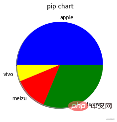
plt.pie(values, labels=labels,colors=colors,startangle=180,shadow=True)
plt.title('pip chart')
plt .show()

Optimization 1
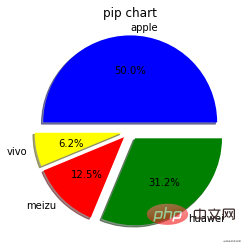
Separate the sector proportions of each part by setting the explode parameter.
explode=[0.1,0.1,0.1,0.1]
Display the proportion of each sector by setting autopct
autopct=' %1.1f%%'

##Optimization 2
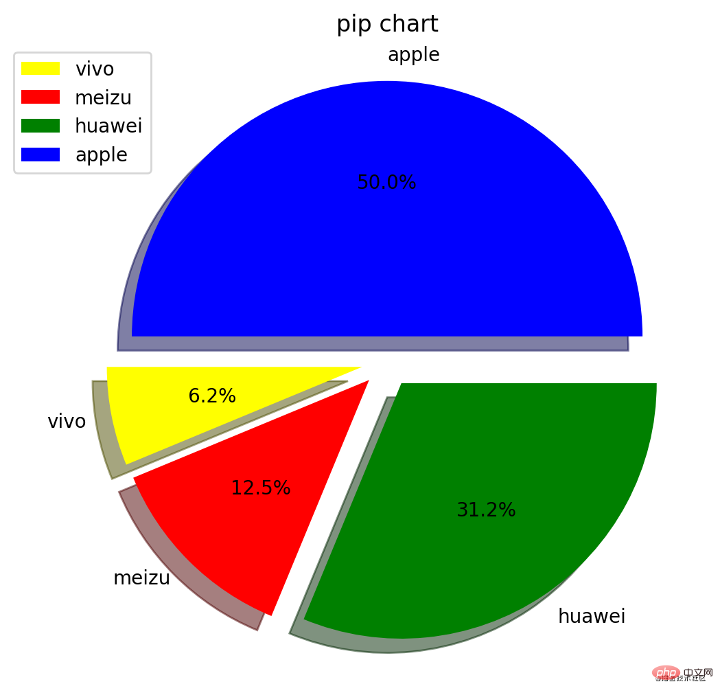
Set the canvas size and dpiplt.figure(figsize=(6,8),dpi=200)
The pie chart obtained in this way is clearer and better able to illustrate the information described (it’s a bit big, don’t panic)
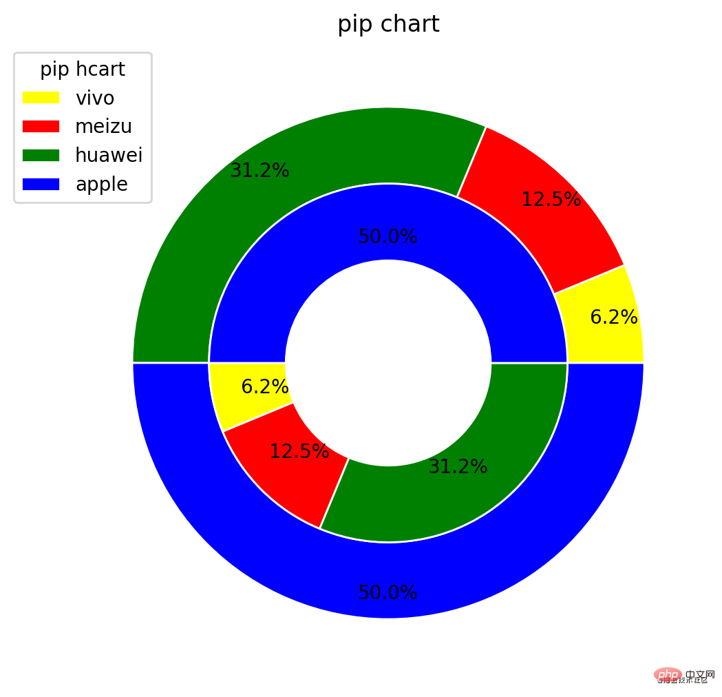
 2. Draw an inline circular pie chart
##plt.pie(values,radius=1,pctdistance=0.9,colors=colors, wedgeprops=dict(width=0.3,edgecolor="w"),autopct='%1.1f%%') plt.pie(values,radius=0.7,colors=colors,pctdistance=0.7,startangle=180,wedgeprops=dict (width=0.3,edgecolor="w"),autopct='%1.1f%%')
 ##Related free learning recommendations :
The above is the detailed content of Python uses Matplotlib to draw pie charts. For more information, please follow other related articles on the PHP Chinese website!