
.div1{background:#000080;border:1px solid red;width:98%;overflow:auto}
Can float be removed with css?

css can remove floating; the method of removing floating in css: 1. The parent container defines the "overflow:hidden" style; 2. At the end of the floating, add a div or p tag with the "clear:both" style ;3. The parent container defines the "overflow:auto" style.
Recommended tutorial: CSS video tutorial
Floating is used in layout A technology that can facilitate our layout.
1. Floating settings: css attribute float: left/right/none left floating/right floating/not floating (default)
2. The principle of floating:
Taking the current element out of the normal flow is equivalent to floating it. The floating box can move left and right until its outer edge meets the edge of the containing box or another floating box
3. The impact of floating:
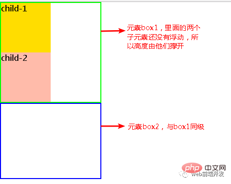
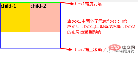
Changes the layout of nearby elements, making the layout confusing
Because the floating elements are out of the ordinary flow, a high degree of collapse will occur: The original height of the parent container is stretched by the internal elements, but when the internal elements float out of the normal flow, the height of the parent container collapses and becomes 0px.
As shown below:
##5 ways to clear floats
1. Parent div definition overflow:hidden<style type="text/css">
.div1{background:#000080;border:1px solid red;width:98%;overflow:hidden}
.left{float:left;width:20%;height:200px;background:#DDD}
.right{float:right;width:30%;height:80px;background:#DDD}
</style>
<div class="div1">
<div class="left">Left</div>
<div class="right">Right</div>
</div>Copy after login
Principle:
When using overflow:hidden, the browser will automatically check the height of the floating area. advantage:
Simple, less code, and good browser support. shortcoming:
Width or zoom: 1 must be defined and cannot be used with position, because the exceeded size will be hidden. suggestion:
It is only recommended for friends who have not used position or understand overflow:hidden. <style type="text/css">
.div1{background:#000080;border:1px solid red;width:98%;overflow:hidden}
.left{float:left;width:20%;height:200px;background:#DDD}
.right{float:right;width:30%;height:80px;background:#DDD}
</style>
<div class="div1">
<div class="left">Left</div>
<div class="right">Right</div>
</div>2. Add an empty div tag at the end clear:both<style type="text/css">
.div1{background:#000080;border:1px solid red}
.div2{background:#800080;border:1px solid red;height:100px;margin-top:10px}
.left{float:left;width:20%;height:200px;background:#DDD}
.rightright{float:rightright;width:30%;height:80px;background:#DDD}
/*清除浮动代码*/
.clearfloat{clear:both}
</style>Copy after login<div class="div1">
<div class="left">Left</div>
<div class="right">Right</div>
<div class="clearfloat"></div>
</div>
<div class="div2">
div2
</div>Copy after login
Principle:
Add an empty p and use clear:both improved by CSS to clear the float so that the parent p can automatically obtain the height. advantage:
Simple, less code, good browser support, and less prone to strange problems. shortcoming:
Many beginners do not understand the principle;
If there are many floating layouts on the page, a lot of empty spaces will be added, which makes people feel very uncomfortable. suggestion:
This method is a method of clearing floats that was mainly used in the past. <style type="text/css">
.div1{background:#000080;border:1px solid red}
.div2{background:#800080;border:1px solid red;height:100px;margin-top:10px}
.left{float:left;width:20%;height:200px;background:#DDD}
.rightright{float:rightright;width:30%;height:80px;background:#DDD}
/*清除浮动代码*/
.clearfloat{clear:both}
</style><div class="div1">
<div class="left">Left</div>
<div class="right">Right</div>
<div class="clearfloat"></div>
</div>
<div class="div2">
div2
</div>3. Parent div definition height<style type="text/css">
.div1{background:#000080;border:1px solid red;height:200px;}
.left{float:left;width:20%;height:200px;background:#DDD}
.right{float:right;width:30%;height:80px;background:#DDD}
</style>
<div class="div1">
<div class="left">Left</div>
<div class="right">Right</div>
</div>Copy after login
Principle:
Manually defining the height of the parent p solves the problem that the parent p cannot automatically obtain the height. advantage:
Simple, less code, easy to master. shortcoming:
It is only suitable for layouts with a fixed height. The exact height must be given. If the height is different from the parent p, problems will occur. suggestion:
Not recommended, only recommended for fixed-height layouts. <style type="text/css">
.div1{background:#000080;border:1px solid red;height:200px;}
.left{float:left;width:20%;height:200px;background:#DDD}
.right{float:right;width:30%;height:80px;background:#DDD}
</style>
<div class="div1">
<div class="left">Left</div>
<div class="right">Right</div>
</div>4. Parent div defines overflow:auto.div1{background:#000080;border:1px solid red;width:98%;overflow:auto}Copy after login
Principle:
Same as 1, when using overflow:auto, the browser will automatically check the height of the floating area. advantage:
Simple, less code, and good browser support. shortcoming:
When the internal width and height exceed the parent p, a scroll bar will appear. suggestion:
Not recommended, use it if you need scroll bars to appear or to ensure that scroll bars do not appear in your code. .div1{background:#000080;border:1px solid red;width:98%;overflow:auto}5. Parent div defines pseudo-classes: after and zoom<style type="text/css">
.div1{background:#000080;border:1px solid red;}
.left{float:left;width:20%;height:200px;background:#DDD}
.right{float:right;width:30%;height:80px;background:#DDD}
.clearfloat:after{display:block;clear:both;content:"";visibility:hidden;height:0}
.clearfloat{zoom:1}
</style>
<div class="div1 clearfloat">
<div class="left">Left</div>
<div class="right">Right</div>
</div>Copy after login
Advantages:
The browser has good support and is not prone to strange problems (currently:
Used by large websites, such as:
Tencent, NetEase, Sina, etc.). <style type="text/css">
.div1{background:#000080;border:1px solid red;}
.left{float:left;width:20%;height:200px;background:#DDD}
.right{float:right;width:30%;height:80px;background:#DDD}
.clearfloat:after{display:block;clear:both;content:"";visibility:hidden;height:0}
.clearfloat{zoom:1}
</style>
<div class="div1 clearfloat">
<div class="left">Left</div>
<div class="right">Right</div>
</div>
shortcoming:
There is a lot of code, and many beginners do not understand the principle. Two lines of code must be used in combination to be supported by mainstream browsers.
suggestion:
Recommended to use, it is recommended to define public classes to reduce CSS code.
Programming Teaching! !
The above is the detailed content of Can float be removed with css?. For more information, please follow other related articles on the PHP Chinese website!

Hot AI Tools

Undresser.AI Undress
AI-powered app for creating realistic nude photos

AI Clothes Remover
Online AI tool for removing clothes from photos.

Undress AI Tool
Undress images for free

Clothoff.io
AI clothes remover

Video Face Swap
Swap faces in any video effortlessly with our completely free AI face swap tool!

Hot Article
Hot Tools

Notepad++7.3.1
Easy-to-use and free code editor

SublimeText3 Chinese version
Chinese version, very easy to use

Zend Studio 13.0.1
Powerful PHP integrated development environment

Dreamweaver CS6
Visual web development tools

SublimeText3 Mac version
God-level code editing software (SublimeText3)
Hot Topics
 1386
1386
 52
52

 How to use bootstrap in vue
Apr 07, 2025 pm 11:33 PM
How to use bootstrap in vue
Apr 07, 2025 pm 11:33 PM
Using Bootstrap in Vue.js is divided into five steps: Install Bootstrap. Import Bootstrap in main.js. Use the Bootstrap component directly in the template. Optional: Custom style. Optional: Use plug-ins.
 The Roles of HTML, CSS, and JavaScript: Core Responsibilities
Apr 08, 2025 pm 07:05 PM
The Roles of HTML, CSS, and JavaScript: Core Responsibilities
Apr 08, 2025 pm 07:05 PM
HTML defines the web structure, CSS is responsible for style and layout, and JavaScript gives dynamic interaction. The three perform their duties in web development and jointly build a colorful website.
 How to write split lines on bootstrap
Apr 07, 2025 pm 03:12 PM
How to write split lines on bootstrap
Apr 07, 2025 pm 03:12 PM
There are two ways to create a Bootstrap split line: using the tag, which creates a horizontal split line. Use the CSS border property to create custom style split lines.
 Understanding HTML, CSS, and JavaScript: A Beginner's Guide
Apr 12, 2025 am 12:02 AM
Understanding HTML, CSS, and JavaScript: A Beginner's Guide
Apr 12, 2025 am 12:02 AM
WebdevelopmentreliesonHTML,CSS,andJavaScript:1)HTMLstructurescontent,2)CSSstylesit,and3)JavaScriptaddsinteractivity,formingthebasisofmodernwebexperiences.
 How to insert pictures on bootstrap
Apr 07, 2025 pm 03:30 PM
How to insert pictures on bootstrap
Apr 07, 2025 pm 03:30 PM
There are several ways to insert images in Bootstrap: insert images directly, using the HTML img tag. With the Bootstrap image component, you can provide responsive images and more styles. Set the image size, use the img-fluid class to make the image adaptable. Set the border, using the img-bordered class. Set the rounded corners and use the img-rounded class. Set the shadow, use the shadow class. Resize and position the image, using CSS style. Using the background image, use the background-image CSS property.
 How to resize bootstrap
Apr 07, 2025 pm 03:18 PM
How to resize bootstrap
Apr 07, 2025 pm 03:18 PM
To adjust the size of elements in Bootstrap, you can use the dimension class, which includes: adjusting width: .col-, .w-, .mw-adjust height: .h-, .min-h-, .max-h-
 How to set up the framework for bootstrap
Apr 07, 2025 pm 03:27 PM
How to set up the framework for bootstrap
Apr 07, 2025 pm 03:27 PM
To set up the Bootstrap framework, you need to follow these steps: 1. Reference the Bootstrap file via CDN; 2. Download and host the file on your own server; 3. Include the Bootstrap file in HTML; 4. Compile Sass/Less as needed; 5. Import a custom file (optional). Once setup is complete, you can use Bootstrap's grid systems, components, and styles to create responsive websites and applications.
 How to use bootstrap button
Apr 07, 2025 pm 03:09 PM
How to use bootstrap button
Apr 07, 2025 pm 03:09 PM
How to use the Bootstrap button? Introduce Bootstrap CSS to create button elements and add Bootstrap button class to add button text
