What is the bootstrap modal box used for?
bootstrap modal boxes can be used to create modal windows to enrich the user experience, or add practical functions for users; they can display warning windows, videos, images, terms and conditions, and even social media widgets in the website wait. The purpose of a modal is to display content from a separate source, providing information and interaction without leaving the parent form.

Bootstrap modal box (Modal) is a lightweight multi-purpose JavaScript pop-up window that is a child form covering the parent form. Typically, the purpose is to display content from a separate source, with some interaction without leaving the parent form; child forms can provide information, interaction, etc. [Related recommendations: "bootstrap Video Tutorial"]
Bootstrap modal box (Modal) is customizable and responsive. You can use it to display warning windows, videos, and pictures on your website. Websites built with Bootstrap can use modals to display terms and conditions (as part of the registration process), videos, and even social media widgets.
Bootstrap modal box can be used to create modal windows to enrich the user experience, or to add practical functions to users. You can use Popovers and Tooltips with Modals.
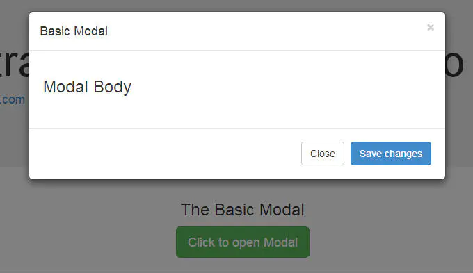
Bootstrap modal box is mainly divided into three parts: header, body and footer.
Default modal box
The default modal box is as follows:

To trigger the modal box, you need to add a link or button. The tag that triggers the element might look like this:
<a href="#" class="btn btn-lg btn-success"
   data-toggle="modal"
   data-target="#basicModal">Click to open Modal</a>
Note that the link element has two custom data attributes: data-toggle and data-target. The toggle tells Bootstrap what to do, and the target tells Bootstrap which element to open. So whenever such a link is clicked, a modal box with the id "basicModal" will appear.
Now let’s look at the code required to define the modal box:
<div class="modal fade" id="basicModal" tabindex="-1" role="dialog" aria-labelledby="basicModal" aria-hidden="true">
<div class="modal-dialog">
<div class="modal-content">
<div class="modal-header">
<button type="button" class="close" data-dismiss="modal" aria-hidden="true">×</button>
<h4 id="Modal-nbsp-title">Modal title</h4>
</div>
<div class="modal-body">
<h3 id="Modal-nbsp-Body">Modal Body</h3>
</div>
<div class="modal-footer">
<button type="button" class="btn btn-default" data-dismiss="modal">Close</button>
<button type="button" class="btn btn-primary">Save changes</button>
</div>
</div>
</div>
</div>The parent div of the modal box should have the same ID as used in the trigger element above. In our case it's id="basicModal".
Note: The custom attributes aria-labelledby and aria-hidden in the parent modal box element make it accessible. It's a good practice to make your website accessible to everyone, so you should use these attributes as they won't negatively affect the normal functionality of the modal.
In the HTML code of the modal box, we can see an encapsulating div nested within the parent modal box div. This div's class modal-content tells bootstrap.js where to look for the modal's content. Inside this div, we need to place the three parts mentioned earlier: header, body, and footer.
The modal box header, as the name suggests, is used to add a title or other elements such as an "x" close button to the modal. These elements should also have a data-dismiss attribute telling Bootstrap which element to hide.
Then let’s look at the text of the modal box. Think of it as an open canvas into which you can add any type of data, including embedded YouTube videos, images, or any other content.
Finally, let’s take a look at the footer of the modal box. This area is right-aligned by default. In this area, you can place operation buttons such as "Save", "Close", "Accept", etc. These buttons are associated with the behavior that the "modal box" needs to display.
Now we have completed our first modal! You can check it out on our demo page (https://codepen.io/SitePoint/pen/KkHyw).
Use jQuery to activate the modal box
The modal box is a jQuery plug-in, so if you want to use jQuery to control the modal box, You need to call the .modal() method on the modal's selector. For example:
$('#basicModal').modal(options);
The "options" here are JavaScript objects that can be passed to custom behaviors. For example:
var options = {
    "backdrop" : "static"
}Available options include:
Backdrop: This can be true or static. This defines whether you want the user to be able to close the modal by clicking on the background.
keyboard: If set to true the modal box will be closed via the ESC key.
show: used to open and close the modal box. It can be true or false.
remote: This is one of the coolest options. It can be used to load remote content using jQuery's load() method. You need to specify external pages in this option. The default setting is false.
For more programming-related knowledge, please visit: Introduction to Programming! !
The above is the detailed content of What is the bootstrap modal box used for?. For more information, please follow other related articles on the PHP Chinese website!

Hot AI Tools

Undresser.AI Undress
AI-powered app for creating realistic nude photos

AI Clothes Remover
Online AI tool for removing clothes from photos.

Undress AI Tool
Undress images for free

Clothoff.io
AI clothes remover

AI Hentai Generator
Generate AI Hentai for free.

Hot Article

Hot Tools

Notepad++7.3.1
Easy-to-use and free code editor

SublimeText3 Chinese version
Chinese version, very easy to use

Zend Studio 13.0.1
Powerful PHP integrated development environment

Dreamweaver CS6
Visual web development tools

SublimeText3 Mac version
God-level code editing software (SublimeText3)

Hot Topics
 1378
1378
 52
52
 How to get the bootstrap search bar
Apr 07, 2025 pm 03:33 PM
How to use Bootstrap to get the value of the search bar: Determines the ID or name of the search bar. Use JavaScript to get DOM elements. Gets the value of the element. Perform the required actions.
 How to do vertical centering of bootstrap
Apr 07, 2025 pm 03:21 PM
Use Bootstrap to implement vertical centering: flexbox method: Use the d-flex, justify-content-center, and align-items-center classes to place elements in the flexbox container. align-items-center class method: For browsers that do not support flexbox, use the align-items-center class, provided that the parent element has a defined height.
 How to write split lines on bootstrap
Apr 07, 2025 pm 03:12 PM
There are two ways to create a Bootstrap split line: using the tag, which creates a horizontal split line. Use the CSS border property to create custom style split lines.
 How to use bootstrap in vue
Apr 07, 2025 pm 11:33 PM
Using Bootstrap in Vue.js is divided into five steps: Install Bootstrap. Import Bootstrap in main.js. Use the Bootstrap component directly in the template. Optional: Custom style. Optional: Use plug-ins.
 How to insert pictures on bootstrap
Apr 07, 2025 pm 03:30 PM
There are several ways to insert images in Bootstrap: insert images directly, using the HTML img tag. With the Bootstrap image component, you can provide responsive images and more styles. Set the image size, use the img-fluid class to make the image adaptable. Set the border, using the img-bordered class. Set the rounded corners and use the img-rounded class. Set the shadow, use the shadow class. Resize and position the image, using CSS style. Using the background image, use the background-image CSS property.
 How to resize bootstrap
Apr 07, 2025 pm 03:18 PM
To adjust the size of elements in Bootstrap, you can use the dimension class, which includes: adjusting width: .col-, .w-, .mw-adjust height: .h-, .min-h-, .max-h-
 How to set up the framework for bootstrap
Apr 07, 2025 pm 03:27 PM
To set up the Bootstrap framework, you need to follow these steps: 1. Reference the Bootstrap file via CDN; 2. Download and host the file on your own server; 3. Include the Bootstrap file in HTML; 4. Compile Sass/Less as needed; 5. Import a custom file (optional). Once setup is complete, you can use Bootstrap's grid systems, components, and styles to create responsive websites and applications.
 How to use bootstrap button
Apr 07, 2025 pm 03:09 PM
How to use the Bootstrap button? Introduce Bootstrap CSS to create button elements and add Bootstrap button class to add button text


